W/o checking other things - this code is wrong in part of syntax.
Check other examples in the thread “accessing shadowRoot + ha-card”.
Also , you cannot use # for comments inside strings.
Slowly making progress. I got the knob to disappear with this:
card_mod:
  style:
    ha-slider:
      $:
        .: |
          .slider-knob-inner {
            opacity: 0%;
          }
And the height of the slider to change with this:
card_mod:
  style: |
    :host {
      --paper-slider-height: 42px;
    }
I’m having trouble combining the two however.
I’ve now combined the two and extended the slider to the edges of the card.
Next goal is to round the corners on the slider. If I use inspect element to add border-radius: 12px to the sliderBar property it only works when I disable the padding property.
With padding 15px top and bottom and border-radius 12px:

With padding 0px and border-radius 12px:

Any tips on getting around this problem?
Another issue is that once I set the slider to 0% the first part disappears:
Slider at 1%:

Slider at 0%:

This is the current code:
    card_mod:
      style:
        .: |
          :host {
            --paper-slider-height: 42px
          }
        ha-slider:
          $:
            .: |
              .slider-knob-inner {
                opacity: 0%;
              }
              div#sliderContainer {
                  margin-left: 0;
                  margin-right: 0;
              }
            paper-progress:
              $: |
                #progressContainer {
                  background: red;
                }
Solved pretty much everything, the only thing left is to adjust the padding so that it matches mushroom-cards perfectly. To do so I have to add “padding: ‘13px 12px’” to the states div inside ha-card, but I’m having troubles doing so. I’ve found some old posts but I guess the syntax is different nowadays since I couldn’t get their snippets to work.
EDIT:
Got it working, I had to apply the padding styling to the whole card and not the entity. Here’s the final code and result, top is mushroom-card light card slider set to adjust brightness, bottom is two slider-entity-row sliders, one to control the light warm_white channel and one to control the cold_white channel:

Everything matches, altho the scrubbing on the mushroom card is much smoother, I assume because slider-entity-row only has 255 “steps”. Here you can find the code for this card:
type: custom:stack-in-card
cards:
  - type: custom:mushroom-light-card
    entity: light.livingroom
    use_light_color: true
    show_brightness_control: true
    show_color_temp_control: false
    show_color_control: false
    name: Living Room
  - type: custom:stack-in-card
    mode: vertical
    cards:
      - type: entities
        entities:
          - type: custom:slider-entity-row
            toggle: false
            hide_state: true
            full_row: true
            entity: light.livingroom
            attribute: warm_white
            card_mod:
              style:
                .: |
                  :host {
                    --paper-slider-height: 42px;
                    --paper-slider-active-color: {{ '#ffcd97' if config.attribute == 'warm_white' else '#99acff' }};
                    --paper-slider-container-color: {{ '#5A4835' if config.attribute == 'warm_white' else '#363c59' }};
                  }
                ha-slider:
                  $:
                    .: |
                      .slider-knob-inner {
                        display: none;
                      }
                      div#sliderContainer {
                          margin-left: 0;
                          margin-right: 0;
                      }
                      .bar-container {
                          left: 0px !important;
                          top: 15px;
                      }
                    paper-progress:
                      .: |
                        #sliderBar {
                          padding: 0px !important;
                          border-radius: 12px;
                        }
        card_mod:
          style: |
            div#states {
              padding: 13px 12px;
            }
      - type: entities
        entities:
          - type: custom:slider-entity-row
            toggle: false
            hide_state: true
            full_row: true
            entity: light.livingroom
            attribute: cold_white
            card_mod:
              style:
                .: |
                  :host {
                    --paper-slider-height: 42px;
                    --paper-slider-active-color: {{ '#ffcd97' if config.attribute == 'warm_white' else '#99acff' }};
                    --paper-slider-container-color: {{ '#5A4835' if config.attribute == 'warm_white' else '#363c59' }};
                  }
                ha-slider:
                  $:
                    .: |
                      .slider-knob-inner {
                        display: none;
                      }
                      div#sliderContainer {
                          margin-left: 0;
                          margin-right: 0;
                      }
                      .bar-container {
                          left: 0px !important;
                          top: 15px;
                      }
                    paper-progress:
                      .: |
                        #sliderBar {
                          padding: 0px !important;
                          border-radius: 12px;
                        }
        card_mod:
          style: |
            div#states {
              padding: 13px 12px;
            }
2 Likes
Nice mod.
Check this version, it has a “standard” height and a bit more “traditional” syntax.
BTW, the style may be applied to “slider-entity-row” & conventional slider.
type: entities
entities:
  - sun.sun
  - sun.sun
  - entity: input_number.test_level_1
    card_mod: &ref_0
      style:
        ha-slider $: |
          div#sliderKnob {
            height: 32px;
          }
          .slider-knob-inner {
            display: none;
          }
          div#sliderContainer {
            margin: 0px;
          }
          .bar-container {
            left: 0px !important;
          }
          paper-progress {
            padding: 0px !important;
            border-radius: 12px;
            --paper-progress-height: 32px !important;
          }
        .: |
          :host {
            --paper-slider-active-color: lightgreen;
            --paper-slider-container-color: darkgreen;
          }
  - sun.sun
  - sun.sun
  - type: custom:slider-entity-row
    entity: input_number.test_level_1
    hide_state: true
    full_row: true
    card_mod: *ref_0

Note that this code:
--paper-slider-active-color: {{ '#ffcd97' if config.attribute == 'warm_white' else '#99acff' }};
does not update a color real-time - only after releasing a mouse input.
A bit modified version with a border:

Code
    card_mod:
      style:
        ha-slider $: |
          div#sliderKnob {
            height: 30px;
          }
          .slider-knob-inner {
            display: none;
          }
          div#sliderContainer {
            margin: 0px;
          }
          .bar-container {
            left: 0px !important;
          }
          paper-progress {
            padding: 0px !important;
            border-radius: 12px;
            --paper-progress-height: 30px !important;
            width: unset !important;
            border: 1px solid darkgreen;
          }
        .: |
          :host {
            --paper-slider-active-color: lightgreen;
            --paper-slider-container-color: darkgreen;
          }
A variant with a knob:

Code
          div#sliderKnob {
            height: 30px;
            width: 8px;
            margin-left: -4px;
            background: var(--card-background-color);
            border: 1px solid var(--secondary-text-color);
          }
8 Likes
How to style map markers in Map card:
Initially the styling was discussed here, here, some other posts later.
Unfortunately, styles were not stable.
Solution was proposed on GitHub.
Author - @kulmegil.
Works in Map card & on a Map page.

Place this js code into “www” folder (or better create a special folder) and then add as a frontend module:
customElements.whenDefined('ha-entity-marker').then(() => {
    const EntityMarker = customElements.get('ha-entity-marker');
    const { html, css } = EntityMarker.prototype;

    // defined added style
    const newStyle = css`
    .marker {
      border: none !important;
      background-color: transparent !important;}`;

    const newStyles = [].concat(EntityMarker.styles, newStyle);
    Object.defineProperty(EntityMarker, 'styles',        {value: newStyles, configurable: true, enumerable: false});
    Object.defineProperty(EntityMarker, 'elementStyles', {value: newStyles, configurable: true, enumerable: false});
  });
Similarly it is possible to create “square avatars” - add this style:
border-radius: 10%;

Update 31.01.23:
The styling above provides a “square & transparent” marker - which is great for entities WITH “entity_picture” defined.
But what if it is NOT defined? Then we’ll see smth like this:

i.e. the marker now is presented as a label only - which is not great.
This updated js-file provides styles ONLY for entities with “entity_picture” defined:

The js code:
customElements.whenDefined('ha-entity-marker').then(() => {
    const EntityMarker = customElements.get('ha-entity-marker');
    const { html, css } = EntityMarker.prototype;

    // defined added style
    const newStyle = css`
    .marker:has(.entity-picture) {
      border: none !important;
      border-radius: 10%;
      background-color: transparent !important;}`;

    const newStyles = [].concat(EntityMarker.styles, newStyle);
    // The LitElement class has already been finalized, but hopefully not yet instantiated
    // guess I'll just do it the hard way
    Object.defineProperty(EntityMarker, 'styles',        {value: newStyles, configurable: true, enumerable: false});
    Object.defineProperty(EntityMarker, 'elementStyles', {value: newStyles, configurable: true, enumerable: false});
  });
Note that “.marker:has(.entity-picture)” part.
3 Likes
Conditional styling for different clients:
Assume you have a Windows desktop, iPhone & iPad.
In some cases we need to specify different styles for different clients.
Here is how to differentiate iOS client & not-iOS client:
place a selector with a style into a condition to specify a style for iOS clients:
        @supports (-webkit-touch-callout: none) {
          selector {
            ...
          }
        }
The example below contains 3 rows:
– styled for all clients;
– styled for iOS clients;
– styled for not iOS clients.
Code
type: entities
entities:
  - entity: sun.sun
    name: everywhere
    card_mod:
      style: |
        :host {color: red}
  - entity: sun.sun
    name: iOS clients
    card_mod:
      style: |
        @supports (-webkit-touch-callout: none) {
          :host {color: red;}
        }
  - entity: sun.sun
    name: not iOS clients
    card_mod:
      style: |
        @supports not (-webkit-touch-callout: none) {
          :host {color: red;}
        }
Screenshots are taken on a Windows desktop.
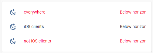
If a style includes a "shadowRoot" - need to place that conditions in every place.
Consider this style:
type: entities
entities:
  - entity: sun.sun
    name: Colored name & value
    style:
      hui-generic-entity-row $: |
        .info.pointer.text-content {
          color: orange;
        }
        .text-content:not(.info) {
          color: red;
        }
      .: |
        :host {
          --paper-item-icon-color: cyan;
        }
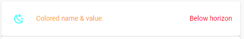
Here is how to render it:
    card_mod:
      style:
        hui-generic-entity-row $: |
          @supports (-webkit-touch-callout: none) {
            .info.pointer.text-content {
              color: orange;
            }
            .text-content:not(.info) {
              color: red;
            }
          }
        .: |
          @supports (-webkit-touch-callout: none) {
            :host {
              --paper-item-icon-color: cyan;
            }
          }
A bit cumbersome; unfortunately, we cannot place the whole style into one condition:
    card_mod:
      style: |
        @supports not (-webkit-touch-callout: none) {
          hui-generic-entity-row $: |
            .info.pointer.text-content {
              color: orange;
            }
            .text-content:not(.info){
              color: red;
            }
          .: |
            :host {
              --paper-item-icon-color: cyan;
            }
        }
An whole example:
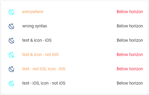
Code
type: entities
entities:
  - entity: sun.sun
    name: everywhere
    card_mod:
      style:
        hui-generic-entity-row $: |
          .info.pointer.text-content {
            color: orange;
          }
          .text-content:not(.info){
            color: red;
          }
        .: |
          :host {
            --paper-item-icon-color: cyan;
          }
  - entity: sun.sun
    name: wrong syntax
    card_mod:
      style: |
        @supports not (-webkit-touch-callout: none) {
          hui-generic-entity-row $: |
            .info.pointer.text-content {
              color: orange;
            }
            .text-content:not(.info){
              color: red;
            }
          .: |
            :host {
              --paper-item-icon-color: cyan;
            }
        }
  - entity: sun.sun
    name: text & icon - iOS
    card_mod:
      style:
        hui-generic-entity-row $: |
          @supports (-webkit-touch-callout: none) {
            .info.pointer.text-content {
              color: orange;
            }
            .text-content:not(.info) {
              color: red;
            }
          }
        .: |
          @supports (-webkit-touch-callout: none) {
            :host {
              --paper-item-icon-color: cyan;
            }
          }
  - entity: sun.sun
    name: text & icon - not iOS
    card_mod:
      style:
        hui-generic-entity-row $: |
          @supports not (-webkit-touch-callout: none) {
            .info.pointer.text-content {
              color: orange;
            }
            .text-content:not(.info) {
              color: red;
            }
          }
        .: |
          @supports not (-webkit-touch-callout: none) {
            :host {
              --paper-item-icon-color: cyan;
            }
          }
  - entity: sun.sun
    name: text - not iOS, icon - iOS
    card_mod:
      style:
        hui-generic-entity-row $: |
          @supports not (-webkit-touch-callout: none) {
            .info.pointer.text-content {
              color: orange;
            }
            .text-content:not(.info) {
              color: red;
            }
          }
        .: |
          @supports (-webkit-touch-callout: none) {
            :host {
              --paper-item-icon-color: cyan;
            }
          }
  - entity: sun.sun
    name: text - iOS, icon - not iOS
    card_mod:
      style:
        hui-generic-entity-row $: |
          @supports (-webkit-touch-callout: none) {
            .info.pointer.text-content {
              color: orange;
            }
            .text-content:not(.info) {
              color: red;
            }
          }
        .: |
          @supports not (-webkit-touch-callout: none) {
            :host {
              --paper-item-icon-color: cyan;
            }
          }
Next point is - how to differentiate iPhone & iPad?
A desktop with 4K display & smaller panel 1920x1080?
Use "@media" conditions for different viewports & screen orientations.
Assume that besides Windows clients we have 3 iOS devices - iPad Air 2, iPhone 5s, iPhone 6 (please do not tell me that they are ancient - I do know it; you wanna fix it - buy me a coffee).
And we need 5 styles for these devices - and these styles must work for these devices only.
Means - we need to define rules for each device.
This code works on a Windows client with 1920x1080 display (fullscreen or less):
    card_mod:
      style: |
        @supports not (-webkit-touch-callout: none) {
          @media (max-width: 1920px) {
            :host { color: red; }
          }
        }
The code for a Windows client with 4K display (fullscreen or less):
    card_mod:
      style: |
        @supports not (-webkit-touch-callout: none) {
          @media (min-width: 1921px) and (max-width: 3840px) {
            :host { color: red; }
          }
        }
This code for iPad Air 2 (1536x2048) for different orientations:
    card_mod:
      style: |
        @supports (-webkit-touch-callout: none) {
          @media (orientation: portrait) and (min-width: 768px) {
            :host { color: red; }
          }
        }
    card_mod:
      style: |
        @supports (-webkit-touch-callout: none) {
          @media (orientation: landscape) and (min-width: 1024px) {
            :host { color: red; }
          }
        }
This code for iPhone 5S (640x1136) for different orientations:
    card_mod:
      style: |
        @supports (-webkit-touch-callout: none) {
          @media (orientation: portrait) and (max-width: 320px) {
            :host { color: red; }
          }
        }
    card_mod:
      style: |
        @supports (-webkit-touch-callout: none) {
          @media (orientation: landscape) and (max-width: 568px) {
            :host { color: red; }
          }
        }
This code for iPhone 6 (750x1334) for different orientations:
    card_mod:
      style: |
        @supports (-webkit-touch-callout: none) {
          @media (orientation: portrait) and (min-width: 321px) and (max-width: 375px) {
            :host { color: red; }
          }
        }
    card_mod:
      style: |
        @supports (-webkit-touch-callout: none) {
          @media (orientation: landscape) and (min-width: 569px) and (max-width: 667px) {
            :host { color: red; }
          }
        }
Values for these "min-width" & "max-width" for iOS devices are set dependingly on “viewport sizes” which may be found here.
Have no idea how these “viewport sizes” are defined; why for iPad it is “768x1024” for “1536x2048” resolution and for iPhone it is “320x568” for “640x1136” (twice less) - is a riddle for me.
Some info may be googled (for example, here).
Another issue is “scaling in iOS Companion App”. My observations tell me that for a correct handling that "@media" conditions the scaling must be “100%”.
I myself usually use “50%” in Companion App for iPad; as for iPhone - do not use it, the App is too slow / too buggy (much more buggy than the App for iPad). So, with “50%” I observed that conditions not working…
I am using a combination of horizontal and vertical stack cards to give me the following:

I would like the borders between these elements to be smaller so they look connected, currently the “Select media device” looks like another separate element in my dashboard. Is there a way of doing this (I know css fairly well but can’t target the margin elements I need). Here’s my yaml for this:
type: vertical-stack
cards:
  - type: custom:button-card
    color_type: card
    color: rgb(0, 0, 164)
    margin: 0
    card_mod: null
    name: Select media device
  - type: horizontal-stack
    cards:
      - type: custom:button-card
        entity: input_select.media_device
        color_type: card
        color: rgb(0, 0, 164)
        styles:
          card:
            - height: 100%
        show_entity_picture: true
        show_name: false
        entity_picture: /local/images/WestWing.jpg
        state:
          - value: West wing Sonos
            entity_picture: /local/images/WestWingSelected.jpg
        tap_action:
          action: call-service
          service: input_select.select_option
          service_data:
            option: West wing Sonos
            entity_id: input_select.media_device
        hold_action:
          action: none
      - type: custom:button-card
        entity: input_select.media_device
        show_entity_picture: true
        color_type: card
        color: rgb(0, 0, 164)
        show_name: false
        entity_picture: /local/images/SonosBeam.jpg
        state:
          - value: Sonos beam
            entity_picture: /local/images/SonosBeamSelected.png
        tap_action:
          action: call-service
          service: input_select.select_option
          service_data:
            option: Sonos beam
            entity_id: input_select.media_device
        hold_action:
          action: none
      - type: custom:button-card
        entity: input_select.media_device
        show_entity_picture: true
        color_type: card
        color: rgb(0, 0, 164)
        show_name: false
        entity_picture: /local/images/google-home.png
        state:
          - value: Study speaker
            entity_picture: /local/images/google-home-selected.png
        tap_action:
          action: call-service
          service: input_select.select_option
          service_data:
            option: Study speaker
            entity_id: input_select.media_device
        hold_action:
          action: none
Try with “stack in card” (replaces vertical, horizontal card), it’s available in HACS. With it i made similar without any borders.
1 Like
Thanks. That seems to have worked.
1 Like
I’m currently building out my dashboard and when using ‘card-mod’ it does an annoying refresh / flash on the initial load of each tab.
Anyone know how I can get rid of this?
Demonstration:

Code used in demo:
type: custom:mod-card
style: |
  ha-card {
    padding: 0px 30px 0px 30px!important;
  }
card:
  type: vertical-stack
  cards:
    - type: horizontal-stack
      cards:
        - type: custom:mod-card
          card:
            type: custom:mushroom-title-card
            title: Entertainment
          card_mod:
            style:
              mushroom-title-card$: |
                .header {
                  --title-padding: 23px 0px 40px;
                  letter-spacing: -0.12vw!important;
                }
                .title {
                  font-size: 35px!important;
                  font-weight: 520!important;
        - type: custom:mushroom-chips-card
          chips:
            - type: entity
              entity: sensor.bathroom_temperature
              tap_action:
                action: none
              hold_action:
                action: none
              double_tap_action:
                action: none
          alignment: end
          style: |
            .chip-container {
                padding-top: 0px;
                padding-right: 0px;
              }
            :host {
                --chip-background: none!important;
    - type: horizontal-stack
      cards:
        - type: custom:mushroom-light-card
          entity: light.bedside_lamps
uhm, feels silly but I can no longer find a way to widen the glance card canvas, without overflowing the containing entities card…
  - type: custom:hui-element
    card_type: glance
    columns: 4
    card_mod: &mod
      style: |
        ha-card {
          box-shadow: none;
          margin: -16px;
        }
    entities:
      - entity: binary_sensor.schimmel_alert
        name: Schimmel
      - entity: binary_sensor.co2_monitor_carbon_dioxide_detected_location_provided
        name: Co2 status
      - entity: binary_sensor.humidity_living_low
        name: Hum

  - type: custom:hui-element
    card_type: glance
    columns: 4
    card_mod: *mod
    entities:
      - entity: sensor.schimmel_sensor
        name: Mold
      - entity: sensor.co2_living
        name: Co2
      - entity: sensor.temperatuur_living
        name: Temp
      - entity: sensor.luchtvochtigheid_living
        name: Vocht
showing:

and Id like it to use more of the:

left and right side space (narrowing those margins). This seems a very default mod, so I can not imagine we didnt discuss this before… simply cant find it.
please help me out… thx!
(btw, not using stack-in-card, this is a regular entities with some modding only)
I’m building compact room cards using mushroom-cards. This card mod stretches the cover buttons so that they’re the same width as the light brightness control slider:
Before:

After:

    card_mod:
      style:
        mushroom-card:
          .: |
            .actions {
              margin-right: 0px;
            }
          mushroom-cover-buttons-control $:
            mushroom-button-group:
              $: |
                .container {
                  justify-content: space-between !important;
                }
              .: |
                mushroom-button {
                  width: 30%;
                  margin-right: 0px;
                }
3 Likes
Any tips to put the entity icon inside the slider? I remember reading a post of yours showing how to stack entities on top of each other, I was thinking that was one of the options with the other being to disable full_row on the slider-entity-row and extend the slider all the way to the left.
Unclear, what do you want? Post an MS Paint picture.
Hi, I’m building a floorplan with ha-floorplan and have completed the floorplan element but now want to overlay it with some entities, e.g. temperature gauge or auto-entities. I’ve been searching how to do this and trying different things with card-mod for a few days but I’ve come to a brick wall each time. I’m simply confused by the css and where it needs to go.
Rather than paste my many failed attempts of code, can someone please point me to a very basic example of one card overlaying another, that I can try to understand and then build on please?
All the examples I’ve found so far are too specific for other needs.
Thanks, Matt
I’m trying to make the outer border of a badge larger. I’ve managed to pin down in the inspector where the value is defined within the CSS, however I haven’t been able to figure out how to implement it using card mod.
Hopefully the picture is clear enough and I haven’t cropped it too poorly. This is what I’m trying to achieve.

My best guess is that I’m somehow not defining the containers correctly. The current code (that isn’t working):
      - type: custom:badge-card
        badges:
          - entity: sensor.eetstatus_0
            name: ''
            card_mod:
              style: |
                :host {
                  --label-badge-background-color: rgba(0, 0, 0, 0.85);
                  {% set sens = 'sensor.eetstatus_0' %}
                  {% set eetst = state_attr(sens,'eetlijst_entry') %}
                  {% if eetst == None %}
                  --ha-label-badge-label-color: black; --label-badge-red: #f7f5f5;
                  {% else %}
                   {% if eetst < 0 %} --label-badge-red: #377330; {% elif eetst > 0 %} --label-badge-red: #bd1313; {% elif eetst == 0 %} --label-badge-red: slategrey; {% endif %}
                  {% endif %}
                   --ha-label-badge-size: 75px; }
                ha-state-label-badge:
                  $:
                    ha-label-badge:
                      $:
                        .badge-container
                            .label-badge {
                            border: 0em solid;
                            }

Without checking the dom, etc., at least this structure and | is missing.
→
            card_mod:
              style:
                .: |
                  :host {
                    ... }
                ha-state-label-badge:
                  $:
                    ha-label-badge:
                      $: |
After playing around with this further, it appears to be prioritising the initial CSS/Styles first then overlaying the updated card-mod styling which cases the weird flash behaviour.
In my config.yaml file I also put the following to see if it would prioritise the load but it has not worked.
frontend:
  extra_module_url:
    - /hacsfiles/lovelace-card-mod/card-mod.js
Anyone know what I can do to help fix this? Seems I am driving myself mad. I have added an issue here also.
Slowed down example:
