yes, I will add a FR for that, however, Kinghat is not very active in adding features, so I wont keep my hopes up.
There already is a FR for allowing dynamic tabs since a long time, and he acknowledged, but postponed…
btw, my active icon is back using the correct spacing, I must have fluked above
card_mod 3.5.0 styling, so dont copy on 3.4.4!!
# tabbed-card style
style:
  .: |
    mwc-tab:hover {
      --mdc-theme-primary: var(--power-color);
      --mdc-tab-color-default: var(--power-color);
    }
    mwc-tab-bar {
      background: {{'var(--lovelace-background)'
                    if is_state('binary_sensor.donker_thema','on')
                    else 'var(--primary-color)'}};
    }
    mwc-tab:nth-child(4) ha-icon {
      --card-mod-icon:
          {{'mdi:coffee' if is_state('switch.espresso_keuken','on') else
            'mdi:coffee-off'}};
        }
  mwc-tab:
    $:
      mwc-tab-indicator $: |
       .mdc-tab-indicator__content--underline {
          border-color: var(--active-color) !important; /*override generic theme primary*/
        }

      .: |
        .mdc-tab {
          min-width: 80px;
        }
        .material-icons {
          display: contents !important;
        }

        .mdc-tab--active {
          --mdc-icon-size: {{states('input_number.active_icon_size')}}px;
          /*background: var(--text-color-off) !important;*/
        }
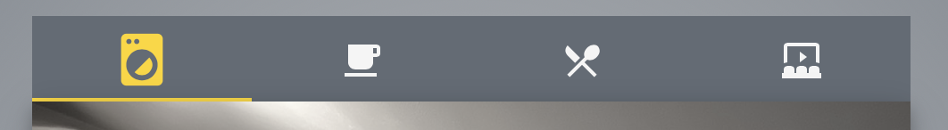
What I will do is create a dedicated !include styling per tabbed card, and only for the ones I like to use the dynamic icons in (most are fixed, well, for now  )
)
It’s easy enough to add those dynamic icons now so it wont be much of an issue and only a bit more yaml. For the fun of it.
second tab on:
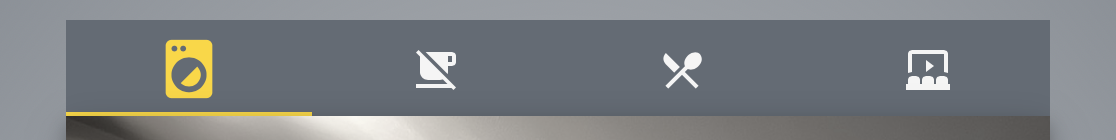
and off
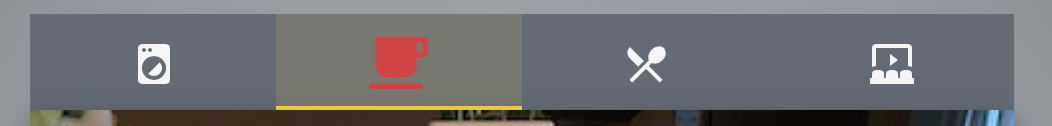
even colorize them:
    mwc-tab:nth-child(2) ha-icon {
      --card-mod-icon:
          {{'mdi:coffee' if is_state('switch.espresso_keuken','on') else
            'mdi:coffee-off'}};
      --card-mod-icon-color:
          {{'var(--alert-color)' if is_state('switch.espresso_keuken','on') else
            'var(--success-color)'}};
      }

nice!
tighter template:
    mwc-tab:nth-child(2) ha-icon {
      {% set coffee = is_state('switch.espresso_keuken','on') %}
      --card-mod-icon:
          mdi:coffee{{'' if coffee else '-off'}};
      --card-mod-icon-color:
         var(-- {{'alert' if coffee else 'success'}}-color);
      }