In v4 this changes to apply the type-entities and user classes to hui-entities-card. Check the application doco I posted eariler.
Ok, I am not getting yet. Will check more with a PC and wait for the final beta.
Changes seems to be revolutionary), so hope it is for the best, need to see.
Where card-mod is running code. When I say patching via, I mean running patching code within the class for the card, in this case hui-card. When I say application, this is where card-mod will place the styles, usually in shadowRoot. This aligns with the application doco I posted earlier.
scrolling back up about 2-3 weeks of comments youll find my issue. Its super niche. I have issues with how certain cards are wrapped with streamline-card, grid, card-mod, button-card templates etc.
just figured the solution of including both would help someone.
2 Likes
I came across something odd when working with subviews. I’m using theme (card-mod) to style the top menu, but after opening a subview and then going back, the styling breaks — the spacing between the icons gets larger, for example.
Interestingly, if I return from the subview quickly, the styling sometimes stays correct.
Has anyone seen this behavior before? I haven’t really used subviews until now, so this is new to me.
Here is a snippet from my theme:
  card-mod-theme: "mxm_theme"
  header-height: 34px # Change this to 0px for header on the bottom. You're 1/3 there.
  card-mod-root-yaml: |
    sl-tab$: |
      div {
        padding: 0 4px 0 4px !important;
      }
    .: |
      div .action-items {display:none}
      ha-menu-button {display:none}
    .header: |
      .toolbar {
        padding-left: 1px !important;
      }
      sl-tab {
        text-transform: uppercase !important;
      }

    .header sl-tab-group$: |
      sl-icon-button[name='chevron-left'], sl-icon-button[name='chevron-right'] {
        display: none;
      }
@maxym wierd issies like that are usually down to either
- card-mod running twice, actually due to following current instructions about Frontend module. Check out specifically what is in the README for v4 about Frontend module, which also applies to 3.4.x, and update any URLs you may have.
- card-mod NOT running as a Frontend module, which is best done especially when you are using theme mods for views. If you are not running as a Frontend module, you can read the same README and follow carefully so you don’t end up with wierd issues as noted in point 1.
I tried to do my best to understand and debug the situation.
Indeed, I had card mod installed via HACS into resources as well as listed in the configuration.yaml.
The path in the config was /local/card-mod.js, I adjusted it to be exactly the same as found in resources. HA restart - no improvement.
Suspecting it might be something about “running twice”, I commented out the lines in configuration.yaml, letting card-mod be listed in resources only.
HA restart - still no change in behavior.
BTW I can reproduce it on desktop too (Win/Chrome)
Where should I look also?
Suggest you leave Frontend URL in matching Dashboard resource. Now that is clarified we can rule that out. Looking further it could be related to theme load timing which is an issue fixed in v4 beta.
I installed v4 b4 (latest one aplicable to my HA version: 2025.9.x) and it seems that the issue is gone. On the mobile gone completely. On desktop, I can see a “wrong” top menu for a fraction of a second, then it turns into the correct one.
I’m gonna keep eye on that.
Thank you for the assistance
1 Like
I want the energy date picker card to be sticky on top of my custom energy dashboard section.
So, when I scroll down, it should stick at the top of the dashboard instead of scrolling away.
Would be very helpful to be able to always change the displayed timespan for the cards below.
I found where I have to place this css:
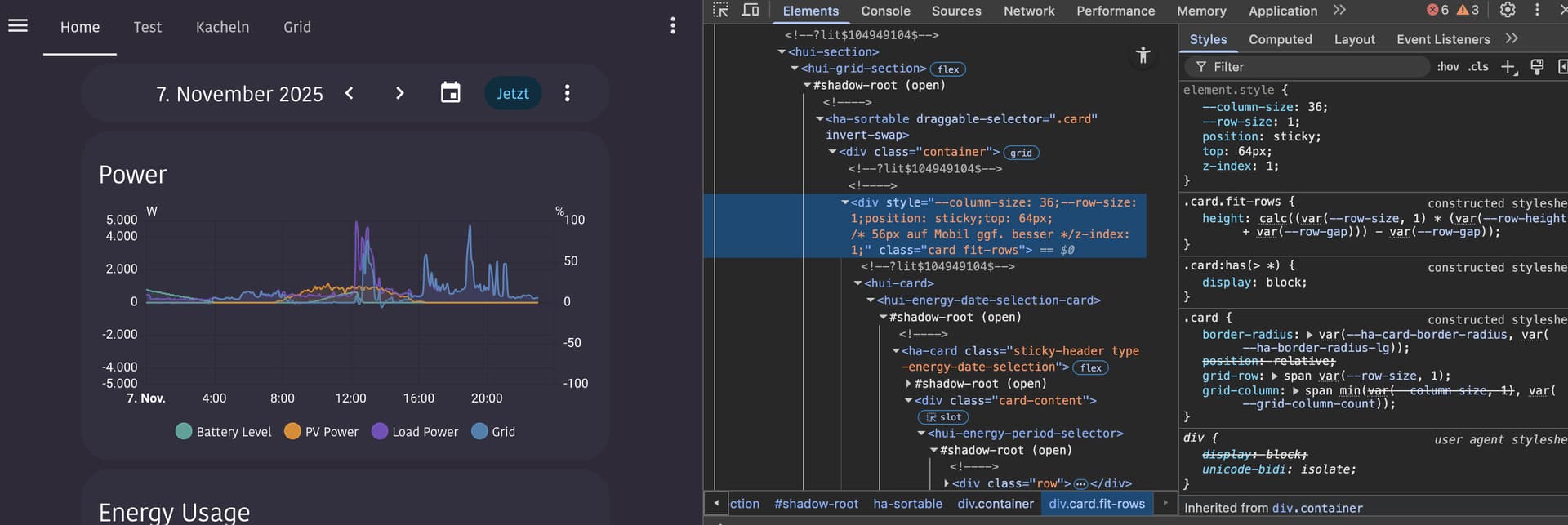
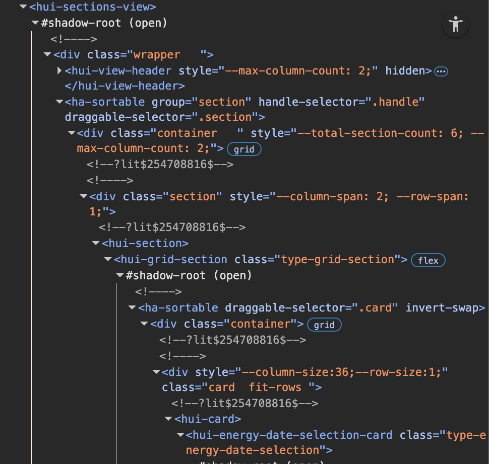
So its inside the hui-view → hui-view-sections-view → shadow-root → hui-grid-section → shadow-root → .card
inside the div with the .card class is the hui-card element, followed by hui-energy-date-selection-card.
Here I need to place the CSS rules:
position: sticky;
  top: 64px;
  z-index: 1;
Inside the .carddiv is the hui-card, which then has the ha-card element in the shadow-root of its card element (like <hui-energy-date-selection-card>).
I applied a class “sticky-header” to the card, using this in the energy date pickers card yaml:
type: energy-date-selection
card_mod:
  class: sticky-header
So my question is now: Can I add these css properties to the .card class div using card-mod-root-yaml or card-mod-view-yaml only when the ha-card inside has the “sticky-header” class?
I feel like I tried endless combinations from things people posted on the forums here.
But my knowledge about the card-mod configuration seems to be too limited to get this working. 
Would be a real cool feature, to have the energy date picker hovering below the topbar on custom energy dashboards.
@Thyraz I can’t think of any easy way to do this with 3.4.6. However I have provided a few v4 options based on new features in v4 which makes this quite straightforward.
- Tag section with class and style that section’s parent div specifically
- v4 supports grid sections and you can apply card-mod editing the section in yaml mode.
- in theme
card-mod-view-yamlyou can select the div containing the grid selection having the specific class you applied using the :has() selector. - Note: You can’t quite get a native section only card_mod solution here as the div you need to make sticky is the parent of the section.
- Grid section yaml (the class I used is energy-date-selection but could be anything as long as you match in theme)
type: grid card_mod: class: energy-date-selection cards: - type: energy-date-selection - Theme yaml (orange left in to confirm correct selection while testing)
  card-mod-view-yaml: |
    hui-sections-view $: |
      .section:has(hui-section hui-grid-section.energy-date-selection) {
        --primary-text-color: orange;
        position: sticky;
        top: 64px;
        z-index: 1;
      }
- Theme only using v4 panel variable
- Target first section in theme
- Use v4 Panel variable in template to only provide CSS when on your energy panel. Without such template targetting, the CSS would apply to the first section in every view. Remove
{# card_mod.debug #}when you have this up and running. - Theme YAML (orange left in to confirm correct selection while testing)
  card-mod-view-yaml: |
    hui-sections-view $: |
      {# card_mod.debug #}
      {% set viewUrlPath = panel.viewUrlPath if 'viewUrlPath' in panel else none %}
      {% if viewUrlPath == 'energy-test' %}
      .section:nth-child(1) {
        --primary-text-color: orange;
        position: sticky;
        top: 64px;
        z-index: 1;
      }
      {% endif %}
- Note here on the extra check on panel containing viewUrlPath is a good practice measure should somehow the panel variable not be available.
1 Like
Hi,
I’m trying to create a class in my theme (card-mod v4beta6) to use these modifications on the mushroom-template map.
card_mod:
  style:
    ha-tile-info$: |
      .primary {
        color: lightskyblue !important;
      }
      .secondary {
        color: yellow !important;
      }
I can’t find a working solution :
  card-mod-card: |
    ha-tile-info$: |
      :host(.mushprimary) .primary {
        color: lightskyblue !important;
      }
      :host(.mushsecondary) .secondary {
        color: yellow !important;
      }
card_mod:
  class:
    - mushprimary
    - mushsecondary
Can you show me an example of a functional class?
Class is applied to the main card so will be selectable at the main card level via :host(.class) for v4 and ha-card.class v3.4.x. The class is not selectabe in shadowDom. Also, as mushroom uses CSS vars you don’t need to go to shadow DOM for most styling and can style at the host/card level.
e.g. Using card_mod in card but with a class (v4)
type: custom:mushroom-template-card
primary: Hello, {{user}}
secondary: How are you?
icon: mdi:mushroom
features_position: bottom
card_mod:
  class:
    - test-mush
  style: |
    :host(.test-mush) {
      --ha-tile-info-primary-color: red;
      --ha-tile-info-secondary-color: blue;
    }
… and then placing the CSS in a theme.
CARD
type: custom:mushroom-template-card
primary: Hello, {{user}}
secondary: How are you?
icon: mdi:mushroom
features_position: bottom
card_mod:
  class:
    - test-mush
THEME (YAML style)
  card-mod-card-yaml: |
    .: |
      :host(.test-mush) {
        --ha-tile-info-primary-color: red;
        --ha-tile-info-secondary-color: blue;
      }
1 Like
I hadn’t noticed there were CSS variables for color. Much simpler to apply.
Thank you for your help.
1 Like
Oh well, forget the whole post.
I used card-mod instead of card_mod as key in the yaml.
Sorry. 
It works flawless, will continue to follow the rest of your description.
Old post content
[quote=“dcapslock, post:2151, topic:212176”]
1. Tag section with class and style that section’s parent div specifically
* v4 supports grid sections and you can apply card-mod editing the section in yaml mode.
…
</s> <s>type: grid</s> <s>card_mod:</s> <s> class: energy-date-selection</s> <s>cards:</s> <s> - type: energy-date-selection</s> <s>
[/quote]
Thank you once again for this detailed answer. 
I updated to the beta, and followed the description how to update the entry in the frontend section of the configuration.yaml.
The browser console seems to confirm that I was successful. 
But I can’t get card-mod to apply a class like in the first step of your example.
I clicked the edit button in the dashboard view → then the edit button of the section → Three dots menu → Edit in YAML:
Also tried to add some additional style here to see if it applies, but also didn’t work.
type: grid
card-mod:
  class: my-test-class
  style: |
    :host {
      --primary-text-color: orange;
    }
cards:
...
Not sure where in the tree the class is applied, but none of the section elements seems to have it:
Anything that I missed here?
1 Like
I’ve been playing around with theme classes with the beta version of card_mod (currently using v4.0.0-beta 6).
Here’s the code I’m using to remove background, border and box-shadow from a core entities card:
    card-mod-card-yaml: |
      .: |
        :host(.class-entities-no-background) ha-card {
          background: none !important;
          border: none !important;
          border-radius: unset !important;
          box-shadow: none !important;
        }
(Not sure the !important’s are really necessary). This is generally working OK, except when the entities card is wrapped in another element, for example:
- when it’s wrapped with a
custom:hui-elementas acard_type: code inspector in developer tools in Firefox (v144.0.2) shows that the class is registered, but at thehui-elementandha-cardlevels, not thehui-entities-cardlevel in between, so no styles applied - when it’s used as the card in an
custom:auto-entitiescard: code inspector shows that the class is registered, but only atha-cardlevel, not precedinghui-entities-cardlevel, so no styles applied - when it’s the first/main card of a
custom:layout-cardcolumn (actually this seems to be a wider issue with applying card_mod’s to the first card in a layout card column which I can’t quite pin down): code inspector shows that the class is registered, but only atha-cardlevel, not precedinghui-entities-cardlevel, so no styles applied
Is my code just wrong? Or can it be adapted to fit these different scenarios?
Ok,it really works.
Amazing work on Card-Mod4. 
edit: I posted this setup here with a little bit more polished CSS styling:
Click me!
Btw. had almost nothing of my existing card-mods that I needed to change for v4.
Love the new possibilities.
My final solution is now on the card inside the section instead of the complete Dashboard,
That way I was able to do a card-mod only solution without the need to add things to my theme (so this doesn’t really fit the card mod theme topic anymore.  )
)
Here’s my test page YAML:
type: sections
max_columns: 4
title: Test
path: test
sections:
  - type: grid
    card_mod:
      style: |
        :host {
          .card:has(hui-card hui-energy-date-selection-card.sticky-header) {
            position: sticky;
            top: 64px;
            z-index: 1;
            box-shadow: 0px 5px 5px 0px var(--primary-background-color);
          }
        }
    cards:
      - type: energy-date-selection
        card_mod:
          class: sticky-header
        collection_key: energy_custom_1
        layout_options:
          grid_columns: 12
      - type: energy-usage-graph
        collection_key: energy_custom_1
        grid_options:
          columns: 48
      - type: energy-usage-graph
        collection_key: energy_custom_1
        grid_options:
          columns: 48
    column_span: 4
  - type: grid
    card_mod:
      class: my-test-class
      style: |
        :host {
          .card:has(hui-card hui-energy-date-selection-card.sticky-header) {
            position: sticky;
            top: 64px;
            z-index: 1;
            box-shadow: 0px 5px 5px 0px var(--primary-background-color);
          }
        }
    cards:
      - type: energy-date-selection
        card_mod:
          class: sticky-header
        collection_key: energy_custom_2
        layout_options:
          grid_columns: 12
      - type: energy-usage-graph
        collection_key: energy_custom_2
        grid_options:
          columns: 48
      - type: energy-usage-graph
        collection_key: energy_custom_2
        grid_options:
          columns: 48
    column_span: 4
And here a little demo:
5 Likes
Hello,
I’m styling the UI with a theme yaml file (no styles or classes directly in cards yaml).
I just updated to card-mod 4, and most of my custom styles are applying well after update.
But I’m stuck when styling heading-card :
Before update, I coded this in my theme, and that worked :
card-mod-card-yaml: |
  .: |
    ha-card.type-heading {
      background-color: #192e36 !important;
      border-radius: 10px !important;
      height: 30px !important;
      margin-top: 5px !important;
      padding-left: 10px !important;
    }
I’m aware that I now have to use hui-card.
Path is now hui-card > hui-heading-card.type-heading
But I don’t find the correct syntax to use.
Can anyone help me with this case ?
Thanks
:host(.type-heading) ha-card { }
Per release notes…
… the best direct change is to use
:host(.myClass) ha-card { ... }.
Note: While hui-card is mentioned in documentation and in the DOM, its never used for styling. Everthing starts at the card itself which is :host.
1 Like
With custom cards you get old style behaviour if they don’t wrap in hui-card. So in your theme have both selectors. Have a read of README-application.md of where and why clases are applied in v4.
e.g.
:host(.class-entities-no-background) ha-card,
ha-card.class-entities-no-background {
}
Same as above. auto-entities does not wrap in hui-card… actually playing with that at the moment with @Mariusthvdb as if auto-entities used hui-card then lots of card-mod stuff just works on the card created.
Again, same. layout-card does not wrap in hui-card.
1 Like