yes i checked this and it looks OK also the file is at the correct path
background-image: 'center / cover no-repeat url("/local/images/wallpapers/gray-wood.png") fixed'
yes i checked this and it looks OK also the file is at the correct path
background-image: 'center / cover no-repeat url("/local/images/wallpapers/gray-wood.png") fixed'
can you try the following?
frontend.reload_themes
{"name":"Space Gray"}
edit: wait - got it working! thanks
Great to hear !
Remember, every file described below has #comments, use these comments as guidelines for your update!
Hi all, a few small fixes and changes to the 0.13.x version. I have gotten a few questions and I will answer them here.
Where did my icons go? mdi: is no longer hardcoded in the template, you WILL have to add mdi: to every single view/include/template/popup-card etc. to EVERY icon you already had. So if you had - icon: washing-machine you will now have to change it to mdi:washing-machine. This is so it makes it possible to have the default icon of an entity if you did not set one and it will give us the ability to use a button-template (string) directly in your decluttering-card. E.g. - icon: "[[[ if (entity.state === 'on') return 'mdi:door-open'; else return 'mdi:door'; ]]]".
Help, all my buttons are gone? Alright this is because you are missing pieces for this template to work. You are missing the following v.0.13.0/1: you are missing automations, groups and input_selects. You need to copy all of these for the template to work. Because this question was the most common this week I have added a commented out config in the button.yaml template so you can use that in case you either don’t want to use my provided theme selector, or you simply do not want to change right now or maybe it is too complicated to understand at the moment. No worries, I’ve got you covered in this update! So before you start copying the automations/groups/input_selects from version 0.13.0/0.13.1 please use the new automations and input_selects from 0.13.2 (this release). Not only are they massively shorter, they are also a lot easier to find and groups are no longer needed. (I will tell you later on in this guide). So remember for the button.yaml template to function properly you will either have to copy the automations and input_selects or change the config in button.yaml to the provided (commented out) config. Either way will work, though using the ‘old’ config will disable the extra options in theme selector (changing themes will still work, just the changing of border-radius and box-shadow won’t).
I want your style of defining views in ui-lovelace.yaml but if I do this it gives me errors, what can I do? Well to use an included directory you will first have to know how including files work. Not only will this make including files a lot easier for you in the future you can also compare the different kinds of includes in my configuration giving you all sorts of examples. Please check out this page for that https://www.home-assistant.io/docs/configuration/splitting_configuration/ For the lazy readers, just skip ahead to the advanced usage section. It will contain all you need with clear examples on which include command you can use on which kind of files or types. Having that said, I use an !include_dir_merge_list. This means items need to be displayed as a list (they start with a hyphen like all views and lovelace cards need by default). Because I used an included file in the past, the hyphen was already coded into ui-lovelace.yaml. This means that you no longer need the hyphen in the included file. (because the hyphen sits in front of the included file)
views:
  - !include lovelace/views/lights.yaml
As you can see in this example, there is already a hyphen in front of the include. Meaning the file has started with a hyphen.
Using my current method means all the hyphens are no longer hardcoded in ui-lovelace.yaml This means we need to put a hyphen on every view. What you need to do here is, add two spaces to the beginning of every line and put a hyphen on the first line and first column of every view. ui-lovelace.yaml will now read the entire directory at once without the need of defining each view ourselves in ui-lovelace.yaml. Now why would I want to do this? Well 2 reasons, I no longer have to create an entry in ui-lovelace.yaml whenever I add a new view. I simply create a new file. The other reason is that I can now have multiple views in a single file. So if I would have really small views I could just add more views without needing to create more files. Remember that this is absolutely unnecessary, you will have NO performance improvements or ANY improvements at all using this method but the previously mentioned two reasons. The only other reason I can think of why you should do this is because you will be up to date with my config and you will not have to remove the 2 spaces at the beginning of the line if you copy my views in the future. So feel free to do with this as you please but if you want to keep the old way, remove the hyphen and the two spaces at the beginning of each line so that the title sits on line 1 column 1 instead of the hyphen.
# New method
- title: view1
  path: view1
  cards:
    - etc

# Old method
title: view1
path: view1
cards:
  - etc
Remember that the new method renders EVERY file in the folder, if you have faulty config in any of those your lovelace will not render. Best practice to the new method is to put the views you don’t use in a seperate folder so you can add them later on. Also I need to mention the reason behind numbering the first 4 views is because I want those 4 views to be in that order and the first 4 views are swipable. If you use the header remember to number all files in the order you’d want. As I do NOT use the header and I only have the first 4 views swipable the other views do not require a number as I don’t care in what order they are as the way to access them will not be with the header.
v. 0.13.2
Please read this first. In all changed files there is a # Changed/Added in 0.13.2 tag. Change/Add these lines in your own files. Most changes are relatively small. Find these tags in any of the files that have changed so you can easily change/add your own lines/files.
This is true for every file below. Note: If it says a file has changed but there are no comments, than it is most likely you only need to remove lines. Below you can read which lines/stacks you will need to remove.
I am only human, I do this for hobby, am an amateur and bound to make mistakes. If you find anything missing to the information below feel free to make suggestions.
*custom_components:
*views:
*themes:
*Templates: if you do not change templates I provide you can always just copy these files without the need of checking the code, Unless when there are added variables!
*Views: views contain information about your own entities, do not just copy this!
*Configuration: please do not copy these files, copy the lines you need.
*Note:
REMINDER: To make the button template work you will need to copy the following files (or copy their config) to your own files:
/configuration/input_select/themes.yaml
/configuration/automations/automations.yaml
/configuration/themes/ *entire directory
Thanks for taking the time to read this and enjoy this release.
Last but not least, the video’s on this update had been postponed, but I will release the videos this weekend. This gave me the time to answer some questions in the video (which I have answered here above as well). Thank you for your patience.
I posted code for that last year and I am still using it combined with automations and it works great, auto-backgrounds just before I posted the editable instant styling … you may want to take a look for some ancient, but working ideas 
Hm I have gone over your repo, so you use card-modder to display wallpapers? Am I correct?
Thanks for the reply.
I use it the same way as you do. The bright image if home and darker/blurred image when not home.
So the best way would be a js template? Sadly i’m not such expert in js haha.
Hm I use the same picture for home/away and they are both in color. I will change the template for you when I have the time and send you the code.
I figured I could just copy the person template and create person-dark template which does the trick. Thinking way too difficult :’)
Yeah, card-mod wasn’t even a thought back then and haven’t had the urge(or time) to change the code since it still works and allows an easy config to apply the changing backgrounds to ha-card-back's as well. My clean up skills have been on pause since this new job, unfortunately  (finally got around to updating repo early this morning
  LOL)
LOL)
Hi @jimz011, can you help please when you have time.
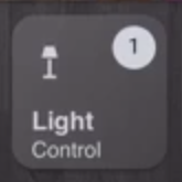
I need help with a button card template, i want to display at the top right corner of the lights button, the current number of lights that are on, i tried looking at examples with no success.
This is the code that i’m using for the button:
  lightspopup:
    card:
      type: 'custom:button-card'
      color: auto
      size: 30%
      icon: '[[icon]]'
      entity: '[[entity]]'
      show_last_changed: true
      aspect_ratio: 1/1
      show_state: true
      name: '[[name]]'
      show_label: true
      tap_action:
        action: call-service
        service: browser_mod.popup
        service_data:
          title: Lights
          style:
            background: var(--background-image)
            color: AliceBlue
            border-radius: 15px
            --ha-card-border-radius: 15px
            --ha-card-background: '#646464'
          card:
            type: entities
            entities:
              - entity: light.bedroom_lights
                icon: mdi:ceiling-light
              - entity: light.corner_living_room_lights
                icon: mdi:ceiling-light
              - entity: switch.sonoff_100017d309
                name: Night Light
                icon: mdi:led-outline
              - light.gateway_light_04cf8c9829a2
              - light.gateway_light_34ce00fa5d87
            style: |
              ha-card {
                --paper-item-icon-color: AliceBlue;
                  color: AliceBlue;
              }
            state:
              - value: 'on'
                styles:
                  card:
                    - box-shadow: 0px 0px 3px 2px var
                  name:
                    - color: AliceBlue
                  state:
                    - color: AliceBlue
                  label:
                    - color: AliceBlue
                id: on-icon
              - value: 'off'
                styles:
                  card:
                    - box-shadow: '0px 0px 3px 2px var'
                    # - opacity: 0.3
                  label:
                    - color: 'AliceBlue'
                  name:
                    - color: 'AliceBlue'
                  state:
                    - color: 'AliceBlue'
                  icon:
                    - color: 'AliceBlue'
                id: off-icon
          deviceID:
            - this
            - dashboard
      hold_action:
        action: more-info
        haptic: success
      styles:
        card:
          - padding-left: 10px
          # - background-color: 'rgba(255,255,240,0.9)'
          # - background-color: '#fff5bc'
          - background-color: 'rgb(100,100,100)'
          - border-radius: 15px
        name:
          - justify-self: start
          - font-weight: bold
          - font-size: 13px
          - color: AliceBlue
        label:
          - font-size: 11px
          - font-family: Helvetica
          - padding: 0px 10px
          - justify-self: start
        state:
          - font-size: 11px
          - font-family: Helvetica
          - padding: 1px 10px
          - justify-self: start
          - text-transform: capitalize
          - font-weight: bold
        grid:
          - grid-template-areas: '"i" "n" "s" "l"'
          - grid-template-columns: 1fr
          - grid-template-rows: 1fr min-content min-content
        img_cell:
          - justify-content: start
          - align-items: start
        icon:
          - color: AliceBlue
code in lovelace:
          - type: horizontal-stack
            cards:
              - type: custom:decluttering-card
                template: lightspopup
                variables:
                  - name: Lights
                  - icon: mdi:lamp
I created template sensor that count the lights that are on, template entity : “sensor.lights_on” screenshot below:
i managed to the make a lot of progress thanks to your setup and your help!!
Thank you!
Ok, I will only do this once, because this is more advanced stuff and giving support like this will take up too much time (I get a lot of questions every day, and I can not personally help everyone with this amount of detail). You should read up on the button-card documentation. It is all explained in there (though I know it is a LOT of documentation to read through and in some areas a bit difficult to understand). Easiest practice is to create a blank view, with only a single button, the button you are currently working on.
Anyways, Maybe this will help you out a bit. This should work:
  lightspopup:
    card:
      type: 'custom:button-card'
      color: auto
      size: 30%
      icon: '[[icon]]'
      entity: '[[entity]]'
      show_last_changed: true
      aspect_ratio: 1/1
      show_state: true
      name: '[[name]]'
      show_label: true
      custom_fields:
        notification: '[[notification]]'
      tap_action:
        action: call-service
        service: browser_mod.popup
        service_data:
          title: Lights
          style:
            background: var(--background-image)
            color: AliceBlue
            border-radius: 15px
            --ha-card-border-radius: 15px
            --ha-card-background: '#646464'
          card:
            type: entities
            entities:
              - entity: light.bedroom_lights
                icon: mdi:ceiling-light
              - entity: light.corner_living_room_lights
                icon: mdi:ceiling-light
              - entity: switch.sonoff_100017d309
                name: Night Light
                icon: mdi:led-outline
              - light.gateway_light_04cf8c9829a2
              - light.gateway_light_34ce00fa5d87
            style: |
              ha-card {
                --paper-item-icon-color: AliceBlue;
                  color: AliceBlue;
              }
            state:
              - value: 'on'
                styles:
                  card:
                    - box-shadow: 0px 0px 3px 2px var
                  name:
                    - color: AliceBlue
                  state:
                    - color: AliceBlue
                  label:
                    - color: AliceBlue
                id: on-icon
              - value: 'off'
                styles:
                  card:
                    - box-shadow: '0px 0px 3px 2px var'
                    # - opacity: 0.3
                  label:
                    - color: 'AliceBlue'
                  name:
                    - color: 'AliceBlue'
                  state:
                    - color: 'AliceBlue'
                  icon:
                    - color: 'AliceBlue'
                id: off-icon
          deviceID:
            - this
            - dashboard
      hold_action:
        action: more-info
        haptic: success
      styles:
        card:
          - padding-left: 10px
          # - background-color: 'rgba(255,255,240,0.9)'
          # - background-color: '#fff5bc'
          - background-color: 'rgb(100,100,100)'
          - border-radius: 15px
        name:
          - justify-self: start
          - font-weight: bold
          - font-size: 13px
          - color: AliceBlue
        label:
          - font-size: 11px
          - font-family: Helvetica
          - padding: 0px 10px
          - justify-self: start
        state:
          - font-size: 11px
          - font-family: Helvetica
          - padding: 1px 10px
          - justify-self: start
          - text-transform: capitalize
          - font-weight: bold
        grid:
          - grid-template-areas: '"i" "n" "s" "l"'
          - grid-template-columns: 1fr
          - grid-template-rows: 1fr min-content min-content
        custom_fields
          notification:
            # - background-color: YOUR-COLOR-HERE
            # - color: YOUR-TEXT-COLOR-HERE
            - border-radius: 50%
            - overflow: visible
            - position: absolute
            - right: 7%
            - top: 7%
            - height: 22px
            - width: 22px
            - font-size: 11px
            - line-height: 20px
        img_cell:
          - justify-content: start
          - align-items: start
        icon:
          - color: AliceBlue
- type: horizontal-stack
cards:
- type: custom:decluttering-card
template: lightspopup
variables:
- name: Lights
- icon: mdi:lamp
- notification: "[[[ if (states['sensor.lights_on'].state > 0) return `${states['sensor.lights_on'].state}`; else return ' ' ]]]"
@jimz011 thank you for your support and i’m apologize.
it’s working !
 is there a way to will be round circle with AliceBlue color just like in your setup :

next time, i will not ask directly .
Thank you
No don’t worry. I will answer your questions 
 . I just won’t change everyones code so it works.
You need to change the background color of the notification area and add a border radius to it. I believe the border-radius is already in your template. The background color I commented out for you as you need to put in your own. Just uncomment that line and put in your background color.
@hassan I am currently experimenting with your solution, and so far it is working great. I need some more testing for more components etc. But this could be the solution I had been looking for in a long while. Thank you so much!!!
Good to know, i used the names en secretes in lovelace so this way whenever i need to make entities names changes i just change one file. this way you can make your code as general and configurable!.
One more thing I think with the state switch and entity of type hash you can create you version for tablet , i use it and very useful.
any thing that can help let me know.
By the way the orange homekit them you had was so nice if you re-enable it again would be nice.
Thanks
Yes, I have used the state-switch before. But didn’t know what the hash was used for. I actually moving away from state-switch as I will create separate views for the tablet and hide other views using CCH. This works well for me on my current interface so I guess it should work fine for my tablet too.
The secrets tip is handy, I even passed through options from customize.yaml to that file so that you can also configure friendly name and icon from the secrets file. This works great, I change 1 entity and it changes for every automation, scene, group, popup card I have. This will make the setup sooooo much easier to setup for new users without needing the knowledge to edit too much themselves. Great!
Really? The orange theme? Wow I didn’t think anyone would actually like that theme. It was never even completed because of the zero reactions to it XD. The pink/rose themes I recently released were something my wife wanted me to do. But sure I can definitely fix the orange theme for my current version of the setup and I could definitely make it look even better than it did before. I will do this for you, though I can not give you an estimated release date. I want to give people the time to work on 0.13.x as it was a pretty large update (in terms of work that needs to be done).
I will probably release a few themes in the coming week for use with my setup.
Very nice, and keep the good work up. 

