Is there a standard way to plot forecast data points on a chart (action: weather.get_forecasts etc)

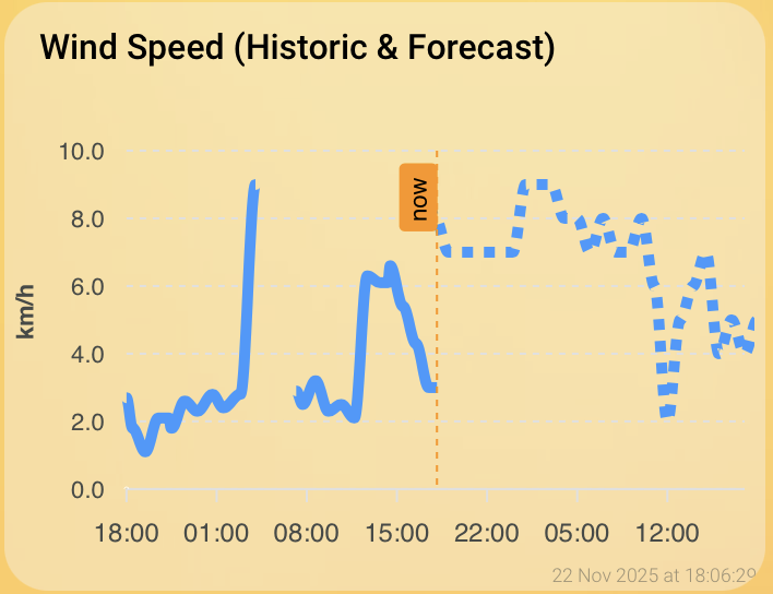
I’ve got a wind speed sensor (sensor.barbate_wind_speed) - super easy to chart that over any particular historic period.

I also have a weather forecast (weather.forecast_barbate) providing hourly wind speed predictions over the coming days. This code in developer tools->actions:

action: weather.get_forecasts
target:
  entity_id: weather.forecast_barbate
data:
  type: hourly

gives me all the data I would need (datetime and wind_speed values for every hour of the coming days), since this action returns:

weather.forecast_barbate:
  forecast:
    - condition: clear-night
      precipitation_probability: 0
      datetime: "2025-11-21T21:00:00+00:00"
      wind_bearing: 45
      temperature: 11
      wind_gust_speed: 13
      wind_speed: 9
      precipitation: 0
    - condition: clear-night
      precipitation_probability: 0
      datetime: "2025-11-21T22:00:00+00:00"
      wind_bearing: 45
      temperature: 10
      wind_gust_speed: 11
      wind_speed: 10
      precipitation: 0
...[lots more data]...

I want to be able to plot those future “wind_speed” forecast/predictions in the same chart as the historic ones (perhaps using a dotted line for the forecast, etc).

However I cannot find ANY way to plot those forecasts at all… What am I missing here? Do I have to create one or more new template sensors and copy the data into them with an automation to be able to plot?

I notice one historic discussion: forecasting data and even a core architecture discussion that was eventually closed. Neither of those seem to contain any solution to this problem.

It’s a PIA but you might put the contents of each value you’re after into a helper. (It’s what I do, but I’m interested in fewer sensors than you are.) Then display those values on the dashboard.

1 Like

Thanks, with a bit of help I’ve got this working. I put this in one of my template_sensors yaml files:

- trigger:
    - platform: time_pattern
      hours: "/1" # Update every hour
    - platform: homeassistant
      event: start
  action:
    - service: weather.get_forecasts
      data:
        type: hourly
      target:
        entity_id: weather.forecast_barbate
      response_variable: forecast_data
  sensor:
    - name: "Barbate Wind Forecast Data"
      unique_id: barbate_wind_forecast_data
      state: "{{ now().isoformat() }}"
      attributes:
        forecast: "{{ forecast_data['weather.forecast_barbate'].forecast }}"

and then (after restarting) this in a dashboard card:

type: custom:apexcharts-card
graph_span: 48h
span:
  start: hour
  offset: "-24h"
header:
  show: true
  title: Wind Speed (Historic & Forecast)
show:
  last_updated: true
now:
  show: true
  label: now
series:
  - entity: sensor.barbate_wind_speed
    name: Historic
    type: line
    color: "#3399ff"
    unit: km/h
    extend_to: now
  - entity: sensor.barbate_wind_forecast_data
    name: Forecast
    type: line
    color: "#3399ff"
    stroke_dash: 5
    data_generator: |
      if (entity && entity.attributes && entity.attributes.forecast) {
        return entity.attributes.forecast.map((entry) => {
          const timestamp = new Date(entry.datetime).getTime();
          const speed = entry.wind_speed;
          return [timestamp, speed];
        });
      }
      return [];
apex_config:
  legend:
    show: false
  yaxis:
    title:
      text: km/h
  tooltip:
    x:
      format: HH:mm ddd

And now I’ve got a decent graph showing the last 24 and next 24 hours:

1 Like