Lovelace: Button card

So I have a navigation button that takes me to another screen. This is working great. I want to add some kind of indication on the button that there is a problem that needs attention on the other screen.

Is there a way that I can add a top triangle red notice to the user? In my case an example would be to show the red triangle if automation.master_bedroom_blinds is off. If that automation is on then the red triangle would not show.

IMG_0374

IMG_B3C49559D2F3-1 copy

Thank you!

I found that an inherited state: object cannot be overridden anymore.

Here is an example of a complete code of the new dashboard. Change entity and operator/value to fit your needs

button_card_templates:
  tpl_test:
    state:
      - operator: '=='
        value: 'off'
        styles:
          name:
            - color: pink
views:
  - title: Home
    cards:
      - type: custom:button-card
        template: tpl_test
        entity: light.pc_room
        state:
          - operator: '=='
            value: 'off'
            styles:
              icon:
                - color: green

The template sets the color of the name with the use of the state: object. Then the template is used by the card.
It causes that

  • the color of name is set to pink color (which is expected)
  • the color of the icon remains default (which is not expected, since we expect to set it by the state: defined in the card)

Of course, removing the template from the card immediately makes the icon change color to green.
Worth to mention (while it seems to be clear), that you cannot override the name color in the card too.

The described behavior applies also when overriding is expected between templates.

Is it known behavior? I’m not aware that this limitation is mentioned in docs. AFAIK most attributes/objects can be overridden

we are supposed to merge by ID: GitHub - custom-cards/button-card: ❇ Lovelace button-card for home assistant to override these state styling settings

Is it possible to embed a map card or a picture entity card in a button card? I have tried using a grid but every time I add a map or picture as a custom field it locks up my HA dashboard and I need to close and reopen.

Ok, so I know this can be done using a value template, but from what I can tell it can also be accomplished with the state_label in the button card integration. However, I can’t figure out why it isn’t working for me!

I simply want to remove the decimal points from my humidity sensor (note this is just a work in progress, not the final button). Can anyone tell me what I’m doing wrong?

humid

          - type: custom:button-card
            show_name: false
            grid:
              - position: relative
            styles:
              custom_fields:
                humidity:
                  - filter: opacity(100%)
                  - overflow: unset
                  - border-radius: 50%
                  - position: absolute
                  - left: 55px
                  - top: 35px
                  - height: 200px
                  - width: 200px
                  - font-size: 10px
            style: |
              ha-card {
                height: 185px;
                width: 200px
                box-shadow: none;
              }
           custom_fields:
              humidity:
                card:
                  type: glance
                  entities:
                    - entity: sensor.temp_sensor_garage_humidity
                      name: Humidity
                      icon: mdi:water
                      state_display: [[[ return entity.state.toFixed(1) ]]]

I got rid of the decimal and the figures behind like this:

  target_temp: |
    [[[
      var statestr = states['input_number.cooling_temperature'].state;
      var intvalue = parseFloat(parseFloat(statestr).toFixed(0));
      return (isNaN(intvalue)) ? 'NA' : 'Target: ' + intvalue + '°';
    ]]]

Pretty sure it doesn’t work because you’re using a glance card as a custom field. So basically this has nothing to do with button-card on it’s own, since the card you’re using as custom field, doesn’t support that variable (state_display).

Use a custom:button-card as custom_field card instead.

@RomRider is it possible to style the parent element of the card?

I would like to style the highlighted section but I don’t know how.
There should be new entry -webkit-transform: translateZ(0);

I want to do that because I use vanilla-tilt.js and it causes some rendering issues with safari browser.
I would appreciate if anyone has some tips for me.

1 Like

Is it possible to set how long an animation will run for? I have several buttons that just call scripts or automations, so the state of entity is always “on”. For example, the green button calls a “vacuum specific room” script.

I’d like to be able to click those and have a twisting animation run for 60 seconds or something like that.

chrome_KVS6kYR2T2

Here’s my working code for an entity that changes state. Just not sure how to do it when clicked and the state doesn’t change.

      - type: custom:button-card
        entity: input_boolean.map_mode_enabled
        state:
          - value: 'off'
            color: rgb(179, 179, 45)
            icon: mdi:map
          - value: 'on'
            color: rgb(250, 250, 62)
            icon: mdi:map-check
            styles:
              icon:
                - animation:
                    - twister .9s linear infinite
        extra_styles: |
          @keyframes twister {
                    0% {transform: rotatez(0deg): top: 10px}
                    25% {transform: rotatez(15deg)}
                    50% { top: 0px}
                    75% {transform: rotatez(-15deg)}
                    100% {transform: roatatez(0deg): top: 10px}
            }
        tap_action:
          action: toggle
        show_name: false

1 Like

I believe in your animation property you can use 60s instead of infinite.

Thanks, that does work for the specified amount of time when a state changes, but when I click the “call script” button, it doesn’t do anything. Probably because the script is always on. I wonder if there’s a way to trigger the animation from the “zoned cleaning” property of my robot.

Take a look at triggers_update. If there is an entity that changes state in response to your action you can specify that entity to refresh the button card on state change.

1 Like

I have a couple button cards placed in a custom:grid-layout card that are width limited by the button card style settings like so:

      styles:
        card:
          - height: 120px
          - margin: 0px
          - justfy-self: center
          - width: 400px

The grid area is wider than 400px, and I would like the cards themselves to sit centered in their respective grid areas. justify-self: center above doesn’t seem to work as I expected it to - they stay left oriented.

I struggled with whether to ask this question in the layout card thread, but I don’t think the problem can be solved with that card because when I tried to achieve the same desired layout using a series of horizontal/vertical stacks, the cards still stayed left justified.

Picture of what I’m talking about is attached below. The green boxes show the outline of the grid areas, with the cards themselves sitting on the left.

Any ideas? And thanks in advance to anyone who understands CSS better than I!

Screenshot 2022-06-13 201443
How to remove extra space beside button created using button-card?

type: custom:button-card
color_type: card
color: red
icon: mdi:television-box
styles:
card:
- width: 100px
- height: 100px

Try margin: auto

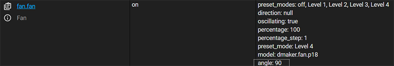
I’ve been trying to change the last pressed option, of the fan oscillation (30Âș, 60Âș, 90Âș, 120Âș), so it shows the active choice, and helps to show which one is “on” at the moment, but I have had no such luck.

fancard

type: vertical-stack
cards:
  - type: entity
    entity: fan.fan
    state_color: true
    attribute: percentage
    unit: '%'
  - type: horizontal-stack
    cards:
      - show_name: true
        show_icon: true
        type: custom:button-card
        name: 30Âș
        tap_action:
          action: call-service
          service: script.fan_30
        show_state: false
        icon: ''
      - show_name: true
        show_icon: false
        type: custom:button-card
        name: 60Âș
        tap_action:
          action: call-service
          service: script.fan_60
        show_state: false
        icon: ''
      - show_name: true
        show_icon: false
        type: custom:button-card
        name: 90Âș
        tap_action:
          action: call-service
          service: script.fan_90
        show_state: false
        icon: ''
      - show_name: true
        show_icon: false
        type: custom:button-card
        name: 120Âș
        tap_action:
          action: call-service
          service: script.fan_120
        show_state: false
        icon: ''

I tried with styles, for name and card, but couldn’t make it work

Any ideas?

1 Like

Does your fan have the state attribute to show which angle is ‘on’? If so a simple template at name could be enough to make the font read or something if 90° is the current state attribute.

It gives the attribute “angle” as 30, 60, 90 and 120.

What’s the best way to blur a background image on a button card? I have tried adding a blend mode and background-colour but no success. Code below:

  styles:
    card:
      - border-radius: "var(--border-radius-bar)"
      - box-shadow: "var(--box-shadow)"
      - padding: "5px"
#                  return 'url('+ variables.room_card_image_path +')'
      - background-image: >
                [[[
                  return 'url('+ variables.room_card_image_path +')'
                ]]]
      - background-blend-mode: "overlay"
      - background-color: "rgba(var(--card-background-color),0.5)"
      - background-position: "center"
      - background-repeat: "no-repeat"
      - background-size: "cover"

Thanks for your reply. Unfortunately, margin: auto doesn’t seem to have made a difference.

A screenshot with the recommended margin settings is below. I’ve mouse hovered over the card in the ‘edit dashboard’ mode to demonstrate more clearly how the card doesn’t center itself within the grid.