berkans
October 17, 2022, 1:49am
3492
I am about to finish a “what to wear page” again created with mushroom and css.
This page is dynamic. It advises you with picture samples about what you can wear at home according to the temperature inside the house .The working principle is as follows. First of all, it takes the average of the temperature sensors in all rooms in the house. Then, according to this average, it recommends you the clothes you can wear at home with photos.
The page can also be displayed with variable icons on the main page of the mobile interface. Chip icons turn the clothes you can wear into icons on the homepage, depending on the temperature at home.
As you can see in the photo, a sweater is recommended to me at the current home temperature.
I will post a very simplified wiki on my github page when coding is done.
2 Likes
rhysb
October 17, 2022, 3:00am
3493
You can modify the entities card to lo be a Mushroom Entities card like this:
Mushroom Entities Card:
type: entities
entities:
  - entity: light.lounge_light
    card_mod:
      style:
        hui-generic-entity-row$: |
          state-badge:before {
            content: '';
            position: absolute;
            top: 0;
            left: 0;
            width: 100%;
            height: 100%;
            border-radius: 50%;
            opacity: 0.2;
            {{ 'background: var(--paper-item-icon-active-color);' if is_state(config.entity, 'on') else 'background: var(--paper-item-icon-color);' }}
          }
          .info {
            font-size: 14px;
            font-weight: bold;
            color: var(--primary-text-color);
          }
  - entity: light.office_light
    card_mod:
      style:
        hui-generic-entity-row$: |
          state-badge:before {
            content: '';
            position: absolute;
            top: 0;
            left: 0;
            width: 100%;
            height: 100%;
            border-radius: 50%;
            opacity: 0.2;
            {{ 'background: var(--paper-item-icon-active-color);' if is_state(config.entity, 'on') else 'background: var(--paper-item-icon-color);' }}
          }
          .info {
            font-size: 14px;
            font-weight: bold;
            color: var(--primary-text-color);
          }
  - entity: light.kitchen_light
    card_mod:
      style:
        hui-generic-entity-row$: |
          state-badge:before {
            content: '';
            position: absolute;
            top: 0;
            left: 0;
            width: 100%;
            height: 100%;
            border-radius: 50%;
            opacity: 0.2;
            {{ 'background: var(--paper-item-icon-active-color);' if is_state(config.entity, 'on') else 'background: var(--paper-item-icon-color);' }}
          }
          .info {
            font-size: 14px;
            font-weight: bold;
            color: var(--primary-text-color);
          }
  - entity: sensor.rhys_office_sensor_temperature
    secondary_info: last-changed
    name: Office Temperature
    card_mod:
      style:
        hui-generic-entity-row$: |
          state-badge {
            color: rgb(var(--mush-rgb-blue));
            background: rgba(var(--mush-rgb-blue), 0.2);
          }
          .info {
            font-size: 14px;
            font-weight: bold;
            color: var(--primary-text-color);
          }
          .secondary {
            font-size: 12px;
            font-weight: bolder;
            color: var(--secondary-text-color);
          }
        .: |
          .value {
            font-size: 14px;
            font-weight: bold;
            color: var(--secondary-text-color);
          }
state_color: false
show_header_toggle: false
card_mod:
  style: |
    ha-card {
      --mush-rgb-amber: 255, 193, 7;
      --mush-rgb-blue: 33, 150, 243;
      --paper-item-icon-color: rgb(var(--mush-rgb-disabled));
      --paper-item-icon-active-color: rgb(var(--mush-rgb-amber));
    }
4 Likes
rhysb
October 17, 2022, 3:03am
3494
You can place the Primary & Secondary info on a single line like this:
type: custom:mushroom-template-card
primary: Mushrooms
secondary: 42 grown
icon: mdi:mushroom
icon_color: red
card_mod:
  style:
    mushroom-state-info$: |
      .container {
        display: table !important;
      }
      .secondary {
        display: table-cell;
        text-align: right;
        width: 100%;
      }
6 Likes
rhysb
October 17, 2022, 3:34am
3495
It would be difficult to rotate the existing slider. A better way would be to use the My-Cards slider.
Mushroom Light Card with Vertical Slider:
type: custom:stack-in-card
mode: horizontal
cards:
  - type: custom:mushroom-light-card
    entity: light.office_light
    layout: vertical
    card_mod:
      style: |
        mushroom-state-info {
          text-align: start;
          width: fit-content;
        }
        ha-card {
          width: 66px;
        }
  - type: custom:my-slider-v2
    entity: light.office_light
    vertical: true
    styles:
      card:
        - height: 147px
        - width: 42px
      container:
        - border-radius: 12px
      track:
        - background: >
            [[[ if (entity.state == "off") return
            "rgba(var(--mush-rgb-disabled), 0.2)";
             else return "rgba(var(--mush-rgb-amber), 0.2)";
            ]]]
      progress:
        - background: >
            [[[ if (entity.state == "off") return
            "rgb(var(--mush-rgb-disabled))";
             else return "rgb(var(--mush-rgb-amber))";
            ]]]
      thumb:
        - width: 0px
    card_mod:
      style: |
        ha-card {
          padding: 12px 12px 12px;
          margin-left: auto;
        }
card_mod:
  style: |
    ha-card {
      height: 171px;
    }
13 Likes
Thank you @rhysb !!
You are the definition of a contributor .
Sometimes on forums I notice people like you.greatly appreciate it.
9 Likes
Sidenote for all readers in this sub forum; Please give 10 seconds, and read the following
The cards that have been shown in this sub-forum, the cards that don’t yet exist inside Mushroom could be made even more accessible to newcomers and users without coding knowledge.
There is a suggestion to create a sub for working custom cards like this.
More of a site request than a HA request. Any chance we can get a “Custom Component” section added to the forum? I find myself stumbling across new ones now and then that really value add to my setup (and others I’m sure).
If we could have them all in one section it would be a whole lot easier to discover the great work being done by fellow users.
1 Like
rhysb
October 17, 2022, 4:25am
3498
What are you trying to change?
Thekholm
October 17, 2022, 6:18am
3499
Wow,
Many thanks! Can it also show the state in the same line and font?
Thekholm
1 Like
Thekholm
October 17, 2022, 6:22am
3500
Thanks again!
It does’nt work, I don’t get the icons.
type: entities
entities:
  - entity: light.matrum
    card_mod:
      style:
        hui-generic-entity-row$: |
          state-badge:before {
            content: '';
            position: absolute;
            top: 0;
            left: 0;
            width: 100%;
            height: 100%;
            border-radius: 50%;
            opacity: 0.2;
            {{ 'background: var(--paper-item-icon-active-color);' if is_state(config.entity, 'on') else 'background: var(--paper-item-icon-color);' }}
          }
          .info {
            font-size: 14px;
            font-weight: bold;
            color: var(--primary-text-color);
          }
  - entity: sensor.lumi_lumi_sensor_magnet_aq2_cddaf006_device_temperature
    secondary_info: last-changed
    name: Office Temperature
    card_mod:
      style:
        hui-generic-entity-row$: |
          state-badge {
            color: rgb(var(--mush-rgb-blue));
            background: rgba(var(--mush-rgb-blue), 0.2);
          }
          .info {
            font-size: 14px;
            font-weight: bold;
            color: var(--primary-text-color);
          }
          .secondary {
            font-size: 12px;
            font-weight: bolder;
            color: var(--secondary-text-color);
          }
        .: |
          .value {
            font-size: 14px;
            font-weight: bold;
            color: var(--secondary-text-color);
          }
state_color: false
show_header_toggle: false
card_mod:
  style: |
    ha-card {
      --paper-item-icon-color: rgb(var(--mush-rgb-disabled));
      --paper-item-icon-active-color: rgb(var(--mush-rgb-amber));
    }
rhysb
October 17, 2022, 7:00am
3501
If you haven’t already, you will need to define the Mushroom colors in your theme:
If you want to match the Mushroom colors, add these variables to your theme:
mush-rgb-red: 244, 67, 54
mush-rgb-pink: 233, 30, 99
mush-rgb-purple: 156, 39, 176
mush-rgb-deep-purple: 103, 58, 183
mush-rgb-indigo: 63, 81, 181
mush-rgb-blue: 33, 150, 243
mush-rgb-light-blue: 3, 169, 244
mush-rgb-cyan: 0, 188, 212
mush-rgb-teal: 0, 150, 136
mush-rgb-green: 76, 175, 80
mush-rgb-light-green: 139, 195, 74
mush-rgb-lime: 205, 220, 57
mush-rgb-yellow: …
rhysb
October 17, 2022, 7:38am
3502
Yes, like this:
type: custom:stack-in-card
cards:
  - type: custom:mushroom-template-card
    primary: Mushroom
    secondary: 42 grown
    icon: mdi:mushroom
    icon_color: red
    card_mod:
      style:
        mushroom-state-info$: |
          .container {
            display: table !important;
          }
          .secondary {
            display: table-cell;
            text-align: right;
            width: 100%;
            font-size: 14px !important;
            font-weight: bold !important;
            color: var(--primary-text-color) !important;
          }
        .: |
          ha-card:after {
            content: '';
            border-bottom: solid 2px rgba(var(--rgb-disabled), 0.2);
            margin: 12px 0px -12px;
          }
  - type: custom:mushroom-template-card
    primary: Mushroom
    secondary: 42 grown
    icon: mdi:mushroom
    icon_color: red
    card_mod:
      style:
        mushroom-state-info$: |
          .container {
            display: table !important;
          }
          .secondary {
            display: table-cell;
            text-align: right;
            width: 100%;
            font-size: 14px !important;
            font-weight: bold !important;
            color: var(--primary-text-color) !important;
          }
Thekholm
October 17, 2022, 8:02am
3503
Super thanks,
You`re crazy good at this
Best regards
1 Like
alnavasa
October 17, 2022, 8:13am
3504
Background color of the button, as you helped me with the Media card.
For media:
card_mod:
  style:
    mushroom-media-player-media-control$: |
      mushroom-button {
        --bg-color: rgba(189, 189, 189, 0.2);
      }
    .: |
      mushroom-button {
        --bg-color: rgba(189, 189, 189, 0.2);
      }
For climate:
card_mod:
  style:
    mushroom-media-climate-control$: |
      mushroom-button-group {
        --bg-color: rgba(189, 189, 189, 0.2);
      }
    .: |
      mushroom-button {
        --bg-color: rgba(189, 189, 189, 0.2);
      }
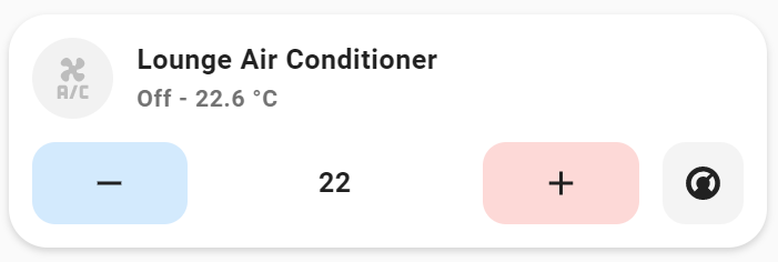
But I Dont get the + - temp buttons to change as in the picture, only the mode button:
rhysb
October 17, 2022, 8:34am
3505
You can change the Mushroom Climate Card buttons like this:
type: custom:mushroom-climate-card
entity: climate.air_conditioner
show_temperature_control: true
hvac_modes:
  - heat_cool
  - heat
  - cool
  - dry
  - fan_only
card_mod:
  style:
    mushroom-climate-temperature-control$:
      mushroom-input-number$: |
        #container {
          background: none;
          padding: 0px;
        }
        #container .button {
          height: 100%;
          width: 30%;
        }
        #container .button:nth-child(1) {
          background: rgba(var(--rgb-blue), 0.2);
        }
        #container .button:nth-child(3) {
          background: rgba(var(--rgb-red), 0.2);
        }
6 Likes
Love this!! I’m having an issue wiith auto-entities card for some reason… I’ve also used the one you pasted for batteries but the list will not populate for either one… I get a big red ! and that’s it…
I know this is for the mushroom card but for the life of me I cannot figure out why the auto entity will not populate… any ideas why.
As always Thank you and excellent job!!
1 Like
rhysb
October 17, 2022, 8:56am
3507
Share your code and I’ll have a look.
I have all the cards installed and browser refreshed… the popup happens just as it should but the list does not populate…
      - type: custom:mushroom-chips-card
        chips:
          - type: conditional
            conditions:
              - entity: group.all_lights
                state: 'on'
            chip:
              type: template
              icon: mdi:lightbulb
              content: >-
                {{ expand(states.group.all_lights) | selectattr( 'state', 'eq', 'on') |
                list | count }}
              entity: group.all_lights
              icon_color: grey
              tap_action:
                action: fire-dom-event
                browser_mod:
                  service: browser_mod.popup
                  data:
                    title: Lights On
                    content:
                      type: custom:auto-entities
                      filter:
                        include:
                          - group: group.all_lights
                            state: 'on'
                            options:
                              type: custom:mushroom-light-card
                              show_brightness_control: true
                              layout: horizontal
                              tap_action:
                                action: toggle
                              use_light_color: true
                              card_mod:
                                style: |
                                  ha-card {
                                    padding: 4px 12px !important;
                                  }
                          - entity_id: group.all_lights
                            state: 'on'
                            options:
                              type: custom:mushroom-light-card
                              layout: horizontal
                              secondary_info: none
                              tap_action:
                                action: toggle
                              card_mod:
                                style: |
                                  ha-card {
                                    background: rgba(var(--rgb-state-light), 0.1);
                                  }
                        exclude: []
                      card:
                        type: custom:layout-card
                        cards: []
                        layout_type: masonry
                      sort:
                        method: friendly_name
Thekholm
October 17, 2022, 9:11am
3509
I’am almost there!
How to get the state on the right side and don’t get the shadow of the card? I can get one or the other.
type: custom:stack-in-card
cards:
  - type: picture-entity
    image: >-
      https://img.freepik.com/free-photo/modern-stylish-scandinavian-kitchen-interior-with-kitchen-accessories-bright-white-kitchen-with-household-items_169016-4791.jpg?w=1800&t=st=1665996359~exp=1665996959~hmac=cc45d77acabe81fa736605220e5492e14c627ee692fbf5b26416a2316d753cb1
    entity: light.matrum
    show_state: false
    show_name: false
    camera_view: auto
    aspect_ratio: '3'
    tap_action:
      action: toggle
    theme: Mushroom
  - type: custom:gap-card
    height: 2
  - type: custom:layout-card
    layout_type: custom:grid-layout
    layout:
      grid-template-columns: auto 33px
      margin: '-4px -4px -8px -4px;'
    cards:
      - type: custom:mushroom-template-card
        primary: Mushroom
        secondary: Name
        icon: mdi:mushroom
        entity: light.matrum
        icon_color: '{{ ''orange'' if is_state(entity, ''on'') else ''red'' }}'
        fill_container: false
        multiline_secondary: false
        card_mod:
          style: |
            ha-card {
              background: none;
              --ha-card-box-shadow: 0px;
            }
      - type: custom:mushroom-template-card
        entity: input_boolean.mushroom_matrum_card
        primary: ''
        secondary: ''
        icon: >-
          {{ 'mdi:chevron-up' if is_state(entity, 'on') else 'mdi:chevron-down'
          }}
        icon_color: black
        hold_action:
          action: none
        card_mod:
          style: |
            ha-card {
              align-items: flex-end;
              background: none;
              --ha-card-box-shadow: 0px;
            }
            mushroom-shape-icon {
              --shape-color: none !important;
            }
  - type: conditional
    conditions:
      - entity: input_boolean.mushroom_matrum_card
        state: 'on'
    card:
      type: entities
      entities:
        - type: custom:mushroom-template-card
          primary: Mushroom
          secondary: Name
          icon: mdi:mushroom
          icon_color: orange
          card_mod:
            style: |
              ha-card {
                box-shadow: none !important;
              }
              ha-card:after {
              content: '';
              border-bottom: solid 2px rgba(var(--rgb-disabled), 0.2);
              margin: 12px 0px -12px;
              }
        - type: custom:mushroom-template-card
          primary: Mushroom
          secondary: Name
          icon: mdi:mushroom
          icon_color: orange
          card_mod:
            style: |
              ha-card {
                box-shadow: none !important;
              }
rhysb
October 17, 2022, 9:13am
3510
Do you have a group.all_lights?
Funny thing as luck would have it I do have a group called all_lights
I do get the count… the problem is the popup which it pops up but that’s where I get the error as it’s not showing the lights that are on… I get the error
1 Like


 Please give 10 seconds, and read the following