one more feedback, and already briefly discussed in Discord:
Personally, I like the new breadcrumbs in the more-info panels. A lot. Especially now they’ve evolved to being clickable, providing a direct path to the entities Device, integration and Area.

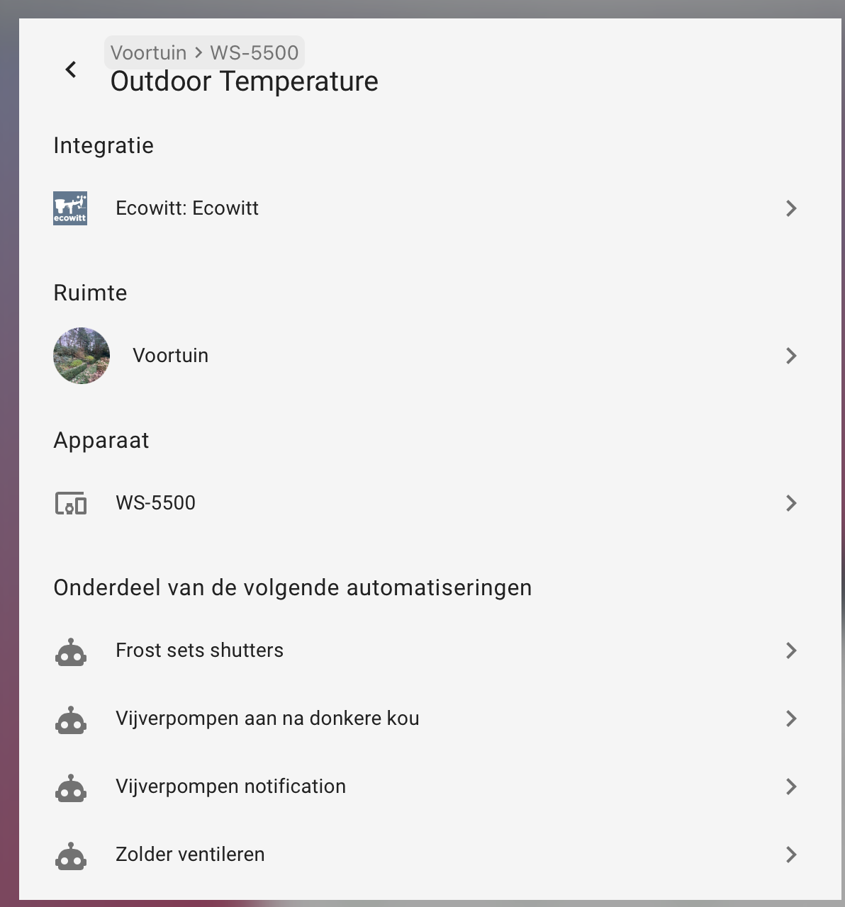
However, in our usecase, this is not info I want to show to my family or other users/guests (all my entities are clear as to what they stand for, and I dont have 20 doors called Door…) under all circumstances.
I believe this info should be better positioned under a separate and single tab on the more-info (like we have icons there now for the Settings (cogwheel) and Menu (meatballs) ). Maybe just add an Info (mdi:information) and clean up all of the current more-info tabs.
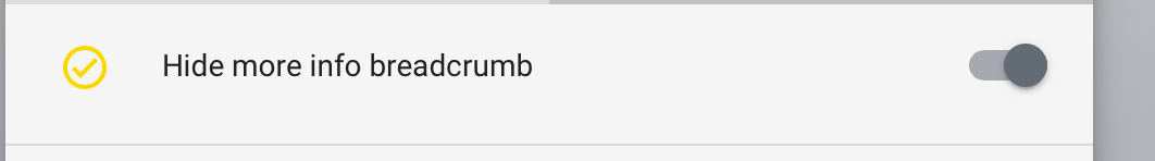
Myself, I hide the breadcrumb conditionally with an input_boolean and a card-mod theming setting
  card-mod-more-info-yaml: |
    ha-dialog-header: |
      .breadcrumb {
        {% if is_state('input_boolean.hide_more_info_breadcrumb','on') %}
        display: none !important
        {% endif %};
      }
to allow it to show only when in dev mode, or require administrating the instance.
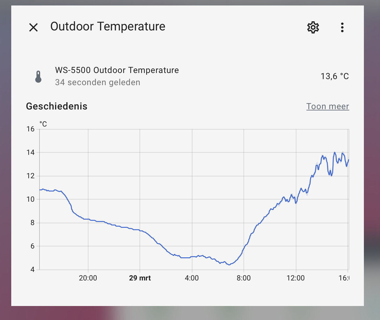
so it brings back the quieter and only essential info that is actually required for the end-user:
I hope the team will reconsider overpopulating all of the current more-info panels on an item, and make the interface less cluttered.
O and please dont ‘sprinkle’ all of this info everywhere in the UI.
When viewing the details of an entity in the entity dialog, we now provide more context about where the entity is originating from. Like its device and the area it is in. This is a first step in sprinkling more context throughout our UI. Thanks, @piitaya!
as is stated in the release notes
or make it opt-in/conditional.
We dont all want our interfaces show this ‘backend’ info in the frontend unconditionally without a choice.
I mean, why would my daughter checking the weather temp need to know which integration is providing the entity, or which automation uses this entity.
Clean up, dont Clutter…