not every one is using browser-mod, maybe they’re looking for something with custom:button-card
here’s the yaml for my dedicated subview
(The style block is in my button-card-templates, but for this post Ive made those into an anchor, so this file is a simple drop-in)
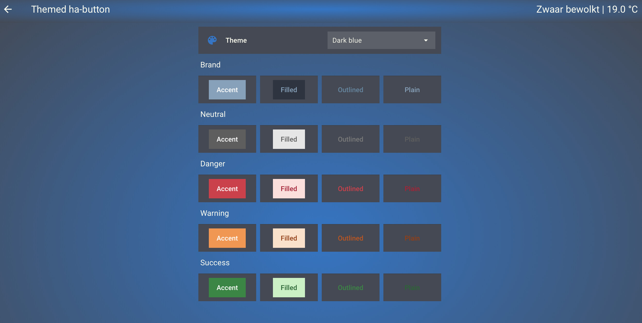
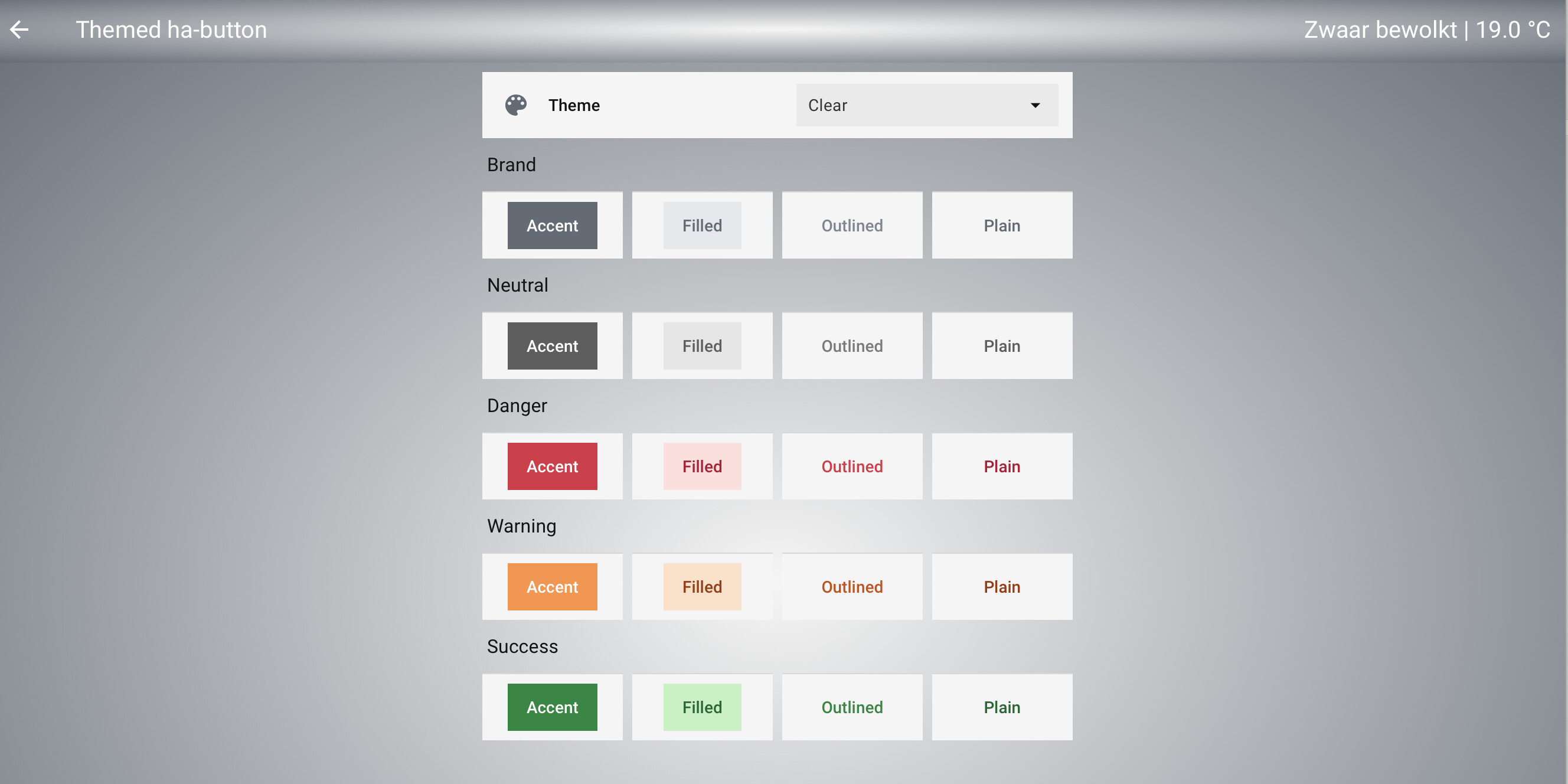
Themed HA-button overview
title: Themed ha-button
path: themed_ha_button
subview: true
max_columns: 1
sections:
  - cards:
      - type: vertical-stack
        cards:
          - type: tile
            card_mod: !include /config/dashboard/card_mods/tile_input_select.yaml
            entity: input_select.theme
            features:
              - type: select-options
            features_position: inline
            hide_state: true
            vertical: false
            tap_action:
              action: perform-action
              perform_action: frontend.reload_themes

          - type: heading
            heading: Brand
          - type: horizontal-stack
            cards:
              - type: custom:button-card
#                 template: styles_action_button
                name: >
                  <ha-button variant="brand" appearance="accent">Accent</ha-button>
                <<: &styles_action_button
                  styles:
                    card:
                      - border-top-color: var(--divider-color) # rgba(0, 0, 0, 0.12)
                      - border-top-style: solid
                      - border-top-width: 1px
                      - padding: 8px 0px
                      - --mdc-ripple-press-opacity: 0
                <<: &tap
                  tap_action:
                    anything: |
                      [[[
                        const isEditor = this.editMode;
                          if (isEditor) {
                            return;
                          }
                        return window.history.back();
                      ]]]
              - type: custom:button-card
                <<: *styles_action_button
                name: >
                  <ha-button variant="brand" appearance="filled">Filled</ha-button>
                <<: *tap
              - type: custom:button-card
                <<: *styles_action_button
                name: >
                  <ha-button variant="brand" appearance="outlined">Outlined</ha-button>
                <<: *tap
              - type: custom:button-card
                <<: *styles_action_button
                name: >
                  <ha-button variant="brand" appearance="plain">Plain</ha-button>
                <<: *tap

          - type: heading
            heading: Neutral
          - type: horizontal-stack
            cards:
              - type: custom:button-card
                <<: *styles_action_button
                name: >
                  <ha-button variant="neutral" appearance="accent">Accent</ha-button>
                <<: *tap
              - type: custom:button-card
                <<: *styles_action_button
                name: >
                  <ha-button variant="neutral" appearance="filled">Filled</ha-button>
                <<: *tap
              - type: custom:button-card
                <<: *styles_action_button
                name: >
                  <ha-button variant="neutral" appearance="outlined">Outlined</ha-button>
                <<: *tap
              - type: custom:button-card
                <<: *styles_action_button
                name: >
                  <ha-button variant="neutral" appearance="plain">Plain</ha-button>
                <<: *tap

          - type: heading
            heading: Danger
          - type: horizontal-stack
            cards:
              - type: custom:button-card
                <<: *styles_action_button
                name: >
                  <ha-button variant="danger" appearance="accent">Accent</ha-button>
                <<: *tap
              - type: custom:button-card
                <<: *styles_action_button
                name: >
                  <ha-button variant="danger" appearance="filled">Filled</ha-button>
                <<: *tap
              - type: custom:button-card
                <<: *styles_action_button
                name: >
                  <ha-button variant="danger" appearance="outlined">Outlined</ha-button>
                <<: *tap
              - type: custom:button-card
                <<: *styles_action_button
                name: >
                  <ha-button variant="danger" appearance="plain">Plain</ha-button>
                <<: *tap

          - type: heading
            heading: Warning
          - type: horizontal-stack
            cards:
              - type: custom:button-card
                <<: *styles_action_button
                name: >
                  <ha-button variant="warning" appearance="accent">Accent</ha-button>
                <<: *tap
              - type: custom:button-card
                <<: *styles_action_button
                name: >
                  <ha-button variant="warning" appearance="filled">Filled</ha-button>
                <<: *tap
              - type: custom:button-card
                <<: *styles_action_button
                name: >
                  <ha-button variant="warning" appearance="outlined">Outlined</ha-button>
                <<: *tap
              - type: custom:button-card
                <<: *styles_action_button
                name: >
                  <ha-button variant="warning" appearance="plain">Plain</ha-button>
                <<: *tap

          - type: heading
            heading: Success
          - type: horizontal-stack
            cards:
              - type: custom:button-card
                <<: *styles_action_button
                name: >
                  <ha-button variant="success" appearance="accent">Accent</ha-button>
                <<: *tap
              - type: custom:button-card
                <<: *styles_action_button
                name: >
                  <ha-button variant="success" appearance="filled">Filled</ha-button>
                <<: *tap
              - type: custom:button-card
                <<: *styles_action_button
                name: >
                  <ha-button variant="success" appearance="outlined">Outlined</ha-button>
                <<: *tap
              - type: custom:button-card
                <<: *styles_action_button
                name: >
                  <ha-button variant="success" appearance="plain">Plain</ha-button>
                <<: *tap
guess I need to find out ho to get those festive buttons to wiggle during the holidays

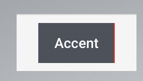
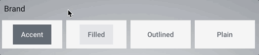
I have to admit I can hardly differentiate between appearance=“outlined” and appearance=“plain”
so why that would even exist? there seems to be a very subtle color difference on the text.
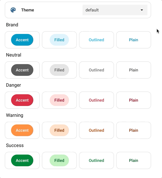
testing these with the color-palettes I posted above, makes for the following:
Which ha-color-primary-xx used where
# color palette
#   ha-color-primary-05:      | (not used in button)
#   ha-color-primary-10:      | (not used in button)
#   ha-color-primary-20:      | (not used in button)
  ha-color-primary-30:        | Brand: background accent hover
  ha-color-primary-40:        | Brand: background accent, text filled , text plain
  ha-color-primary-50:        | Brand: text outlined
#   ha-color-primary-60:      | (not used in button)
#   ha-color-primary-70:      | (not used in button)
  ha-color-primary-80:        | Brand: background hover filled
  ha-color-primary-90:        | Brand: background filled
  ha-color-primary-95:        | Brand: background outlined hover, plain hover
the Neutral, Danger, Warning and Success buttons dont use these color variables as far as I was able to test. Therefor we can leave them out… (no use setting variables if they’re not used anywhere)
also, this might make it a bit easier to style the Brand buttons closer to our themes and make them use the variables we already had set. In stead of mapping them the other way around
I’ve also found a slight issue on that background styling
which I filed an issue for
also found the variables to touch for the text color Accent. below is the overview I create for myself using the palette based in my primary-color, and play around a bit with the various combinations to get the look I feel smoothly fits the rest of the theme:
Clear theme variables
Clear:

# 'shuttle-gray': {
#     '50': '#f5f6f6',
#     '100': '#e4e6e9',
#     '200': '#cdd1d4',
#     '300': '#aab0b6',
#     '400': '#7f8891',
#     '500': '#636b75',
#     '600': '#565c64',
#     '700': '#494d55',
#     '800': '#414449',
#     '900': '#393b40',
#     '950': '#232529',
# },

# https://github.com/home-assistant/frontend/blob/dev/src/resources/theme/color/wa.globals.ts#L21
  ha-color-on-primary-loud: '#e4e6e9' #text accent
#   ha-color-on-primary-normal: green text filled, plain
#   ha-color-on-primary-quiet: yellow text outlined

# Brand color palette
  ha-color-primary-30: '#494d55'    # background accent hover
  ha-color-primary-40: '#636b75'    # background accent, text filled , text plain
  ha-color-primary-50: '#636b75'    # text outlined
  ha-color-primary-80: '#cdd1d4'    # background filled hover
  ha-color-primary-90: '#e4e6e9'    # background filled
  ha-color-primary-95: '#e4e6e9'    # background outlined hover, plain hover
resulting
in a perfect fit with my theme: