Can’t help you… but I‘m looking for similar modifications: Change size and font-size (entity-state) of the sub-buttons
If it is all at the same time you have css here
You can change that in .rows-2 .bubble-sub-button-container or in .rows-2 .bubble-sub-button
In custom styles
Thanks for your help! … but I‘m not sure how to do it… do I insert the following code into custom styles?
  .rows-2 .bubble-sub-button {
    font-size: 16px !important;
  }
… as that doesn‘t work…
Edit: the following code worked:
.bubble-sub-button {
font-size: 16px !important;
}
O
strange, but if we set the service correctly manualy in editor mode, then after, it is working again and we can modify it in the web ui!
Il also seams that the show_name: false option do not work for main button for switch and state button
is there any way to keep all my popups in a separate view and trigger them from the main view ? Im only being able to trigger popups as long as they’re on the same view of the trigger, I tried navigate: ‘popups#lights’ sometimes it opens ‘popups’ blank view, others it opens the ‘lights’ popup but without any animations effects (it just appears) and closing just takes you to the blank ‘popups’ view
Hi, I just finish my first bubble-card dashboard
Some captures  :
:
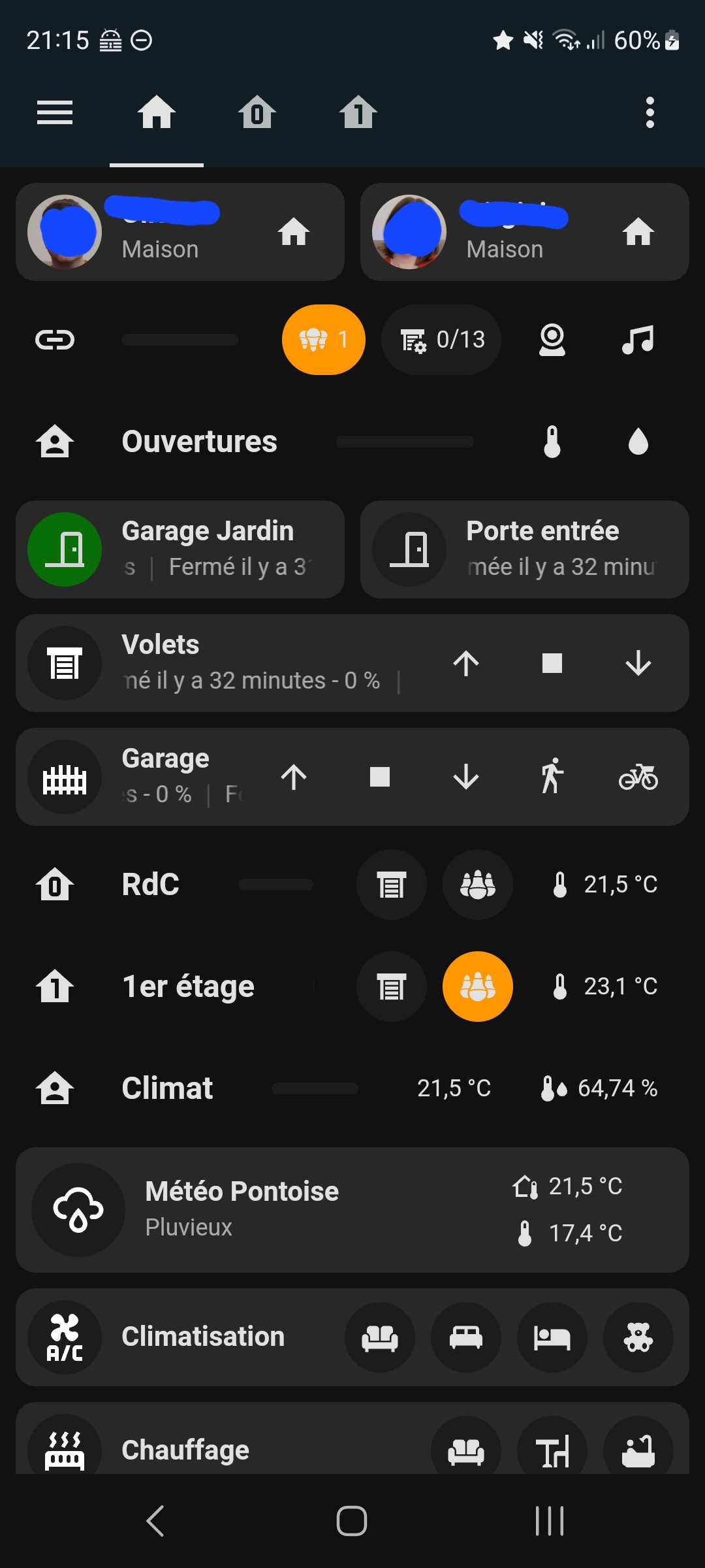
Home page with some shortcuts and global view
1 page per flour. We can even do 3 rows of sub buttons !


View on the light and shutter views


Many thanks !
Evolutions that could be nice :
- tap button on separator icons
- possibility to update background… of a specific sub button
- use by default layout of theme
6 Likes
2 things iv got to mention.
- Call service doesnt work for button type: state & for subbuttons
- Is it possible to get conditional sub buttons & Buttons? This would be really handy and really great!
If I want to change the background colours of the sub buttons dependant on their state, is there a way to do this?
Anyone know why the content of this pop-up card is going on top of the header when scrolled?

The background of each slider is transparent, but even if I remove that it covers up the “Lights” gray header bubble at the top when scrolled.
I also have a sticky nav bar at the bottom of my main dashboard view (this is all on my main dash view) and it gets covered up by the Lights pop-up.
My Thermostat pop-up card seems to be fine in both respects:

Not sure what I’m doing wrong. Here’s my code for the Lights one if it is helpful. Thanks for any help.
type: vertical-stack
cards:
  - type: custom:bubble-card
    card_type: pop-up
    bg_color: '#e6e4da'
    hash: '#lights'
    name: Lights
    icon: mdi:lightbulb
    bg_opacity: 100
  - type: custom:mushroom-title-card
    title: ''
    subtitle: Press and hold a room for more controls
    alignment: start
    card_mod:
      style: |
        ha-card {
          margin-top: -10px;
        }
  - type: custom:big-slider-card
    entity: light.master_bedroom
    name: Bedroom
    show_percentage: false
    height: 60
    bold_text: true
    color: orange
    icon: mdi:bed-empty
    icon_color: orange
    border_radius: 20px
    border_color: green
    background_color: rgba(0,0,0,0,)
  - type: custom:big-slider-card
    entity: light.living_room
    name: Living Room
    show_percentage: false
    height: 60
    bold_text: true
    color: orange
    icon: mdi:sofa
    icon_color: orange
    border_radius: 20px
    border_color: green
    background_color: rgba(0,0,0,0)
  - type: custom:big-slider-card
    entity: light.hallway
    name: Hallway
    icon: mdi:square-outline
    show_percentage: false
    height: 60
    bold_text: true
    color: orange
    colorize: false
    icon_color: orange
    border_radius: 20px
    border_color: green
    background_color: rgba(0,0,0,0)
  - type: custom:big-slider-card
    entity: light.kitchen_lights
    name: Kitchen
    show_percentage: false
    height: 60
    bold_text: true
    color: orange
    icon: mdi:food-fork-drink
    icon_color: orange
    border_radius: 20px
    border_color: green
    background_color: rgba(0,0,0,0)
  - type: custom:big-slider-card
    entity: light.main_floor_bathroom_light
    name: Bathroom
    show_percentage: false
    height: 60
    bold_text: true
    color: orange
    icon: mdi:toilet
    icon_color: orange
    border_radius: 20px
    border_color: green
    background_color: rgba(0,0,0,0)
  - type: custom:big-slider-card
    entity: light.basement
    name: Basement TV Area
    show_percentage: false
    height: 60
    bold_text: true
    color: orange
    icon: mdi:television-classic
    icon_color: orange
    border_radius: 20px
    border_color: green
    background_color: rgba(0,0,0,0)
  - type: custom:big-slider-card
    entity: light.office
    name: Office
    show_percentage: false
    height: 60
    bold_text: true
    color: orange
    icon: mdi:desktop-tower-monitor
    icon_color: orange
    border_radius: 20px
    border_color: green
    background_color: rgba(0,0,0,0)
  - type: custom:big-slider-card
    entity: light.patio_string_lights
    name: Patio
    icon: mdi:string-lights
    show_percentage: false
    height: 60
    bold_text: true
    color: orange
    icon_color: orange
    border_radius: 20px
    border_color: green
    background_color: rgba(0,0,0,0)
Hi everyone, I apologize for the lack of answers these days. I’ve been focusing on coding due to limited time. However, I want you to know that I’ve read all your messages and thank you for all your feedback! A new beta version should be released soon!
3 Likes
How did you get the 3 rows of sub buttons?
It don’t work with the interface but in yaml yes.
Exemple
type: custom:bubble-card
card_type: button
entity: cover.volet_sam
styles: |-
  .bubble-button-card-container {
    border-radius: 10px !important;
  }

  .bubble-icon {
    opacity: 1;
    color: white !important;
  }
sub_button:
  - entity: cover.volet_sam
    icon: mdi:arrow-up
    show_background: false
    tap_action:
      action: call-service
      service: cover.open_cover
      target:
        entity_id: cover.volet_sam
  - entity: cover.volet_sam
    icon: mdi:stop
    show_background: false
    tap_action:
      action: call-service
      service: cover.stop_cover
      target:
        entity_id: cover.volet_sam
  - entity: cover.volet_sam
    icon: mdi:arrow-down
    show_background: false
    tap_action:
      action: call-service
      service: cover.close_cover
      target:
        entity_id: cover.volet_sam
show_state: true
show_last_changed: true
show_attribute: true
attribute: current_position
button_type: state
tap_action:
  action: toggle
double_tap_action:
  action: more-info
button_action:
  double_tap_action:
    action: more-info
  hold_action:
    action: toggle
name: Salle à Manger
You can adapt the css of the two lines to make three in custum styles
Exemple:
type: custom:bubble-card
card_type: button
button_type: state
entity: light.salon_lumieres
sub_button:
  - entity: sensor.salon_th_temperature
    icon: mdi:thermometer
    show_state: true
    show_background: false
  - entity: sensor.salon_th_humidity
    show_background: false
    show_last_changed: false
    show_state: true
    icon: mdi:water
  - show_background: true
    show_icon: true
    show_name: false
    tap_action:
      action: none
    show_attribute: false
    attribute: brightness
    entity: binary_sensor.fenetres_salon
    icon: ''
  - entity: light.salon_lumieres_hautes
    icon: mdi:chevron-up
    tap_action:
      action: toggle
    double_tap_action:
      action: more-info
  - entity: light.salon_lumieres_basses
    icon: mdi:chevron-down
    tap_action:
      action: toggle
    double_tap_action:
      action: more-info
  - entity: light.salon_lumieres
    icon: ''
    double_tap_action:
      action: toggle
    tap_action:
      action: more-info
  - icon: ''
    double_tap_action:
      action: more-info
    hold_action:
      action: toggle
    entity: cover.salon_volets
    tap_action:
      action: toggle
  - entity: climate.x4fp_ndeg0_fp_3
    icon: mdi:radiator
    tap_action:
      action: navigate
      navigation_path: chauffage-salon
    double_tap_action:
      action: more-info
  - icon: mdi:air-conditioner
    double_tap_action:
      action: more-info
    hold_action:
      action: toggle
    entity: climate.daikinsalon
    tap_action:
      action: navigate
      navigation_path: climatisation-salon
tap_action:
  action: toggle
double_tap_action:
  action: more-info
name: Salon
show_last_changed: true
styles: >+
  .bubble-button-card-container {
    border-radius: 10px !important;
    background: rgba(0,190,240,0.4);
  }


  .bubble-icon {
    opacity: 1;
    color: white !important;
  }


  .large .bubble-button-card-container {
    height: 120px;
  }

  .rows-2 .bubble-sub-button-container {
    flex-direction: column;
    gap: 4px !important;
    display: grid !important;
    grid-template-columns: repeat(3, min-content);
    grid-template-rows: repeat(3, 1fr);
    grid-auto-flow: column;
    width: auto;
    padding-right: 1px;
    align-items: center;
    justify-items: center;
  }


  .rows-2 .bubble-sub-button {
    height: 35px !important;
  }


  ${subButtonIcon[2].setAttribute("icon",
  hass.states['binary_sensor.fenetres_salon'].state === 'on' ?
  'phu:double-window-open' : 'phu:double-window-closed')}

card_layout: large-2-rows
icon: mdi:sofa
show_state: true
scrolling_effect: false
Perfect, Thanks for that.
All I need to do know is work out how to change the background colours of the sub buttons based upon their states, don’t suppose you know how to do that?
This is not possible in the current beta, but I’ve already fixed that. I’m doing my best to release the new one as soon as I can! 
Hi,
I am trying to change the sub-button icon depending on that state of the corresponding entity with the following code:
    styles: >+
      .rows-2 .bubble-sub-button {
      ${subButtonIcon[1].setAttribute("icon",
      hass.states['cover.sonnenrollo'].state === 'open' ?
      'mdi:window-shutter-open' : 'mdi:window-shutter')}
      }
When I use the „Bubble-Button“-Card the code works. When I am trying to implement this to the header of a „Bubble-Popup“-Card it does not…
Does it work on the header of a popup at all?
Cloos you are a star and really appreciate the work you are doing on this, I only wish I had a fraction of your skills and could help!
1 Like
Thanks. Also, would it possible to have the Button Switch to have the same Light state background as the Button Slider, or some sort of gradient effect?
I’ve fixed that too and many other issues!
1 Like
Maybe this is a new feature request but is it possible to add entities instead of buttons as sub-buttons?
My idea is to have a button for a space and have the humidity and temp status as well on the right side.