This way…

Oh my 
Hey there, I really like this mod. I use bubble card for showing a slide in from the top down using bubble card. It works like a charm, but I am curious if bubble card is doing some kind of animation or anything with the content inside the popup? I have a 0.5 second animation as the popup “falls down”, and during this time it is very visible that all the content that I have (layout cards, card-mod etc) is “sliding” gently into place. The second time I show the popup, everything is where it should be right as the popup starts to slide down. It is quite annoying, and the effect is the same on both my gamingpc and android tablet, only difference is that it stutters somewhat on the android, and on my pc it is smooth as silk.
Here is a quick walkthrough of my dashboard so far. Big thank you to the community and in particular @Cloos and @MrBearPresident for their contributions to these awesome cards!
https://youtube.com/shorts/RZDUWSxKGZo?si=q9ytsWGYLMjOiWaf
10 Likes
is there a way to disable the haptic feedback?
thats bloody nice mate!
add this and should work
.bubble-color-background { background-color: rgba(0,0,0,0) !important; }
You should configure the visibility of the Sub Button:

type: custom:bubble-card
card_type: button
entity: input_select.test1
sub_button:
  - entity: input_select.test1
    state_background: false
  - entity: input_select.test2
    visibility:
      - condition: state
        entity: input_select.test1
        state_not: Scegli una temperatura
    state_background: false
button_type: state
That look really cool. Mind sharing your dashboard? I really like the notification option in the top and the switch kind-a button to get another view.
Hello all, just installed the card colletion and I’m playing around. Just a question how is it possible to achieve this →

Would love to see a yaml 
Hey @Cloos !
I got a weird template behavior, when there is a lag between the original data replaced with a templated data.
Here is how it looks after page refresh:

And here is a card code:
type: custom:bubble-card
card_type: button
button_type: state
entity: sensor.kitchen_thermometer_temperature
show_name: true
show_attribute: true
icon: mdi:thermometer-water
styles: >-
  ${card.querySelector('.bubble-name').innerText =
  hass.states['sensor.cradle_thermometer_temperature'].state + " °C"}

  ${card.querySelector('.bubble-state').innerText =
  hass.states['sensor.cradle_thermometer_humidity'].state + " %"}
grid_options:
  columns: 9
  rows: 1
Any Idea on how to fix this?
Hello everyone,
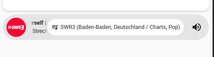
is it possible for the text in the sub-button to also be scrollable?
I’m displaying the attribute “Channel” there, but the name of the radio station is often too long.
And is it possible to create shortcuts for a radio station?
Thanks
Last one example
1 Like
Hello,
I love the looks and simplicity of Bubble Card, thanks for all your work!! Here is a challenge that I’m facing, not sure how to get it done.
I hope to implement a frontend for iphone that has a horizontal button stack on the bottom, to select from five pages (light, climate, media, presence, config). Each of these pages will have a main page with buttons, each of these calls a pop-up with more detailed UI elements.
I already have these pages as individual sections on a dashboard “iPhone UI”, but I’m not sure how to nest these functionalities. If so, can it be done without editing the raw config?
Thanks so much! Mark
Great work - could i kindly have the yaml please?
Is it possible to make the horizontal buttons card navbar footer be two buttons, left and right. Pressing right would advance to the next page that is visible in the UI for that particular user. Not all of my users have visibility on the same pages.
ChatGPT suggests this might be possible using jinja templates, but IIRC bubble card doesn’t do jinja templating.
I may have found a little bug. It seems I can only make the state font larger if the name is also shown. As the card is below, I cannot edit the state font size.
type: custom:bubble-card
card_type: button
button_type: state
entity: sensor.time
show_name: false
card_layout: large
styles: |-
  .bubble-state {
      font-size: 24px;
      font-weight: normal;
  }
show_state: true
show_attribute: false
show_icon: true
thanks for your reply but
I don’t have the visibility option when I add sub button


type: custom:bubble-card
card_type: button
entity: input_select.climatisation
sub_button:
  - entity: input_select.climatisation
    state_background: false
  - entity: input_select.choix_temp_hot
    visibility:
      - condition: state
        entity: input_select.climatisation
        state_not: Froid
    state_background: false
  - entity: input_select.choix_temp_cold
    visibility:
      - condition: state
        entity: input_select.climatisation
        state_not: Chaud
    state_background: false
button_type: state
That’s odd, which version of Bubble Card are you using?