Hello guys,
After updating to 3.1 RC I got sub-buttons shape changed to square instead of round.
For those how wants to fix that, please add the following:
.bubble-sub-button {
border-radius: 50% !important;
Before:
After:
Hello guys,
After updating to 3.1 RC I got sub-buttons shape changed to square instead of round.
For those how wants to fix that, please add the following:
.bubble-sub-button {
border-radius: 50% !important;
Before:
After:
Hi! Are these regular (default) Sub-buttons or are these modified to enlarged with some custom styles?
How do you style the below row of sub buttons? I want to change the colours on them but can’t seem to do it
Bonjour cher Cloos et bonne année!
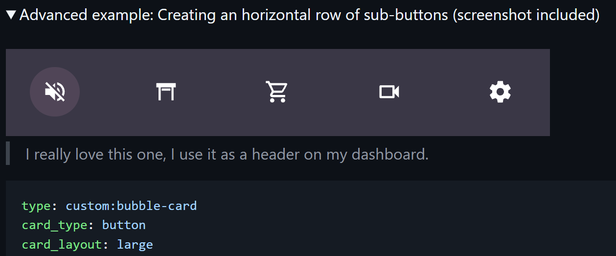
These are custom made sub buttons which were made according to your manual:
Please see full code of mine below:
type: custom:bubble-card
card_type: button
card_layout: large
button_type: name
show_icon: false
show_name: false
sub_button:
  main:
    - name: Light
      icon: mdi:lightbulb-group
      tap_action:
        action: navigate
        navigation_path: "#light"
    - name: Covers
      icon: mdi:devices
      tap_action:
        action: navigate
        navigation_path: "#technics"
    - name: TVs
      icon: mdi:television-classic
      tap_action:
        action: navigate
        navigation_path: "#tv"
    - name: Music
      icon: mdi:speaker
      tap_action:
        action: navigate
        navigation_path: "#music"
    - name: Scent Diffuser
      icon: mdi:scent
      tap_action:
        action: perform-action
        perform_action: button.press
        target:
          entity_id: button.diffuser_01_run
  bottom: []
styles: |
  .card-content {
    width: 100%;
    margin: 0 !important;
  }
  .bubble-button-card-container {
    background: none !important;
  }
  .bubble-sub-button {
    height: 55px !important;
    width: 55px !important;
    border-radius: 50% !important;

  }
  .bubble-sub-button-container {
    width: 100%;
    justify-content: space-between !important;
      }
  .bubble-sub-button-icon {
    --mdc-icon-size: inherit !important

  }
  .bubble-name-container {
    margin-right: 0px !important;

  }
  .bubble-sub-button-1 {
      background-color: ${hass.states['light.group_all_lighting'].state === 'off' ? ' var(--ha-card-background)' : 'rgba(255,165,0,0.2)'} !important;
      color: ${hass.states['light.group_all_lighting'].state === 'off' ? 'rgba(255,255,255,0.8)' : 'rgba(255,165,0,1)'} !important;
  }
  .bubble-sub-button-2 {
      background-color: ${hass.states['switch.heating_and_ventilation'].state === 'off' ? 'var(--ha-card-background)' : 'rgba(0,155,255,0.2)'} !important;
      color: ${hass.states['switch.heating_and_ventilation'].state === 'off' ? 'rgba(255,255,255,0.8)' : 'rgba(0,155,255,1)'} !important;
  }

  .bubble-sub-button-3 {
      background-color: ${hass.states['media_player.media'].state === 'off' ? ' var(--ha-card-background)' : 'rgba(255,0,0,0.2)'} !important;
      color: ${hass.states['media_player.media'].state === 'off' ? 'rgba(255,255,255,0.8)' : 'rgba(255,0,0,1)'} !important;
  }

  .bubble-sub-button-4 {
      background-color: ${hass.states['media_player.music'].state === 'paused' ? ' var(--ha-card-background)' : 'rgba(0,128,0,0.2)'} !important;
      color: ${hass.states['media_player.music].state === 'paused' ? 'rgba(255,255,255,0.8)' : 'rgba(50, 205, 50,0.8)'} !important;
  }

  .bubble-sub-button-5 {
      background-color: rgba(0,128,0,0.2) !important;
      color: rgba(50, 255, 50,0.8) !important;
  }
scrolling_effect: true
layout_options:
  grid_columns: full
rows: 1.297
Please see the manual and refer to “Styling” section:
https://github.com/Clooos/Bubble-Card
Alternatively you can see my code above.
@DBunevich This is the expected behavior then, this border-radius was changed for other reasons and this is indeed a small breaking change for anyone who use this example from the documentation.
@Minicupracer1 This issue is because of the new HA 2026.1 update, but this is already fixed in v3.1.0-rc.2.
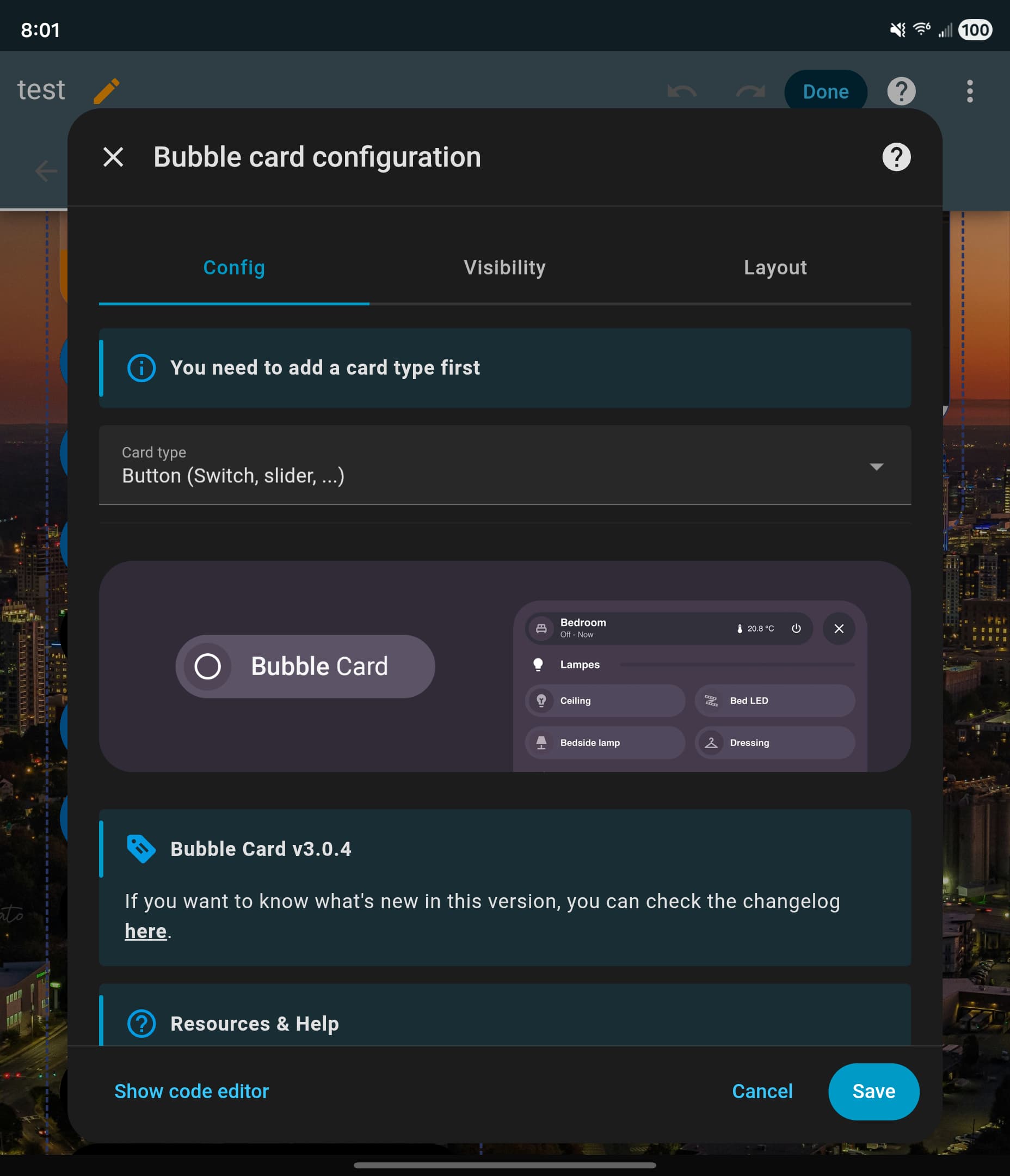
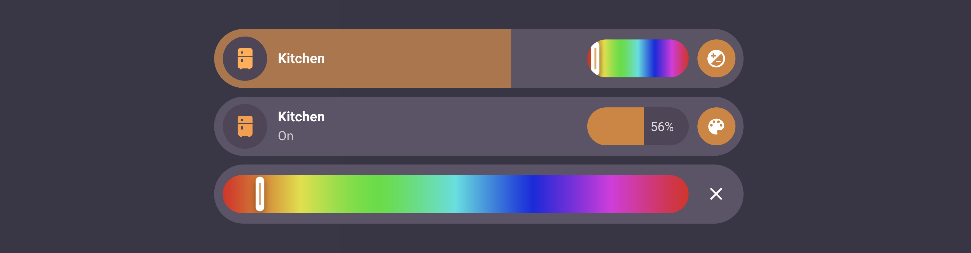
Hi! A better description of the issue mentioned above is that I have the following view for a light group. The main slider is a relative one for all the sub button sliders. But I would still like to show the individual slider names, but “always show slider” hides the details as configured in the button settings.
This was intentional indeed, but I will add an option to show it in the next release 
Hi! This is a module I will release soon 
Im having a issue when i install modules. My horizontal stack card, when i touch it, does not turn on any devices even though they are in there after i install modules. Im new to all this so if theres any specific info you need, let me know.
type: horizontal-stack
cards:
  - alert_classes:
      - motion
      - opening
    cover_classes: []
    sensor_classes:
      - temperature
      - humidity
    toggle_domains:
      - light
      - switch
      - media_player
    popup_domains:
      - light
      - media_player
      - switch
      - binary_sensor
      - update
      - sensor
      - select
      - button
      - number
    type: custom:area-card-plus
    area: loft
    columns: 4
    mirrored: false
    customization_domain: []
    customization_alert: []
    customization_cover: []
    customization_sensor: []
    custom_buttons: []
    tap_action:
      action: perform-action
      perform_action: homeassistant.toggle
      target:
        device_id:
          - 5d7c9ef810bcf76d1d3d6c70be0c04c8
          - 852bdb529427983e3f0e6d434db91a08
          - e022ccf9751700b8b57f152e53f68a6e
          - e82ed02bd2315335ab17ec9b16a10153
    design: V2
    layout: horizontal
    show_sensor_icons: false
    v2_color:
      - 213
      - 114
      - 1
    theme: Frosted Glass Light
    area_icon_color: black
    display_type: icon
    area_name_color: deep-orange
  - alert_classes:
      - motion
      - occupancy
    cover_classes: []
    sensor_classes:
      - temperature
      - humidity
    toggle_domains:
      - light
      - switch
    popup_domains:
      - light
      - switch
      - binary_sensor
      - update
      - sensor
      - select
      - button
      - number
    type: custom:area-card-plus
    area: bedroom
    columns: 4
    mirrored: false
    customization_domain: []
    customization_alert: []
    customization_cover: []
    customization_sensor: []
    custom_buttons: []
    tap_action:
      action: perform-action
      perform_action: homeassistant.toggle
      target:
        device_id:
          - 1abc416f490381e412a483585dfbc90a
          - a774dd536771040bc9968125fff21651
          - b629e4921d0132728d00e642c16b805d
      data: {}
    design: V2
    layout: horizontal
    show_sensor_icons: false
    v2_color:
      - 213
      - 114
      - 1
    theme: Frosted Glass Light
    area_icon_color: black
    display_type: icon
    area_name_color: deep-orange
    area_icon: mdi:bed-king-outline
I love the new bottom subbuttons! There is one minor issue when all bottom subbuttons are hidden based on a visibility condition: The height of the card is not reduced to a card without bottom subbuttons:
Also with multiple subbutton rows, the card height stays the same if one row becomes hidden.
It would be amazing if the height can be adjusted according to the content. I am using cards for rooms and I would like to show music controls as bottom subbutton row if music is playing or heating controls when manual control overrides schedules.
Another nice addition would be the ability to set the visibility of a full group next to separate buttons.
Curious if anyone has any advice for architecting a Bubbles dashboard for snappy performance, even when there are a lot of rooms and entities.
As an example, in my main Rooms dashboard, we have ~35 rooms (i.e., bubble cards) each with their own pop-up. As I understand it, pop-ups have to be on the same dashboard as the “calling” card. So this main dashboard has gotten big in a hurry. Some of the pop-ups have camera feeds (though only RTSP so about as low overhead as a stream can be). Many of them have 15+ rows with a mix of sliders, climate, media, etc. entities, including sub-buttons. So it’s not just high quantity, but also reasonably high complexity.
IOW, I feel like I’m really asking a lot of Bubbles to maintain subsecond performance at this level of volume and complexity. I started to see degradation, especially when editing dashboards, at around 20-25 popups. Is that the experience others have? If so, have you come up with strategies to somehow subdivide the dashboard to get it back to its snappy initial performance? I could add a layer to the hierarchy (organize the dashboard flow by floor/area and then by room, but then everything is an additional click away. Ick. I’m wondering if I’m just fighting gravity here.
To be clear, I’m not judging Bubbles (it’s awesome!)–I’m trying to figure out how to better cope with complexity in the interest of performance.
Appreciate any thoughts, advice, or input!
Have you checked how you are affected by the latest 3.1.0 release candidate?
I haven’t. Good idea will do. I kinda figured I’d ride along with the release upgrade trajectory regardless of anything else. And if history is any indication, it seems like @Cloos does an amazing job baking in performance improvements with nearly every release.
With that said, I’m still searching for something creative I could do with how folks setup/structure their dashboards — something that perhaps I’m not thinking of — that would help, even if in the meantime.
This release candidate was a real challenge for two reasons. First, at this stage many bugs required heavy fixes to get things right (always stressful), and I also added some new features (definitely not the thing to do during a release candidate, but these ones looked more like bugs to me  ). Second, and more importantly, I spent the last few days at the hospital with my wife for the birth of our second child!!! Everyone is doing great and I couldn’t be happier!
Thankfully, this v3.1.0 is reaching its final stage, and I’m really counting on your feedback now! It’s definitely time to release this version, and I’m taking advantage of baby naps to keep pushing forward (my time is more limited but we’ll get there!). If you are updating from a previous release candidate, here’s the changelog of this new version:
Show button info with “Always show slider”:
Added a new “Show button info (Icon, name, state…)” option when “Always show slider” is enabled.
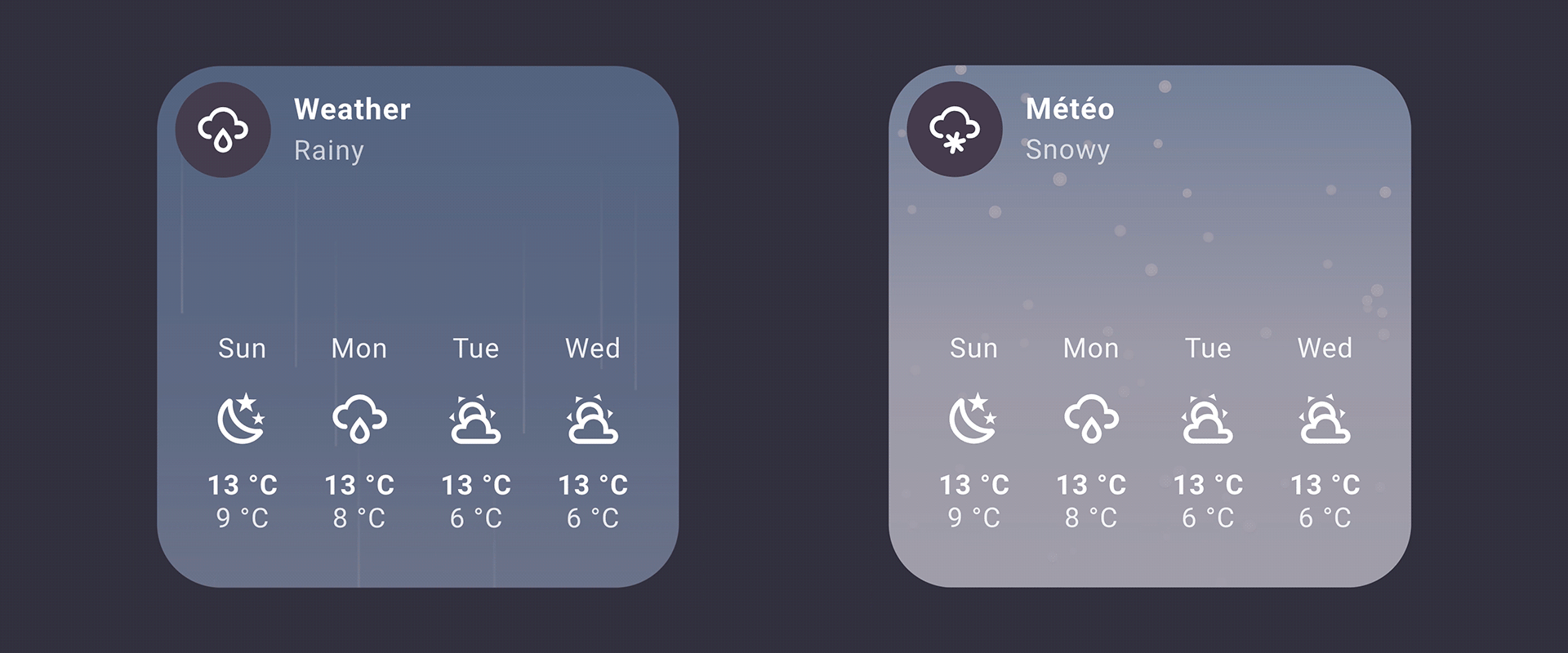
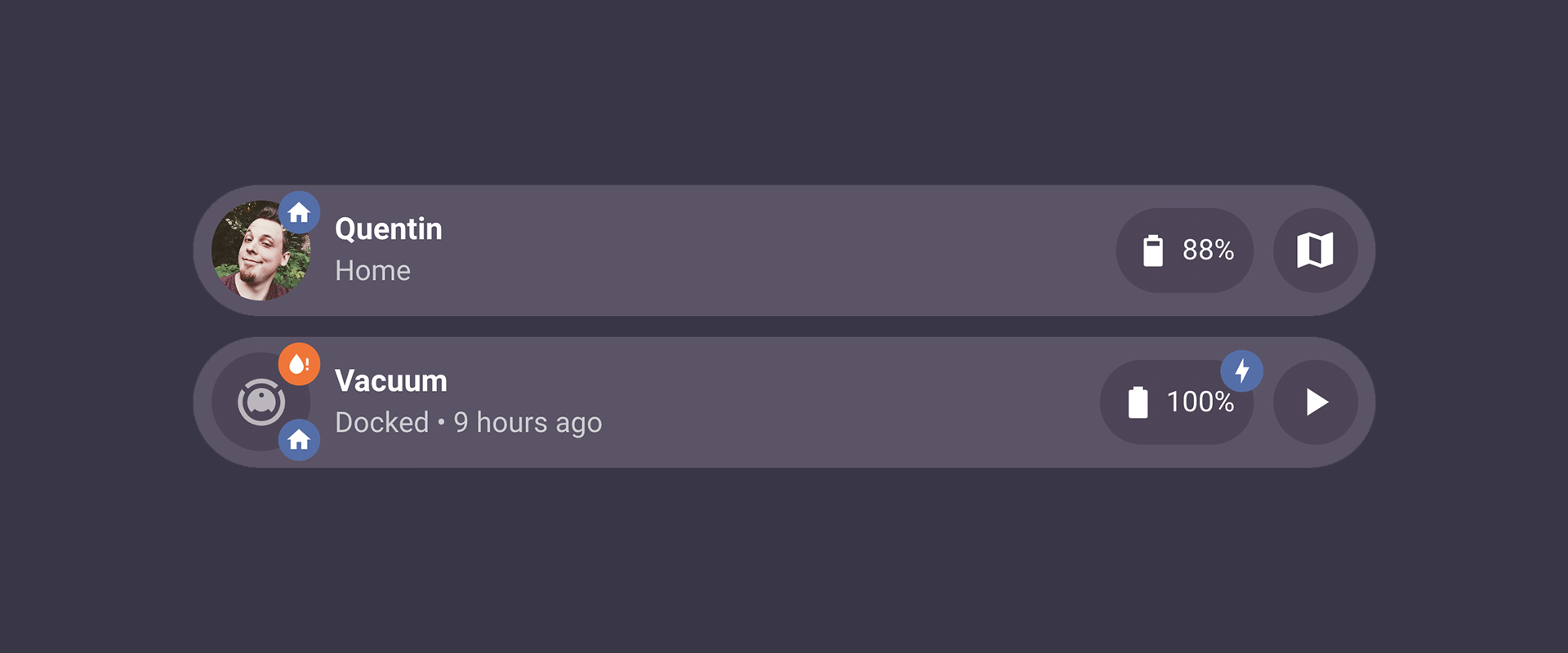
Entity pictures support for sub-buttons:
Sub-buttons now finally support entity pictures! #2077 #1007
Icon priority over entity pictures:
When an icon is explicitly defined, it now takes priority over an entity picture (for both the main icon and sub-buttons).
Main icon color consistency:
Main icon colors are now consistent in all cases (climate cards, RGB lights, etc.).
Sub-button with custom width:
Sub-buttons in a group with “Buttons alignment” set to Right, Left, or Center can now be resized with a custom width in the editor (in px only).
Module editing fix:
Fixed an issue where editing a module was not working in some cases.
Better YAML import experience:
Improved the overall experience when importing a module from YAML.
subButtonIcon[0] variable improvement:
The subButtonIcon[0] variable now correctly ignores clones (useful in custom styles and modules).
Sub-button visibility positioning fix:
Fixed an issue where sub-button visibility was breaking the positioning of remaining sub-buttons. #2079
Input select sub-button styling fix:
Fixed an issue where using an input_select as the entity for a sub-button was breaking the sub-button background custom styling. #2078
Climate card editing in pop-up fix:
Fixed an issue where it was not possible to edit a climate card inside a pop-up. #2067
Sub-button color update fix:
Fixed an issue where the sub-button color was not updating anymore when combined with a light entity.
Safari light color transition:
On Safari, when a card combined with a light entity is changing its color, the transition is now displayed smoothly.
Text scrolling effect improvements:
Fixed some more issues with the text scrolling effect.
Various styling improvements:
Multiple styling improvements in the cards and in the editor.
After the final release, I’ll be slowing down for a while to focus on my (enlarged) family. That said, I’ll still keep an eye on any new bugs and I also have some (almost finished) new modules to release!
Thank you so much for your continued feedback! I count on you all again!
I will now try to take a nap as well 
Also, if you never installed a Bubble Card pre-release, all the steps to get it are explained below:
How to test this pre-release?
The easiest way is to click on the button below, or go to HACS, search for Bubble Card, and click on it. Then, click the three dots icon in the top-right corner and select “Redownload”. You’ll be able to choose the beta version under “Need a different version?”. You can then change back to your previous version if needed.
And now, here’s the final (huge) changelog, combining all the new features and fixes from the previous betas (go grab a coffee):
Hi everyone!
I’m finally confident enough to release Bubble Card v3.1.0! And this new version is… well… once again… huge. You might want to read this one carefully
This update was a real challenge for me, with many major new features and fixes that make Bubble Card more customizable, faster, and more fun to use! Also, thanks to a major change, the editor is now up to 100 times faster (for real!) on dashboards with many pop-ups! For many of you, this finally makes the editor fully responsive and much more enjoyable to use!
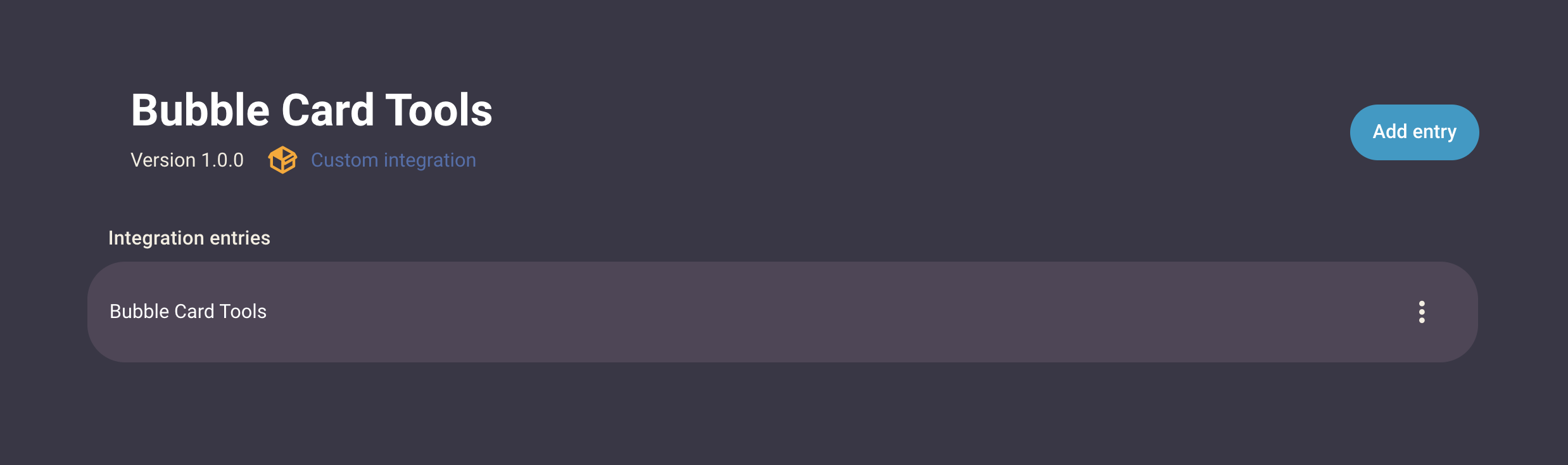
One of the biggest changes is the new integration with Bubble Card Tools. This is a new custom integration for Home Assistant that takes care of the Bubble Card backend. Your modules are now stored in individual YAML files, which makes them easier to back up, share, and edit.
This change was truly important to improve stability, reliability and make the whole system more future proof. Another benefit of moving to a custom component is that setup is now much easier, and if you already used the Module Store in the past, all your modules will be migrated automatically! You can even do it later since this is not a breaking change, but it is requested if you want to install new modules.
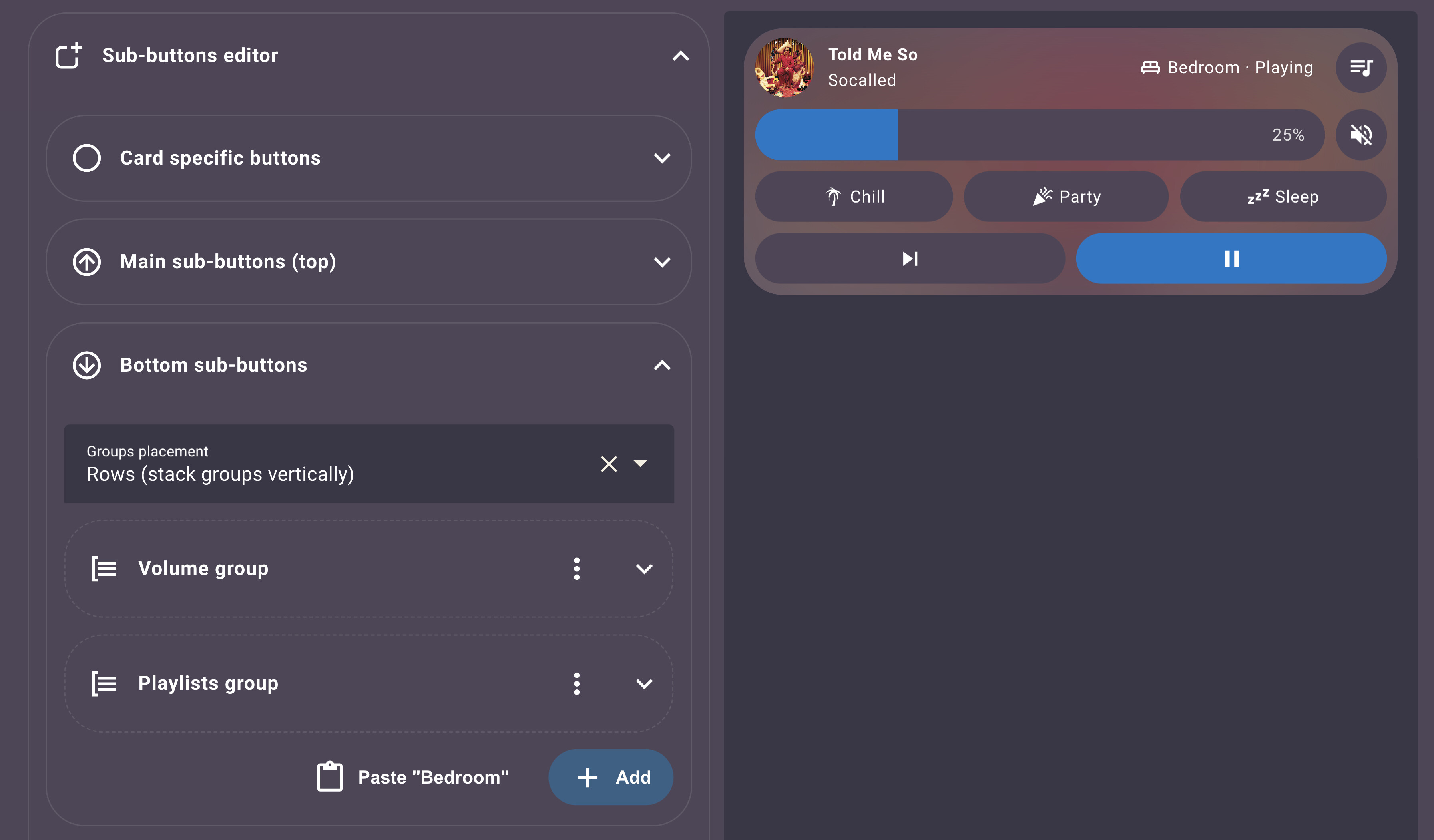
Another big feature is the new “Sub-buttons only” card. It’s perfect if you want to create a simple card made entirely of quick actions or to display information. For example, you can create a menu with a sub-button for each of your rooms, and place it at the bottom of the screen as a fixed footer.
For module developers:
Please make sure to update your modules to support this card if needed. You can now even use the “All” setting to make this easier and future-proof.
Sub-buttons also got a huge upgrade. You can now choose between three types: Default (button), Slider, and Select / Dropdown. For example, you can create a slider for brightness, another slider for temperature, and a dropdown to choose a scene, all in the same card. Sliders can always stay visible or appear only when tapped, which helps keep your layout clean.
Here’s the biggest part of this release, and also my favorite one! This version finally brings powerful customization features that give you full control over your card layout! With sub button groups, you can organize related buttons into custom groups with flexible layouts. The new below placement options let you place sub buttons and buttons under the other elements, opening up entirely new design possibilities!
The new sub-button editor lets you copy and paste to duplicate sub-buttons or entire groups, saving time when creating similar setups. Individual size customization allows you to fine-tune the height and width of each sub-button, while icon placement options let you position icons exactly where you want them (top, bottom, left, or right). Together, these features work in harmony to give you the flexibility to create virtually any layout you can imagine!
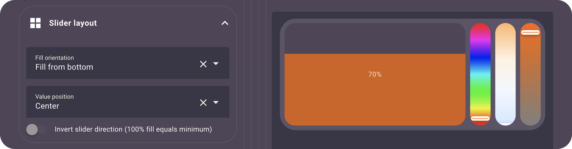
This release also brings new Slider layout options to control orientation, value placement, and inversion!
The module editor has also been improved to be faster and easier to use. You can search your modules, sort them, and even set them as compatible with all card types so they stay future proof.
My goal was to release the final version before the end of the year (well… early 2026 seems right as well). The reason is also a very happy one, I will very (very) soon become a dad for the second time and I couldn’t be happier about that! My development time will be limited for a while, so I worked harder than ever to release the best version of Bubble Card to date, and I truly hope you will love it!
But there is a lot more in this update, here’s the full changelog:
 New features and enhancements
Bubble Card Tools integration:
Automatic migration from legacy module storage (entity-based) to file-based storage via Bubble Card Tools. Modules are now stored as YAML files for better management. Installing it is requested if you still want to install or create new modules, but this can be done later as this is not a breaking change.
New “Sub-buttons only” card:
A dedicated card type for displaying only sub-buttons, perfect for creating custom button panels. Includes a footer mode option for fixed positioning at the bottom of the screen.
Sub-button types:
You can now choose between three sub-button types: Default (button), Slider, or Select (dropdown). Each type offers specific functionality tailored to different use cases.
Slider sub-buttons:
Sub-buttons can now be configured as sliders with various options including temperature control, color sliders (hue, saturation, white temperature), and brightness control. Sliders can be set to always show or appear on tap.
Sub-button groups:
Create groups of sub-buttons with customizable layouts.
Sub-buttons/buttons below:
Sub-buttons and specific buttons can now be displayed below with various new layout options.
Copy/paste sub-buttons and groups:
Easily duplicate sub-buttons or entire groups using copy and paste functionality in the editor. Saves time when creating similar configurations.
Sub-button size customization:
Customize the height and width of individual sub-buttons for better layout control.
Icon placement options:
Control where icons appear within sub-buttons (top, bottom, left, right) for better visual organization.
Sub-button CSS classes by name:
Sub-buttons can now be targeted with CSS classes based on their name (e.g., if your sub-button is named “My sub-button” the class to target will be .my-sub-button), making it easier to apply custom styles to specific sub-buttons. Sliders sub-button can also be targeted with .bubble-sub-button-slider-x (index aligned with the sub-button).
Timer support:
Timer entities are now fully supported with live countdown display. Finally!
Text scrolling for sub-buttons:
Text scrolling effect is now available for sub-buttons, perfect when sub-button width is reduced.
Module editor improvements:
Smooth media player cover transitions:
Media player covers now fade smoothly between different cover images for a more polished experience.
Lock and error state colors:
Lock entities now use red when unlocked and the main color when locked, providing clearer visual feedback. Same behavior applies to entities with “error” state. #1874
Calendar card event limit:
You can now limit the number of events displayed in the calendar card using the “limit” parameter. This helps improve performance when calendars have many events. PR #1931 by @nomis52, thank you so much for this PR and all the others!
Slider layout options:
Added fill orientation (left, right, top, bottom), value position (right, left, center, hidden).
Invert slider direction:
Added optional inverted behavior where 100% fill equals the minimum value for sliders. #1968
Template conditions in modules:
Experimental support for Jinja template conditions directly inside modules that support conditions.
Numeric conditions in modules:
Modules can now evaluate numeric conditions. #1981
Improved object selector for modules
A new and better object selector replaces the default Home Assistant one in modules that use it (like Bubble Badges 2), shows changes live, and finally supports the attribute selector correctly.
“Enable unsupported modules” option in editor
Added a toggle in the Modules section to enable modules that aren’t yet marked as supporting certain card types (great for “Sub-buttons only” cards).
Sub-button pop-up toggle behavior
Pressing a sub-button that navigates to a pop-up now closes it when pressed again. #1999
 Bug fixes and improvements
HA 2026.1 compatibility:
Fixed the missing dropdown fields in the editor since HA 2026.1. #2068
Editor responsive boost with many pop-ups
The editor is now up to 100 times faster on dashboards with many pop-ups (like my own dashboard), thanks to hiding pop-up content while editing! This change finally makes the editor fully responsive for everyone! #1936
All slider issues fixed:
Fixed all known slider responsiveness and functionality issues. Sliders now work reliably across all supported entity types.
Dropdown opening direction fix:
Opening a dropdown close to the left side of the page or in a pop-up now opens it in the correct direction.
Mobile slider scrolling fix:
On mobile devices, scrolling up or down by starting on a slider no longer blocks page scrolling, allowing natural page navigation.
Active sub-button background fix:
Sub-buttons that are active (colored) on an active card no longer have their background color mixed with the card background, ensuring better visual separation.
Text scrolling loop fix:
The text scrolling effect loop no longer restarts after each change (like when “last changed” updates), providing smoother scrolling behavior.
Pop-up header display:
Fixed an issue where the pop-up header was not appearing in some cases.
Pop-up performance improvements (again):
Pop-ups were slower on low-end devices in recent releases, they are now faster than ever (even with blured backdrop!).
Pop-up content loading:
Fixed issues where pop-up contents (gauge card, map card, etc.) weren’t loading correctly in some cases.
Pop-up state management:
Improved pop-up state tracking with active popups set to prevent conflicts and ensure proper cleanup.
Live style updates in pop-up editor:
When editing a module in a pop-up card, styles are now updated in real-time as you make changes.
Module editor error clearing:
Fixed an issue where errors weren’t clearing when creating or editing a module.
API limit warning in Module Store
When the GitHub API rate limit is reached after many refreshes, a warning is shown and cached content is displayed instead.
Sub-button editor restructure:
The sub-button editor has been completely restructured with a new sectioned approach (Main/Bottom) and better organization. Old configurations are automatically migrated.
Calendar card “days” option:
Added “days” option to calendar card editor (was missing in previous version).
Custom icon pack support:
Custom icon packs like hass-hue-icons should now work correctly with Bubble Card.
Improved color management:
Better overall color handling with more vivid colors, especially for sliders and RGB light sub-buttons. #692
Hold action improvements:
Hold actions now include a slight dead zone to prevent accidental triggers from minor finger movement. #1781
Module registry refactoring:
Improved module loading system with better caching and performance. Module styles are now preloaded more efficiently.
Correct icon state for lock entities:
Icons for lock entities now change correctly based on their state.
Memory leak fix in sub-buttons:
A slight memory leak inside the sub-buttons system has been fixed for better performance.
Unnecessary text scrolling:
The text scrolling effect was still running in cases where it should have been disabled. This is now fixed.
Calendar event sorting:
Fixed ordering to handle both all-day and timed events correctly. PR #1937 by @nomis52.
Media player buttons:
Restored missing buttons in the media player card in some cases. #1930 #1846.
Custom styles templates:
Resolved a case where JS templates blocked the CSS declaration immediately following them. #1978.
Horizontal scrolling:
Fixed unwanted horizontal scrolling appearing on some cards.
Slider steps on release:
Respect the configured steps when releasing the slider so values snap correctly (finally!). #1607
Calendar gradient mask:
Tweaked styling for a cleaner gradient mask effect on the calendar card.
Global modules enabled across all cards
Global modules now correctly show as enabled (not greyed out) on all cards in the editor. #2027
Module Store filtering issues
Fixed some filtering problems in the Module Store so search results behave more reliably.
Modules editor UI fixes
Resolved an issue where the code editor panel could deform the layout.
Module Store version comparison issue
Fixed version comparison bugs in the modules editor.
Pop-up preview cropping fix:
Fixed an issue in the editor where a pop-up was cropped after opening the “more info” pop-up of an entity in the preview.
“Update cards in background” pop-up fixes:
Fixed multiple issues when “Update cards in background” is enabled in a pop-up.
Menu clarity in modules editor
The “Create new Modules” and “Import from YAML” menu now hides when “Import from YAML” is selected to avoid confusion.
Hold action context menu on touchscreen PC:
Hold actions doesn’t brings up the right click context menu on touchscreen PCs anymore. #1845
Button color consistency:
Fixed some color differences across button types. #2056
Editor UI polish:
Some minor styling, descriptions and structure improvements in the editor.
Various performance optimizations:
 Bubble Card news
Over the past years, I’ve been working almost everyday on Bubble Card to make it the best it can be, and I still don’t believe how much it have grown in popularity. Watching the community getting this big and seeing so many people using my work has been incredibly rewarding.
This is why I decided to create a Patreon as a way to offer something more for those who want to support me. A few days ago, I refreshed my Patreon with two new modules: Bubble Badges v2 (unlimited badges on any sub-button or the main icon) and Bubble Weather (animated weather backgrounds with daily/hourly forecasts). The custom dropdown module is still there if you want full control over labels, icons, and actions on select cards and sub-buttons.
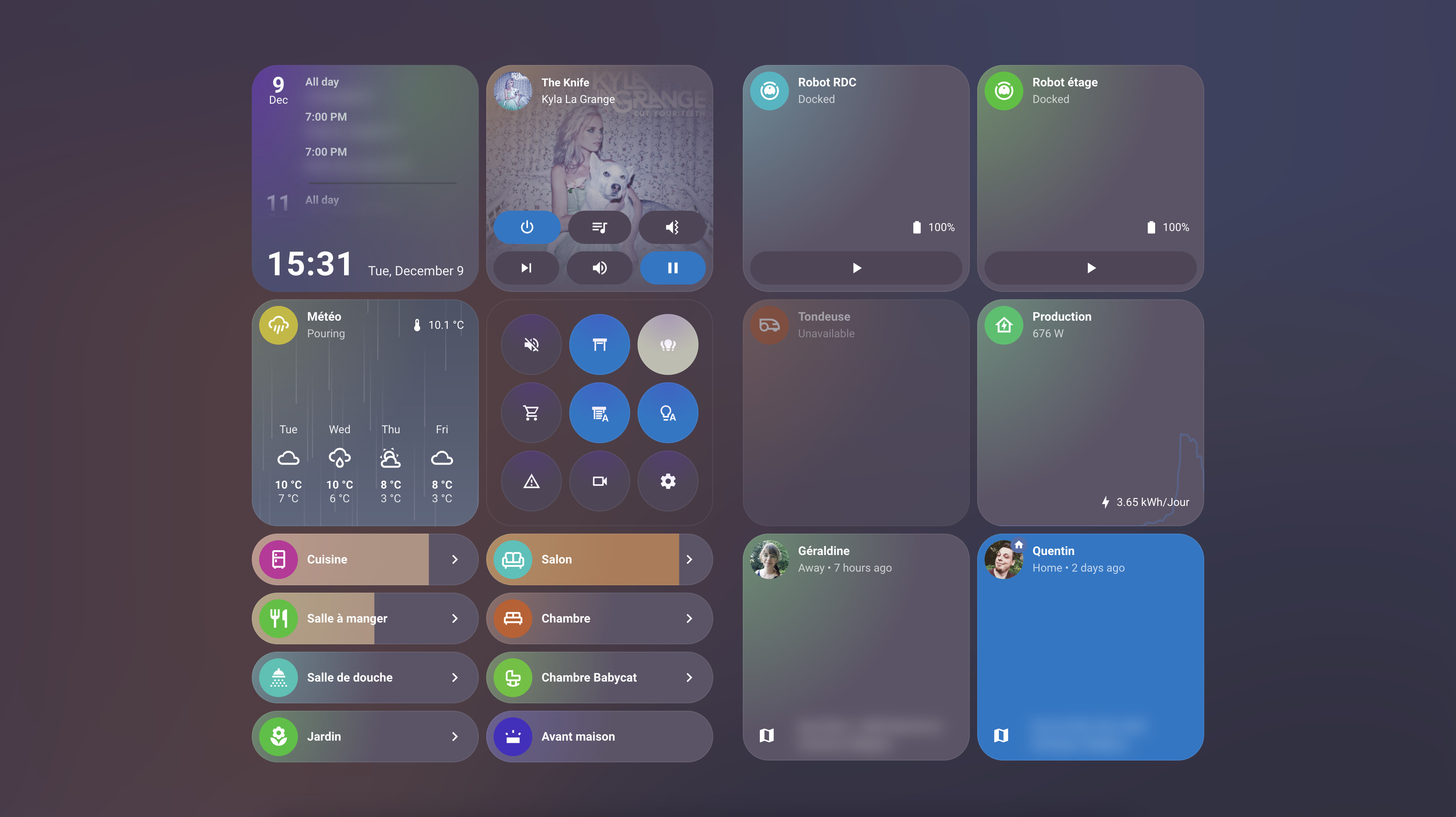
I’m also finally happy with my own dashboard, built entirely with Bubble Card v3.1.0-beta and only new custom modules I’ve been working on for months! Like one that adds unique colors and styles to all cards, one for the weather, one for graphs, square cards, time… I’ll release more of these modules soon, with a detailed post on Patreon and a new YouTube video. I would love to know what you think!
Thank you so much for being part of this amazing community, your support always makes a huge difference!
I’ve been wanting to start my own YouTube channel for a while, focusing on tutorials around Home Assistant and Bubble Card, and I really hope you will enjoy my videos. Don’t hesitate to subscribe to help give my channel more visibility. Thank you in advance!
I want to highlight that on the GitHub page, in the Discussions section, you can share and discover some amazing YAML examples from the community. Go check it out! Some of the creations are absolutely incredible!
And if you are interested I’ve opened a Subreddit for Bubble Card where I post my progress on the project. Here it is:
Also, if you ever want to grab me a fresh beer, here are two easy ways
I’ve fixed several issues that were introduced in rc.3, particularly with the editor and sub-button sliders. If this one isn’t the one… well, I promise the next release will be called “v3.1.0-rc.final-finaaaal-for-real-this-time” (maybe not)!
If you are updating from a previous rc/beta, here’s what has been fixed:
Template conditions fix:
Template conditions (Jinja2) are now working correctly in modules that use the condition selector. #2087
Sub-button slider actions fix:
Tap, double tap and hold actions are now correctly disabled when a sub-button slider is set to “Always show slider”. #2104
Sub-button index fix:
Reverted a change I made in rc.3 with how the subButtonIcon variable is processed, to fix a new sub-button index issue. #2103
Editor dropdown fixes:
Fixed some dropdown issues in the editor since rc.3. #2107
Card dropdown fixes:
Fixed dropdown that were appearing behind other elements since rc.3. #2107
Last chance to report your issues, or I’ll assume everything is perfect!
Also, if you never installed a Bubble Card pre-release, all the steps to get it are explained below:
How to test this pre-release?
The easiest way is to click on the button below, or go to HACS, search for Bubble Card, and click on it. Then, click the three dots icon in the top-right corner and select “Redownload”. You’ll be able to choose the beta version under “Need a different version?”. You can then change back to your previous version if needed.
And now, here’s the final (huge) changelog, combining all the new features and fixes from the previous betas (go grab a coffee):
Best custom card available for Home Assistant!
The only thing I’d still love to see is a native option to change the card and/or icon color. The solutions that rely on the module store are extremely buggy for me. This is mainly because I use smart switches instead of bulbs, and with your card they appear grey by default.
PS: Would you be willing to share pictures of your full dashboard, or maybe a YouTube tutorial? I’d love to see how you’ve set everything up.
And lastly—congratulations on your new baby! Wishing you all the best! 
Thank you! My goal is to share a post with my full dashboard with everything explained, writing this will take a lot of time (and the module I have created for it as well).
For the color customization this will come as well, I just don’t know when (my to-do list is huge  ).
).


