I’m getting this error like 50 times per second when I have my dashboard up. I can see them in the log but they don’t seem to be affecting usage. Has anyone found a solution for this?
Hi! The next Bubble Card v2 is on its way, but I really wanted to work on the section view full support. And I can now say that this is my recommended way to start with Bubble Card, I just love it!
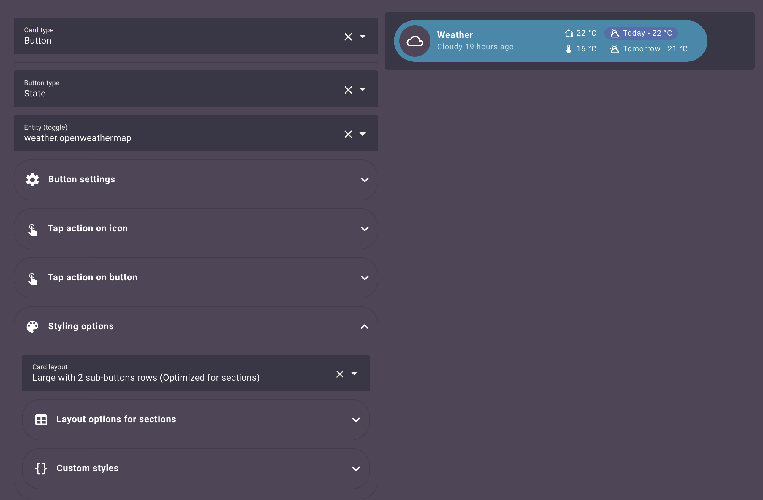
Also, take a look at the “Styling options” in this screenshot.
Been looking into remaking my mobile dashboard with your bubblecards. They look amazing!
However, I’ve run into the issue that the pop-up won’t show when I push my button on my mobile, with the popup linked to. It just fades the background. Also it doesn’t show on my desktop. The subpage doesn’t show the content of the pop-up, unless I’m entering editmode on the subpage.
Front page is masonry and subpage Kitchen is panel at the moment.
I’ve got version 1.7.3. Found the beta version, but how do i overrule the latest release and install the beta? I’m gonna try to figure that out and see if that helps.
*Update:
Tried redownloading to beta version 2.0.0.6. Still shows 1.7.3 when i make a new bubble card, but the bubble-card.js says “v2.0.0-beta.6”. Didn’t fix the issue unfortunately.
Hi! This new beta is a major one. I’ve finally added the full support of the new section view! And I can now say that this is my recommended way to start with Bubble Card, I just love it! I’ve also added a new large layout for most of the cards to fit this new view type, but also a new large one where you can have two rows of sub-buttons!
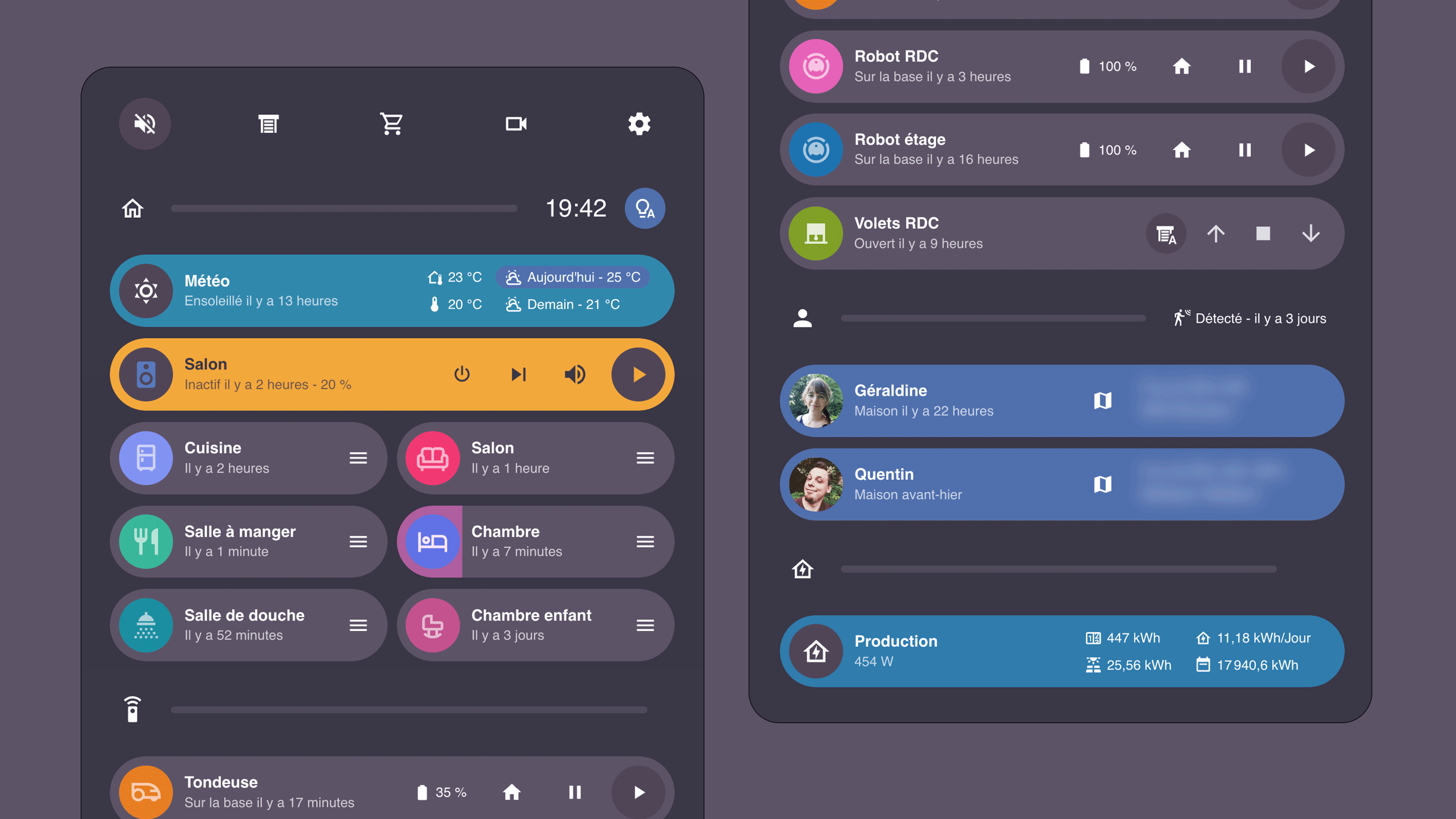
Also, I’ve finally redesigned my dashboard to be 100% Bubble Card (except for the Frigate card, so let’s say 99%). Here is what you can achieve now with this new release in the new section view:
My next big step is to finish the new documentation (WIP), and I’m planning to add a lot of advanced examples to customize Bubble Card! We are getting closer!
I can’t wait for your feedback as always!
New features
Section support and new layouts: You can now change the layout to make the cards bigger to fit the new Home Assistant section view. In YAML, you have access to card_layout: large and card_layout: large_2_rows if you want 2 rows of sub-buttons.
Section column and rows support: In YAML, you can change that with columns: 2 and rows: 1 for example. Thank you again @brunosabot for that part!
Sub-button custom icon template: You can now change the sub-buttons icons with a template. Here is an example of a template that changes the icon of the third sub-button (0 is 1) based on an entity state: ${subButtonIcon[2].setAttribute("icon", hass.states['mower.garden'].state === 'error' ? 'mdi:alert' : 'mdi:robot-mower')}, try that in the custom styles editor.
Custom weather icon template: You can also get the weather icon based on a weather entity or any sensor that returns the weather condition, like sunny will return mdi:weather-sunny. This is helpful to make a weather card based on a state button for example. Here is how you can do that: ${subButtonIcon[2].setAttribute("icon", getWeatherIcon(hass.states['weather.home'].state))}
Bug fixes and optimizations
Fixed the pop-up close on click feature
Fixed the issues with the sub-buttons tap actions
Fixed a lot of button and sub-buttons editor issues with the help of @brunosabot!
Removed the possibility to set actions on a button when the button is a slider (this was not working together)
Fixed a memory leak in the sub-buttons code
The pop-ups are not taking space anymore when placed in a section view
For the 2 rows they are available on the separator but I’ve just tested and there is a small CSS issue that I need to fix And I will add it to the pop-ups as well
If you missed it, you can take a look at the 2.0.0-beta.1 (huge) full changelog here.
Version 2.0.0-beta.8
Hi again!
This release should fix all the new issues introduced in the beta.7, and also the last older one!
Is this the true one this time?
New features
Added the missing pop-up header layouts
Bug fixes and optimizations
Fixed the « last changed » showed by default
Fixed the default icon template not working after beta.7
Fixed a pop-up issue with the position of dropdowns (like with the xiaomi-vacuum-map-card, probably Mushroom too)
You don’t need to refresh a section view anymore when leaving the editor on a view with pop-ups
Fixed the DOM changing for sub-button icons, that was slowing down everything!
Fixed a sub-button CSS issue on the separator when there is no sub-buttons
Fixed the cover card icons color when the large layout is selected
Fixed the separator “2 rows” layout
Fixed a compatibility issue with the position of the horizontal buttons stack and the fully kiosk extension (not sure if it works, but @brunosabot opened a PR on the Fully kiosk GitHub page in the same time).
Well, again… and again… and agaiiiin fingers crossed, we are so clooosed!
I still have white on very light buttons for lamps which are extremely hard to read. This happens in all themes. You said this was a bug earlier, is this still on the list to be fixed later on?
If not, is there any workaround? I had to stop using bubble cards due to this. I literally can’t read it.
Thanks Cloos, appreciate it! I think it may be something to do with smart bulbs and the white color temperature. Doesn’t happen on switches, they look fine and the theme applies as expected.
Light as purple (perfectly fine):
Light as white as I can make it, listed as 4000K (unreadable):
by adding a sub-button without defining an own icon, I would assume that the icon of the entity will be used.
However, in the latest beta version, the icon of the selected main entity is being used. Is this behavior intentional or is it a bug?


 New features
 Bug fixes and optimizations
 And I will add it to the pop-ups as well


