Mabaelst
May 16, 2024, 4:17pm
724
Hello everyone,
I really like the bubble card and I’m experimenting with it now. I would like to put a popup button in a popup window. This works very well, but the second popup card is not fully visible. Is there a way to reduce the height of a popup window?
Cloos
May 16, 2024, 9:08pm
725
Here is the YAML from my weather card:
Here is the YAML of the weather card I’ve made, you can see the templates in the custom styles section:
type: custom:bubble-card
card_type: button
card_layout: large-2-rows
button_type: state
entity: weather.maison_2
name: Weather
show_state: true
show_last_changed: false
sub_button:
- entity: sensor.salon_temperature
icon: mdi:home-thermometer-outline
show_state: true
show_background: false
- entity: sensor.openweathermap_temperature
icon: mdi:thermometer
show_state: tr…
xADDRx
May 17, 2024, 7:50am
726
Damn Cloos,
looks realy great.
Please let us take part in the Yaml
Thank you for this great work.
AUkkers
May 17, 2024, 9:36am
727
Hello everyone !
RaA11
May 17, 2024, 10:17am
728
Hi,
I have an issue with pop-up
on the Dashboard it looks like that:
Sometimes the popup have no issues and sometimes the brightness bar have some bugs.
any idea how to fix it?
Thank You!
Hallo
May 18, 2024, 10:44am
729
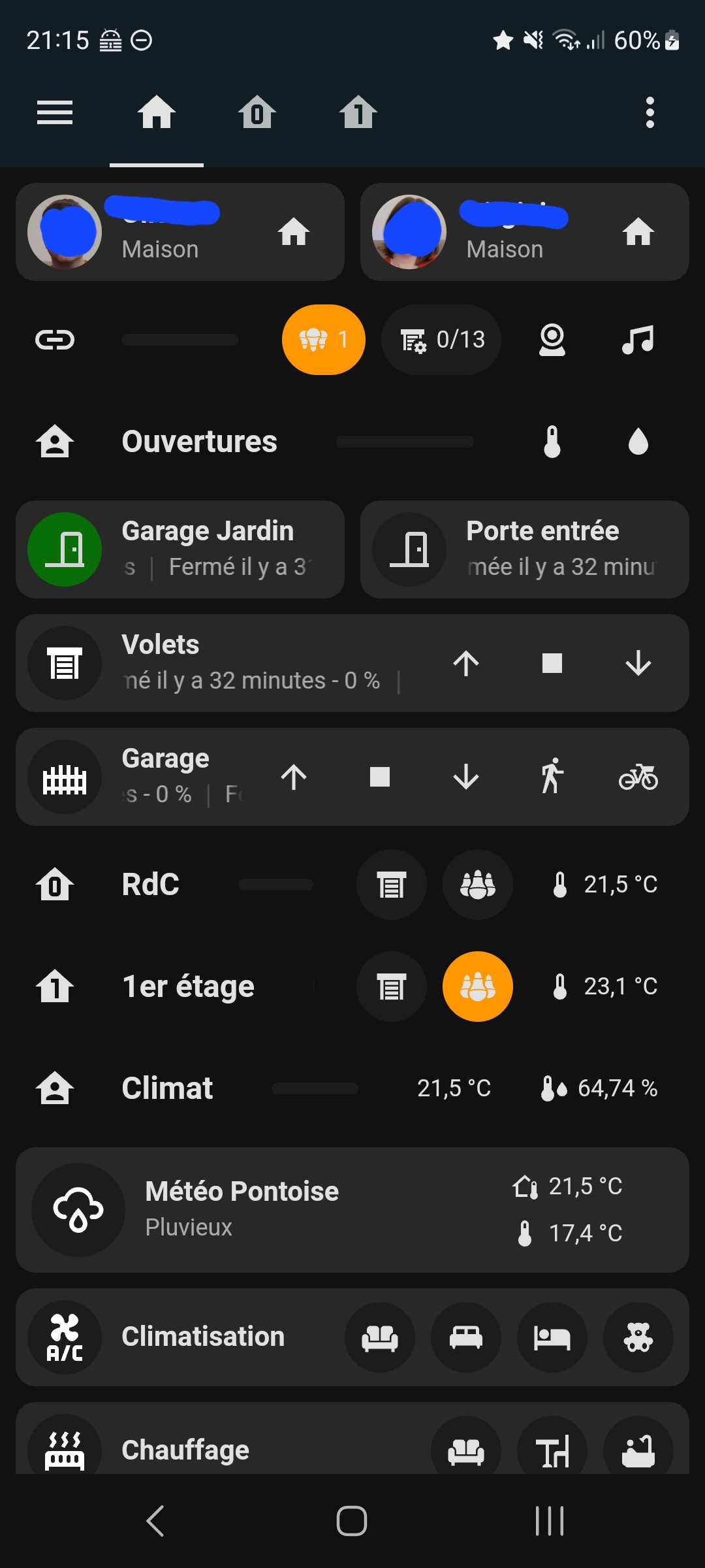
Hello guys,
this is my first time here.
I have now brought my house into Home-Assistant myself and started with the dashboard.
I would like to add small numbers or graphics at the bottom of the Horizontal buttons stack that report the status in the room, e.g. how many people are currently in the room or how many lights are on etc…
In the screenshots attached I have drawn it roughly as I would like it to look.
Can anyone help me here? Thank you very much!
Have a nice weekend! Enjoy the sun, I hope it shines with you as much as it does with us
Hallo
May 18, 2024, 10:49am
730
I can only upload one picture per post, so unfortunately a second post. Sorry!
Even when I use your code I still get an error. I think it is something to do with how I have my Weather_forecast_daily sensor set up along with my lack of understanding how this code actually works!
DrNRG
May 18, 2024, 8:58pm
732
Thanks for an amazing card! It has really improved flexibility.
I’d like to ask if it is possible to change the border radius.
Is it possible to do this?
Many thanks.
koleos
May 19, 2024, 5:11am
733
Very nice, can you share your code? I like the temperature card how did you do that?
koleos
May 19, 2024, 5:14am
734
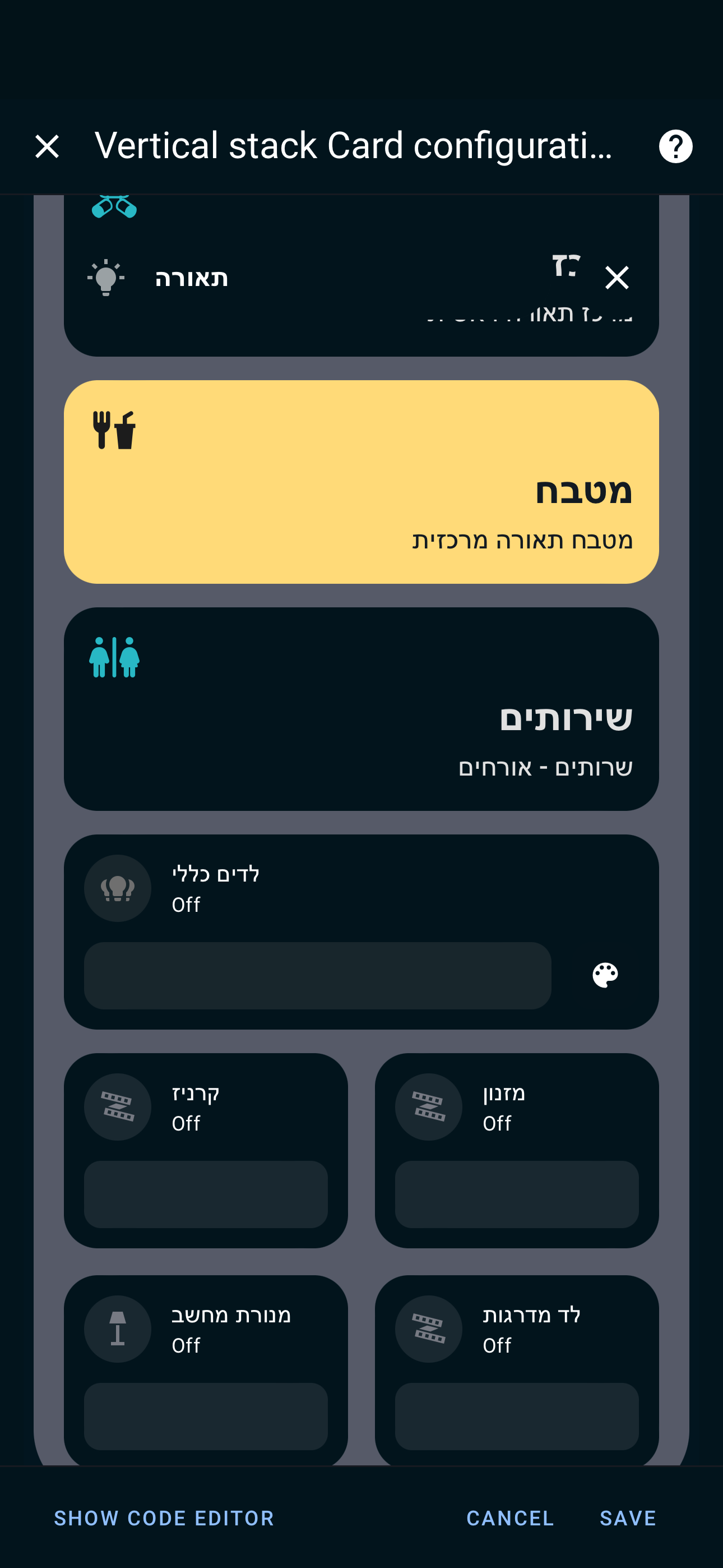
I am trying to change the background-color of the sub_button icons. Does anyone manage to do that? Thanks
amstermk
May 19, 2024, 11:33am
735
Can’t help you… but I‘m looking for similar modifications: Change size and font-size (entity-state) of the sub-buttons
koleos
May 19, 2024, 11:38am
736
If it is all at the same time you have css here
export default `
    * {
        -webkit-tap-highlight-color: transparent !important;
    }
    ha-card {
        margin-top: 0;
        background: none;
        opacity: 1;
    }
    .is-unavailable {
        opacity: 0.5;
    }

    .bubble-button-card-container {
        position: relative;
        width: 100%;
        height: 50px;
        background-color: var(--background-color-2,var(--secondary-background-color));
        border-radius: 25px;
        mask-image: radial-gradient(white, black);
show original
You can change that in .rows-2 .bubble-sub-button-container or in .rows-2 .bubble-sub-button
In custom styles
amstermk
May 19, 2024, 2:03pm
737
Thanks for your help! … but I‘m not sure how to do it… do I insert the following code into custom styles?
  .rows-2 .bubble-sub-button {
    font-size: 16px !important;
  }
… as that doesn‘t work…
Edit: the following code worked:
.bubble-sub-button {
font-size: 16px !important;
}
koleos
May 19, 2024, 7:26pm
738
O
strange, but if we set the service correctly manualy in editor mode, then after, it is working again and we can modify it in the web ui!
Il also seams that the show_name: false option do not work for main button for switch and state button
gado
May 20, 2024, 5:03pm
739
is there any way to keep all my popups in a separate view and trigger them from the main view ? Im only being able to trigger popups as long as they’re on the same view of the trigger, I tried navigate: ‘popups#lights’ sometimes it opens ‘popups’ blank view, others it opens the ‘lights
koleos
May 20, 2024, 7:32pm
740
Hi, I just finish my first bubble-card dashboard
Some captures
Home page with some shortcuts and global view
1 page per flour. We can even do 3 rows of sub buttons !
View on the light and shutter views
Many thanks !
Evolutions that could be nice :
tap button on separator icons
possibility to update background… of a specific sub button
use by default layout of theme
6 Likes
2 things iv got to mention.
Call service doesnt work for button type: state & for subbuttons
Is it possible to get conditional sub buttons & Buttons? This would be really handy and really great!
If I want to change the background colours of the sub buttons dependant on their state, is there a way to do this?
Anyone know why the content of this pop-up card is going on top of the header when scrolled?
The background of each slider is transparent, but even if I remove that it covers up the “Lights” gray header bubble at the top when scrolled.
I also have a sticky nav bar at the bottom of my main dashboard view (this is all on my main dash view) and it gets covered up by the Lights pop-up.
My Thermostat pop-up card seems to be fine in both respects:
Not sure what I’m doing wrong. Here’s my code for the Lights one if it is helpful. Thanks for any help.
type: vertical-stack
cards:
  - type: custom:bubble-card
    card_type: pop-up
    bg_color: '#e6e4da'
    hash: '#lights'
    name: Lights
    icon: mdi:lightbulb
    bg_opacity: 100
  - type: custom:mushroom-title-card
    title: ''
    subtitle: Press and hold a room for more controls
    alignment: start
    card_mod:
      style: |
        ha-card {
          margin-top: -10px;
        }
  - type: custom:big-slider-card
    entity: light.master_bedroom
    name: Bedroom
    show_percentage: false
    height: 60
    bold_text: true
    color: orange
    icon: mdi:bed-empty
    icon_color: orange
    border_radius: 20px
    border_color: green
    background_color: rgba(0,0,0,0,)
  - type: custom:big-slider-card
    entity: light.living_room
    name: Living Room
    show_percentage: false
    height: 60
    bold_text: true
    color: orange
    icon: mdi:sofa
    icon_color: orange
    border_radius: 20px
    border_color: green
    background_color: rgba(0,0,0,0)
  - type: custom:big-slider-card
    entity: light.hallway
    name: Hallway
    icon: mdi:square-outline
    show_percentage: false
    height: 60
    bold_text: true
    color: orange
    colorize: false
    icon_color: orange
    border_radius: 20px
    border_color: green
    background_color: rgba(0,0,0,0)
  - type: custom:big-slider-card
    entity: light.kitchen_lights
    name: Kitchen
    show_percentage: false
    height: 60
    bold_text: true
    color: orange
    icon: mdi:food-fork-drink
    icon_color: orange
    border_radius: 20px
    border_color: green
    background_color: rgba(0,0,0,0)
  - type: custom:big-slider-card
    entity: light.main_floor_bathroom_light
    name: Bathroom
    show_percentage: false
    height: 60
    bold_text: true
    color: orange
    icon: mdi:toilet
    icon_color: orange
    border_radius: 20px
    border_color: green
    background_color: rgba(0,0,0,0)
  - type: custom:big-slider-card
    entity: light.basement
    name: Basement TV Area
    show_percentage: false
    height: 60
    bold_text: true
    color: orange
    icon: mdi:television-classic
    icon_color: orange
    border_radius: 20px
    border_color: green
    background_color: rgba(0,0,0,0)
  - type: custom:big-slider-card
    entity: light.office
    name: Office
    show_percentage: false
    height: 60
    bold_text: true
    color: orange
    icon: mdi:desktop-tower-monitor
    icon_color: orange
    border_radius: 20px
    border_color: green
    background_color: rgba(0,0,0,0)
  - type: custom:big-slider-card
    entity: light.patio_string_lights
    name: Patio
    icon: mdi:string-lights
    show_percentage: false
    height: 60
    bold_text: true
    color: orange
    icon_color: orange
    border_radius: 20px
    border_color: green
    background_color: rgba(0,0,0,0)


