⚪ Bubble Card - A minimalist card collection for Home Assistant with a nice pop-up touch

I’m seeing something odd with the popup header sub buttons CSS. I’m trying to do a custom CSS on the header button so that when the entity for the button is ‘on’, it doesn’t show a background but when it’s off, it does show a background (weird thing with a camera switch I have). However, when i set the background-color, nothing happens, but if I set the ‘background’ instead, it works. However, it doesn’t update on click, only page refresh. So if I click the button to show the background, it doesn’t do anything unless i refresh the page. Same result when i click it again. Below are my custom styles. Thoughts?

.bubble-sub-button-2 {
  background: ${hass.states['switch.camera_privacy'].state === 'off' ? 'orange' : 'none'} !important;
}

Hi, have you tried the latest version? (v2.0.0-rc.1) If it’s already the case I will have to take a look at this but I’ve recently fixed a similar issue.

Gah! Sorry about that. Forgot to update to the latest version. That resolved my issue! Thanks again!

1 Like

Congratulations on the RC milestone. I have been enjoying the beta versions for some time onmy main dashboard. I have one question: For the covers, is it possible to remove the stop button? Most of my covers don’t have this feature.

1 Like

Thanks for creating what looks like a fantastic card. I’ve been struggling with something that I hope someone can point out a (probably simple) solution to:

When creating a button card to control a switch entity everything works as expected - i.e. if I toggle the switch via the bubble card UI it updates the entity state, and vice versa. However, when I try to do this using a slider for a number or input_number entity it doesn’t work in both directions. If I adjust the slider elsewhere in Home Assistant then the Bubble Card entity state is updated to reflect the change, but if I make the change within Bubble Card then the entity remains unchanged. I’ve tried with multiple different slider or input_number based entities and none of them let me change their state from Bubble Card although it will always display their current state if the entity is changed elsewhere in HA.

Am I missing something fundamental or is there something simple I’m missing?

Thanks in advance.

Indeed I haven’t added that possibility yet. But you can also create your own cover card with the v2.0.0-rc.1 sub-buttons.

Hi, just to be sure have you tried the v2.0.0-rc.1 release, because this should works. If not I will have to take a look at this issue.

Hello, you can as said by Cloos.

Here an example :

type: custom:bubble-card
card_type: button
entity: cover.volets
styles: ''
sub_button:
  - entity: cover.volets
    icon: mdi:arrow-up
    show_background: false
    tap_action:
      action: call-service
      service: cover.open_cover
      target:
        entity_id: cover.volets
  - entity: cover.volets
    icon: mdi:arrow-down
    show_background: false
    tap_action:
      action: call-service
      service: cover.close_cover
      target:
        entity_id: cover.volets
show_state: true
show_last_changed: true
show_attribute: true
attribute: current_position
button_type: state
tap_action:
  action: more-info
double_tap_action:
  action: toggle
button_action:
  double_tap_action:
    action: toggle
  hold_action:
    action: toggle

1 Like

Cloos

Have to say you have done an amazing job with these cards, I am loving the styling elements and how you can really get them to work adapt colours and styles conditionally.

I am now 95% bubble on my mobile dashboards and will soon start working on bubble dashboards for my wall tablets.

My only thing is since I started with Home Assistant and now Bubble Cards is I am wondering if there will ever be a point when I will stop tinkering with the dashboard!

5 Likes

Sub-buttons-everywhere

3 Likes

Is it possible to use a picture rather than an icon in a sub button?

You can do that, I’ve just tried and here’s how:

sub_button:
  - icon: none
styles: |-
  .bubble-sub-button-1 {
    background-image: url("/local/pictures/your_picture.jpg");
    background-size: cover;
  }

Just place this image in a “pictures” folder (or the name you want) in the “www” folder.

Thank you for the help. I agree, creating my own card using sub-buttons would work I ended hiding the stop button using styles:

styles: |
  .bubble-icon-stop {
    --mdc-icon-size: 0px !important;
  }  
  .bubble-stop {
      background: none;
  }    

Result:
image

Now I am wondering if I could also change the stop icon conditionally. In that case I could use the space to indicate whether the cover is on a time clock or not. I tried the example from the v2 documentation but I am not able to find the right name for the stop button icon:

styles: |
  ${iconStop.setAttribute("icon", hass.states['sensor.example'].state === 'on' ? 'mdi:alert' : 'mdi:robot-vacuum')}

Any idea if that is even possible?

That works and is helping me massively, the only thing I have noticed is that the icon background stays the same as the bubble theme and I would prefer it to either be white or same colour as the rest of my card and cannot work out how to do it.

Have got everything to appear conditionally (Although I do think there might be a better way to achieve the same result)

type: custom:bubble-card
card_type: button
button_type: state
name: Bin Collections
entity: sensor.all_waste_types
icon: mdi:trash-can
sub_button:
  - entity: sensor.next_black_bin_collection
    icon: mdi:trash-can-outline
  - entity: sensor.next_green_bin_collection
    icon: none
  - entity: sensor.next_brown_bin_collection
    icon: mdi:leaf
  - entity: sensor.next_food_collection
    icon: mdi:food
styles: |-
  .bubble-button-card-container {
      background: ${hass.states['sensor.julian_watch'].state === 'kitchen' ? 'rgba(131,41,48,1)' : (hass.states['sensor.julian_watch'].state === 'office' ? 'rgba(74,91,107,1)' : (hass.states['sensor.julian_watch'].state === 'living_room' ? 'rgba(130,136,178,1)' : 'rgba(221,221,221,1'))}
    } .bubble-icon {
      opacity: 1;
      color: rgba(229,221,207,1)!important;
    } .bubble-icon-container {
      background-color: black !important;
    } .bubble-sub-button {
      color: rgba(229,221,207,1)!important;
    } .bubble-name,.bubble-state {
      color: rgba(229,221,207,1)!important;
    }.bubble-sub-button-1 {
      background-image: ${hass.states['sensor.all_waste_types'].state.includes('Black Bin') ? 'url("https://forms.cherwell.gov.uk/images/bin-collections/bin-collection-black.svg")' : 'none'}!important;
      background-size: cover;
      background: ${hass.states['sensor.all_waste_types'].state.includes('Black Bin') ? '' : 'none'}!important;
    }.bubble-sub-button-2 {
      background-image: ${hass.states['sensor.all_waste_types'].state.includes('Green Bin') ? 'url("https://forms.cherwell.gov.uk/images/bin-collections/bin-collection-green.svg")' : 'none'}!important;
      background-size: cover;
      background: ${hass.states['sensor.all_waste_types'].state.includes('Green Bin') ? '' : 'none'}!important;
    }.bubble-sub-button-3 {
      background-image: ${hass.states['sensor.all_waste_types'].state.includes('Brown Bin') ? 'url("https://forms.cherwell.gov.uk/images/bin-collections/bin-collection-brown.svg")' : 'none'}!important;
      background-size: cover;
      background: ${hass.states['sensor.all_waste_types'].state.includes('Brown Bin') ? '' : 'none'}!important;
    }.bubble-sub-button-4 {
      background-image: ${hass.states['sensor.all_waste_types'].state.includes('Food') ? 'url("https://forms.cherwell.gov.uk/images/bin-collections/bin-collection-blue.svg")' : 'none'}!important;
      background-size: cover;
      background: ${hass.states['sensor.all_waste_types'].state.includes('Food') ? '' : 'none'}!i
    }
card_layout: large

2 Likes

Well… It’s probably still not perfect and I’m aware that there are still some compatibility issues with some custom cards but here it is. It was a long journey.

Bubble Card 2

v2.0.0

Hi everyone!

About 9 months ago, I released the very first beta of Bubble Card. Since then, I have been improving it in my spare time, but as some of you know the latest versions did not add many features, mainly because the list of bugs was getting longer but also because I had started a complete restructuring of the code to allow better maintenance in the future.

For this version, I had considerable help from @brunosabot, an experienced developer who helped me push the restructuring even further. But he didn’t just settle for a better structure, he also corrected and improved many points along the way!

This new structure finally allowed me to focus on some of the features that I wanted to add since the very first version, and now after 4 months of intensive development here is a preview!
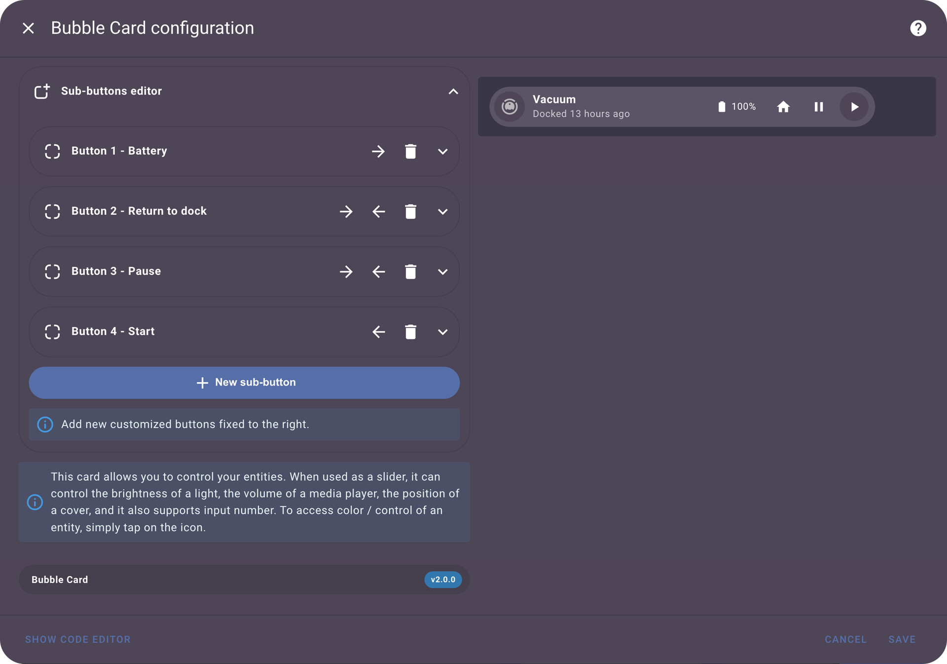
Sub-buttons

This is the biggest new feature of this version, it is now possible to add customized buttons in almost all the cards already available, even the separator! This allows for almost endless possibilities! I can’t wait to see what you are going to create with these!

The first button handles a vacuum with multiple sub-buttons and the second one is a slider with a sub-button that shows the brightness percentage and one that can toggle the light directly.

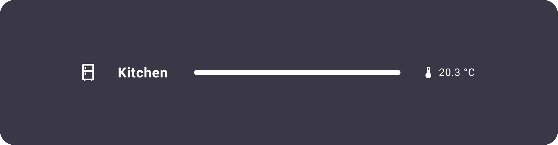
A separator with a sub-button that shows the room temperature.

The sub-button editor is really easy to use and almost everything can be customized.

New media player card

I’ve also added a new card to handle a media player, you can even add your own custom sub-buttons in it!

bubble-media-player-2

These buttons are not sub-buttons but you can show/hide the ones you need.

The pop-up header is now a Bubble button

This feature was requested for a long time, you can now change your pop-up header to act as a slider if you want to (this means you can add sub-buttons too!).

This is some sort of breaking change compared to the previous release, to add back the power button or the state just add some sub-buttons in the editor :slightly_smiling_face:

Advanced states

You now have the possibility to add an attribute or the last changed time next to the state on almost every card types, and translated to every available languages!

Section view support

Bubble Card now fully supports the Home Assistant section view, you can change the card layout to make the card bigger and also change the number of columns or rows the card should occupy in your section view (only on the cards that support that option). These layouts are also supported in all other view types.

New editor

This release comes with an all new GUI for the editor, and also with a lot of fixes! For example the horizontal buttons stack editor is now instant. I’ve also added the possibility to add tap actions directly in it, as well as the custom styles!

Tap actions everywhere

The Home Assistant tap actions are really helpful, that’s why I’ve added them in new places. Such as on the buttons or the sub-buttons to allow even more customization.

Performance, stability and a lot of bug fixes

This was the first thing that was worked on for this version, to everyone who had issues in the past this version is for you! Especially for iOS and Safari users!

New documentation

I’ve worked a lot on a new and much clearer documentation with a lot of new examples. Go take a look at it!

But that’s not all!

Here is the list of all other new features and bug fixes:

:bulb: New features

  • Breaking change: No more custom button, all buttons are customizable now.
  • Section support and new layouts: You can now change the layout to make the cards bigger to fit the new Home Assistant section view. In YAML, you have access to card_layout: large and card_layout: large_2_rows if you want 2 rows of sub-buttons. These layouts are also working on the other view types.
  • Section column and rows support: In YAML, you can change that with columns: 2 and rows: 1 for example. Thank you again @brunosabot for that part!
  • Default icons: There is now default icons for the entities when you create a new button.
  • New state button: @brunosabot added a new state card, the difference is that it shows the more info panel when you tap/click on it and that its background is not changing color.
  • New name/text button: I’ve added a new button to only show text if you need, this is perfect for the new pop-up header for example.
  • Forcing icons: You can now add force_icon: true to always display the icon instead of the entity picture. It’s also available in the editor.
  • Sliders supports more entities: Slider buttons now supports the cover position and input_number.
  • Switch supports more entities: Switch buttons now support more entity types (if an entity type is not supported you can now edit the default action).
  • Texts auto-scrolling: Long texts in small cards are now scrolling by default if the content is longer than its container, perfect for small screens. You can disable it with scrolling_effect: false.
  • Button switch color: If you add a light that handles colors in your switch, the background will now automatically change accordingly.
  • Styles changes: Some styles have changed a bit.
  • Editor optimization: The card preview in the editor is now sticky when you scroll. But there is so much more changes in it!
  • Pop-up in editor: When you enter the editor, the pop-ups are now collapsed to take less space.
  • Haptic feedback: I’ve added haptic feedback everywhere for the HA companion app users, they are also smoother!
  • Icons templating: It is now possible to change all the icons with templates! More info in the documentation.
  • Custom weather icon template: You can also get the weather icon based on a weather entity or any sensor that returns the weather condition, like sunny will return mdi:weather-sunny. This is helpful to make a weather card based on a state button for example. More info in the documentation.
  • New card variable: I’ve added this for the custom styles, it returns the card element in the DOM. You can take a look at the documentation for some examples.
  • Possibility to disable the “close by clicking outside” pop-up feature: You can change this behavior in the editor or in YAML by adding close_by_clicking_outside: false.
  • And I’m probably forgetting some others!

:heavy_check_mark: Bug fixes and optimizations

  • Dashboard column layout: This old issue is now finally fixed! I’ve removed the column_fix, just place your pop-up before all cards to ensure a correct layout.
  • Pop-up now covers all cards correctly: Changed pop-up z-index to 5.
  • Pop-up top gradient: I’ve replaced it by a mask to make it looks better.
  • Pop-up position: The pop-up should now be centered correctly in all cases (there is still the margin fix if you need it).
  • Pop-up custom styles: They are now working correctly.
  • Entity picture fix: The entity picture are now working when accessing Home Assistant from outside of the local network.
  • Horizontal buttons stack fixes: The HBS is not covering the last card of your view anymore. And a lot of other issues are now fixed, thanks to @brunosabot!
  • Variable support for the pop-ups: The pop-up background can now be a variable of a theme.
  • Pop-up fix removed: Fixed and removed the unnecessary fix for when the sidebar is hidden.
  • Slider fixes: Fixed the behavior of the sliders in some cases.
  • Quicker tap actions: Double-tap action delay reduced from 300ms to 200ms and there is no delay anymore if double tap is set to none.
  • Sliding to close a pop-up optimization: Changed the slide to close threshold from 300px to 400px because it was too sensitive.
  • And sooo much more from @brunosabot and me!

And that’s all… I would also like to say thank you again to the numerous beta testers who have been of immense help on this long process.

One more thing, if you are interested I’ve opened a Subreddit for Bubble Card where I post my progress on the project. Here it is:

Reddit Page

:beers:

12 Likes

The followiing should work:


  sub_button:
    - name: Light WZ
      icon: mdi:power
      show_background: false

That was so obvious. I couldn’t see it for looking!

Hi Cloos,

Just noted with release V 2.0 the problem with the horizontal button stack reapeared

I haven’t changed anything about that, but I will take a look.

Edit: I’ve just tried and it’s working on my side, have you downloaded the v2.0.1 that I’ve just released?

Ah, didn‘t notice there is a version 2.0.1. already :wink: Works again! Thanks

1 Like