I finally figured out why my dashboards were slowing down on Fire devices. If I mix bubble and mushroom cards, everything grinds to a halt. With just bubble cards it’s super fast.
Also, is there any plan to do a bubble door lock? Or is there some way to do this already?
How can I change the ha_card style alongside with other styles from bubble_card?
If you noticed on my code below, the ha_card is not reflecting the changes:
When I released the first Bubble Card 2 stable version a few days ago, it (unfortunately) coincided with the release of the new Home Assistant 2024.6.0 version. This new release ended up breaking some functionalities, the most notable of which was the creation of an empty space by the pop-ups.
However, I’m glad to announce that these issues have now been resolved to ensure a full compatibility!
I also worked on the slider button, it now supports fan, climate, and number entities! I don’t have any of these entities to test it, but it should work. I can’t wait for your feedback on these new possibilities!
Important: I would also like to acknowledge that there was an error in the documentation and in the note in the GUI editor regarding where to place the pop-ups. In fact, they should be placed at the very end in your view. However, if you are using the section view, their positions are not important.
Here is the full list of the new features and bug fixes.
New features
Experimental support: Added experimental support for fan, climate and number entities for the sliders.
Step attribute support: Sliders now support the step attribute if there is one.
Bug fixes and optimizations
Section view pop-up gap fix: Fixed the gap created by the pop-ups on a section view introduced after the Home Assistant 2024.6.0 update (For section view users please update Home Assistant to the last release for full compatibility).
Masonry view fix: Fixed an issue with the pop-up messing with the masonry view after the 2024.6.0 update.
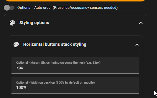
Horizontal buttons stack fix: Fixed the missing horizontal buttons stack gap after the 2024.6.0 update.
Internal rounding for sliders: Sliders now round values internally for lights (WLED fix?).
And thank you to everyone for the incredibly motivating feedback on this new version!!!
Hey all, thanks for such a supportive and collaborative thread@ @Cloos , what a great project and friendly developer. I’ve had two posts where I thought something was broken and each time an upgrade or the docs led me correctly
Would anyone be willing to share their color scheme/theme examples? My dashboard is nearly complete structurally but I’m struggling to recreate the colors used in the github docs or other examples in the thread. Using only the Bubble theme as an example, a normal switch/button bubble card will turn blue-ish if the switch is on and I can’t figure out how to edit that globally. Inspecting via browser I can see ha-card class=“type-custom-bubble-card is-on”, and accordingly color is set to the accent-color: ‘rgb(80, 110, 172)’ in the default Bubble theme.
How could I change the default for cards that are “on” as above?
More interestingly, does anyone have some coloring examples they’re proud of and don’t mind to share? If you take a look at Cloos’ screenshots under “Card layouts”, there’s a nice mix of buttons with no active color and some with icons colored. I’d love to replicate this.
Note I’m not asking for help in conditionally coloring icons etc as that works wonderfully as per the docs. Just looking to borrow someone’s creativity in how they’ve defined their colors. Thanks!
Am I missing how to make this work on IOS device such as an Iphone in the app? Desktop version works great with pop up and buttons/sensors/media but I get you need to define an entity on my Iphone.
Hi again! Here is a fast release to fix the slider behavior after the v2.0.2 update, it was terrible and erratic! I can also confirm that the new supported entities by the slider are perfectly working!
Bug fixes and optimizations
Slow slider fix: Reverted to the previous slider behavior to makes it faster.
Slider editor note update: Added the new supported entities in the slider editor note.
Hi, the best way would be to edit the accent-color variable directly in the theme file, then don’t forget to run the frontend.reload_themes service once.
That was it exactly. Didn’t put it all together that the app would need refreshed also after exiting and restarting. Had to go into servers page and clear frontend cache. Thanks for the pointer!
@Cloos Your project is amazing! I would love if you could help on this please. How we can change the ha_card style alongside with bubble_card style as well. I didn’t find any clue in this thread neither in the repo
Sorry for the late answer, is this custom card mod style is working outside of a pop-up? I don’t use card mod anymore so I was not aware that they could not work together.

 New features
 Bug fixes and optimizations


