Great thank you it does work. I ll read then why I do require this hass.states to understand further.
BTW, this bar or pop-ups at the bottom of the page is missing some space. Is there a way to either adapt the icon size to the page width or even better and the bar aligning to the size of the screen?
Is it possible to show state or attribute from another entity than the entity you have set in the header? I would like to show state/attribute from a Helper while keeping the entity.
in the bottom button stack, could i simply assign a toggle or automation to trigger when pressing a button instead of opening a bubble menu? i want one button to trigger a action.
I am looking for a command to assign it to a separator sub-button to close a pop-up. I don’t want the header in the card but the swipe down option doesn’t reliably work on my phone. Is there a command to close the pop-up from a custom button?
Sorry for the lack of news these days, I needed to take a few days off from development, mainly to spend some quality time with my wife and my adorable son but also to conduct a long-term test on a new optimization for the pop-ups. Unfortunately, I’m not yet satisfied with the results
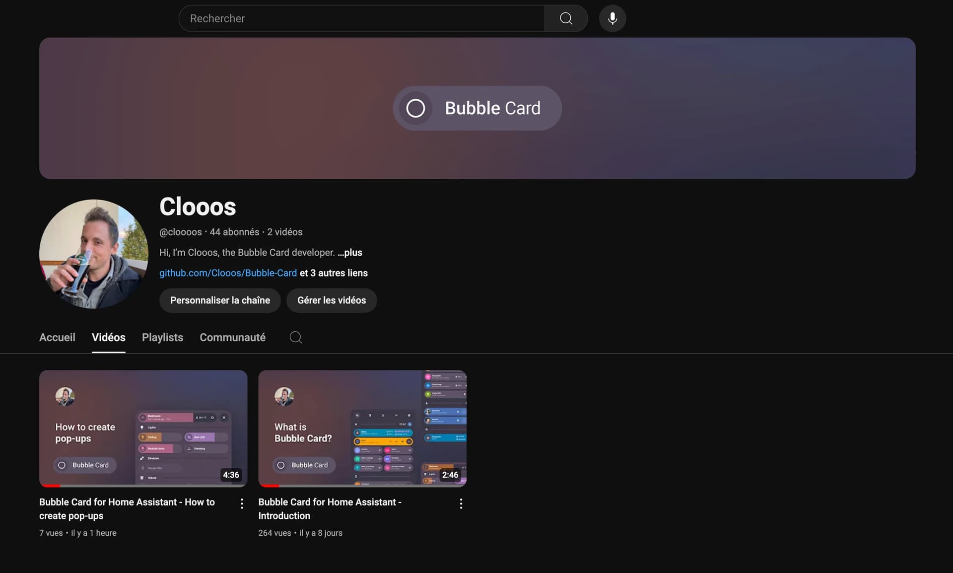
But I’m not stopping there and I have a small surprise for all of you! I’ve been wanting to start my own YouTube channel for a while now, focusing on tutorials around Home Assistant and Bubble Card, and this was the perfect opportunity. There are two videos so far, an introduction explaining the project and a first tutorial on how to create your first pop-up. I understand that some of you don’t need that kind of help anymore but I really hope you will enjoy them. Don’t hesitate to subscribe to help give my channel more visibility. Thank you in advance!
The next video will cover custom styles and templates, as I’ve noticed there are more and more questions about these topics. And don’t worry, Bubble Card development will always be my priority.
I can’t wait for your feedback, I’m really new to this!
@Cloos thank you very much for your hard work and awesome cards. I just start using Bubble cards for my new dashboard and watch your first YouTube video, it’s looks promising for people like me. One question ( will be more ) Is it possible to use vertical stack cards for initial bubble cards, I want to use them in sidebar to optimize space . For example: Vertical Cards:
First Floor and then when you click it will open list of rooms which will be navigation to each room page.
Second Floor- the same
Basement- same
Outside - to front yard and backyard
Thank you
But it is still a button card. I’m trying to make this card design by only using a bubble-card
@Cloos can you consider moving from flex to grid fully? That will really help move element around freely a create cards liken this using bubble-card only
I just found the bubble cards a few days ago and I like it!
Now I try to hide the name in a separator card on smartphones, based on the screen size width. Unfortunately I have no idea how to write the CSS statement in the customs styles for the card. The values to get back is easy, ‘’ to show the name and ‘none’ to don’t show the name. But I can’t figure out how to get the screen size width as a condition.
I took a few days off from development, but I’m back! This new beta release brings a highly requested feature, along with a few others.
Here are all the details:
Global CSS variables
You can now modify most of the styles directly in your theme file without needing custom styles! For example, here’s my dashboard with less rounded borders and new background colors.
This was achievable with just a few lines added to my theme. Don’t forget to reload your theme using the frontend.reload_themes action, such as via Developer Tools.
I’ll be adding the full list to the documentation soon, but just like with custom styles, you can find all of them by checking the src/cards folder in this repository. In each card folder, you’ll find a file named styles.ts. These files contain all the applied styles.
Sub-buttons support light color
If you have a sub-button with a light entity, it will now change its color based on the light’s color. I noticed many of you were achieving this with custom templates, no need for them anymore!
That “Power” sub-button now changes its color based on the light’s color. This pop-up is also modified by the new global variables, though the color harmony might not be the best…
I’ve also worked on improving the button slider, updates are now triggered only on release, making it easier to use!
This is still an early release, and I plan to fix more of the new issues you’ve all submitted.
Here’s the full changelog:
New Features
Global CSS variables: Added CSS variables for the most important values, allowing simple editing in themes.
Sub-buttons color: Sub-buttons background color now changes based on light color.
Select styling: It’s now possible to modify the styles of a select card/sub-button with the new variables. #725
Bug Fixes and Optimizations
Slider optimization: Button slider updates are now triggered only on release. #686 (Partial optimization for #764)
Slider haptic feedback: Button slider haptic feedback is now triggered only on release.
Cover attribute fix: Attributes with a value of “0” were not displayed, this is now fixed! #750
Show name issue: Disabling the “Text Scrolling Effect” was breaking “Show Name”, this is now fixed! #598
Sub-view back button issue: The back button on sub-views stopped working after the v2.2.4 release, this is now fixed!
I can’t wait for your feedback as always!
Oh, and one more thing! I have a small surprise for you all! I’ve been wanting to start my own YouTube channel for a while, focusing on tutorials around Home Assistant and Bubble Card. There are two videos so far, an introduction explaining the project and a first tutorial on how to create your first pop-up. I really hope you will enjoy them. Don’t hesitate to subscribe to help give my channel more visibility. Thank you in advance!
The next video will cover the new global variables, as well as custom styles and templates, since I’ve noticed more and more questions on these topics.
And if you are interested I’ve opened a Subreddit for Bubble Card where I post my progress on the project. Here it is:
does anyone have a clue how to execute a automation using a button in the Horizontal buttons stack?
if needed on the trigger of opening a popup.
Would be nice to use some of those buttons as actual buttons/toggles. not ONLY as popup menu.
thanks for all the effort @cloos that you put into this project, by the way!
EDIT: when opening a popup card, i can assign a action “toggle” to it. but where do we set the entity/boolean that is being toggled when we select “toggle” as opening or closing action of a popup?


 ) Is it possible to use vertical stack cards for initial bubble cards, I want to use them in sidebar to optimize space . For example: Vertical Cards:
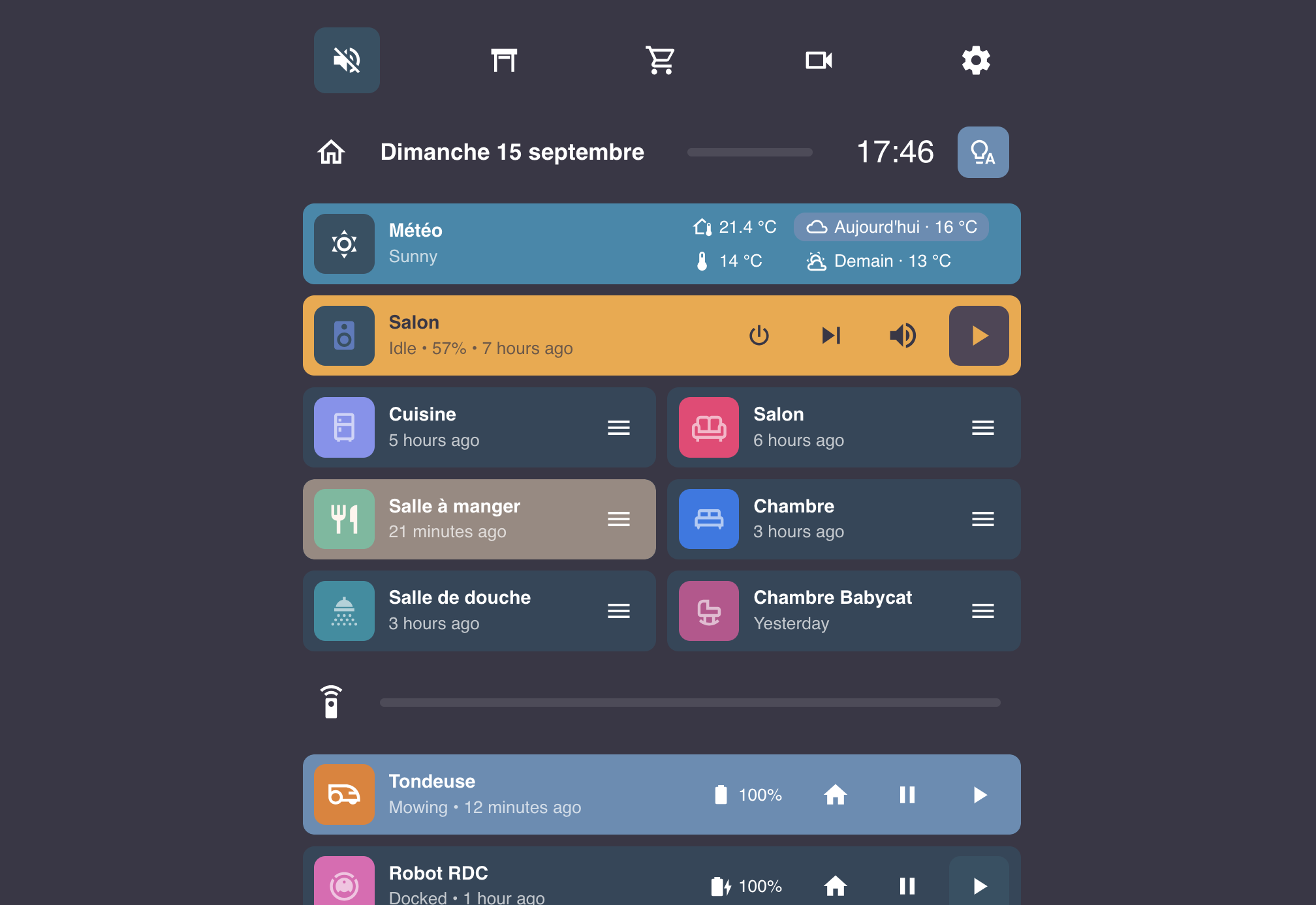


 New Features
 Bug Fixes and Optimizations