lutz108
January 20, 2024, 11:31pm
1
Hello
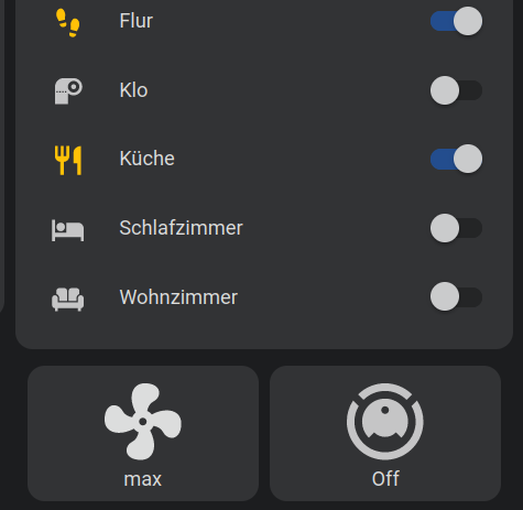
I’m trying to achieve an easy and minimal looking way of setting the fanspeed of my dreame running valetudo. I would like to have a simple fan icon button, that acts as a select. So whenever i click it, the dropdown shows up and the selected value will be send. Like using the select.valetudo_fan entity:
However without the select, or have it way more “minimal” as just the current value written under the fan.
I tried to create a button card that calls the select.valetudo_fan entity.
...
  - type: horizontal-stack
    cards:
      - type: custom:button-card
        tap_action:
          action: call-service
          service: input_select.select_option
          service_data:
            entity_id: select.valetudo_fan
            options:
              - high
              - mid
              - ...
        icon: mdi:fan
...
But that didn’t work and I found out, that the (input_)select.option service call is not the way to achieve that.
Is there any easy way to get this feature by using select.valetudo_fan entity our would I need work with a script to or similar to use the mqtt.publish service?
CO_4X4
January 21, 2024, 12:01am
2
I may not be understanding what you are asking but it sounds like you could use a select helper with automation for the commands and use a conditional card to show or hide the drop-down. Again, perhaps I’m not interpreting the issue properly.
lutz108
January 23, 2024, 12:23am
4
exactly like this , thanks for the hint
[...]
 - type: custom:layout-card
    layout_type: grid
    layout:
      grid-template-columns: 50% 50%
      grid-template-areas: |
        "A1 A2"
    cards:
      - type: horizontal-stack
        view_layout:
          grid-area: A1
        cards:
          - type: custom:button-card
            name: ''
            entity: select.valetudo_schlecki_fan
            show_state: true
            show_name: false
            styles:
              card:
                - font-size: 14px
              icon:
                - height: 64px
                - width: 64px
      - type: horizontal-stack
        view_layout:
          grid-area: A1
        cards:
          - type: custom:mushroom-select-card
            name: ' '
            entity: select.valetudo_schlecki_fan
            secondary_info: none
            icon_type: none
            fill_container: true
            container_title: false
            show_name: true
            show_title: false
            card_mod:
              style:
                mushroom-select-option-control$:
                  mushroom-select$: |
                    .mdc-select__anchor{
                      background: none !important;
                      border-radius: 12px !important;
                    }
                    .mdc-line-ripple::before {
                      border-bottom-width: 0px !important;
                    }
                    .mdc-line-ripple::after {
                      border-bottom-width: 0px !important;
                    }
                    .mdc-select__selected-text {
                      color: transparent !important;
                    }
                    .mdc-select__dropdown-icon {
                      fill: transparent !important;
                    }
                    .mdc-select {
                      position: absolute !important;
                      width: 100% !important;
                      --select-height: 97px;
                      top: 0%;
                      right: 0%;
                    }
                .: |
                  ha-card {
                   background: none;
                   height:100%;
                  }
      - type: horizontal-stack
        view_layout:
          grid-area: A2
        cards:
          - type: custom:button-card
            styles:
              card:
                - font-size: 14px
              icon:
                - height: 64px
                - width: 64px
            tap_action:
              action: call-service
              service: script.vacuum_clean_segments
[...]
need some small customization, but I’m happy
2 Likes
Great. Glad I could help
jlogan223
August 23, 2024, 1:31pm
6
I am looking for exactly this , but noticed the ability to customise the card, layout, text position, colour etc. Is very limited on this card. Any thoughts on any others? I use custom:button-card for everything. Just wish it had a drop down option
I also use button-card a lot.
Just add some card_mod and/or layout-card and you can customize everything.
type: custom:mod-card
style: |
  ha-card {
    border: solid 1px !important;
    background: blue !important;
  }
card:
  type: custom:layout-card
  layout_type: grid
  layout:
    grid-template-columns: 100%
    grid-template-areas: |
      "A1"
  cards:
    - type: horizontal-stack
      view_layout:
        grid-area: A1
      cards:
        - type: custom:button-card
          name: ' '
          show_state: false
          show_entity_picture: false
          show_icon: false
          styles:
            card:
              - height: 7rem
              - font-size: 1rem
              - font-weight: bold
              - background: green
            icon:
              - height: 4rem
              - width: 4rem
    - type: horizontal-stack
      view_layout:
        grid-area: A1
      cards:
        - type: custom:mushroom-select-card
          entity: input_select.ir_command_ac2_mode
          name: Mushroom Input select
          secondary_info: none
          icon_type: none
          fill_container: true
          card_mod:
            style:
              mushroom-select-option-control$:
                mushroom-select$: |
                  .mdc-select__anchor{
                    background: none !important;
                    border-radius: 10px !important;
                  }
                  .mdc-line-ripple::before {
                    border-bottom-width: 0px !important;
                  }
                  .mdc-line-ripple::after {
                    border-bottom-width: 0px !important;
                  }
                  .mdc-select__selected-text {
                    color: yellow !important;
                    text-shadow: none !important;
                    padding-bottom: 20px;
                  }
                  .mdc-select__dropdown-icon {
                    fill: transparent !important;
                  }
                  .mdc-select__ripple::before {
                    background: none !important;
                  }
                  .mdc-select__anchor:hover {
                    background-color: rgba(var(--rgb-grey), 0.2) !important;
                  }
                  .mdc-select {
                    position: absolute !important;
                    width: 100% !important;
                    --select-height: 7rem;
                    top: 0%;
                    right: 0%;
                  }
              .: |
                ha-card {
                 background: none;
                 #align-items: center !important;
                 padding-top: 30px;
                }
Another option is to customize the “select” entities:
type: custom:mod-card
card_mod:
 style:
   layout-card$:
     grid-layout$: |
       :host {
         padding: 0rem !important;
       }
       #root {
         margin: 0rem !important;
       }
       #root > * {
         margin: 0.2rem !important;
       }
   .: |
     ha-card  {
       border: solid 1px var(--primary-color) !important;
       background: transparent;
       margin-top: 0rem;
       margin-bottom: 0.5rem;
       --ha-card-background: none;
       --ha-card-border-color: none;
       --ha-card-border-width: 0px;
       height: 5rem;
       background: rgb(32, 33, 36);
       }
card:
 type: custom:layout-card
 layout_type: grid
 layout:
   grid-template-columns: 100%
   grid-template-rows: auto
   grid-template-areas: |
     "A1"
 cards:
   - type: custom:mod-card
     view_layout:
       grid-area: A1
     style:
       hui-horizontal-stack-card:
         $: |
           #root  {
             margin: 0.1rem !important;
             margin-top: 0rem !important;
             margin-bottom: 0rem !important;
             height: 3
           }
     card:
       type: horizontal-stack
       cards:
         - type: entities
           entities:
             - entity: select.winamp_radio
               icon: mdi:radio
               card_mod:
                 style:
                   ha-select $: |
                     .mdc-line-ripple::before,
                     .mdc-line-ripple::after {
                      border-bottom-style: none !important;
                     }
                     .mdc-select__anchor {
                       height: 4rem !important;
                       margin-top: 0.2rem !important;
                       margin-left: 2rem
                     }

                     .mdc-select__selected-text-container {
                       height: 4rem !important;
                       margin: 0rem !important;
                     }
                     span#label {
                       font-size: 0rem;
                       font-weight: 100;
                       align-self: end;
                       height: 1.5rem;
                     }

                     span.mdc-select__selected-text {
                       font-size: 2rem;
                       font-weight: 500;
                       align-self: center;
                       height: 2.5rem;
                     }
                   .: |
                     ha-select {
                       height: 4rem;
                       position: absolute;
                       top: -1.3rem;

                     }
                     :host {
                       --mdc-icon-size: 40px;
                       --mdc-select-ink-color: var(--primary-color);
                       --mdc-select-fill-color: transparent;
                     }
                     mwc-list-item {
                             line-height: 2rem;
                           }
                   hui-generic-entity-row:
                     $: |
                       state-badge {
                         display:;
                         position: absolute;
                         left: -0.5rem;
                         top: -0.5rem
                       }
           style: |
             ha-card {
               height: 4.5rem !important;
               --mdc-typography-subtitle1-font-size: 2rem !important;
               --mdc-menu-item-height: 2.5rem;
               }
1 Like
jlogan223
August 23, 2024, 7:59pm
8
looks like a got a lot of learning and reading up to do on this now. Thanks for the education.


