Clearly you haven’t even checked the examples there…
Answer: yes you can.
So what is the intended behavior? What is currently happening?
I thought I was following the doc but I must have something wrong. I am trying to modify a couple of CSS variables.
Here is my config:
              - type: light
                hold_action:
                  action: none
                entity: light.master_bedroom_light
                name: Master Bedroom
                card_mod:
                  style: |
                    ha-card {
                      --font-size: 1.7rem;
                      }
If I’m reading the inspector right, it appears as thought the card mod is being applied to the ha-card but in the wrong place.
Is anybody able to see what I’m doing wrong?
Change that to --name-font-size: 1.7rem !important;.
I posted the picture:

The font is changed but the text is not centrally aligned.
Spot on, thank you so much. Have just learnt so much from your post that you linked.
Clearly I cannot read or at least understand what I read :-). I can’t find an answer to my question there… at least not how I could use it.
This is my config:
Monitor 16:9
Test1 view - (in panel mode)
One Picture Elements Card Configuration
Picture used: 2748x1817 Pixel

Yaml for Picture Elements Card Configuration:
type: picture-elements
elements:
  - entity: sensor.ph
    style:
      color: blue
      left: 28.5%
      top: 18%
    type: state-label
    tap_action:
      action: more-info
  - entity: sensor.d1mini_01_sensor_1
    style:
      color: brown
      left: 58%
      top: 15%
    type: state-label
    tap_action:
      action: none
  - entity: sensor.esp32_02_22_humidity
    style:
      color: red
      left: 8%
      top: 36%
    type: state-label
    tap_action:
      action: more-info
  - type: state-icon
    entity: binary_sensor.pir_motion_sensor_toilet_01
    title: Toilet-01
    style:
      top: 53%
      left: 39%
      '--paper-item-icon-color': lightgreen
      '--paper-item-icon-active-color': red
  - type: state-label
    entity: counter.toilet_01_counter
    title: Toilet-01
    style:
      color: red
      top: 53%
      left: 39%
image: local/test1.png
Outcome:
Here I miss the bottom of the picture.
Test2 view - (in panel mode)
One Picture Elements Card Configuration
Picture used: 1421x1842 pixel

Yaml for Picture Elements Card Configuration:
type: picture-elements
image: /local/test2.png
style:
  transform: '‘translate(-50%, -50%)'
elements:
  - type: state-badge
    entity: sensor.d1mini_01_sensor_2_2
    style:
      top: 40%
      left: 20%
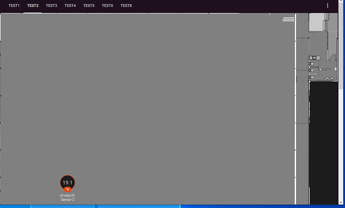
Outcome:
Here I miss half of the picture.
My question is:
Is there an option to:
Since I have really tried so much it is not doable anymore to reproduce what I have tried.
In the end I have tried all kinds of wrong things (css, cards, mods, Code copy, etc.). So I tried to ask my question the other way around initially. By writing it down as above I hope I will be able to get some help on how to scale a large image so it always fits the screen (mobile, 16:9, other browsers, browser in other format !=16:9, etc.)
I believe your issue is clear now.
And I believe the custom layout card is the solution for you.
Try to create a column or a grid with a column of 80% the screen size using:
Here is a great example of usage:
I think I have solved for now the
Edit I was too fast…
It is still not scaling:
I did the same as below…
Test1 view - (in panel mode) it now size along with the browser size. Thank you!
The second one
Test2 view - (in panel mode)
I cannot solve that. what I have done:
And then full panel mode with 1 picture
Picture Elements Card Configuration with yaml:But it keeps showing:
How can I size that to always fit the screen?
To be clear, your problem is with the height, correct?
In that case, your examples above, you should define for the row size instead of column.
Hi! May I know how can I make the pop up in the sidebar info looks like this — transparent with blurred back ground?
And the pop up in the dashboard looks like this?

Using the existing themes, it looks like this - dark box:
I have copied and pasted from IOS Dark Theme to Mattias’ themes.yaml but to no avail.
Yes, correct, how and where should I do that?
Try switching the same configuration you tested before, but defining % for rows.
![]()
Some experimentation with other cards will be very usefull.
Sory, I really do not know now what to do… should I change this:
layout:
  grid-template-columns: auto 30px 25%
  grid-template-rows: auto
  grid-template-areas: |
to this
layout:
  grid-template-columns: auto 30px 25%
  grid-template-rows: auto 30px 25%
  grid-template-areas: |
because that does not do anything. sorry I am not a programmer but wanting to learn. And this is too steap leaning for now… appreciate all the help I can get…
Thanks for this job
Found out a solution:

Changing a name’s width and margin-top are required.
      - entity: sensor.cleargrass_1_co2
        name: name font for a very long name
        style:
          ha-state-label-badge:
            $:
              ha-label-badge:
                $: |
                  .badge-container .title {
                    margin-top: 11px !important;
                  }
          .: |
            :host {
              --ha-label-badge-title-font-size: 7px;
              --ha-label-badge-title-width: 48px;
            }
Added it here (“Changing a font size for the name” part):
Badges: different styling
Where did you get those screenshots?
Hi! Those screenshots came from my Home Assistant based on the projects/contributions of Mattias_Persson, kalkih, basnijholt and the others.
Hi all,
I’m trying to change the margin in the following screenshot:
I’ve tried many variations of code. Here’s a MWE with the latest attempt at the bottom:
    type: 'custom:layout-card'
    layout_type: custom:grid-layout
    grid-template-columns: 25% 25% 25% 25%
    grid-template-rows: auto
    grid-template-area: |
      "1" "1" "1" "1"
      "2" "2" "2" "2"
      "3" "3" "3"
      "4" "4" "4"
      "5" "5" "5"
      "6" "6" "6"
    grid-gap: 0px
    cards:
      - type: 'custom:button-card'
        template: media_service
        variables:
          name: Plex
          service: media_player.select_source
          entity: media_player.living_room_tv
          type: source
          data: Plex
          picture: /local/ui/btns/plex.png
        view_layout:
          grid-area: 1
      - type: 'custom:button-card'
        template: media_service
        variables:
          name: Partage
          service: media_player.select_source
          entity: media_player.living_room_tv
          type: source
          data: Screen Share
          picture: /local/ui/btns/screenshare.png
        view_layout:
          grid-area: 1
      - type: 'custom:button-card'
        ...
      - type: 'custom:button-card'
        template: media_volume_vertical
        variables:
          service: media_player.volume_up
          picture: /local/ui/btns/volume_up_vertical.png
          top: 20%
        view_layout:
          grid-column: 4
          grid-row-start: 3
          grid-row-end: span 2
      - type: 'custom:button-card'
        template: media_volume_vertical
        variables:
          service: media_player.volume_down
          picture: /local/ui/btns/volume_down_vertical.png
          top: 0%
        view_layout:
          grid-column: 4
          grid-row-start: 5
          grid-row-end: span 2
    card_mod:
      style:
        $:
          grid-layout:
            $:
              div#root:
                button-card: |
                  #root > * {
                    margin: 0px !important;
                  }
Any ideas or tips?


