šŸ”¹ Card-mod - Add css styles to any lovelace card

You could try around with the Performance tab in the browser devtools.

1 Like

Thanks, I will investigate using that with both builds and report on Github.

Styling footer (or header):


This whole description outdated since HA 2021.12 when new "chip" buttons were presented.

Earlier I tried to understand the styling and faced some problem which was described here and here. The problem was not solved but I found a walkaround - and then decided not to worry about the problem (since there is another solution).

Resizing icons:
image

      - type: entities
        style: |
          .header-footer.footer {
            --mdc-icon-size: 50px;
            height: 50px;
          }    
        entities:
          - sun.sun
          - type: divider
        footer:
          type: buttons
          entities:
            - entity: binary_sensor.updater
            - entity: binary_sensor.updater

Note: this method allows to resize icons but do not align them with respect to the center of the card:
image

To make icons aligned, the following method must be used:

      - type: entities
        style:
          .header-footer.footer hui-buttons-header-footer$:
            hui-buttons-base$div: |
              state-badge {
                width: unset !important;
              }
          .: |
            .header-footer.footer {
              --mdc-icon-size: 50px;
              height: 50px;
            }    
        entities:
          - sun.sun
          - type: divider
        footer:
          type: buttons
          entities:
            - entity: binary_sensor.updater
            - entity: binary_sensor.updater

image

Colored icons:
Method #1 - works for all kind of entities including "sensor", "input_boolean", "binary_sensor", "sun.sun":
image

type: entities
card_mod:
  style:
    hui-buttons-header-footer$:
      hui-buttons-base$div: |
        state-badge {
          color: red;
        }    
entities:
  - sun.sun
  - type: divider
footer:
  type: buttons
  entities:
    - entity: sun.sun
    - entity: sun.sun
    - entity: sun.sun

Method #2 - same for some particular items:
image

type: entities
card_mod:
  style:
    hui-buttons-header-footer$:
      hui-buttons-base$div: |
        div:nth-child(1) state-badge {
          color: red;
        }    
        div:nth-child(3) state-badge {
          color: cyan;
        }    
entities:
  - sun.sun
  - type: divider
footer:
  type: buttons
  entities:
    - entity: sun.sun
    - entity: sun.sun
    - entity: sun.sun

Method #3 - changing "--paper-item-icon-color" & "--paper-item-icon-active-color" variables which define styles for binary_sensor, input_boolean, switch, sun.sun:
image

type: entities
card_mod:
  style: |
    .header-footer.footer {
      --paper-item-icon-active-color: orange;
      --paper-item-icon-color: grey;
    }    
entities:
  - sun.sun
  - type: divider
footer:
  type: buttons
  entities:
    - entity: sensor.cleargrass_1_co2
    - entity: sun.sun
    - entity: input_boolean.service_true_value

Changing a background:
image

type: entities
entities:
  - sun.sun
footer:
  type: buttons
  entities:
    - entity: sun.sun
    - entity: sun.sun
style:
  .header-footer.footer hui-buttons-header-footer:
    $: |
      hui-buttons-base {
        background-color: red;
      }

####### END of old style-buttons #######


Styling an image inside a footer:
By default the footerā€™ height is automatically set dependingly on the imageā€™s size:
image

type: entities
entities:
  - sun.sun
footer:
  type: picture
  image: >-
    https://www.home-assistant.io/images/lovelace/header-footer/balloons-header.png

Here is how to adjust the imageā€™s height to the cardā€™s height:
image

type: entities
entities:
  - sun.sun
footer:
  type: picture
  image: >-
    https://www.home-assistant.io/images/lovelace/header-footer/balloons-header.png
style:
  .header-footer.footer hui-picture-header-footer:
    $: |
      img {
        height: 100%;
      }
  .: |
    .header-footer.footer {
      height: 200px;
    }

P.S. Do you know that you can use a GIF?
11

type: entities
entities:
  - sun.sun
footer:
  type: picture
  image: 'https://i.gifer.com/Z23b.gif'
style:
  .header-footer.footer hui-picture-header-footer:
    $: |
      img {
        height: 100%;
      }
  .: |
    .header-footer.footer {
      height: 100px;
    }

qaws

  type: entities
  entities:
    - sun.sun
  footer:
    type: picture
    image: 'https://i.gifer.com/5uwq.gif'
  style:
    .header-footer.footer hui-picture-header-footer:
      $: |
        img {
          height: 100%;
        }
    .: |
      .header-footer.footer {
        height: 70px;
      }
      ha-card {
        --ha-card-background: black ;
        color: white;
      }

More examples are described here.

2 Likes

One thing I remembered: with card-mod 3.0 the syntax has changed. While the old syntax still works like Thomas mentioned in the changelog, I now wonder if using the old syntax could somehow cause a performance hit.

Old:

style:
  ... stuff here ...

New:

card_mod:
  style:
    ... stuff here ...

Since I use the old syntax, I figured maybe this can cause this. If itā€™s unknown, Iā€™ll re-create a dashboard with some elements using the new syntax and load 3.0. And then compare that with old syntax on 3.0 and use the performance tab. A lot of people still use the old syntax, so I find it odd no-one else has mentioned or experienced this performance hit.

But could be Iā€™m way off and the syntax has no influence (Iā€™m not experienced enough to make that assumption). I want to prevent wasting a lot of time in testing stuff that has no effect ofcourse.

I gonna ask some probably silly questions (sorry for broken English).

I have HA on RPi 3 (docker).
My HA setup includes 3 dashboards (for HA itself, for testing things, for testing card-mod), each dashboard includes lots (~10ā€¦20) of views.
This is all edited in UI, not in yaml files (I know nothing about yaml-mode, it is in my plans).
And I use an old card-mod syntax in most cases (99%).

Every time when I work with Inspector (Chrome, Win10x64) with views with card-mod, I observe a high CPU load on my PC (~40% load for Chrome).
Sometimes I have to restart Chrome since it becomes too slow.
When I do not use Inspector - it works quite fine.
And I usually use Inspector only for testing card-mod.
Q1: Is it normal for Chrome to become so slow when using an Inspector?
If not - should I change something in Chromeā€™s settings?

Also, as I understand, a code for some particular view works only when I open this view in my browser.
And some part of this code works on RPi, some part - on my PC.
That means that I can have lots of views in my HA setup, and it will not make my HA slower - unless I open some very complex view. But - this is just my opinion, my knowledge about HA internal structure is very poor.
Q2: Since I have a separate dashboard with ~20 views for testing card-mod - may it slow down my HA when I do not open this dashboard?

Meanwhile - a small Animation for bar-card:

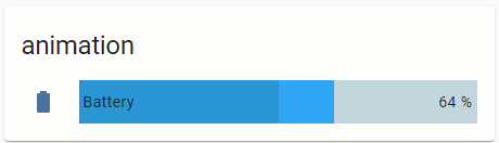
The progress is moving if the battery is charging.

type: 'custom:bar-card'
title: animation
columns: 1
entities:
  - entity: sensor.battery_life360_ildar_iphone_5s
    direction: right
    name: Battery
    icon: 'mdi:battery'
    height: 40px
    decimal: '0'
    min: '0'
    max: '100'
    target: '100'
style: |
  bar-card-row bar-card-card bar-card-background bar-card-targetbar {
    {% if is_state('binary_sensor.battery_charging_life360_ildar_iphone_5s','on') %}
    animation: filling 5s linear infinite;
    {% endif %}
    --bar-percent: 0 !important;
  }
  @keyframes filling {
    0% {
      --bar-target-percent: 0;
    }
    10% {
      --bar-target-percent: 10%;
    }
    20% {
      --bar-target-percent: 20%;
    }
    30% {
      --bar-target-percent: 30%;
    }
    40% {
      --bar-target-percent: 40%;
    }
    50% {
      --bar-target-percent: 50%;
    }
    60% {
      --bar-target-percent: 60%;
    }
    70% {
      --bar-target-percent: 70%;
    }
    80% {
      --bar-target-percent: 80%;
    }
    90% {
      --bar-target-percent: 90%;
    }
    100% {
      --bar-target-percent: 100%;
    }
  }
  bar-card-row bar-card-card bar-card-background bar-card-markerbar {
    display: none;
  }

More examples are described here.

5 Likes

Hi Guys,

I wonder if you can help me I am in the process of setting up my card for my air fresheners im 90% there but I canā€™t seem to figure out how to style the text input highlighted below:

using the following I have been able to change the font size:

--paper-input-container-shared-input-style_-_font-size: 12px;

but I canā€™t work out how to change the colour and justify the text to the right hand side. Any ideas?

Youā€™ll probably need to shadow-root into it.

Styling an "input-text" row inside the Entities card:

Update (21.06.22): the post is updated with styles for MDC controls; old styles (see at the bottom of the post) do not work since 2022.3.


Colored name:
Two methods are available:
ā€“ using a CSS variable;
ā€“ using a CSS property with a detailed DOM navigation.

image

Notes:
1.The 1st method - the nameā€™s color changes if an input field is selected (from " --mdc-text-field-label-ink-color" to ā€œ--mdc-theme-primaryā€).
2.The 2nd method - allows to change a color permanently (whether the input field is selected or not).

code
          - entity: input_text.test_text
            name: Colored name (method 1)
            card_mod: &ref_card_mod_red_text_host
              style: |
                :host {
                  --mdc-text-field-label-ink-color: red;
                }
          - entity: input_text.test_text
            name: Colored name (method 2)
            card_mod: &ref_card_mod_red_text_dom
              style:
                ha-textfield $: |
                  span#label {
                    color: red;
                  }
          - entity: input_text.test_text
            name: default

How to style several rows:
image

Note that a common style may be overwritten for some particular entity.

code
      - type: entities
        title: Colored name for all entities
        card_mod:
          style:
            .card-content:
              div:
                hui-input-text-entity-row $ hui-generic-entity-row ha-textfield $: |
                  span#label {
                    color: orange;
                  }
        entities:
          - entity: input_text.test_text
            name: Cannot be overwritten
            card_mod:
              style: |
                :host {
                  --mdc-text-field-label-ink-color: red !important;
                }
          - entity: input_text.test_text
            name: Overwritten style
            card_mod: &ref_card_mod_overwritten_text
              style:
                ha-textfield $: |
                  span#label {
                    color: red !important;
                  }
          - entity: input_text.test_text
            name: Colored name (common)

Colored icon:
Two methods are available:
ā€“ using a CSS variable;
ā€“ using a CSS property with a detailed DOM navigation.

image

code
      - type: entities
        title: Colored icon for some entity
        entities:
          - entity: input_text.test_text
            name: 'Colored icon (method #1)'
            card_mod:
              style: |
                :host {
                  --paper-item-icon-color: red;
                }
          - entity: input_text.test_text
            name: 'Colored icon (method #2)'
            card_mod:
              style:
                hui-generic-entity-row $: |
                  state-badge {
                    color: red;
                  }      
          - entity: input_text.test_text
            name: default

How to style several rows:
image

Note that a common style may be overwritten for some particular entity.

code
      - type: entities
        title: Colored icon for all entities
        card_mod:
          style: |
            ha-card {
              --paper-item-icon-color: cyan;
            }
        entities:
          - entity: input_text.test_text
            name: Overwritten color
            secondary_info: last-changed
            card_mod:
              style: |
                :host {
                  --paper-item-icon-color: red;
                }
          - entity: input_text.test_text
            name: Colored icon (common)
          - entity: input_text.test_text
            name: Colored icon (common)

Some other styles for an icon - resized icon, hidden icon:
image

code
      - type: entities
        title: Other styles for icon
        entities:
          - entity: input_text.test_text
            name: resized icon
            card_mod:
              style: |
                :host {
                  --mdc-icon-size: 40px;
                }
          - entity: input_text.test_text
            name: hidden icon
            card_mod:
              style:
                hui-generic-entity-row $: |
                  state-badge {
                    display: none;
                  }

Colored value:
Two methods are available:
ā€“ using a CSS variable;
ā€“ using a CSS property with a detailed DOM navigation.

image

code
      - type: entities
        title: Colored value
        entities:
          - entity: input_text.test_text
            name: colored value (method 1)
            card_mod:
              style: |
                :host {
                  --mdc-text-field-ink-color: red;
                }
          - entity: input_text.test_text
            name: colored value (method 2)
            card_mod:
              style:
                ha-textfield $: |
                  .mdc-text-field__input {
                    color: red !important;
                  }
          - entity: input_text.test_text
            name: default

Colored fieldā€™s background:
image

code
      - type: entities
        title: Colored background
        entities:
          - entity: input_text.test_text
            name: colored background
            card_mod:
              style: |
                :host {
                  --mdc-text-field-fill-color: lightgreen;
                }
          - entity: input_text.test_text
            name: default

Colored underline:
The underline had 3 possible states:
ā€“ a default (static) state;
ā€“ the input field is hovered by a mouse;
ā€“ the input field is selected by a mouse.

There are CSS variables for each state.
In the example below:
ā€“ the 1st row is modded by using these CSS variables;
ā€“ the 2nd row is modded by changing CSS properties with a detailed DOM navigation;
ā€“ the 3rd row has transparent underlines.

it1

code
      - type: entities
        title: Colored underline
        entities:
          - entity: input_text.test_text
            name: colored underline (method 1)
            card_mod:
              style: |
                :host {
                  --mdc-text-field-idle-line-color: red;
                  --mdc-text-field-hover-line-color: cyan;
                  --mdc-theme-primary: magenta;
                }
          - entity: input_text.test_text
            name: colored underline (method 2)
            card_mod:
              style:
                ha-textfield $: |
                  .mdc-line-ripple::before {
                    border-bottom-color: orange !important;
                  }
                  .mdc-line-ripple::after {
                    border-bottom-color: magenta !important;
                  }
          - entity: input_text.test_text
            name: no underline
            card_mod:
              style:
                ha-textfield $: |
                  .mdc-line-ripple::before,
                  .mdc-line-ripple::after {
                    border-bottom-style: none !important;
                  }
          - entity: input_text.test_text
            name: default

Making the name hidden or more compact:
Since the row has a bigger height than other entity rows, we may want to make a row more compact.
First, we need to customize the rowā€™s height.
Next, there are 2 options for a name & a value:
ā€“ remove the name;
ā€“ place the name and the value closer to each other.

image

code
  - type: entities
    title: Hidden/compact name
    entities:
      - entity: input_text.test_text
        name: custom
        card_mod:
          style:
            ha-textfield $: |
              .mdc-text-field {
                height: 40px !important;
              }
              .mdc-text-field__input {
                align-self: center;
              }
              span#label {
                display: none;
              }
            .: |
              ha-textfield {
                height: 40px;
              }
      - entity: input_text.test_text
        name: custom
        card_mod:
          style:
            ha-textfield $: |
              .mdc-text-field {
                height: 40px !important;
              }
              .mdc-text-field__input {
                align-self: end;
              }
            .: |
              ha-textfield {
                height: 40px;
              }
      - entity: input_text.test_text
        name: default

How to disable an input_text row:
Two methods are available:
ā€“ the row is displayed as disabled;
ā€“ the row only has a read-only input field.

image

code
  - type: entities
    title: Locked input_text
    entities:
      - entity: input_boolean.test_boolean
        name: Lock input_text
      - entity: input_text.test_text
        name: disabled
        tap_action:
          action: none
        card_mod:
          style: |
            :host {
              {% if is_state('input_boolean.test_boolean','on') %}
                --mdc-text-field-ink-color: var(--disabled-text-color);
                --mdc-text-field-label-ink-color: var(--disabled-text-color);
                --mdc-text-field-idle-line-color: var(--disabled-text-color);
                --paper-item-icon-color: var(--disabled-text-color);
                pointer-events: none;
              {% endif %}
            }
      - entity: input_text.test_text
        name: read-only
        tap_action:
          action: none
        card_mod:
          style: |
            :host {
              {% if is_state('input_boolean.test_boolean','on') %}
                pointer-events: none;
              {% endif %}
            }

Short list of CSS variables available for ā€œtextfieldā€ control:


Old styles - not valid since HA 2022.3

Colored name:
image
Method #1:

type: entities
entities:
  - entity: input_text.test_text
    style:
      hui-generic-entity-row:
        $: |
          .info {
            color: red;
          }

Method #2:

type: entities
entities:
  - entity: input_text.test_text
    style: |
      :host {
        color: red;
      }

Colored value:
image
Method #1:

type: entities
entities:
  - entity: input_text.test_text
    style:
      hui-generic-entity-row:
        paper-input:
          $: |
            paper-input-container iron-input {
              color: red;
            }

Method #2:

type: entities
entities:
  - entity: input_text.test_text
    style: |
      :host {
        --paper-input-container-input-color: red;
      }

Colored background:
image
Method #1:

type: entities
entities:
  - entity: input_text.test_text
    style:
      hui-generic-entity-row:
        paper-input:
          $: |
            paper-input-container iron-input {
              background-color: orange;
            }

Method #2:

type: entities
entities:
  - entity: input_text.test_text
    style: |
      :host {
        --paper-input-container-shared-input-style_-_background: orange;
      }

Aligned value:
image
Method #1:

type: entities
entities:
  - entity: input_text.test_text
    style:
      hui-generic-entity-row:
        paper-input:
          $: |
            paper-input-container iron-input {
              text-align: right;
            }

Method #2:

type: entities
entities:
  - entity: input_text.test_text
    style: |
      :host {
        --paper-input-container-input_-_text-align: right;
      }

Wrapping a text for the name:
By default a long name is clipped:
image

type: entities
entities:
  - entity: input_text.test_text
    name: long long long long long long long

How to enable wrapping:
image

type: entities
entities:
  - entity: input_text.test_text
    name: long long long long long long long
    style:
      hui-generic-entity-row:
        $: |
          .info {
            text-overflow: unset !important;
            white-space: unset !important;
          }

Changing a width of the input field:
image
Method #1:

type: entities
entities:
  - entity: input_text.test_text
    style:
      hui-generic-entity-row:
        paper-input:
          $: |
            paper-input-container iron-input {
              width: 300px;
            }

Method #2:

type: entities
entities:
  - entity: input_text.test_text
    style: |
      :host {
        --paper-input-container-shared-input-style_-_width: 300px;
      }

Hidden name:
image

type: entities
entities:
  - entity: input_text.test_text
    style:
      hui-generic-entity-row:
        $: |
          .info {
           display: none;
          }
        paper-input:
          $: |
            paper-input-container iron-input {
              --paper-input-container-shared-input-style_-_width: 400px;
            }

Colored underline:
image
image
Method #1:

type: entities
entities:
  - entity: input_text.test_text
    style:
      hui-generic-entity-row:
        paper-input:
          $:
            paper-input-container:
              $: |
                .underline .unfocused-line {
                  border-color: orange;
                }
                .underline .focused-line {
                  border-color: red;
                }

Method #2:

type: entities
entities:
  - entity: input_text.test_text
    style: |
      :host {
        --paper-input-container-focus-color: red;
        --paper-input-container-color: orange;
      }

Disabled control:
image

type: entities
title: Locked input_text
entities:
  - entity: input_boolean.test_boolean
    name: Lock input_text
  - entity: input_text.test_text
    tap_action:
      action: none
    card_mod:
      style: |
        :host {
          {% if is_state('input_boolean.test_boolean','on') %}
            --paper-item-icon-color: var(--disabled-text-color);
            --paper-input-container-color: var(--disabled-text-color);
            --paper-input-container-input-color: var(--disabled-text-color);
            color: var(--disabled-text-color);
            pointer-events: none;
          {% endif %}
        }

Also, you may remove color options to make the row clearly visible but ā€œread-onlyā€.


More examples are described here.

5 Likes

Thank you so much, was really pulling my hair out over this one.

Iā€™m super noob but simply want to reduce the size of the fonts in my card. Have it working in some cards but canā€™t see to get it working in this horizontal card. In my codef iā€™m just applying it for now in 2 of the cards in the stack. Iā€™d also like to control the font size of the horizontal stack card itself (the title).

Appreciate any help to get me startedā€¦

type: horizontal-stack
title: Living Room
cards:
  - type: button
    tap_action:
      action: toggle
    entity: scene.living_room_hang
    name: Hang Scene
    icon_height: '-4px'
  - type: light
    entity: light.living_room_fireplace
    double_tap_action:
      action: toggle
    name: Fireplace
    card_mod:
      style: |
        ha-card {
        font-size: 10px;
        }
  - type: gauge
    entity: sensor.living_room_trisensor_temperature_measurement
    min: 0
    max: 100
    name: Temp
    card_mod:
      style: |
        ha-card {
        font-size: 8px;
        }
  - type: light
    entity: light.living_room_walls
    double_tap_action:
      action: toggle
    name: Walls
type: 'custom:mod-card'
style:
  hui-vertical-stack-card$: |
    .card-header {
      font-size: 10px !important;
    }
card:
  type: vertical-stack
  title: Changed font
  cards:
  ###################
1 Like

Thanks! I tried all kinds of combinations but canā€™t seem to get it formatted or added to my code properly.

So does this ā€œcustom:mod-cardā€ type snippet go at the top of the card before my horizontal stack code?

In meantime iā€™ll spend more time understanding how the custom:mod-card fits into all of thisā€¦

card mod is extention to existing cards. it allows to style html entities inside the card. you use it by adding style attribute to every card definition.

However sometimes card-mod cannot reach some outer html objects (styling allows to apply styles to children items while some cards has outer objects unavailable to card-mod). mod-card creates a container with your card inside. This way your whole card turns into mod-cardā€™s child element, allowing to style it from mod-card level

Some examples of using "::before", "::after" & "content":
Note: may be used with many Lovelace cards (I hope).

NOTE:
Do not forget to add a "card_mod:" keyword before "style:" (new in card-mod 3).

Prefix & suffix:
image

type: entities
entities:
  - entity: sun.sun
  - entity: sun.sun
    style:
      hui-generic-entity-row $: |
        .text-content.pointer:not(.info) {
          color: red;
        }
        .text-content.pointer:not(.info)::before {
          content: "XXX - ";
          color: magenta;
        }
        .text-content.pointer:not(.info)::after {
          content: " (elevation {{state_attr(config.entity,'elevation')}})";
          color: orange;
        }
  - entity: sensor.iphone_5s_battery_level
    style:
      hui-generic-entity-row: |
        .text-content {
          color: red;
        }
        .text-content::before {
          content: "Level: ";
          color: red;
        }
        .text-content::after {
          content: " ({{states('sensor.iphone_5s_battery_state')}})";
          color: magenta;
        }

+ undocumented feature for "secondary_info":
image

type: entities
entities:
  - entity: sun.sun
    secondary_info: true
    style:
      hui-generic-entity-row:
        $: |
          .info .secondary {
            color: red;
          }
          .info .secondary::before {
            content: "Elevation: ";
            color: red;
          }
          .info .secondary::after {
            content: "{{state_attr(config.entity,'elevation')}}";
            color: magenta;
          }

ā€œUndocumentedā€ means that you can use also "secondary_info: bla_bla_bla" instead of "secondary_info: true", it will create a "div" element anyway.

Math operations:
image

type: entities
entities:
  - entity: sensor.cleargrass_1_co2
    style:
      hui-generic-entity-row: |
        .text-content {
          color: red;
        }
        .text-content::before {
          content: "{{states(config.entity)|int/10}} (divided), ";
          color: magenta;
        }

Replacing a value:
image
For the Entities card it is enough to set a transparent color for the element keeping the state:

type: entities
entities:
  - entity: sensor.network_throughput_in_eth0_mbits
    name: Network throughput
  - entity: sensor.network_throughput_in_eth0_mbits
    name: Network throughput
    style:
      hui-generic-entity-row: |
        .text-content::after {
          content: "{{states(config.entity)|float*1024}} KBit/s";
          color: var(--primary-text-color);
        }
        .text-content {
          color: transparent;
        }

But for the Glance card I have to set a zero font-size:
image

type: glance
entities:
  - entity: sensor.network_throughput_in_eth0_mbits
    name: Network throughput
  - entity: sensor.network_throughput_in_eth0_mbits
    name: Network throughput
    style: |
      :host div:not(.name)::after {
        content: "{{states(config.entity)|float*1024}} KBit/s";
        font-size: var(--mdc-typography-body1-font-size, 1rem);
      }
      :host div:not(.name) {
        font-size: 0px;
      }

One more example for ā€œinput_booleanā€ entity:
image

type: glance
entities:
  - entity: input_boolean.test_boolean
    name: default
  - entity: input_boolean.test_boolean
    name: modded
    style: |
      :host div:not(.name)::after {
        content: "{% if is_state(config.entity,'on') -%}
                  switched ON
                  {%- else -%}
                  switched OFF
                  {%- endif %}";
        font-size: var(--mdc-typography-body1-font-size, 1rem);
      }
      :host div:not(.name) {
        font-size: 0px;
      }

For "multiple-entity-row" it is much tricky:
image
The original value must be transparent & placed on the next line whose height must be set to 0px:

type: entities
entities:
  - type: 'custom:multiple-entity-row'
    style: |
      .entities-row div.entity:nth-child(1) div::before {
        color: orange;
        content: {%if is_state('sun.sun','above_horizon') -%} "Rise and shine\A" {%- else -%} "Sleep well\A" {%- endif %};
        line-height: var(--mdc-typography-body1-line-height, 1.5rem);
      }
      .entities-row div.entity:nth-child(1) div {
        color: transparent;
        line-height: 0px;
      }
    entity: sun.sun
    entities:
      - entity: sun.sun
        name: xxx
        styles:
          width: 60px
      - entity: sun.sun
        name: xxx
        styles:
          width: 60px
    unit: ''
    icon: ''
    toggle: false
    show_state: false
    state_header: ''
    state_color: false

For badges inside "picture-elements" card:
This trick may be useful since there is no possibility to display any text for the entityā€™s name (BTW, for badges displayed on the top of views this possibility is present - a ā€œnameā€ property).
image

type: picture-elements
image: /local/images/blue.jpg
style: |
  ha-card { height: 130px !important; }
elements:
  - type: state-badge
    entity: sensor.cleargrass_1_co2
    style:
      top: 18%
      left: 10%
  - type: state-badge
    entity: sensor.cleargrass_1_co2
    style:
      top: 18%
      left: 30%
    card_mod:
      style:
        ha-state-label-badge:
          $:
            ha-label-badge:
              $:
                .badge-container: |
                  .title {
                    color: transparent;
                    line-height: 0px !important;
                  }
                  .title::before {
                    color: var(--primary-text-color);
                    content: "New name\A";
                    line-height: normal;
                  }

For icons inside ā€œpicture-elementsā€ card:
image
Described here.

custom:multiple-entity-row:
How to display "last-changed" for items:

described here

custom:mini-graph-card:
How to display an additional info on the card:

described here

Any card with a title:
How to add a small header:

described here


More examples are described here.

4 Likes

Iā€™m trying to use style my markdown-card with the help of card-mod.
But whatever I am trying, nothing wil change the format of the markdown-card.
What am I doing wrong?

      - type: markdown
        style: |
          ha-card {
            font-size: 20px;
            font-family: Quicksand;
            height: 30px;
            background: none;
          }
          ha-markdown {
            padding: 0px 0px 0px 8px !important;
            border-left: 3px solid var(--accent-color);
          }
        content: 'Modi'
2 Likes

Styling vertical-stack (horizontal-) card.

Styling a title:
image
Method #1:

type: 'custom:mod-card'
style: |
  ha-card {
    --ha-card-header-color: red;
    --ha-card-header-font-size: 10px;
  }
card:
  type: vertical-stack
  title: Changed font for title
  cards:
    - type: entities
      entities:
        - entity: sun.sun
        - entity: sun.sun
    - type: entity
      entity: sun.sun

Method #2:

type: 'custom:mod-card'
style:
  hui-vertical-stack-card$: |
    .card-header {
      font-size: 10px !important;
      color: red !important;
    }
card:
  type: vertical-stack
  title: Changed font for title
  cards:
    - type: entities
      entities:
        - entity: sun.sun
        - entity: sun.sun
    - type: entity
      entity: sun.sun

Colored header:
image

type: 'custom:mod-card'
style:
  hui-vertical-stack-card$: |
    .card-header {
      background-color: green;
    }
card:
  type: vertical-stack
  title: Some title
  cards:
    - type: entities
      entities:
        - entity: sun.sun
        - entity: sun.sun
    - type: entity
      entity: sun.sun

Colored background:
image

type: 'custom:mod-card'
style: |
  ha-card {
    background-color: red;
  }
card:
  type: vertical-stack
  title: Colored background
  cards:
    - type: entities
      entities:
        - entity: sun.sun
        - entity: sun.sun
    - type: entity
      entity: sun.sun

Using an image for the background:
image
Notes:

  1. The "--ha-card-background" variable is used to style the child cards.
  2. The background image is stretched to fit the cardā€™s size.
type: 'custom:mod-card'
style: |
  ha-card {
    background-image: url('/local/images/blue_low_2.jpg');
    background-size: 100% 100%;
    --ha-card-background: rgba(50,50,50,0.3);
  }
card:
  type: vertical-stack
  title: Image for background
  cards:
    - type: entities
      entities:
        - entity: sun.sun
        - entity: sun.sun
    - type: entity
      entity: sun.sun

Using an image for the header:
image

type: 'custom:mod-card'
style:
  hui-vertical-stack-card$: |
    .card-header {
      background-image: url('/local/images/blue_low_2.jpg');
      background-size: 100% 100%;
    }
card:
  type: vertical-stack
  title: Image for background
  cards:
    - type: entities
      entities:
        - entity: sun.sun
        - entity: sun.sun
    - type: entity
      entity: sun.sun

More styles for vertical-stack:

type: custom:mod-card
card_mod:
  style:
    hui-vertical-stack-card $: |
      hui-card:nth-of-type(1) {
        --ha-card-background: rgba(50,50,50,0.7);
        margin: 0px 150px 150px 20px;
      }
      hui-card:nth-of-type(2) {
        --ha-card-background: rgba(50,50,50,0.1);
        margin: 0px 20px 20px 150px;
      } 
    .: |
      ha-card {
        background-image: linear-gradient(to right, red,orange,yellow,green,blue,indigo,violet);
        --ha-card-header-color: white;
        --ha-card-header-font-size: 40px;
        height: 500px !important;
        border: 4px solid black;
      }
card:
  type: vertical-stack
  title: Some title
  cards:
    - type: entities
      entities:
        - entity: sun.sun
        - entity: sun.sun
    - type: entity
      entity: sun.sun

More styles for horizontal-stack:
Example #1:
image

type: 'custom:mod-card'
style:
  hui-horizontal-stack-card$: |
    hui-entities-card {
      margin-left: 10px !important;
      margin-bottom: 10px !important;
      --ha-card-background: rgba(50,50,50,0.1);
    }
    hui-entity-card {
      margin-right: 10px !important;
      margin-bottom: 10px !important;
      --ha-card-background: rgba(50,50,50,0.7);
    }
  .: |
    ha-card {
      background-color: lightblue;
    }
card:
  type: horizontal-stack
  title: Some title
  cards:
    - type: entities
      entities:
        - entity: sun.sun
        - entity: sun.sun
        - entity: sun.sun
    - type: entity
      entity: sun.sun

Example #2:
image

type: 'custom:mod-card'
style:
  hui-horizontal-stack-card$: |
    hui-entities-card {
      margin-left: 10px !important;
      margin-right: 10px !important;
      margin-bottom: 10px !important;
      width: 150%;
      flex: auto !important; 
    }
    mini-graph-card {
      margin-right: 10px !important;
      margin-bottom: 10px !important;
      flex: auto !important; 
    }
  .: |
    ha-card {
      background-color: lightblue;
      --ha-card-background: rgba(50,50,50,0.1);
    }
card:
  type: horizontal-stack
  title: Some title
  cards:
    - type: entities
      entities:
        - entity: sun.sun
        - entity: sun.sun
        - entity: sun.sun
    - type: 'custom:mini-graph-card'
      entities:
        - sensor.cleargrass_1_co2
      hours_to_show: 12
      points_per_hour: 60
      show:
        name: false
        icon: false

Example #3:
ŠøŠ·Š¾Š±Ń€Š°Š¶ŠµŠ½ŠøŠµ

type: custom:mod-card
card_mod:
  style:
    hui-horizontal-stack-card $: |
      div#root > :first-child > * {
        width: 30%;
        flex: auto; 
      }
      div#root > :last-child > * {
        width: 70%;
        flex: auto; 
      }
card:
  type: horizontal-stack
  cards:
    - type: entity
      entity: sun.sun
    - type: custom:tabbed-card
      tabs:
        ...

Align a title: (added in 2024.6)
ŠøŠ·Š¾Š±Ń€Š°Š¶ŠµŠ½ŠøŠµ

type: custom:mod-card
card_mod:
  style: |
    ha-card {--ha-stack-title-text-align: end;}
card:
  type: vertical-stack
  title: xxxxxxxxxx
  cards:
    - type: entity
      entity: sun.sun
    - type: button
      entity: sun.sun

More examples are described here.

3 Likes

You need to shadow-root for that, I think.

How would I do that?
Nothing is working. Is the markdown card even stylable?

This is what I got with your code:


Is it what you expect?
If yes - may be you do not have card-mod installed.
If no - what is wrong?