You may have a default box-shadow setting applied in your theme.
Try this under your image:
style:
  box-shadow: none
You may have a default box-shadow setting applied in your theme.
Try this under your image:
style:
box-shadow: none
not working
I have a picture elements card where I wish to change the opacity of the background depending on the sun state
          type: picture-elements
          image: /local/floorplan2/lights/floorplan-dark.png
          style: |
            ha-card:first-child {
              background: rgba(87, 87, 74, 1);
              width: 100%;
              margin: 0 auto;
             }
I have a sensor (which works) called sensor.sunlight_opacity
Can I somehow use this sensor to change the alpha “1” value in the rgba
I already use this sensor in my config for opacity
opacity: '${ states[''sensor.sunlight_opacity''].state }'
This results in a value between 0 and 1
Can you let me see how you made this?
found it
:host {
   --paper-item-icon-active-color: red;
   --paper-item-icon-color: #5A5A5A;
}
Yes, I centered my picture element with a blank custom button card.
type: custom:button-card
color_type: blank-card
styles:
  card:
    - width: 50px
tap_action:
  action: toggle
name: offset
show_name: false
If you don’t enter a width all cards will be the same size. If you want a bigger picture-element you just have to make the blank cards a little smaller like in my example and the picture-element will get bigger.
Ofc if your picture-element sais square it will still be square
How to add a small header to a card:
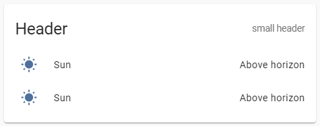
type: entities
title: Header
entities:
  - sun.sun
  - sun.sun
card_mod:
  style: |
    .card-header {
      display: flex;
      flex-direction: row;
    }
    .card-header::after {
      flex: 1 1 50%;
      color: var(--secondary-text-color);
      font-size: 1rem;
      text-align: right;
      content: "small header";
    }
More examples are described here.
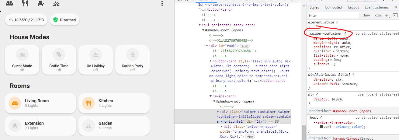
Could someone point me in the right direction of styling the custom:swipe-card. I’m specifically trying to style the .swiper-container class to fix the drop shadow cut off, but I’m getting lost in #shadow-root notation.
EDIT:
For anyone else stumbling across this, I got it working with the below:
              - type: custom:mod-card
                style:
                  swipe-card$: |
                    .swiper-container {
                      padding: 0px 2px 4px !important;
                      margin-left: -2px !important;
                      margin-right: -2px !important;
                    }
Is it possible to hide icon and state as in entities card?
show_icon: false
show_state: false
before recent frontend changes, or maybe the graph changes, I had an entities card with several graphs and pictures, and a few listings, which I post below. As you can see I had a card-mod in place, to spread the graphs nicely and use the available width to the max, with the same adjustments I use for all other cards on left and right side, being -16px, which I use throughout my complete config. However, using it now makes the card too wide and overlap the other cards in the view. Using anything less doesnt really help.
Upon first load it seems to work, but a seconds refresh make the card too wide again. So I am now left with this un modded history-graph’s, which are not using the available space at all. Hope anyone of you can see what to do? thanks!
  - type: entities
    entities:
      - type: custom:hui-element
        card_type: picture-entity
        card_mod:
          style: |
            ha-card.type-picture-entity {
              box-shadow: none;
              margin: -16px -16px 0px -16px;
            }
        entity: input_boolean.ventilate
        name: Ventilate
        image: /local/images/ventilate.png
        state_filter:
          'off': grayscale(72%)
        tap_action:
          action: toggle
        hold_action:
          action: more-info

      - type: custom:hui-element
        card_type: glance
        columns: 4
        card_mod:
          style: |
            ha-card {
              box-shadow: none;
              margin: 0px -16px 0px -16px;
            }
        entities:
          - entity: binary_sensor.schimmel_alert
            name: Alert
            show_last_changed: true
          - entity: sensor.co2_living
            name: Co2
          - entity: sensor.temperatuur_living
            name: Temp
          - entity: sensor.luchtvochtigheid_living
            name: Vocht
          - entity: sensor.schimmel_sensor
            name: Schimmel
          - entity: binary_sensor.humidity_living_low
            name: Hum Living low

      - type: custom:hui-element
        card_type: history-graph
        card_mod:
          style: |
            ha-card {
              box-shadow: none;
            /*  margin: 0px -16px 0px -16px; */
            }
        entities:
          - entity: sensor.co2_living_statistics
            name: Co2
          - entity: sensor.temp_living_statistics
            name: Temp Living
          - entity: sensor.humid_living_statistics
            name: Vocht
          - entity: sensor.schimmel_sensor
            name: Schimmel

      - type: custom:fold-entity-row
        head:
         type: section
         label: Living climate daystart
        padding: 0
        entities:
          - sensor.co2_living_daystart
          - sensor.luchtvochtigheid_living_daystart
          - sensor.temperatuur_living_daystart

      - type: custom:fold-entity-row
        head:
         type: section
         label: Climate automations
        padding: 0
        entities:
          - entity: automation.vocht_living_te_laag
            secondary_info: last-triggered
          - entity: automation.average_indoor_temp
            secondary_info: last-triggered
          - entity: automation.ventileren_aan
            secondary_info: last-triggered
          - entity: automation.ventileren_uit
            secondary_info: last-triggered
un-modded:
modded first load:
and after a reload once again:
I made it work with template-entity-row.
Check this:
type: entities
entities:
  - entity: sun.sun
  - entity: sun.sun
    card_mod:
      style: |
        :host .text-content {
          display: none;
        }
  - entity: sun.sun
    card_mod:
      style:
        hui-generic-entity-row:
          $: |
            state-badge {
              display: none;
            }
  - entity: sun.sun
    card_mod:
      style:
        hui-generic-entity-row:
          $:
            state-badge:
              $: |
                ha-icon {
                  display: none;
                }

Nobody can help me with my question regarding the restriction card?
I have a similar issue with badge card. I can’t style it.
Doing it in the inspector works fine, but in lovelace, it does not work:
type: custom:badge-card
badges:
  - entity: person.one
  - entity: person.two
  - entity: person.three
card_mod:
  style: |
    div#badges {
      transform: scale(0.5);
      color:red;
      }
Isn’t there a guide somewhere how to exactly pinpoint and then represent with card_mod the DOM element you want to style?
I checked those already.
But it turns out I’m just very stupid and didn’t read all documentation again (it’s been a while I played with card_mod and thought I remembered stuff), it seems for some cards you need to create a custom:mod-card around the card to be able to style it. The restriction card is starting to work now 
Check this:
type: vertical-stack
cards:
  - type: custom:badge-card
    badges:
      - entity: sun.sun
      - entity: sun.sun
      - entity: sun.sun
  - type: custom:mod-card
    card:
      type: custom:badge-card
      badges:
        - entity: sun.sun
        - entity: sun.sun
        - entity: sun.sun
    card_mod:
      style:
        badge-card:
          $: |
            div#badges {
              transform: scale(0.5);
              color:red;
            }

As far as I understood for styling all badges you need to use mod-card.
But for styling some particular badge you do not need it:
type: custom:badge-card
badges:
  - entity: sun.sun
  - entity: sensor.cleargrass_1_co2
    name: CO2
    card_mod:
      style:
        ha-state-label-badge:
          $:
            ha-label-badge:
              $: |
                .badge-container .label-badge .label span {
                  border-style: solid;
                  border-color: green;
                  color: blue;
                  background-color: magenta;
                 }
                .badge-container .title {
                  color: orange;
                }
            .: |
              ha-label-badge {
                --label-badge-background-color: yellow;
                --label-badge-text-color: red;
                --label-badge-red: cyan;
              }

Styles for badges are explained here.
How to add a “normal” background:
By default the badge card does not have a border & background:
  - type: custom:mod-card
    card:
      type: custom:badge-card
      badges:
        - entity: sun.sun
    card_mod:
      style: |
        ha-card {
          background: var(--ha-card-background,var(--card-background-color,#fff));
          box-shadow: var(--ha-card-box-shadow, none);
          border-radius: var(--ha-card-border-radius, 12px);
          border-width: var(--ha-card-border-width, 1px);
          border-style: solid;
          border-color: var(--ha-card-border-color,var(--divider-color,#e0e0e0));
        }

Also, it is possible to add a top/bottom paddings to the card.
More examples are described here.
Been searching for several hours without joy so could someone point me in the right direction? I have a mini-graph-card and I’d like the border to change red when the humidity goes above 60. I have the code below which I know is completely wrong. A bonus would be to animate the boarder and ease flash it for 3s. Any advice would be appreciated.
card_mod:
  style: |
    ha-card {
    border-radius: 5px;
    border: |
          [[
            if (states['sensor.humidity_xiaomi_outside'].state >= 60), "red", "green";
          ]];
    }
EDIT: Cracked it! Only took 4hrs 
style: |
  ha-card {
    border:
      {% if states('sensor.humidity_xiaomi_outside') | float > 60 %}
        solid 2px orange
      {% else %}
        solid 2px rgba(255,255,255,.4)
      {% endif %}
      ;
  }
Hi Guys,
could someone please help
I’m trying to reduce the Title space for this Vertical-stack shown below

I’ve added the following code yet I don’t know what I’m doing wrong
type: custom:mod-card
card_mod:
  style: |
    h1.card.header {
       padding-top: 1px;
       padding-right: 1px;
       padding-bottom: 1px;
       padding-left: 1px;
       }
card:
  type: vertical-stack
  title: Master Server
  cards:
    - type: grid
      cards:
        - type: gauge
          entity: sensor.master_intel_core_i7_9700__cpu
          min: 0
          max: 100
          name: CPU
        - type: gauge
          entity: sensor.master_generic_memory_load_memory
          min: 0
          max: 100
          name: Ram
        - type: gauge
          entity: sensor.master_gigabyte_b365m_h_ite_it8686e_fans_fan_1
          min: 0
          max: 3000
          name: Fan
        - type: gauge
          entity: sensor.master_intel_core_i7_9700_temperatures_cpu_package
          min: 0
          max: 100
          name: Temp
      square: false
      columns: 4
it’s in a vertical stack as I was intending to add hard drive bar graphs to the bottom of it.
Is there any possibility to achieve this without using card-mod?
I heard that this could be achieved by using custom:slider-entity-row (hope spelled it correctly).
Thank you