Looked again at your case.
display: none;
.... remove margin after the row ....
I am afraid there is not much to simply:( … I just added 3 bars for cpu, ram, ram_% (copy paste code)
    cpu:
      - align-self: top
      - justify-self: left
      - padding-bottom: 10px
      - height: 50px
      - width: 10px
      - direction: up
      - positions: null
      - icon: 'off'
      - indicator: 'off'
      - minmax: 'off'
      - title: outside
      - value: outside
      - name: outside
      - decimal: 0
      - animation:
          state: 'on'
type: custom:button-card
entity: sensor.docker_homeassistant_state
icon: mdi:home-assistant
aspect_ratio: 1/1
name: Home Assistant
styles:
  card:
    - border-radius: 10%
    - padding: 5%
    - font-size: 10px
  grid:
    - grid-template-areas: '"i n n " "st st sts"  "cpu ramp ram"
    - grid-template-columns: 1fr 1fr 1fr
    - grid-template-rows: 1fr 1fr 1fr
  name:
    - font-weight: bold
    - font-size: 10px
    - color: dodgerblue
    - align-self: top
    - justify-self: right
    - padding-bottom: 25%
  img_cell:
    - justify-content: left
    - align-items: top
    - padding-top: 5%
    - padding-bottom: 50%
  icon:
    - width: 50%
    - color: |
        [[[
          if (entity.state = "Running") return 'lime';
          if (entity.state = "Restarting") return 'yellow';
          else return 'red';
        ]]]
  custom_fields:
    st:
      - align-self: top
      - justify-self: left
      - padding-bottom: 80%
      - font-size: 8px
      - '--text-color-sensor': >-
          [[[  if (entity.state = "Running") return 'lime';  if (entity.state =
          "Restarting") return 'yellow';  else return 'red'; ]]]
    sts:
      - align-self: top
      - justify-self: right
      - font-size: 8px
      - padding-bottom: 90%
      - '--text-color-sensor': >-
          [[[  if (entity.state = "Running") return 'lime';  if (entity.state =
          "Restarting") return 'yellow';  else return 'red';
    cpu:
      - align-self: top
      - justify-self: left
      - padding-bottom: 10px
      - height: 50px
      - width: 10px
      - direction: up
      - positions: null
      - icon: 'off'
      - indicator: 'off'
      - minmax: 'off'
      - title: outside
      - value: outside
      - name: outside
      - decimal: 0
      - animation:
          state: 'on'
    ram:
      - align-self: top
      - justify-self: right
        height: 50px
        width: 10px
        direction: up
        positions:
          icon: 'off'
          indicator: 'off'
          minmax: 'off'
          title: outside
          value: outside
          name: outside
        decimal: 0
        animation:
          state: 'on'
    ramp:
      - align-self: top
      - justify-self: middle
        height: 50px
        width: 10px
        direction: up
        positions:
          icon: 'off'
          indicator: 'off'
          minmax: 'off'
          title: outside
          value: outside
          name: outside
        decimal: 0
        animation:
          state: 'on'
custom_fields:
  st: |
    [[[
      return `<ha-icon
        icon="mdi:flash"
        style="width: 12px; height: 12px; color: var(--text-color-sensor);">
        </ha-icon><span><span style="color: var(--text-color-sensor);">${states['sensor.docker_homeassistant_state'].state}</span></span>`
    ]]]
  sts: |
    [[[
      return `<span><span style="color: var(--text-color-sensor);">${states['sensor.docker_homeassistant_status'].state}</span></span>`
    ]]]
  cpu:
    card:
      type: custom:bar-card
      entity: sensor.docker_homeassistant_1cpu
  ram:
    card:
      type: custom:bar-card
      entity: sensor.docker_homeassistant_memory
  ramp:
    card:
      type: custom:bar-card
      entity: sensor.docker_homeassistant_memory_percent
Later edit: It seems some styles need to be set at the bar-card level and not at the style level … I am getting closer
klogg
September 26, 2021, 9:45pm
2165
This is quite a complex config.mod-card actually ‘contains’ a vertical-stack which is made up of a custom:config-template-card which in turns displays the entities.
I am not sure where you mean me to try removing the margin?
Thanks and I understand if this is all a bit esoteric.
Here is the whole config which I have simplified by removing the entire tap action section.
# lovelace_gen

#===============================================================
#=== ZONE DURATION LINE
#===
#=== A line for each zone showing duration, every day check box
#=== and buttons for each day.
#===
#=== cycle: Cycle number 1, 2 or 3
#=== zone:  Zone number 1 to 16
#===============================================================

#=== mod-card to allow conditional displaying of zones (based
#=== on the number of zones configured) and to put a border
type: custom:mod-card
card_mod:
  style: |
    ha-card {
      {% raw %}
      {% set zone = {% endraw %} {{ zone }} {% raw %} %}
      {% set zone_count = states('input_number.irrigation_number_of_zones') %}
      {% if (zone_count | int) < (zone | int) %}
        display: none;
      {% else %}
        border: 1px solid var(--primary-background-color);
      {% endif %}
      {% endraw %}
    }
card:

  #==============================
  #=== DURATION AND DAY BUTTONS
  #==============================
  type: vertical-stack
  cards:
    - type: horizontal-stack
      cards:
        #=== ZONE DURATION
        - type: custom:config-template-card
          variables:
            - states['input_text.irrigation_zone{{ zone }}_name'].state
            - states['input_text.irrigation_cycle{{ cycle }}_name'].state
            - states['timer.irrigation_zone{{ zone }}_timer'].state
          entities:
            - input_text.irrigation_zone{{ zone }}_name
            - input_number.irrigation_cycle{{ cycle }}_zone{{ zone }}_duration
            - timer.irrigation_zone{{ zone }}_timer
          card:
            type: entities
            entities:
              - entity: input_number.irrigation_cycle{{ cycle }}_zone{{ zone }}_duration
                name: "${ vars[0] }"
                icon: "${ vars[2] === 'active' ? 'mdi:sprinkler-variant' : '' }"
            card_mod:
              style: |
                ha-card {
                  box-shadow: none;
                  background: none;
                  overflow: visible !important;
                }
                #states {
                  font-family: {% raw %}{{ states('input_text.irrigation_ui_font_family') }}{% endraw %};
                  font-size: 16px;
                  padding: 0.25em 0.75em 0.25em 0.25em;
                }
                :host {
                  {% raw %}
                  {% if is_state('input_select.irrigation_cycle', 'cycle1') %}
                    {% set cycle_ui = 1 %}
                  {% elif is_state('input_boolean.irrigation_cycle', 'cycle2') %}
                    {% set cycle_ui = 2 %}
                  {% else %}
                    {% set cycle_ui = 3 %}
                  {% endif %}
                  {% set zone = {% endraw %} {{ zone }} {% raw %} %}
                  {% set cycle = {% endraw %} {{ cycle }} {% raw %} %}
                  {% if is_state('timer.irrigation_zone' ~ zone ~ '_timer', 'active') and
                        cycle_ui == 3 %}
                    --paper-item-icon-color: var(--paper-item-icon-active-color);
                  {% endif %}
                  {% endraw %}
                  ;
                }

        #=== EVERY DAY CHECK BOX
        - !include
          - item_cycle_zone_every_day_check_box.yaml
          - entity: input_boolean.irrigation_cycle{{ cycle }}_zone{{ zone }}_every_day


    #======================
    #=== ZONE DAY BUTTONS
    #======================
    - type: conditional
      conditions:
        - entity: input_boolean.irrigation_cycle{{ cycle }}_zone{{ zone }}_every_day
          state: "off"
      card:
        type: custom:mod-card
        card_mod:
          style: |
            ha-card {
              margin: 0em 0.5em 0.5em 0em
            }
        card:
          type: horizontal-stack
          cards:

            - type: custom:button-card
              color_type: blank-card

            - !include
              - item_cycle_day_select_button.yaml
              - entity: input_boolean.irrigation_cycle{{ cycle }}_zone{{ zone }}_mon
                name: Mon

            - !include
              - item_cycle_day_select_button.yaml
              - entity: input_boolean.irrigation_cycle{{ cycle }}_zone{{ zone }}_tue
                name: Tue

            - !include
              - item_cycle_day_select_button.yaml
              - entity: input_boolean.irrigation_cycle{{ cycle }}_zone{{ zone }}_wed
                name: Wed

            - !include
              - item_cycle_day_select_button.yaml
              - entity: input_boolean.irrigation_cycle{{ cycle }}_zone{{ zone }}_thu
                name: Thu

            - !include
              - item_cycle_day_select_button.yaml
              - entity: input_boolean.irrigation_cycle{{ cycle }}_zone{{ zone }}_fri
                name: Fri

            - !include
              - item_cycle_day_select_button.yaml
              - entity: input_boolean.irrigation_cycle{{ cycle }}_zone{{ zone }}_sat
                name: Sat

            - !include
              - item_cycle_day_select_button.yaml
              - entity: input_boolean.irrigation_cycle{{ cycle }}_zone{{ zone }}_sun
                name: Sun
Look at your card:
There are vertical spaces (margins, probably) between cards.
As far as I understood your logic is:
if TRUE (whatever) then DO_NOT_SHOW
else BORDER
If some card (i.e. some row) is hidden, the margin-bottom is still displayed.margin-bottom too.
Hi,
I have a multi-part card with horizontal-stack and vertical-stack.
type: conditional
conditions:
  - entity: switch.docker_mariadb
    state: 'on'
card:
  type: vertical-stack
  cards:
    - type: entity
      entity: switch.docker_mariadb
    - type: horizontal-stack
      cards:
        - entities:
            - entity: sensor.docker_mariadb_memory
              index: 0
              show_points: true
          hours_to_show: 12
          points_per_hour: 6
          color_thresholds:
            - value: 180
              color: '#5F9BEA'
            - value: 200
              color: '#d35400'
            - value: 240
              color: '#c0392b'
          color_thresholds_transition: smooth
          hour24: true
          line_color: '#5F9BEA'
          show:
            average: true
            extrema: true
            icon: false
            legend: false
            name: true
          type: custom:mini-graph-card
        - entities:
            - entity: sensor.docker_mariadb_cpu
              index: 0
              show_points: true
          hours_to_show: 12
          points_per_hour: 6
          color_thresholds:
            - value: 180
              color: '#5F9BEA'
            - value: 200
              color: '#d35400'
            - value: 240
              color: '#c0392b'
          color_thresholds_transition: smooth
          hour24: true
          line_color: '#5F9BEA'
          show:
            average: true
            extrema: true
            icon: false
            legend: false
            name: true
          type: custom:mini-graph-card
    - type: gauge
      entity: sensor.docker_mariadb_memory_percent
      min: 0
      max: 100
How can I add card-mod to make that modification to me?
Regards
Cuacco
September 28, 2021, 5:13pm
2168
Thanks, for show me, I am learning about the restrictions
just noticed there’s no pointer to template-entity-row on the more examples link which ofc was just what I was looking for.
got this entity-row:
  - type: custom:template-entity-row
    entity: binary_sensor.vijverpompen
    name: >
      Vijverpompen {{'moeten:' if is_state(config.entity,'on') else 'mogen:'}}
    secondary: >
      {% set temp = states('sensor.pond_buiten_sensor_calibrated_temperature')|float %}
      {% set dark = 'Licht' if is_state('binary_sensor.dark_outside','off') else 'Donker'%}
      {{relative_time(states[config.entity].last_changed)}} ago, {{dark}} en {{temp}}°C
    state: >
      {{'Aan' if is_state(config.entity,'on') else 'Uit'}}
    icon: >
      {{'mdi:engine' if is_state(config.entity,'on') else 'mdi:engine-off-outline'}}
which I need the icon to change colors depending on states(config.entity)…
Have this in a template sensor(top entity below) that is customized via custom-ui’s template option. the T-e-r makes it somewhat more complex.
now how do I go forward changing color, and, preferably, make the icon rotate
tried all options above, and then some… made them up myself using template-entity-row, but nothing happens ;-((
or copied from inspector:
document.querySelector("body > home-assistant").shadowRoot.querySelector("home-assistant-main").shadowRoot.querySelector("app-drawer-layout > partial-panel-resolver > ha-panel-lovelace").shadowRoot.querySelector("hui-root").shadowRoot.querySelector("#view > hui-view > hui-masonry-view").shadowRoot.querySelector("#columns > div > hui-entities-card:nth-child(8)").shadowRoot.querySelector("#states > div:nth-child(5) > template-entity-row").shadowRoot.querySelector("#wrapper > state-badge").shadowRoot.querySelector("ha-icon").shadowRoot.querySelector("ha-svg-icon")
hope this can be done and would immensely appreciate any suggestions…
Styling custom:template-entity-row :
Code
type: entities
entities:
  - type: custom:template-entity-row
    entity: binary_sensor.test_value_from_input_boolean
    name: name
    secondary: some value
    state: state
    icon: mdi:engine
    card_mod:
      style:
        div#wrapper:
          state-badge $: |
            ha-state-icon {
              color: red !important;
            }
          .: |
            .state {
              color: magenta;
            }
            .info {
              color: cyan;
            }
            .info .secondary {
              color: orange;
            }
Animation - rotating & coloring:
Resizing in the 1st variant currently does not work in iOS & MacOS.It was was promised to be fixed in Safari 16.
Code
type: entities
entities:
  - type: custom:template-entity-row
    entity: sun.sun
    name: '--mdc-icon-size'
    secondary: some value
    state: state
    icon: mdi:fan
    card_mod:
      style:
        div#wrapper: |
          state-badge {
            animation: rotation 0.5s linear infinite, resizing 1s linear infinite alternate, coloring 8s linear infinite alternate;
          }
          @keyframes rotation {
            0% {
              transform: rotate(0deg);
            }
            100% {
              transform: rotate(359deg);
            }
          }
          @keyframes resizing {
            0% {
              --mdc-icon-size: 10px;
            }
            25% {
              --mdc-icon-size: 15px;
            }
            50% {
              --mdc-icon-size: 20px;
            }
            75% {
              --mdc-icon-size: 26px;
            }
            100% {
              --mdc-icon-size: 32px;
            }
          }
          @keyframes coloring {
            0% {
              color: red;
            }
            17% {
              color: orange;
            }
            34% {
              color: yellow;
            }
            51% {
              color: green;
            }
            68% {
              color: lightblue;
            }
            85% {
              color: blue;
            }
            100% {
              color: violet;
            }
          }
  - type: custom:template-entity-row
    entity: sun.sun
    name: height & width
    secondary: some value
    state: state
    icon: mdi:fan
    card_mod:
      style:
        div#wrapper state-badge $ ha-state-icon $ ha-icon $: |
          ha-svg-icon {
            animation: rotation 0.5s linear infinite, resizing 1s linear infinite alternate, coloring 8s linear infinite alternate;
          }
          @keyframes rotation {
            0% {
              transform: rotate(0deg);
            }
            100% {
              transform: rotate(359deg);
            }
          }
          @keyframes resizing {
            0% {
              height: 10px;
              width: 10px;
            }
            25% {
              height: 15px;
              width: 15px;
            }
            50% {
              height: 20px;
              width: 20px;
            }
            75% {
              height: 26px;
              width: 26px;
            }
            100% {
              height: 32px;
              width: 32px;
            }
          }
          @keyframes coloring {
            0% {
              color: red;
            }
            17% {
              color: orange;
            }
            34% {
              color: yellow;
            }
            51% {
              color: green;
            }
            68% {
              color: lightblue;
            }
            85% {
              color: blue;
            }
            100% {
              color: violet;
            }
          }
1 Like
thanks @Ildar_Gabdullin ! , Sorry I missed your post, but you didnt tag me so I didnt recieve a ping.
this is almost getting there, but look how odd: everything changes but the icon in my setup:
If I can make it change, I’ll hope to make it happen based on state after that: ‘on’ - blue/spin, ‘off’- grey/no motion.
and its not my templates because copying your setup gives me:
this shows spinning:
          state-badge {
            animation: rotation 1s linear infinite, colorize 5s linear forwards 1;
          }
no coloring though
  - type: custom:template-entity-row
    entity: binary_sensor.vijverpompen
    card_mod:
      style:
        div#wrapper: |
          state-badge {
            {% if is_state(config.entity,'on') %}
            animation: rotation 1s linear infinite, colorize 5s linear forwards 1;
            {% endif %}
          }
          @keyframes rotation {
            0% {
              transform: rotate(0deg);
            }
            100% {
              transform: rotate(360deg);
            }
          }
          @keyframes colorize {
            0% {
              color: var(--text-color-off);
            }
            100% {
              color: blue;
            }
          }
again: spinning works, no color (other than set on the binary itself)
Can anyone help with changing the font size in the shopping list card.
Currently tried
type: shopping-list
style: |
  ha-card {
    font-size: 20px;
  }
title: Shopping list
however changing the size only seems to change the spacing between items and not the actual font size.
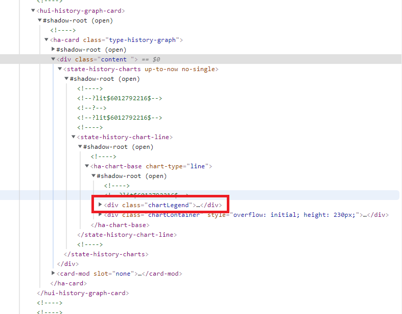
i have problems to understand how dom navigation feature works… can anyone tell me how do i access elements like the element in the red box?!
thanks
Surely my examples were about styling in general.
Check this example, the icon’s color changes:
type: entities
entities:
  - input_boolean.test_boolean
  - type: custom:template-entity-row
    entity: input_boolean.test_boolean
    name: name
    secondary: secondary
    state: state
    icon: mdi:engine
    card_mod:
      style:
        div#wrapper: |
          state-badge {
            {% if is_state(config.entity,'on') %}
            color: red;
            {% else %}
            color: cyan;
            {% endif %}
          }
Mariusthvdb:
@keyframes colorize {
This code causes the icon to change color in animation “OFF → ON”, do you need it?colorize 5s linear 1 normal
not sure ht is happening but if I use this code:
  - type: entities
    title: Color Icon T-e-r
    entities:
      - type: custom:template-entity-row
        entity: input_boolean.test
        icon: >
          {{'mdi:engine' if is_state(config.entity,'on') else 'mdi:engine-off-outline'}}
        card_mod:
          style:
            div#wrapper: |
              state-badge {
                {% if is_state(config.entity,'on') %}
                animation: rotation 4s linear infinite, colorize 5s linear forwards 1;
                {% endif %}
              }
              @keyframes rotation {
                0% {
                  transform: rotate(0deg);
                }
                100% {
                  transform: rotate(360deg);
                }
              }
              @keyframes colorize {
                0% {
                  color: var(--text-color-off);
                }
                100% {
                  color: blue;
                }
              }
all is well, and both color and animation kick in when turned on. If I use the binary_sensor.vijverpompen, I only get the animation and no color is set.
So, the code must be ok, its just that it wont work somehow for the binary. the forwards makes it a gradual coloring, and that is a nice touch, working with the input_boolean.
I thought it might be interfering with the glob customize I have for binary_sensors:
  customize_domain:

    automation:
      templates:
        <<: &state_color
          icon_color: >
            if (state == 'on') return 'var(--primary-color)';
            return 'steelblue';

    binary_sensor:
      templates:
        <<: *state_color
but that seems a bit far fetched, I believe the local coloring on an entity always ‘wins’, but to be sure I will take it out and see what happens
Do you use Custom UI for the entity?
Yes, I mean this…
Ive disabled it, and cleared all… no effect. as it shouldn’t. I also use the same glob for booleans …
    input_boolean:
      templates:
        <<: *state_color
which as said, does work. How odd. As a last resort, Ill make a new binary sensor, based on the boolean.
UPDATE: Only thing I can think of is I tested it in the dev tools states, and not the real entity state. that cant be, when I posted the original question, the binary was ‘on’ so should have worked correctly. hmmm
have to use the full “path” to the element, clear now… thanks
the binary_sensor glob was the issue after all… wondering if we can set something like this
            if (state == 'on') return 'var(--primary-color)';
            return 'steelblue';
in a card-mod-theme setting? And if we can, if that wouldn’t interfere with the individual card_mod I am trying to realize here…
@Ildar_Gabdullin Ive dug into this some more, and I am still very much surprise. If I use config.entity in all fields for the TER, obviously there is a need for an entity (…) and with that, I can not make the coloring happen on the binary. This seems to be caused by custom-ui which sets these domain templates:
homeassistant:

##########################################################################################
# Domain
##########################################################################################

  customize_domain:

    automation:
      templates:
        <<: &state_color
          icon_color: >
            if (state == 'on') return 'var(--primary-color)';
            return 'steelblue';

    binary_sensor:
      templates:
        <<: *state_color

    input_boolean:
      templates:
        <<: *state_color

    switch:
      templates:
        <<: &toggle_icon
          icon: >
            if (state == 'on') return 'mdi:toggle-switch';
            return 'mdi:toggle-switch-off';
        <<: *state_color
as you can see, automation and input_boolean use the identical templates. And be stunned: these do work correctly using the card_mod with config.entity. so both make the icon spin, and color it.
If I take out the config.entity, and use the explicit entity in all templates, like:
  - type: entities
    title: Color Icon T-e-r
    entities:
      - type: custom:template-entity-row
#        entity: binary_sensor.vijverpompen
        icon: >
          {{'mdi:engine' if is_state(config.entity,'on') else 'mdi:engine-off-outline'}}
        card_mod:
          style:
            div#wrapper: |
              state-badge {
                {% if is_state('binary_sensor.vijverpompen','off') %}
                animation: rotation 4s linear infinite, colorize 5s linear forwards 1;
                {% endif %}
              }
              @keyframes rotation {
                0% {
                  transform: rotate(0deg);
                }
                100% {
                  transform: rotate(360deg);
                }
              }
              @keyframes colorize {
                0% {
                  color: var(--text-color-off);
                }
                100% {
                  color: aquamarine;
                }
              }

        name: >
          Vijverpompen {{'moeten:' if is_state('binary_sensor.vijverpompen','on') else 'mogen:'}}
        secondary: >
          {% set temp = states('sensor.pond_buiten_sensor_calibrated_temperature')|float %}
          {% set dark = 'Licht' if is_state('binary_sensor.dark_outside','off') else 'Donker'%}
          {{relative_time(states['binary_sensor.vijverpompen'].last_changed)}} ago, {{dark}} en {{temp}}°C
        state: >
          {{'Aan' if is_state('binary_sensor.vijverpompen','on') else 'Uit'}}
        icon: >
          {{'mdi:engine' if is_state('binary_sensor.vijverpompen','on') else 'mdi:engine-off-outline'}}
I also see the icon spin and get colorized…
now what is going on here. why does binary_sensor not behave like input_boolean and automation… for now, beats me.
TMidi
October 4, 2021, 1:55am
2183
Is there a way to made the slider wider for media player using css? Currently I have a need for the volume slider only with all other controls hidden.