Styling an "input_datetime" row (part 1) (part 2 is here)
Notes:
1.There are 3 types of input_datetime entity:
– date & time;
– date;
– time.
This tutorial contains examples for each type.
2.A user may use either “12H (AM/PM)” or “24H” time format. Both cases are considered.
3.Screenshots are made in Chrome.
Colored name (time, date):
Two methods are available:
– using a short “:host” navigation;
– using a detailed DOM navigation.
Note: these styles do not affect on “secondary-info”.

code
      - type: entities
        entities:
          - entity: input_datetime.test_time
            name: method 1
            card_mod: &ref_host
              style: |
                :host {
                  color: red;
                }
          - entity: input_datetime.test_date
            name: method 1
            card_mod: *ref_host
          - entity: input_datetime.test_date
            name: method 1
            secondary_info: last-changed
            card_mod: *ref_host
          - type: section
          - entity: input_datetime.test_time
            name: method 2
            card_mod: &ref_dom
              style:
                hui-generic-entity-row $: |
                  .info {
                    color: red;
                  }
          - entity: input_datetime.test_date
            name: method 2
            card_mod: *ref_dom
          - entity: input_datetime.test_date
            name: method 2
            secondary_info: last-changed
            card_mod: *ref_dom
          - type: section
          - entity: input_datetime.test_time
            name: default
          - entity: input_datetime.test_date
            name: default
How to style several rows:

Note that a common style may be overwritten for some particular entity.
code
      - type: entities
        card_mod:
          style:
            .card-content:
              div:
                hui-input-datetime-entity-row $ hui-generic-entity-row $: |
                  .info {
                    color: orange;
                  }
        entities:
          - entity: input_datetime.test_time
            name: Can't overwrite
            style: &ref_cannot_be_overwritten|
              :host {
                color: red !important;
              }
          - entity: input_datetime.test_time
            name: Overwritten style
            card_mod: &ref_overwritten
              style:
                hui-generic-entity-row $: |
                  .info {
                    color: red !important;
                  }
          - entity: input_datetime.test_time
            name: common style
          - entity: input_datetime.test_time
            name: common style
          - type: section
          - entity: input_datetime.test_date
            name: Can't overwrite
            style: *ref_cannot_be_overwritten
          - entity: input_datetime.test_date
            name: Overwritten style
            card_mod: *ref_overwritten
          - entity: input_datetime.test_date
            name: common style
          - entity: input_datetime.test_date
            name: common style
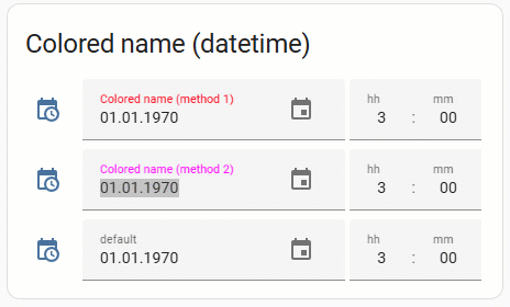
Colored name (datetime):
Two methods are available:
– using a CSS property with a detailed DOM navigation;
– using a CSS variable.
Notes:
1.The 1st method - allows to change a color permanently (whether the input field is selected or not).
2.The 2nd method - the name’s color changes if an input field is selected (from “--mdc-text-field-label-ink-color” to “--mdc-theme-primary”).
3.A popup window to select a date is not shown on a video.
code
type: entities
title: Colored name (datetime)
entities:
  - entity: input_datetime.test_datetime
    name: Colored name (method 1)
    card_mod:
      style:
        hui-generic-entity-row ha-date-input $:
          ha-textfield $: |
            span#label {
              color: red;
            }
  - entity: input_datetime.test_datetime
    name: Colored name (method 2)
    card_mod:
      style: |
        ha-date-input {
          --mdc-text-field-label-ink-color: magenta;
          --mdc-theme-primary: cyan;
        }
  - entity: input_datetime.test_datetime
    name: default
How to style several rows:
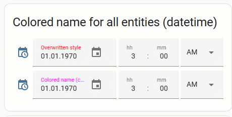
Note that a common style may be overwritten for some particular entity.
code
      - type: entities
        title: Colored name for all entities (datetime)
        card_mod:
          style:
            .card-content:
              div:
                hui-input-datetime-entity-row $: |
                  ha-date-input {
                    --mdc-text-field-label-ink-color: magenta;
                    --mdc-theme-primary: orange;
                  }
        entities:
          - entity: input_datetime.test_datetime
            name: Overwritten style
            card_mod:
              style: |
                ha-date-input {
                  --mdc-text-field-label-ink-color: red !important;
                  --mdc-theme-primary: cyan !important;
                }
          - entity: input_datetime.test_datetime
            name: Colored name (common)
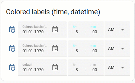
Colored “hh” & “mm” labels for “time” & “datetime”:
Two methods are available:
– using a CSS property with a detailed DOM navigation;
– using a CSS variable.
Notes:
1.The 1st method - allows to change a color permanently (whether the input field is selected or not).
2.The 2nd method - the name’s color changes if an input field is selected (from “--mdc-text-field-label-ink-color” to “--mdc-theme-primary”).
code
      - type: entities
        title: Colored labels (time, datetime)
        entities:
          - entity: input_datetime.test_datetime
            name: Colored labels (method 1)
            card_mod:
              style:
                hui-generic-entity-row ha-time-input $:
                  ha-base-time-input $ ha-textfield $: |
                    span#label {
                      color: cyan;
                    }
          - entity: input_datetime.test_datetime
            name: Colored labels (method 2)
            card_mod:
              style: |
                ha-time-input {
                  --mdc-text-field-label-ink-color: cyan;
                  --mdc-theme-primary: red;
                }
          - entity: input_datetime.test_datetime
            name: default
How to style several rows:
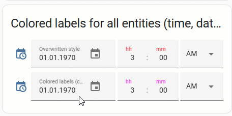
Note that a common style may be overwritten for some particular entity.
code
      - type: entities
        title: Colored labels for all entities (time, datetime)
        card_mod:
          style:
            .card-content:
              div:
                hui-input-datetime-entity-row $: |
                  ha-time-input {
                    --mdc-text-field-label-ink-color: magenta;
                    --mdc-theme-primary: orange;
                  }
        entities:
          - entity: input_datetime.test_datetime
            name: Overwritten style
            card_mod:
              style: |
                ha-time-input {
                  --mdc-text-field-label-ink-color: red !important;
                  --mdc-theme-primary: cyan !important;
                }
          - entity: input_datetime.test_datetime
            name: Colored labels (common)
Colored secondary_info (time, date):

code
      - type: entities
        entities:
          - entity: input_datetime.test_time
            name: Colored secondary_info
            secondary_info: last-changed
            card_mod: &ref_colored
              style:
                hui-generic-entity-row $: |
                  .info .secondary ha-relative-time {
                    color: orange;
                  }
          - entity: input_datetime.test_time
            name: Different colors
            secondary_info: last-changed
            card_mod: &ref_different
              style:
                hui-generic-entity-row $: |
                  .info .secondary ha-relative-time {
                    color: orange;
                  }
                  .info {
                    color: red;
                  }
          - entity: input_datetime.test_time
            secondary_info: last-changed
            name: default
          - entity: input_datetime.test_time
            name: default
          - type: section
          - entity: input_datetime.test_date
            name: Colored secondary_info
            secondary_info: last-changed
            card_mod: *ref_colored
          - entity: input_datetime.test_date
            name: Different colors
            secondary_info: last-changed
            card_mod: *ref_different
          - entity: input_datetime.test_date
            secondary_info: last-changed
            name: default
          - entity: input_datetime.test_date
            name: default
How to style several rows:

Note that a common style may be overwritten for some particular entity.
code
      - type: entities
        card_mod:
          style:
            .card-content:
              div:
                hui-input-datetime-entity-row $ hui-generic-entity-row $: |
                  .info .secondary ha-relative-time {
                    color: cyan;
                  }
        entities:
          - entity: input_datetime.test_time
            secondary_info: last-changed
            name: common style
          - entity: input_datetime.test_time
            name: overwritten style
            secondary_info: last-changed
            card_mod: &ref_overwritten
              style:
                hui-generic-entity-row $: |
                  .info .secondary ha-relative-time {
                    color: orange !important;
                  }
          - entity: input_datetime.test_time
            secondary_info: last-changed
            name: common style
          - entity: input_datetime.test_time
            name: default
          - type: section
          - entity: input_datetime.test_date
            secondary_info: last-changed
            name: common style
          - entity: input_datetime.test_date
            name: overwritten style
            secondary_info: last-changed
            card_mod: *ref_overwritten
          - entity: input_datetime.test_date
            secondary_info: last-changed
            name: common style
          - entity: input_datetime.test_date
            name: default
Colored main icon:
Two methods are available:
– using a CSS variable;
– using a CSS property with a detailed DOM navigation.

code
      - type: entities
        entities:
          - entity: input_datetime.test_time
            name: method 1
            card_mod: &ref_colored_1
              style: |
                :host {
                  --paper-item-icon-color: red;
                }
          - entity: input_datetime.test_time
            name: method 2
            card_mod: &ref_colored_2
              style:
                hui-generic-entity-row $: |
                  state-badge {
                    color: red;
                  }
          - entity: input_datetime.test_time
            name: default
          - type: section
          - entity: input_datetime.test_datetime
            name: method 1
            card_mod: *ref_colored_1
          - entity: input_datetime.test_datetime
            name: method 2
            card_mod: *ref_colored_2
          - entity: input_datetime.test_datetime
            name: default
          - type: section
          - entity: input_datetime.test_date
            name: method 1
            card_mod: *ref_colored_1
          - entity: input_datetime.test_date
            name: method 2
            card_mod: *ref_colored_2
          - entity: input_datetime.test_date
            name: default
How to style several rows:

Note that a common style may be overwritten for some particular entity.
code
      - type: entities
        card_mod:
          style: |
            ha-card {
              --paper-item-icon-color: cyan;
            }
        entities:
          - entity: input_datetime.test_time
            name: overwritten style
            card_mod: &ref_overwritten
              style: |
                :host {
                  --paper-item-icon-color: red;
                }
          - &ref_row_time
            entity: input_datetime.test_time
            name: common style
          - *ref_row_time
          - type: section
          - entity: input_datetime.test_datetime
            name: overwritten style
            card_mod: *ref_overwritten
          - &ref_row_datetime
            entity: input_datetime.test_datetime
            name: common style
          - *ref_row_datetime
          - type: section
          - entity: input_datetime.test_date
            name: overwritten style
            card_mod: *ref_overwritten
          - &ref_row_date
            entity: input_datetime.test_date
            name: common style
          - *ref_row_date
Some other styles for the main icon - resized icon, hidden icon:

code
      - type: entities
        entities:
          - entity: input_datetime.test_time
            name: resized icon
            card_mod: &ref_card_mod_resize_host
              style: |
                :host {
                  --mdc-icon-size: 40px;
                }
          - entity: input_datetime.test_time
            name: hidden icon
            card_mod: &ref_card_mod_hide_icon
              style:
                hui-generic-entity-row $: |
                  state-badge {
                    display: none;
                  }
          - type: section
          - entity: input_datetime.test_datetime
            name: resized all icons
            card_mod: *ref_card_mod_resize_host
          - entity: input_datetime.test_datetime
            name: resized main icon
            card_mod: &ref_card_mod_resize_main_icon
              style:
                hui-generic-entity-row $: |
                  state-badge {
                    --mdc-icon-size: 40px;
                  }
          - entity: input_datetime.test_datetime
            name: hidden main icon
            card_mod: *ref_card_mod_hide_icon
          - type: section
          - entity: input_datetime.test_date
            name: resized all icons
            card_mod: *ref_card_mod_resize_host
          - entity: input_datetime.test_date
            name: resized main icon
            card_mod: *ref_card_mod_resize_main_icon
          - entity: input_datetime.test_date
            name: hidden main icon
            card_mod: *ref_card_mod_hide_icon
Colored value:
Two methods are available:
– using a “:host” navigation;
– using a detailed DOM navigation.
Notes:
1.The 1st method - may be used to define a same color for all “text” fields (date, time) and another color for a “select” field (“AM/PM”).
2.The 2nd method - may be used to define colors individually for all “text” fields (date, time) and another color for a “select” field (“AM/PM”).

code
      - type: entities
        entities:
          - entity: input_datetime.test_time
            name: method 1
            card_mod:
              style: |
                :host {
                  --mdc-text-field-ink-color: red;
                  --mdc-select-ink-color: cyan;
                }
          - entity: input_datetime.test_time
            name: method 2
            card_mod:
              style:
                ha-time-input $ ha-base-time-input $: |
                  ha-textfield:nth-of-type(1) {
                    --mdc-text-field-ink-color: red;
                  }
                  ha-textfield:nth-of-type(2) {
                    --mdc-text-field-ink-color: orange;
                  }
                  ha-select {
                    --mdc-select-ink-color: cyan;
                  }
          - entity: input_datetime.test_time
            name: default
          - type: section
          - entity: input_datetime.test_datetime
            name: method 1
            card_mod:
              style: |
                :host {
                  --mdc-text-field-ink-color: red;
                  --mdc-select-ink-color: cyan;
                }
          - entity: input_datetime.test_datetime
            name: method 2
            card_mod:
              style:
                ha-date-input $: |
                  ha-textfield {
                    --mdc-text-field-ink-color: red;
                  }
                ha-time-input $ ha-base-time-input $: |
                  ha-textfield:nth-of-type(1) {
                    --mdc-text-field-ink-color: red;
                  }
                  ha-textfield:nth-of-type(2) {
                    --mdc-text-field-ink-color: orange;
                  }
                  ha-select {
                    --mdc-select-ink-color: cyan;
                  }
          - entity: input_datetime.test_datetime
            name: default
          - type: section
          - entity: input_datetime.test_date
            name: method 1
            card_mod:
              style: |
                :host {
                  --mdc-text-field-ink-color: red;
                }
          - entity: input_datetime.test_date
            name: method 2
            card_mod:
              style:
                ha-date-input $: |
                  ha-textfield {
                    --mdc-text-field-ink-color: red;
                  }
          - entity: input_datetime.test_date
            name: default
Colored field’s background:

code
      - type: entities
        entities:
          - entity: input_datetime.test_time
            name: colored background
            card_mod:
              style: |
                :host {
                  --mdc-text-field-fill-color: lightgreen;
                  --mdc-select-fill-color: magenta;
                }
          - entity: input_datetime.test_time
            name: default
          - type: section
          - entity: input_datetime.test_datetime
            name: colored background
            card_mod:
              style: |
                :host {
                  --mdc-text-field-fill-color: lightgreen;
                  --mdc-select-fill-color: magenta;
                }
          - entity: input_datetime.test_datetime
            name: colored background
            card_mod:
              style: |
                ha-date-input {
                  --mdc-text-field-fill-color: orange;
                }
                ha-time-input {
                  --mdc-text-field-fill-color: cyan;
                  --mdc-select-fill-color: magenta;
                }
          - entity: input_datetime.test_datetime
            name: default
          - type: section
          - entity: input_datetime.test_date
            name: colored background
            card_mod:
              style: |
                :host {
                  --mdc-text-field-fill-color: lightgreen;
                }
          - entity: input_datetime.test_date
            name: default
Colored underline:
The underline had 3 possible states:
– a default (static) state;
– the input field is hovered by a mouse;
– the input field is selected by a mouse.
There are CSS variables for each state.
In the example below:
– the 1st row is modded by using these CSS variables;
– the 2nd row is modded by changing CSS properties with a detailed DOM navigation;
– the 3rd row has transparent underlines.

code
      - type: entities
        entities:
          - entity: input_datetime.test_time
            name: method 1
            card_mod:
              style: |
                :host {
                  --mdc-text-field-idle-line-color: red;
                  --mdc-text-field-hover-line-color: cyan;
                  --mdc-select-idle-line-color: red;
                  --mdc-select-hover-line-color: cyan;
                  --mdc-theme-primary: magenta;
                }
          - entity: input_datetime.test_time
            name: method 2
            card_mod:
              style:
                ha-time-input $ ha-base-time-input $:
                  ha-textfield $: &ref_style_underline_time |
                    .mdc-line-ripple::before {
                      border-bottom-color: red !important;
                    }
                    .mdc-line-ripple::after {
                      border-bottom-color: magenta !important;
                    }
                  ha-select $: *ref_style_underline_time
          - entity: input_datetime.test_time
            name: no underline
            card_mod:
              style:
                ha-time-input $ ha-base-time-input $:
                  ha-textfield $: &ref_style_no_underline_time |
                    .mdc-line-ripple::before,
                    .mdc-line-ripple::after {
                      border-bottom-style: none !important;
                    }
                  ha-select $: *ref_style_no_underline_time
          - entity: input_datetime.test_time
            name: default
          - type: section
          - entity: input_datetime.test_datetime
            name: method 1
            card_mod:
              style: |
                :host {
                  --mdc-text-field-idle-line-color: red;
                  --mdc-text-field-hover-line-color: cyan;
                  --mdc-select-idle-line-color: red;
                  --mdc-select-hover-line-color: cyan;
                  --mdc-theme-primary: magenta;
                }
          - entity: input_datetime.test_datetime
            name: method 2
            card_mod:
              style:
                ha-time-input $ ha-base-time-input $:
                  ha-textfield $: &ref_style_underline_datetime |
                    .mdc-line-ripple::before {
                      border-bottom-color: red !important;
                    }
                    .mdc-line-ripple::after {
                      border-bottom-color: magenta !important;
                    }
                  ha-select $: *ref_style_underline_datetime
                ha-date-input $ ha-textfield $: *ref_style_underline_datetime
          - entity: input_datetime.test_datetime
            name: no underline
            card_mod:
              style:
                ha-time-input $ ha-base-time-input $:
                  ha-textfield $: &ref_style_no_underline_datetime |
                    .mdc-line-ripple::before,
                    .mdc-line-ripple::after {
                      border-bottom-style: none !important;
                    }
                  ha-select $: *ref_style_no_underline_datetime
                ha-date-input $ ha-textfield $: *ref_style_no_underline_datetime
          - entity: input_datetime.test_datetime
            name: default
          - type: section
          - entity: input_datetime.test_date
            name: method 1
            card_mod:
              style: |
                :host {
                  --mdc-text-field-idle-line-color: red;
                  --mdc-text-field-hover-line-color: cyan;
                  --mdc-theme-primary: magenta;
                }
          - entity: input_datetime.test_date
            name: method 2
            card_mod:
              style:
                ha-date-input $ ha-textfield $: |
                  .mdc-line-ripple::before {
                    border-bottom-color: red !important;
                  }
                  .mdc-line-ripple::after {
                    border-bottom-color: magenta !important;
                  }
          - entity: input_datetime.test_date
            name: no underline
            card_mod:
              style:
                ha-date-input $ ha-textfield $: |
                  .mdc-line-ripple::before,
                  .mdc-line-ripple::after {
                    border-bottom-style: none !important;
                  }
          - entity: input_datetime.test_date
            name: default
More examples here.