W/o checking other stuff, at least an error is here - class names must start with “.”, i.e. “.entity__info__name”
Missing the pipe after style, you don’t need those div tags (just remove them) and check the post above this one from Ildar, you’re missing a .
OK, so I…
- Added a $ in front of the two parent divs’ :'s
- added the . in front of entity__info__name
- Added the pipe back in on the style line (although I’m sure not sure when/why to use that for card-mod after reading up on YAML multiline)
          card_mod:
            style: |
              .mmp-player $:
                .mmp-player__core.flex $:
                  .entity__info__name: {color: white !important;}
I tried with and without the two $'s. It doesn’t work.
Is there a list of other rules like
class names must start with “.”
…applicable to card-mod (which seems to be a mashup of “proper” CSS and YAML? I think that would be helpful as well. Otherwise, it’s like being handed a book in a foreign language and told to reconstruct your own sentences. Can it be done? Sure. But, I’d rather just learn the top 10-20 things necessary to properly structure the grammar in a repeatable way and then ask informed questions from that level of understanding. The card-mod-helper tool provides a good way to dig out the necessary vocabulary. From there, it seems I’m essentially just trying different types of glue (syntax and punctuation) trying to figure out what will hold the words together when those rules are known…just not to me. 
Don’t know about others on here, but there’s much trial and error for me as well… Without testing and from what I can see, you will need the $, since you’re entering various shadow roots. That can be seen in the output of the tool as well.
Right off the bat, no spaces between the div name and the $. Then, the {color: white !important;} should be on its own line and indented one more than the previous line.
card_mod:
            style: |
              .mmp-player$:
                .mmp-player__core.flex$:
                  .entity__info__name: {
                    color: white !important;
                  }
This would be a guess on my part, not tested. Be sure to check indentation, as I’m writing from a phone 
Ok, did some looking around. I would most definitely recommend looking at the link a the bottom of the first post, what you’re trying to achieve is described there. Here’s the direct link to styling the mini-media-player.
Funny thing, though, I actually got to the same code as what Ildar shows in his post for styling the .entity__info__name but somehow, that did not work. Can’t explain why.
For the learning experience, here is the output from the card-mod-helper:
"#view>hui-view>hui-masonry-view$#columns>div:nth-child(2)>hui-card-options>mini-media-player$ha-card>div.mmp-player>div.mmp-player__core.flex>div.entity__info>div.entity__info__name"
and this is the code I ended up with (same as Ildar’s in his post, just on multiple lines:
card_mod:
  style: |
    .mmp-player:
      .mmp-player__core.flex:
        .entity__info:
          .entity__info__name: {
            color: red !important;
          }
As said, basically everything after ha-card from the card-mod-helper output… Now, as why that didn’t work for me in this test, I have to say that I’m stumped!
Regarding my examples.
In most of them a non-optimized code is provided - just to demonstrate how to define a navigation path, like:
element:
  $:
    element:
      $: |
        element {
          ...
        }
instead of (where it is appropriate, see these rules):
element $ element $: |
  element {
    ...
  }
Also, in some cases we may use not the whole path:
element_1 element_2 element_3 {
  ...
}
but the shorter one (again, where it is appropriate):
element_3 {
  ...
}
+not to mention omitted “card_mod” keyword in some examples (used to be to required).
Thanks for the clarification. I did, of course, account for the missing card_mod keyword which is now required. Checking again, the following works:
type: custom:mini-media-player
entity: media_player.pioneer_avr
card_mod:
  style: |
    .mmp-player
      .mmp-player__core.flex
        .entity__info
          .entity__info__name {
            color: magenta;
          }
My bad, no : necessary at the end of each line… 
Of course, your syntax with everything in one line worked as well.
@GoodyGizmos hope this will work out for you too!
where I believed this card-mod-theme class to work still on entities cards:
        .: |
          ha-card.class-header-margin .card-header {
            background-color: var(--background-color-off);
            font-weight: 400;
            font-size: 20px;
            color: var(--text-color-off);
            padding: 0px 12px;
            margin: 0px 0px 16px 0px;
          }
I now notice it doesnt anymore.
It’s too bad really, because I skipped 3.15 for the card-mod-icon issue, which the latest update fixed. This is even more important in my setup, and now forces me to go back to 3.14 yet again…?
or write:
card_mod:
  style:
    $: |
      .card-header {
         background-color: var(--background-color-off);
         font-weight: 400;
         font-size: 20px;
         color: var(--text-color-off);
         padding: 0px 12px;
         margin: 0px 0px 16px 0px;
       }
on all cards…
this probably isnt a fluke by Thomas, so we’re going to have to adjust our stylings everywhere…
btw, I now notice the card-mod-theme setting on a tab icon no longer works either…
    card-mod-root-yaml: |

      paper-tab[aria-label='Verwarming'] ha-icon$: |
        ha-svg-icon {
          --card-mod-icon: {% set action = state_attr('climate.front_room','hvac_action') %}
                           {{'mdi:radiator' if action == 'heating' else
                             'mdi:radiator-disabled' if action == 'idle' else
                             'mdi:radiator-off'}};
        }

      paper-tab[aria-label='Beweging'] ha-icon$: |
        ha-svg-icon {
          --card-mod-icon: {{'mdi:motion-sensor' if is_state('binary_sensor.motion_sensors_all','on') else 'mdi:motion-sensor-off'}};
          color: {{'red' if is_state('binary_sensor.motion_sensors_all','on')}};
        }
shows the hard-coded icon in the view, while before this was nicely modded.
need to go back to 3.14, but this can no longer be downloaded through HACS…?
update
after manually downgrading to card-mod 3.14, I see it all return to life… icons are changed, and the card_header class works again. (had a small fluke so edited the post)
Thank you. It did indeed work for me on the two text fields. Moreover, I’m comfortable converting a bunch of nested divs from the tool’s output into CSSYAML’ese.
          card_mod:
            style: |
              .mmp-player
                .mmp-player__core.flex
                  .entity__info
                    .entity__info__name {
                      color: white;
                    }
              .mmp-player
                .mmp-player__core.flex
                  .entity__info
                    .entity__info__media {
                      color: yellow;
                    }
Now, I’m trying my hand at the source selection dropdown and it’s got things other than div. to parse, so I’m trying to make sense of those:
"#view>hui-view>horizontal-layout$#columns>div>stack-in-card$ha-card>div>hui-vertical-stack-card$#root>mini-media-player:nth-child(2)$ha-card>div.mmp-player>div.mmp-player__core.flex>mmp-powerstrip$mmp-source-menu$mmp-dropdown$div"
so, working with…
div.mmp-player>div.mmp-player__core.flex>mmp-powerstrip$mmp-source-menu$mmp-dropdown$div
which gets me to…
              .mmp-player
                .mmp-player__core.flex
                  mmp-powerstrip$
                    mmp-source-menu$
                      mmp-dropdown$
                        .mmp-dropdown {
                          color: white;
                        }
…which doesn’t work. The dropdown is in a div container in the dom screenshot I posted way above and I think that’s reflected in the final div output by the card-mod-helper, so I left that in there. What did I miss/exclude and am I even targeting the right entity for this or do I need to target deeper in the tree?

At least add “:” to your path after the last “$” (other thing have not checked)
Okay, so this is a bit different. You go from the base element ha-card directly into the first shadow-root. You then need to add “:” after each “$”.
See here:
card_mod:
  style:
    mmp-powerstrip$:
      mmp-source-menu$:
        mmp-dropdown$: |
          #button
            div
              ha-icon {
                color: red;
              }
Removing some unnecessary lines:
card_mod:
  style:
    mmp-powerstrip$:
      mmp-source-menu$:
        mmp-dropdown$: |
          ha-icon {
            color: red;
          }
Please don’t cross post. Of course, this would be the better thread for the question, but as it has been solved already in the other thread, perhaps better delete it here.
Were you able to figure this out? I want to have the exact same thing with Horizontal card by updating the flex value but no success so far.
Logbook in a Panel mode:
Consider a Logbook card in a view on a Panel mode:
type: logbook
hours_to_show: 168
entities:
  - sun.sun
Although the card occupies the whole view, the logbook itself occupies just a half of the available area:
1920x1200 desktop, Chrome, Win10:

iPhone 12:

It happens due to this style:

There is a Frontend issue about this.
A possible solution:
type: logbook
hours_to_show: 168
entities:
  - sun.sun
card_mod:
  style: |
    ha-logbook {
      height: calc(100vh - var(--header-height) - 32px) !important;
    }


1 Like
I’ve been playing with custom: button-card, but as I’ve been trying to solve a text-aligment challenge, I now found Card_Mod. If Card_Mod adds CSS capabilities to existing cards, is this more versatile? Would there be cause to use both add-ons, or can Card_Mod do everything Custom does?
Yes, and much more.
But some people may find it more complex than using “custom:button-card”.
If smth may not be achieved by using “custom:button-card” - then ADD some card-mod style. But these styles must not conflict (i.e. adding diff styles to same element).
Great. Thanks. I’ll give Card_Mod a spin.
HI all.
I need help about a this situation.
I have a time-piker row
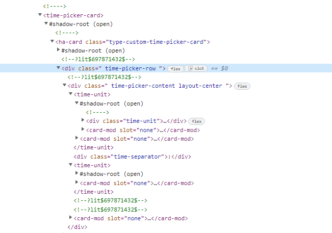
I am able to change style for different items, but I don’t know how to change the .time-picker-row padding.
I don’t understand where to put it in the structure below:
              style:
                .: |
                  ha-card {
                    font-family:Oswald;
                    background: none;
                  }
                .time-picker-row:
                  .time-picker-content:
                    .: |
                      .time-separator {
                        display: none;
                      }
                    time-unit:
                      $: |
                        .time-unit {
                          padding: 2px !important;
                        }
                        .time-input {
                          border: 2px solid #fff!important;
                          background-color: transparent!important;
                          color: orange !important;
                          border-radius: 5px;
                          pointer-events: none !important;
                        }
                        .time-picker-icon {
                          color: red !important;
                          padding: 0px!Important;
                        }
Can you help me?
Regards.
Hi there
I`m trying to add some CSS value to my type: image and seems like nothing is working. What I want to do is to animate an PNG I created when an battery sensor is on. This is my code lines so far!
views:
  - theme: Backend-selected
    title: Parter
    path: dsa
    type: panel
    icon: mdi:home-floor-0
    panel: true
    badges: []
    cards:
      - type: picture-elements
        image: local/images/parter/main1.png
        elements:
          - type: image
            entity: binary_sensor.entrance_battery_timed
            card_mod:
              style:
                .: |
                  img {
                    max-width: 100%;;
                    height: auto;
                  }
                  div {
                    animation: my-blink 2s linear infinite;
                  }
                  @keyframes my-blink {
                    from {opacity: 0;}
                    to {opacity: 100;}
                    from {opacity: 100;}
                    to {opacity: 0;}
                  }
            state_image:
              'on': local/images/parter/entr_bat.png
              'off': local/images/parter/blank.png
Enyone here would help me please?
The only one way to work this is to link @keyframes to elements root, but this affect all the picture-elements cards, and this goes to decrease loading page. This is the code line working so far:!
views:
  - theme: Backend-selected
    title: Parter
    path: dsa
    type: panel
    icon: mdi:home-floor-0
    panel: true
    badges: []
    cards:
      - type: picture-elements
        image: local/images/parter/main1.png
        elements:
          - type: image
            entity: binary_sensor.entrance_battery_timed
            style:
              top: 50%
              left: 50%
              width: 100%
              animation: my-blink 2s linear infinite
            state_image:
              'on': local/images/parter/entr_bat.png
              'off': local/images/parter/blank.png
        style: |
          @keyframes my-blink {
            from {opacity: 0;}
            to {opacity: 100;}
            from {opacity: 100;}
            to {opacity: 0;}
          }
Is there another way I can have this animation?
1st post - link at the bottom - picture-elements