I think its cuz thats where the name would go normally when on.

This whole time I could’ve just used mushroom climate card wow nevermind, thanks for helping though.

Errr… Forget it.
Lack of ’ ’ before and after sensor.
Mea maxima culpa… 
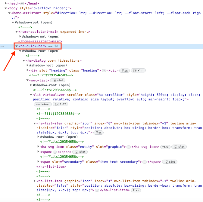
I don’t find a way to apply any css mod on the ha-quick-bar (the pop-up menu that comes out when you click on search icon).
I tried to use:
  card-mod-more-info-yaml: |
    $: |
      .mdc-dialog .mdc-dialog__content {
        display: none !IMPORTANT;
      }
but it seem to apply only to “ha-more-info-dialog” and not to “ha-quick-bar”.
Is there any solution or card-mod is not capable to modify the css in the “ha-quick-bar” at the moment? Thank for the help
- type: "custom:button-card"
    template: card_cover
    entity: cover.raamrechts
    variables:
      ulm_card_cover_name: Raam rechts
      ulm_card_cover_enable_slider: true
      ulm_card_cover_enable_horizontal: true
How can I prevent opening the cover for 100% ? It may open max for 78% otherwise my fly screen will get broken.
is it possible to Set the end value of the cover to 78 ? So 100% is in real time 78 ?
tabbed-card: adding images instead of icons

code
type: custom:mod-card
card_mod:
  style:
    tabbed-card:
      $:
        mwc-tab:nth-child(1) ha-icon $: |
          ha-svg-icon {
            background-image: url("/local/images/devices/iphone_5s.png") !important;
          }
        mwc-tab:nth-child(2) ha-icon $: |
          ha-svg-icon {
            background-image: url("/local/images/devices/iphone_6.png") !important;
          }
        mwc-tab:nth-child(3) ha-icon $: |
          ha-svg-icon {
            background-image: url("/local/images/devices/iphone_12.png") !important;
          }
        mwc-tab:
          ha-icon $: |
            ha-svg-icon {
              background-size: 100% 100% !important;
              display: block;
            }
card:
  type: custom:tabbed-card
  attributes:
    icon: mdi:blank
  tabs:
    - card:
        type: entities
        entities:
          - sun.sun
      attributes:
        label: tab 1
    - card:
        type: entities
        entities:
          - sun.sun
      attributes:
        label: tab 2
    - card:
        type: entities
        entities:
          - sun.sun
      attributes:
        label: tab 3
3 Likes
I need some help changing the font size in a Horizontal stack card. Here is what I have
type: horizontal-stack
cards:
  - type: entity
    entity: sensor.openweathermap_condition
    name: Conditions
  - type: entity
    entity: sensor.openweathermap_forecast_wind_speed
    name: Wind Speed
Any help very much appreciated
Do it in the entity-cards in your stack and not in the stack (as it is not possible without extra mod_cad). See first post. Link at the bottom from Ildar. Entity card.
Dear all,
I managed to get this result:

with this code (it is only the first card for brevity, all the others in the grid are the same with different entities):
square: false
type: grid
cards:
  - type: custom:stack-in-card
    mode: vertical
    cards:
      - type: grid
        columns: 1
        square: false
        cards:
          - type: custom:mod-card
            card_mod:
              style:
                hui-grid-card$: |
                  div#root {
                    grid-template-columns: 78% 20%;
                  }
            card:
              square: false
              columns: 2
              type: grid
              cards:
                - type: custom:mushroom-template-card
                  primary: Soggiorno
                  secondary: >-
                    {{ states('sensor.soggiorno_temperature')
                    }}°C                 {{ states('sensor.soggiorno_humidity')
                    }}%
                  icon: mdi:silverware-variant
                  tap_action: null
                  icon_color: blue
                  multiline_secondary: true
                - type: custom:mushroom-chips-card
                  chips:
                    - type: entity
                      entity: binary_sensor.finestra_soggiorno_contact
                      icon_color: blue
                      content_info: none
                    - type: entity
                      entity: binary_sensor.porta_soggiorno_contact
                      icon_color: red
                      content_info: none
      - type: custom:mushroom-chips-card
        alignment: center
        chips:
          - type: entity
            entity: switch.presa_ikea_salotto
            content_info: none
            icon_color: blue
            tap_action:
              action: toggle
            double_tap_action:
              action: none
            hold_action:
              action: none
          - type: entity
            entity: input_boolean.posta
            content_info: none
            icon_color: purple
            tap_action:
              action: none
            double_tap_action:
              action: none
            hold_action:
              action: toggle
Can anyone tell me if it is possible to reduce the distance between the two chip cards that are on the right side of the room card?

Ideally, I would like the red space to go away so that the two chips are adjacent but still in the center compared to the card on the left.
Any suggestions or help is appreciated, I tried some styles in other posts but with no luch. Thank you in advance!
I don’t know if bottom: will work. Or it might need to be 10px. I have a card pinned to the top and the z-index ensures it shows on top of everything else. I would suggest setting a distance from the top and see if that does what you want.
    type: markdown
    content: '{{ now().strftime("%m/%d/%Y, %H:%M") }}'
    card_mod:
      style: |
        ha-card {
          background: transparent;
        }
        :host {
          position: fixed;
          top: 0px;
          left: 75%;
          z-index: 99;
        }
1 Like
While card-mod can be installed as a lovelace resource, some functionality will benefit greatly from it being installed as a frontend module instead.
To do that, add the following to your
configuration.yamlfile and restart Home Assistant:
Since this seems to be outdated information (or different configuration?) am I right in adding the full path like how I have it here?


Does anyone use node_anchors in their card_mod code?
I just discovered this feature this morning, but I can’t replace if/else entities with an anchor.
As an example:
    card_mod:
      style:
        mushroom-template-chip:nth-child(2)$: |
          ha-icon {
            {{ 'animation: open 6s ease-in-out infinite;' if is_state(*door_sensor, 'on') }}
            transform-origin: 30%;
          }
          @keyframes open {
            0%, 66% { transform: rotateY(0deg); }
            33% { transform: rotateY(-120deg); }
          }
          .shape {
            perspective: 45px;
          }
Any suggestions would be fab.
    - type: custom:mod-card
      card:
        type: horizontal-stack
        cards:
          - type: "custom:button-card" #navigatie terug naar hoofdscherm
            template: chip_navigate
            variables:
              ulm_chip_navigate_path: home
              ulm_chip_navigate_icon: mdi:home-outline
          - type: custom:button-card
            template: chip_navigate
            variables:
              ulm_chip_navigate_path: grafiekenslaapkamerminne
              ulm_chip_navigate_icon: mdi:chart-bar
              ulm_chip_navigate_icon_color: rgb(241, 136, 5)
        card_mod:
          style: |
            :host {
              top: 300;
              z-index: 99;
            }
            ha-card {
              display: flex;
              background: none;
              --ha-card-border-width: 0px;
              --ha-card-box-shadow: none;
              justify-content: center;
            }
This doesn’t do a thing 
ofc. Because the indentation if wrong. The card_mod has to be on type level from mod-card. If this is your goal.
    - type: custom:mod-card
      card:
        type: horizontal-stack
        cards:
          - type: "custom:button-card" #navigatie terug naar hoofdscherm
            template: chip_navigate
            variables:
              ulm_chip_navigate_path: home
              ulm_chip_navigate_icon: mdi:home-outline
          - type: custom:button-card
            template: chip_navigate
            variables:
              ulm_chip_navigate_path: grafiekenslaapkamermattheo
              ulm_chip_navigate_icon: mdi:chart-bar
              ulm_chip_navigate_icon_color: rgb(241, 136, 5)
      card_mod:
        style: |
          :host {
            top: 200;
            z-index: 99;
          }
          ha-card {
            display: flex;
            background: none;
            --ha-card-border-width: 0px;
            --ha-card-box-shadow: none;
            justify-content: center;
          }
like this ?
Yes. Then it is applied to the mod-card. You can double-check in dev-tools of your browser. If it now does, what you want has to be evaluated by you and the css perhaps be adjusted to your needs.
it doesnt change a thing for me. I search again
As long as it is not clear what you want to have, it is hard to help. The code above is doing what it is for. Try yourself with adjusting the 0px to eg. 50px.
I want my 2 buttons at the bottom of my screen, centered. As a menu, but at the bottom. So I have a menu, on every page on the same spot (centered and at the bottom)
Then I don’t know for what you are ingesting all the CSS above? I’m not an expert of positioning CSS, but something like this should be more in the right direction.
card_mod:
  style: |
    ha-card {
        position: fixed;
        bottom: 0;
        left: 0;
        width: 100%;
        display: flex;
        justify-content: center;
    }