Example of using card-mod to display values on a Map card:
link

Update 15.10.23: this mod is not needed since 2023.10 - a possibility of displaying states was added (discussion, PR)
Example of using card-mod to display values on a Map card:
link
Update 15.10.23: this mod is not needed since 2023.10 - a possibility of displaying states was added (discussion, PR)
Use the browser tools to see what other paddings and margins there are. That slider is probably vertically aligned within it’s own bounding box, but the box itself may not be.
Hi, I have the follow HTML.
I’ve been trying to modify it to remove the box-shadow inside .color-circle but no luck. I’m very new to card-mod.

I’ve tried so many things though mostly blindly. I’ve been able to use card-mod to modify other stuff but not to remove this darn shadow.
For context, this is an entities card containing custom rgb card which by default adds these shadows.
The entities card is inside a stack-in card but I don’t know if that matters.
      - type: entities
        show_header_toggle: false
      #showing all the random stuff I've tried, mostly throwing stuff at the wall admittedly
        style: |
          rgb-light-card {
            box-shadow: 0 0px 0px 0 rgba(0,0,0,0);
          }
          type-custom-rgb-light-card {
            box-shadow: 0 0px 0px 0 rgba(0,0,0,0);
          }
          .color-circle {
            transition: none;
            box-shadow: 0 0px 0px 0px rgba(0,0,0,0);
          }
          ha-card {
            border: none; #this bit works great and I need it
            margin-top: -15px; #this also works great
          }
          rgb-light-card:
            $: |
              .color-circle {
                color: green;
                border-radius: 10%;
              }
        entities:
          - type: custom:rgb-light-card
            entity: light.bath_1
            justify: between
            size: 30
            colors:
              - type: call-service
                service: scene.turn_on
                service_data:
                  entity_id: scene.living_room_natural_light
                icon_color: ... etc
Not sure if this will help for context
Try like this instead:
type: entities
show_header_toggle: false
entities:
  - type: custom:rgb-light-card
    entity: light.lounge_main_light
    justify: between
    size: 30
    colors:
      - type: call-service
        service: scene.turn_on
        service_data:
          entity_id: scene.living_room_natural_light
        icon_color: ... etc
    card_mod:
      style: |
        .color-circle {
          box-shadow: none;
        }
thank you very much @dimitri.landerloos !
this did it!
additionally, i had to move the original style below this one and now both are active (removed border and margin adjustment for the entire RGB card + removal of shadows for individual rgb icons)
thanks again!
Example of using card-mod:
How to set a 0 lower bound for Y-axis in history-graph
link
default:

modded:

Warning: this mod is not needed since 2024.2 (PR)
I saw the cool post with many, many great examples by Ildar, but are there also example of how css templates can be/were used in HA?
I would like to play around with some of the css style templates available on codepen but I am not sure how to apply them.
I can do simple things like adjust padding, border etc.
But not sure about how to test there kinds of css styles in HA:
quick ask: does this no longer work?
  - type: custom:fold-entity-row
    head:
      type: section
      label: Test Label
      card_mod:
        style: |
          .label {
            margin-left: 0px;
          }
might have been going on for some time, but now that I wanted to move those to a secret and paste them from there, I notice it does nothing. bringing it back as posted above doesnt either…
which is explained by:

seems we need to add the !important now…
      card_mod:
        style: |
          .label {
            margin-left: 0px !important;
            color: red !important;
          }
wonder what brought that about, and when
somehow I feel bad about adding !important, to force an override, and fear it takes even more of the system.
I’ve only a few card_mods using !important, so it is quite the surprise this long-standing mod now also needs it.
Similar:
How to set a 0 lower bound for Y-axis in statistics-graph:
link
default:

modded:

Warning: this mod is not needed since ~2024.12 (PR)
Is it possible to add a header image to a card that does not support it?
Hello and please…
I need to apply those .handle etc changes only to ha-card with class “type-thermostat”. Is it possible?

Complicated.
1st post → link at the bottom → themes → using classes
Could someone help me out on the
Energy source table?
I’m not sure if it’s possible,
But was trying to get rid of the background
Cq black color…then wanted it transparent
Did try with help of this card_mod
But ill gues i got not the correct code
after reading up here some code…
Thank you…
I am new to ccs styles and having a challenge identifying the primary an secondary text attributes. I would like to change font characteristics. I have attempted with the code below using card-mod. I have added the following command --primary-font-size: 10px !important; with no effect on the text font size. This is a tile card. I have had no issues with the custom button card changing the font size and color. Appreciate any assistance or guidance.

      - features:
          - type: light-brightness
        type: tile
        entity: light.breakfast_chandelier
        card_mod:
          style: |
            ha-card
              {
              --primary-font-size: 10px !important;
              border-radius: 2px;
              font-family: 'Verdana';
              border: solid 3px;
              border-color: rgba(82, 144, 195, 1);
              height: 115px !important;
              width: 269px;
              background: rgba(0, 0, 0, 1);
              }
        vertical: false
        show_entity_picture: false
        icon: mdi:chandelier
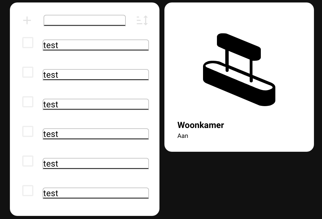
I hope that somebody can help me out with this one. I’m trying to create a new dashboard with square tiles and I was working on the Shopping list card. I did some modifications with card mod which I found on the web and in this thread. Unfortunately I’m stuck…
I would like to achieve the following:
Unfortunately I’m not able to figure this out and I hope somebody can help me with this. Thanks in advance!
              - type: shopping-list
                style:
                  ha-textfield:
                    $: |
                      .mdc-text-field__input {
                        color: black !important;
                      }
                      .mdc-text-field {
                        --mdc-text-field-fill-color: white;
                        border: 1px solid rgba(127,127,127,0.5);
                        height: auto !important;
                        --text-field-padding: 0px 0px;
                      }
                  .: |
                      ha-card {
                        background: white;
                        box-shadow: none;
                      }
                      :host {
                        --mdc-text-field-idle-line-color: black;
                        --mdc-text-field-hover-line-color: cyan;
                        --mdc-theme-primary: black;
                      }
Edit:
I found the solution for most the problems, except for the border around the text input at the top of the card.
          - type: shopping-list
            style:
              ha-textfield:
                $: |
                  .mdc-text-field__input {
                    color: black !important;
                  }
                  .mdc-text-field {
                    --mdc-text-field-fill-color: white;
                    height: auto !important;
                    --text-field-padding: 0px 0px;
                  }
              .: |
                  ha-card {

                    --mdc-typography-subtitle1-font-size: 11px;
                    background: white;
                    box-shadow: none;
                    height: 234px;
                    width: 100%;
                    max-height: 234px; /* Set a maximum height for the card */
                    overflow-y: auto; /* Enable vertical scrolling if content exceeds max height */

                    @media (max-width: 767px) {
                    height: 194px; /* Adjusted height for mobile */
                    max-height: 194px; /* Set a maximum height for the card */
                    }
                  }
                  :host {
                    --mdc-checkbox-ripple-size: 20px;
                    #--mdc-checkbox-state-layer-size: 5px;
                    --mdc-text-field-idle-line-color: grey;
                    --mdc-text-field-hover-line-color: red;
                    --mdc-theme-primary: grey;
                  }
@heisenberg Try this.
type: custom:button-card
entity: lock.front_door
tap_action:
  action: toggle
icon: mdi:door
show_name: true
show_state: false
size: 18%
state:
  - color: green
styles:
  card:
    - '--mdc-ripple-color': red
    - '--mdc-ripple-press-opacity': 0.5
  grid:
    - grid-template-areas: '"n" "i" "s"'
    - grid-template-columns: null
    - grid-template-rows: min-content fr min-content min-content
name: Front Door
Hi,
Hope it was not answered before, could not find it.
I want to apply several css mods in several selectors at the same time when 1 condition is met. I wish to avoid to have to have the same if statement for each selector. Can I normally do something like below (does not seem to work…), or i do I have to make an if statement for each selector?
type: thermostat
entity: climate.thermostat_chambre_theo
style: |
  {% if is_state_attr("climate.thermostat_chambre_theo", "hvac_action",
  "heating") %}
    #info {
      font-size: 1.5rem !important;
    }
    #modes {
      display: none;
    }
    #set-mode {
      --secondary-text-color: red;
    }
  {% endif %}