šŸ”¹ Card-mod - Add css styles to any lovelace card

Try like this instead:

type: entities
show_header_toggle: false
entities:
  - type: custom:rgb-light-card
    entity: light.lounge_main_light
    justify: between
    size: 30
    colors:
      - type: call-service
        service: scene.turn_on
        service_data:
          entity_id: scene.living_room_natural_light
        icon_color: ... etc
    card_mod:
      style: |
        .color-circle {
          box-shadow: none;
        }
1 Like

thank you very much @dimitri.landerloos !
this did it!
additionally, i had to move the original style below this one and now both are active (removed border and margin adjustment for the entire RGB card + removal of shadows for individual rgb icons)
thanks again!

1 Like

Example of using card-mod:
How to set a 0 lower bound for Y-axis in history-graph
link

default:
ŠøŠ·Š¾Š±Ń€Š°Š¶ŠµŠ½ŠøŠµ

modded:
ŠøŠ·Š¾Š±Ń€Š°Š¶ŠµŠ½ŠøŠµ

Warning: this mod is not needed since 2024.2 (PR)

3 Likes

I saw the cool post with many, many great examples by Ildar, but are there also example of how css templates can be/were used in HA?

I would like to play around with some of the css style templates available on codepen but I am not sure how to apply them.
I can do simple things like adjust padding, border etc.
But not sure about how to test there kinds of css styles in HA:

quick ask: does this no longer work?

  - type: custom:fold-entity-row
    head:
      type: section
      label: Test Label
      card_mod:
        style: |
          .label {
            margin-left: 0px;
          }

might have been going on for some time, but now that I wanted to move those to a secret and paste them from there, I notice it does nothing. bringing it back as posted above doesnt eitherā€¦

which is explained by:

SchermĀ­afbeelding 2023-09-18 om 08.17.40

seems we need to add the !important nowā€¦

      card_mod:
        style: |
          .label {
            margin-left: 0px !important;
            color: red !important;
          }

wonder what brought that about, and when

somehow I feel bad about adding !important, to force an override, and fear it takes even more of the system.
Iā€™ve only a few card_mods using !important, so it is quite the surprise this long-standing mod now also needs it.

Similar:
How to set a 0 lower bound for Y-axis in statistics-graph:
link

default:
ŠøŠ·Š¾Š±Ń€Š°Š¶ŠµŠ½ŠøŠµ

modded:
ŠøŠ·Š¾Š±Ń€Š°Š¶ŠµŠ½ŠøŠµ

2 Likes

Is it possible to add a header image to a card that does not support it?

  1. Place you card inside custom:stack-in-card.
  2. Add any card which supports images like Markdown as the 1st card.

Hello and pleaseā€¦

I need to apply those .handle etc changes only to ha-card with class ā€œtype-thermostatā€. Is it possible?
image

Complicated.
1st post ā†’ link at the bottom ā†’ themes ā†’ using classes

Could someone help me out on the
Energy source table?
Iā€™m not sure if itā€™s possible,
But was trying to get rid of the background
Cq black colorā€¦then wanted it transparent
Did try with help of this card_mod
But ill gues i got not the correct code
after reading up here some codeā€¦
Thank youā€¦

I am new to ccs styles and having a challenge identifying the primary an secondary text attributes. I would like to change font characteristics. I have attempted with the code below using card-mod. I have added the following command --primary-font-size: 10px !important; with no effect on the text font size. This is a tile card. I have had no issues with the custom button card changing the font size and color. Appreciate any assistance or guidance.

tile_card

      - features:
          - type: light-brightness
        type: tile
        entity: light.breakfast_chandelier
        card_mod:
          style: |
            ha-card
              {
              --primary-font-size: 10px !important;
              border-radius: 2px;
              font-family: 'Verdana';
              border: solid 3px;
              border-color: rgba(82, 144, 195, 1);
              height: 115px !important;
              width: 269px;
              background: rgba(0, 0, 0, 1);  
              }
        vertical: false
        show_entity_picture: false
        icon: mdi:chandelier

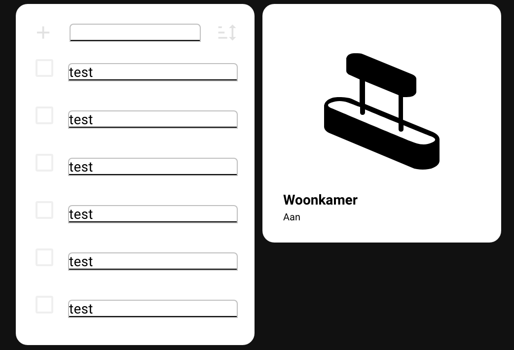
I hope that somebody can help me out with this one. Iā€™m trying to create a new dashboard with square tiles and I was working on the Shopping list card. I did some modifications with card mod which I found on the web and in this thread. Unfortunately Iā€™m stuckā€¦

I would like to achieve the following:

  1. Keep the card as a square. Add a scrollbar instead of making the card longer.
  2. Have a border only around the first input text field instead of the items added to the list.
  3. Have less space between the items on the list.

Unfortunately Iā€™m not able to figure this out and I hope somebody can help me with this. Thanks in advance!

              - type: shopping-list
                style:
                  ha-textfield:
                    $: |
                      .mdc-text-field__input {
                        color: black !important;
                      }
                      .mdc-text-field {
                        --mdc-text-field-fill-color: white;
                        border: 1px solid rgba(127,127,127,0.5);
                        height: auto !important;
                        --text-field-padding: 0px 0px;
                      }
                  .: |
                      ha-card {
                        background: white;
                        box-shadow: none;
                      }
                      :host {
                        --mdc-text-field-idle-line-color: black;
                        --mdc-text-field-hover-line-color: cyan;
                        --mdc-theme-primary: black;
                      }

Edit:

I found the solution for most the problems, except for the border around the text input at the top of the card.

          - type: shopping-list
            style:
              ha-textfield:
                $: |
                  .mdc-text-field__input {
                    color: black !important;
                  }
                  .mdc-text-field {
                    --mdc-text-field-fill-color: white;
                    height: auto !important;
                    --text-field-padding: 0px 0px;
                  }
              .: |
                  ha-card {
                    
                    --mdc-typography-subtitle1-font-size: 11px;
                    background: white;
                    box-shadow: none;
                    height: 234px;
                    width: 100%;
                    max-height: 234px; /* Set a maximum height for the card */
                    overflow-y: auto; /* Enable vertical scrolling if content exceeds max height */
                    
                    @media (max-width: 767px) {
                    height: 194px; /* Adjusted height for mobile */
                    max-height: 194px; /* Set a maximum height for the card */
                    }
                  } 
                  :host {
                    --mdc-checkbox-ripple-size: 20px;
                    #--mdc-checkbox-state-layer-size: 5px;
                    --mdc-text-field-idle-line-color: grey;
                    --mdc-text-field-hover-line-color: red;
                    --mdc-theme-primary: grey;
                  }
2 Likes

@Mark53 did you manage to get the lock icon in red/green depending on status of the lock?

@Miura

Looks great, what theme is this?

@heisenberg Try this.

type: custom:button-card
entity: lock.front_door
tap_action:
  action: toggle
icon: mdi:door
show_name: true
show_state: false
size: 18%
state:
  - color: green
styles:
  card:
    - '--mdc-ripple-color': red
    - '--mdc-ripple-press-opacity': 0.5
  grid:
    - grid-template-areas: '"n" "i" "s"'
    - grid-template-columns: null
    - grid-template-rows: min-content fr min-content min-content
name: Front Door

Hi,

Hope it was not answered before, could not find it.

I want to apply several css mods in several selectors at the same time when 1 condition is met. I wish to avoid to have to have the same if statement for each selector. Can I normally do something like below (does not seem to workā€¦), or i do I have to make an if statement for each selector?

type: thermostat
entity: climate.thermostat_chambre_theo
style: |
  {% if is_state_attr("climate.thermostat_chambre_theo", "hvac_action",
  "heating") %} 
    #info {
      font-size: 1.5rem !important;      
    }
    #modes {
      display: none;
    }        
    #set-mode {          
      --secondary-text-color: red;
    }
  {% endif %}

Iā€™m trying to style an entity-filter card to squeeze more entities into a smaller space. Iā€™ve been able to get the icons and text to scale and then to get them spaced vertically using margin-top and margin-bottom (zeroed out at the moment). Iā€™ve got two issues Iā€™d appreciate help with.

The first has to do with entity icons under the state-badge selector. The spotify icons behave differently than the mdc-icons. adjusting state-badge height and width has the expected effect on the spotify icons. they scale and stay centered. The mdc-icons, however donā€™t scale or re-center and end up overlapping the state text. I can scale them down with ā€˜ā€“mdc-icon-sizeā€™, but that doesnā€™t adjust their alignment and I get the result in the attached image.

2023-09-27_00-27-23

The second issue Iā€™d love to resolve is I cannot figure out how to adjust the spacing of the entities horizontally. Iā€™ve tried many variants of margin-left and -right with no success.

type: entity-filter
entities:
  - etc
state_filter:
  - etc
card:
  type: glance
  card_mod:
    style:
      .entities:
        .entity:
          $: |
            state-badge {
              margin-bottom: 0px;
              margin-top: 0px;
              height: 15px !important;
              width: 15px !important;
              filter: drop-shadow(1px 1px 2px black);
              --mdc-icon-size: 15px;   
            }
            div:not(.name) {
              margin-top: 0px !important;
              font-size: .7vw;
            }
            .name {
              margin-top: 0px !important;
              font-size: .7vw;
              text-overflow: unset !important;
              white-space: unset !important;
              line-height: 130%; 
            }
show_empty: true

this is a late return on the matter, hope to receive some more generic advice on my specific needs, especially for the 2 input_datetime s that are now regarded ā€˜onā€™ entities apparentlyā€¦

What would be shortest to only have the entities that go on/off, so the left binary and the right 2 booleans change color when ā€˜onā€™, and leave the 2 date times untouched?
consider:

    - type: custom:hui-element
      card_type: picture-glance
      entities:
        - binary_sensor.wekker_gezet
        - entity: input_datetime.alarmclock_wd
          show_state: true
        - entity: input_datetime.alarmclock_we
          show_state: true
        - input_boolean.alarmclock_wd_enabled
        - input_boolean.alarmclock_we_enabled
      state_image:
        'on': /local/images/alarm_bell.png
        'off': /local/images/alarm_bell_off.png
      entity: binary_sensor.wekker_gezet
      card_mod:
        style: |
          ha-card {
            --ha-picture-icon-button-on-color: var(--alert-color);
            --ha-picture-icon-button-color: ivory;
          }

returning:

Anyone have a clue as to why my animation works in my PC browser, but not in the iOS Companion app?

            card_mod:
              style: |
                ha-card {
                  margin-top: -59px;
                  margin-right: 0px;
                  --card-primary-font-size: 16px;
                  --card-secondary-font-size: 14px;
                  --ha-card-border-width: 0px;
                }
                mushroom-shape-icon{
                  animation:
                    {% if is_state('thing1') or is_state('thing2') or is_state('thing3') %} blink 1s linear infinite;
                    {% endif %}
                }
                @keyframes blink {
                  50% {opacity: 0;}
                }