- Place you card inside custom:stack-in-card.
- Add any card which supports images like Markdown as the 1st card.
Hello and please…
I need to apply those .handle etc changes only to ha-card with class “type-thermostat”. Is it possible?

Complicated.
1st post → link at the bottom → themes → using classes
Could someone help me out on the
Energy source table?
I’m not sure if it’s possible,
But was trying to get rid of the background
Cq black color…then wanted it transparent
Did try with help of this card_mod
But ill gues i got not the correct code
after reading up here some code…
Thank you…
I am new to ccs styles and having a challenge identifying the primary an secondary text attributes. I would like to change font characteristics. I have attempted with the code below using card-mod. I have added the following command --primary-font-size: 10px !important; with no effect on the text font size. This is a tile card. I have had no issues with the custom button card changing the font size and color. Appreciate any assistance or guidance.

      - features:
          - type: light-brightness
        type: tile
        entity: light.breakfast_chandelier
        card_mod:
          style: |
            ha-card
              {
              --primary-font-size: 10px !important;
              border-radius: 2px;
              font-family: 'Verdana';
              border: solid 3px;
              border-color: rgba(82, 144, 195, 1);
              height: 115px !important;
              width: 269px;
              background: rgba(0, 0, 0, 1);
              }
        vertical: false
        show_entity_picture: false
        icon: mdi:chandelier

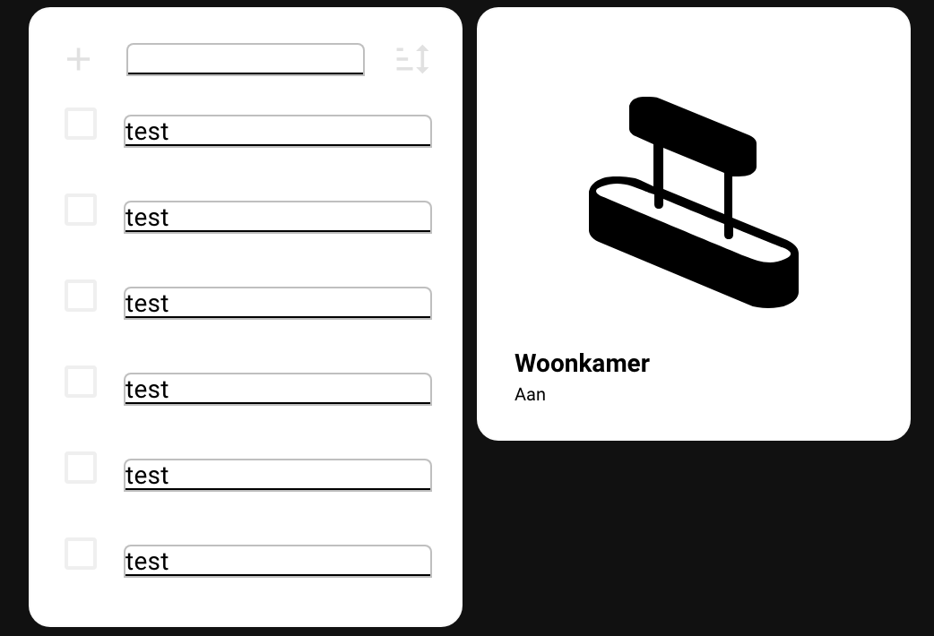
I hope that somebody can help me out with this one. I’m trying to create a new dashboard with square tiles and I was working on the Shopping list card. I did some modifications with card mod which I found on the web and in this thread. Unfortunately I’m stuck…
I would like to achieve the following:
- Keep the card as a square. Add a scrollbar instead of making the card longer.
- Have a border only around the first input text field instead of the items added to the list.
- Have less space between the items on the list.
Unfortunately I’m not able to figure this out and I hope somebody can help me with this. Thanks in advance!
              - type: shopping-list
                style:
                  ha-textfield:
                    $: |
                      .mdc-text-field__input {
                        color: black !important;
                      }
                      .mdc-text-field {
                        --mdc-text-field-fill-color: white;
                        border: 1px solid rgba(127,127,127,0.5);
                        height: auto !important;
                        --text-field-padding: 0px 0px;
                      }
                  .: |
                      ha-card {
                        background: white;
                        box-shadow: none;
                      }
                      :host {
                        --mdc-text-field-idle-line-color: black;
                        --mdc-text-field-hover-line-color: cyan;
                        --mdc-theme-primary: black;
                      }
Edit:
I found the solution for most the problems, except for the border around the text input at the top of the card.
          - type: shopping-list
            style:
              ha-textfield:
                $: |
                  .mdc-text-field__input {
                    color: black !important;
                  }
                  .mdc-text-field {
                    --mdc-text-field-fill-color: white;
                    height: auto !important;
                    --text-field-padding: 0px 0px;
                  }
              .: |
                  ha-card {

                    --mdc-typography-subtitle1-font-size: 11px;
                    background: white;
                    box-shadow: none;
                    height: 234px;
                    width: 100%;
                    max-height: 234px; /* Set a maximum height for the card */
                    overflow-y: auto; /* Enable vertical scrolling if content exceeds max height */

                    @media (max-width: 767px) {
                    height: 194px; /* Adjusted height for mobile */
                    max-height: 194px; /* Set a maximum height for the card */
                    }
                  }
                  :host {
                    --mdc-checkbox-ripple-size: 20px;
                    #--mdc-checkbox-state-layer-size: 5px;
                    --mdc-text-field-idle-line-color: grey;
                    --mdc-text-field-hover-line-color: red;
                    --mdc-theme-primary: grey;
                  }
2 Likes
@heisenberg Try this.
type: custom:button-card
entity: lock.front_door
tap_action:
  action: toggle
icon: mdi:door
show_name: true
show_state: false
size: 18%
state:
  - color: green
styles:
  card:
    - '--mdc-ripple-color': red
    - '--mdc-ripple-press-opacity': 0.5
  grid:
    - grid-template-areas: '"n" "i" "s"'
    - grid-template-columns: null
    - grid-template-rows: min-content fr min-content min-content
name: Front Door
Hi,
Hope it was not answered before, could not find it.
I want to apply several css mods in several selectors at the same time when 1 condition is met. I wish to avoid to have to have the same if statement for each selector. Can I normally do something like below (does not seem to work…), or i do I have to make an if statement for each selector?
type: thermostat
entity: climate.thermostat_chambre_theo
style: |
  {% if is_state_attr("climate.thermostat_chambre_theo", "hvac_action",
  "heating") %}
    #info {
      font-size: 1.5rem !important;
    }
    #modes {
      display: none;
    }
    #set-mode {
      --secondary-text-color: red;
    }
  {% endif %}
I’m trying to style an entity-filter card to squeeze more entities into a smaller space. I’ve been able to get the icons and text to scale and then to get them spaced vertically using margin-top and margin-bottom (zeroed out at the moment). I’ve got two issues I’d appreciate help with.
The first has to do with entity icons under the state-badge selector. The spotify icons behave differently than the mdc-icons. adjusting state-badge height and width has the expected effect on the spotify icons. they scale and stay centered. The mdc-icons, however don’t scale or re-center and end up overlapping the state text. I can scale them down with ‘–mdc-icon-size’, but that doesn’t adjust their alignment and I get the result in the attached image.

The second issue I’d love to resolve is I cannot figure out how to adjust the spacing of the entities horizontally. I’ve tried many variants of margin-left and -right with no success.
type: entity-filter
entities:
  - etc
state_filter:
  - etc
card:
  type: glance
  card_mod:
    style:
      .entities:
        .entity:
          $: |
            state-badge {
              margin-bottom: 0px;
              margin-top: 0px;
              height: 15px !important;
              width: 15px !important;
              filter: drop-shadow(1px 1px 2px black);
              --mdc-icon-size: 15px;
            }
            div:not(.name) {
              margin-top: 0px !important;
              font-size: .7vw;
            }
            .name {
              margin-top: 0px !important;
              font-size: .7vw;
              text-overflow: unset !important;
              white-space: unset !important;
              line-height: 130%;
            }
show_empty: true
this is a late return on the matter, hope to receive some more generic advice on my specific needs, especially for the 2 input_datetime s that are now regarded ‘on’ entities apparently…
What would be shortest to only have the entities that go on/off, so the left binary and the right 2 booleans change color when ‘on’, and leave the 2 date times untouched?
consider:
    - type: custom:hui-element
      card_type: picture-glance
      entities:
        - binary_sensor.wekker_gezet
        - entity: input_datetime.alarmclock_wd
          show_state: true
        - entity: input_datetime.alarmclock_we
          show_state: true
        - input_boolean.alarmclock_wd_enabled
        - input_boolean.alarmclock_we_enabled
      state_image:
        'on': /local/images/alarm_bell.png
        'off': /local/images/alarm_bell_off.png
      entity: binary_sensor.wekker_gezet
      card_mod:
        style: |
          ha-card {
            --ha-picture-icon-button-on-color: var(--alert-color);
            --ha-picture-icon-button-color: ivory;
          }
returning:


Anyone have a clue as to why my animation works in my PC browser, but not in the iOS Companion app?
            card_mod:
              style: |
                ha-card {
                  margin-top: -59px;
                  margin-right: 0px;
                  --card-primary-font-size: 16px;
                  --card-secondary-font-size: 14px;
                  --ha-card-border-width: 0px;
                }
                mushroom-shape-icon{
                  animation:
                    {% if is_state('thing1') or is_state('thing2') or is_state('thing3') %} blink 1s linear infinite;
                    {% endif %}
                }
                @keyframes blink {
                  50% {opacity: 0;}
                }
just as a heads up, be careful to check this out because card_mod seems broken in 2023.10.0b3
its been found in the current beta cycle, and seems to throw various results, some don’t see it, some see the header not move, and I dont see a single working card_mod being effective any longer.
Maybe chime in and report what you see in your specific config? would be helpful in debugging and ofc fixing for the author.Though the main reasons seems to have been pinpointed already
and fixed, by Thomas, so a big thanks is in order!
however, forcing me to move over from 3.1.4 (which has the changing icon in the header still functional) to the new 3.2.3.
This has another effect, namely I can no longer use my trusted mod on history-graph headers, which I used to simply set this class on:
        ha-card.class-header-margin .card-header {
          background-color: var(--background-color-off);
          font-weight: 400;
          font-size: 20px;
          color: var(--text-color-off);
          padding: 0px 12px;
          margin: 0px 0px 16px 0px;
        }
Ive been looking any the various examples here (and seem to remember a change in headers at some time, but cant find it), but I can not find the fix for this, so please could anyone help me out, how to mod the header and have it look like that again?
top is the class at work on a regular entities, below is the history-graph unmodded…

I’ve also tried the mentioned
  - type: history-graph
    title: Temperatuur - Verwarming
    card_mod:
      style:
        .: |
          .card-header {
            color: red;
            font-size: 38px;
            padding-bottom: 0px;
          }
in this thread, without succes
same goed for any of the other graph-card btw, so its a bit of a wider issue for me than this card alone, appreciate a pointer to the change/fix
this mentions the change, 🔹 Card-mod - Add css styles to any lovelace card - #3414 by Ildar_Gabdullin but I already applied that, and it doesnt work for the header
I had one spot where I took it into the shadow root with:
    card_mod:
      style:
        $: |
          .card-header {
             background-color: var(--background-color-off);
             font-weight: 400;
             font-size: 20px;
             color: var(--text-color-off);
             padding: 0px 12px;
             margin: 0px 0px 16px 0px;
           }
and that actually does set the correct background-color, but all off the other properties are untouched, resulting in

and then in dawned on me, need !important:
    card_mod:
      style:
        $: |
          .card-header {
             background-color: var(--background-color-off);
             font-weight: 400 !important;
             font-size: 20px !important;
             color: var(--text-color-off) !important;
             padding: 0px 12px !important;
             margin: 0px 0px 16px 0px !important;
           }

hardly a streamlined method, but it gets the job done. If anyone can instruct me to do it differently, please dont hold back…
leaving me with the ultimate challenge which !important cant solve either: how to change the icon of the view tab:
    paper-tab[aria-label='Beweging'] ha-icon$: |
      ha-svg-icon {
        --card-mod-icon: {{'mdi:motion-sensor' if
                           is_state('binary_sensor.motion_sensors_all','on') else
                           'mdi:motion-sensor-off'}};
        color: {{'red' if is_state('binary_sensor.motion_sensors_all','on')}};
      }
it does set the color alright, heck, it even correctly applies the condition al animation I set.
and it worked up to 3.1.4.
cant make it change the icon though anymore, no matter what I try. And that is really a bummer, because I didnt have to open a view to check the weather, or see how many people are at home. Just a glance at the tab in the menu would disclose this vital info
Can card-mod be used with the button-card HACS? I have an entity that I need word-wrap on (hense card-mod) but I also like the ease of hiding icon and name with button-card.
The color changes but the word-wrap doesn’t work bjut the card-mod wraps with a normal entity card (not button-mod)
type: custom:button-card
entity: sensor.nws_daily_summary
show_name: false
show_state: true
show_icon: false
card_mod:
  style: |
    :host {
      text-overflow: unset !important;
    }
      ha-card {
      color: red;
    }
The custom button card has its own style options. Have you tried that?
back again on this, seems that card_mod update changed something in those mods…
type: custom:mod-card
card_mod:
  style:
    tabbed-card $:
      .: |
        mwc-tab-bar {
          background: {{'var(--lovelace-background)'
                        if states('input_select.theme')|regex_search('(ight|Dark|Matrix)')
                        else 'var(--primary-color)'}};
        }
      mwc-tab:
        $:
          mwc-tab-indicator $: |
           .mdc-tab-indicator__content--underline {
              border-color: var(--text-color-off) !important;
            }

          .: |
            .mdc-tab {
              min-width: 80px;
            }
            .material-icons {
              display: contents !important;
            }

            .mdc-tab--active {
              --mdc-icon-size: {{states('input_number.active_icon_size')}}px;
              /*background: var(--text-color-off) !important;*/
            }

    .: |
      tabbed-card {
        --mdc-tab-horizontal-padding: 0px;
      }
worked just nicely before, amongst others, but now, even mentioning the
mwc-tab:
causes an error of Unhandled Promise Rejection: TypeError: Argument 1 ('target') to MutationObserver.observe must be an instance of Node in inspector:

not sure where to start, but figured since its such a specific error to tabbed cards mods, this would be the best place to begin.
Any thoughts would be appreciated!
this code runs ok:
type: custom:mod-card
card_mod:
  style:
    tabbed-card $:
      .: |
        mwc-tab-bar {
          background: {{'var(--lovelace-background)'
                        if states('input_select.theme')|regex_search('(ight|Dark|Matrix)')
                        else 'var(--primary-color)'}};
        }
#       mwc-tab:
#         $:
#           mwc-tab-indicator $: |
#            .mdc-tab-indicator__content--underline {
#               border-color: var(--text-color-off) !important;
#             }
#
#           .: |
#             .mdc-tab {
#               min-width: 80px;
#             }
#             .material-icons {
#               display: contents !important;
#             }
#
#             .mdc-tab--active {
#               --mdc-icon-size: {{states('input_number.active_icon_size')}}px;
#               /*background: var(--text-color-off) !important;*/
#             }

    .: |
      tabbed-card {
        --mdc-tab-horizontal-padding: 0px;
      }
edit/update
I had obviously missed Ildar’s note on the change format of the card_mod,
moving it all under that $ like this makes all work, and the error disappear:
card_mod:
  style:
    tabbed-card:
      $:
        .: |
          mwc-tab-bar {
            background: {{'var(--lovelace-background)'
                          if states('input_select.theme')|regex_search('(ight|Dark|Matrix)')
                          else 'var(--primary-color)'}};
          }
        mwc-tab:
          $:
            mwc-tab-indicator $: |
             .mdc-tab-indicator__content--underline {
                border-color: var(--text-color-off) !important;
              }

            .: |
              .mdc-tab {
                min-width: 80px;
              }
              .material-icons {
                display: contents !important;
              }

              .mdc-tab--active {
                --mdc-icon-size: {{states('input_number.active_icon_size')}}px;
                /*background: var(--text-color-off) !important;*/
              }

      .: |
        tabbed-card {
          --mdc-tab-horizontal-padding: 0px;
        }
Custom button-card doesn’t seem to have a word-wrap option, but I finally was able to get the visual I wanted with card-mod through a bunch of trial and error last night. Thanks.
Not explicitly, but you can inject your own CSS, similar to card-mod: injecting CSS with extra_styles.
But even with styles you just set CSS properties. All the options won’t be listed.
For example:
          styles:
            card:
              - font-size: 12px
That font-size is CSS.