No. Style tags are not allowed either.
Perfect. Thanks!
Whelp that explains why it wasn’t working.
1 Like
Hello!
I have used card-mod successfully with different cards, but I am not able to modify the text size in an input_number mode: box. Any suggestion?
Thanks in advance!

Hello. Tell me please I can change the style of the service-button?
I need to remove the opacity from mwc-button.
I have a piece of HTML:
<hui-service-button-element class="element" style="left: 40%; top: 20%;">
  shadow-root
   <ha-call-service-button>
    shadow-root
	 <ha-progress-button id="progress" tabindex="0">
	  shadow-root
	   <div class="container" id="container">
        <mwc-button id="button">
AND I treid to do it like this:
- type: picture-elements
              image: /local/ui/devices/bedroom_TV/remote_controller.png?v1
              debug_cardmod: true
              style: |
                       ha-card .element:before {
                            content: "";
                            background: green;
                            position: absolute;
                            padding-top: 300%;
                            padding-left: 350%;
                            border-radius: 100px;
                            overflow: hidden;
                            opacity: 0;
                            transition: all 0.8s;
                            pointer-events: none;
                        }
                        ha-card .element:active:before {
                          padding: 0;
                          margin: 0;
                          opacity: 1;
                          transition: 0s;
                          border-radius: 100px;
                          overflow:hidden;
                        }
                        "#states div":
                           service-button:
                           $:
                             ha-call-service-button:
                              $:
                                ha-progress-button:
                                        $: |
                                         #container #button{
                                             opacity: 0;
                                         }
              elements:
                - type: service-button
                  service: media_player.toggle
                  service_data:
                   entity_id: media_player.bedroom_tv4
                  style:
                    left: 40%
                    top: 20%
Help me please. Where is my mistake?
It seems that it is no longer possible to style markdown cards. See issue 2. here:
I would raise an issue but am not sure if it should be for card-mod or the frontend. Do you have an opinion / guidance Thomas?
EDIT: Never mind. Some one has opened an issue in your repo:
then it would be more of a HTML card rather than markdown.
This is how I get around it, pretty much put each row in a div and target each for using
ha-markdown :nth-child(2) {
   text-align:center;
}
You can view my config here
but of course only ha-card level styles applies how that card-mod needs a rework after 0.111
@thomasloven, i’m having an issue where I am using a conditional “card” where it only displays if the entity is on.
My issue is style doesn’t work on this so I’m using the mod-card, but i still am unable to get the height to work. Am I doing something incorrectly?

Have you tried applying the style to the gauge card? Regardless of whether it’s conditional, that ought to work.
I sure have. I have tried the custom card, the conditional , and the gauge card. It just doesn’t want to work. it’s being rude. 
I’m playing around with the config from Mattias_Persson
I don’t have much height on my tablet (landscape) so I’d like to remove the app-toolbar
My template is mostly the same as here I’ve tried to use the debug_cardmod option but this does not display anything in my browser console?!


1 Like
I’d really like to get my headers back to how they were…

I can do the font and border but I don’t seem to be able to style the actual card at the same time.
This does the markdown bit;
type: markdown
style:
  ha-markdown:
    $: |
      h2 {
        font-family: {{ font_family }};
        font-size: {{ font_size }};
        font-weight: 100;
        color: {{ color }};
        padding-left: {{ padding_left }};
        border-left: {{ border_left }} {{border_left_color}};
      }

But how do I remove the box-shadow and background-color of the actual card?
this doesn’t do it…
type: markdown
style: |
  ha-card {
    margin: {{ margin_top }};
    background-color: {{ background_color }};
    box-shadow: {{ box_shadow }};
  }
  ha-markdown:
    $: |
      h2 {
        font-family: {{ font_family }};
        font-size: {{ font_size }};
        font-weight: 100;
        color: {{ color }};
        padding-left: {{ padding_left }};
        border-left: {{ border_left }} {{border_left_color}};
      }
The selector changed. So your pathing is incorrect at this point in time.
Yeah I have that bit ok (I thought). It is the ha-card bit I can’t get right.
I think it would be
ha-markdown:
$:
ha-card:
$: |
div {
EDIT: I Don’t use markdown cards but I’m using the lovelace demo to get the selector. So you’d have to test it out. Either way, there’s 2 shadow roots now.
and you might have to replace div with card-header, seeing that it has a class.
style:
.: |
ha-card {...}
  ha-markdown:
    $: |
h2 {...}
H2 is currently a special case with the markdown card, btw. In order to reliably set the font-size and font-weight you’ll have to use
ha-markdown-element:first-of-type h2 {instead of h2 { and add !important to the properties.
See end of this github issue: https://github.com/thomasloven/lovelace-card-mod/issues/52.
2 Likes
Thanks for the pointers but…
blimey, things are getting complex!!
I wonder if I might be better off just changing to using a custom button card. It’s a pretty simple use case I have here and it means I don’t have to struggle so much with CSS.
Especially if the use of the word ‘currently’ here…
really does mean it might all change again in the future.
I have an input_boolean in an entities card, and I am trying to change the colour of the toggle switch (in the hui-toggle-entity-row) to be different from the theme. So, for example, I would want the toggle to be a colour other than blue in the sample below:
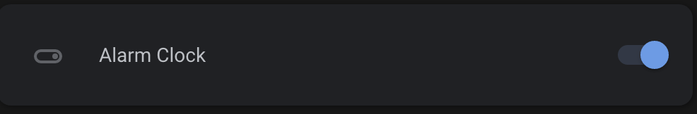
Is there a way to do this with card-mod as I haven’t found a a way yet?
Does this work for you?
      - type: entities
        style: |
          ha-card {
            --switch-checked-button-color: red;
          }
        entities:
          ...
This should change every toggle on the card. You’d have to get into
ha-card div#states div:nth-of-type(n) type-stylings to set the variable at the individual entity level I think.
1 Like
That works brilliantly, thanks.