You would be better off asking Thomas in the topic I linked to. I have not used those particular css options.
Right, thanks 
So I’m a little confused… I use a few different themes. (Downloaded via HACS and I use an input select with an automation to change theme)
Some of the themes seem display different icons with different colours… So far as I cam tell,
paper-item-icon-color:
state-icon-color:
seem to be the main culprits. So I’d like some global way of mapping paper-item-color to state-icon-color… now I know I can do that with card mod on a card and I could also just edit the offending themes but that makes it hard when the theme maker updates a theme.
This is an example of what I mean.
With Google Dark Theme:

With ios-dark-mode-blue-red

Google Dark Mode
  paper-item-icon-color: rgb(169, 177, 188)
  paper-item-icon-active-color: rgb(138, 180, 248)
  state-icon-color: rgb(138, 180, 248)
  state-icon-active-color: rgb(169, 177, 188)
iOS Dark Blue Red
  state-icon-color: "#FFF"
  state-icon-active-color: rgba(255, 214, 10, 1)
  paper-item-icon-active-color: rgba(255, 214, 10, 1)
  paper-item-icon-color: "#333333"
So I’d like to be able to set a global style that maps paper-item-icon to the state-icon-color etc overiding the theme. Is that something this card-mod can do?
For me it has no effect on the color.
Would you care to share an example of a theme-file that has these class definitions?
This feature will make styling much easier!
Thanks 
I posted an example here last week:
1 Like
Great thanks, that got me started.
I´m having som problem reaching markdown
This is what I´m trying to convert.
content: |
  # Doors
style:
  .: |
    ha-card {
      padding-left: 20px !important;
      background-color: var(--primary-background-color);
      border-radius: 15px;
      margin: 10px;
      box-shadow: none;
    }
  ha-markdown:
    $: |
      h1 {
        font-size: 20px !important;
        font-weight: 500 !important;
        padding: 0px 0px 0px 8px !important;
        border-left: 3px solid #ffcc00;
        color: var(--card-header-text-color);
      }
type: markdown

card-mod-theme: clear
  card-mod-card: |

    ha-card.header-card {
      padding-left: 20px !important;
      background-color: var(--primary-background-color);
      border-radius: 15px;
      margin: 10px;
      box-shadow: none;
    }

    ha-card.header-card ha-markdown {
      $: |
        h1 {
          font-size: 20px !important;
          font-weight: 500 !important;
          padding: 0px 0px 0px 8px !important;
          border-left: 3px solid #ffcc00;
          color: var(--card-header-text-color);

        }

But I can´t get the correct syntax for the markdown bit, any suggestions ?
I can’t seem to locate the/a example for animated icons moving across what is presumably a picture entities card like in the OP example. Link to ‘more examples’ is dead via Github. Could someone please point me in the right direction?
I’m interested in using this to draw bounding boxes (or at least “positioning icons”) for image processing/object detection.
Thanks plus maybe sorry if I’ve missed something obvious…
I’m pulling my hair out here. How do I get buttons within a horizontal-stack to align to the left side of the screen with defined space between them? I figured out how to set a uniform size for the button in ha.card.type-button but can’t figure out the alignment. Right now they evenly space across the screen. I’ve tried setting margin and padding everywhere I can think of but I’m at a loss. Surely others have done this?
Also, is there a cheatsheet somewhere for where to format the stack title and icon and friendly name within a button? I’ve tried using the Inspector in Chrome but to no avail.
Hi, I’m looking for some help on how to style a certain element within the shadow-dom. Despite the various examples in this thread I’m still failing to write the proper syntax.
I want to style the items of a shopping list card.
The DOM tree for these items is (class/id added when element has that property too):
ha-card > div (.addRow) > paper-input (.addBox) > $ > paper-input-container (#container) > iron-input (.input-element) > $ > input

ha-card > div (.editRow) > paper-input > $ > paper-input-container (#container) > iron-input (.input-element) > $ > input
Following the examples in this thread this should do the trick to style both elements:
style:
  paper-input:
    $:
      iron-input:
        $: |
          input {
            color: red !important;
          }
but it doesn’t. I’ve already tried via the classnames or id’s as well or adding all tree elements that you should be able to skip in the selector.
I also have enabled debug_cardmod: true but don’t see any feedback in the console.
To be complete: the shopping list card is itself daughter of a stack-in card, but I don’t think that’s an issue. Styling shopping-card elements that are not inside a shadowroot works fine.
Could someone help me figure out on which element I should be adjusting the margin/padding to get rid of the space between these buttons in a horizontal stack? I’ve tried seemingly everywhere…modifying ha-card with a style tag under the button definition doesn’t seem to do it. The orange space is what I’m trying to eliminate. This is what Inspector shows when I click on this button card element.

Edit:
I figured it out within the style: tag with much experimentation, but how do I now convert this into the themes.yaml so it is applied everywhere? I have the basic structure with card-mod-card:, etc.
              style:
                hui-horizontal-stack-card:
                  $:
                    "#root": |
                      hui-button-card {
                        width: 130px !important;
                        max-width: 130px !important;
                      }
Hi,
I am trying to use a layout-card grid layout. When I do that, I get something like this:

Except that I manually edited the style for the div tag in my browser to set height:100%.
And that is my question:
I would think it would be more sensible if the div tag was 100% by default. The <layout-card> does have the height I want, but the div tag sizes after its content instead of after the <layout-card>.
Anyway, I can not figure out to use card-mod to set the height of the div tag to 100%. Can anybody help.
Sorry if the above is to terse, just let me know if I should add more code and screen samples
Thanks this is kind of what I was looking for too. I was trying to use entity filter on the badge to hide when not active. I found out mod-card is needed for this but this only works with cards not badges.
Then realised your template hides the badge when not on as well which is awesome! The only problem is when loading the page the badge displays for a second then hides. Is there another way to do this without this effect? Did you find a more elegant solution @Tomahawk?
Hi, first, thanks a lot for this module !
I have found most example and use it in my lovelace.
Today, i don’t find example so i ask here my question :
I would like to reduce margin/padding of ‘time-picker-time’.
I try to enter in shadow-root but i can’t do it.
I have this :

i use :
style: |
  ha-card{
   background-color: rgba(0,0,0,0);
  }
  .time-picker-content{
    background-color: red;
  }
  time-unit{
        background-color: blue;
      }
and i got : 
but i would like to go into shadow-root at time-unit class and i can’t do it :
style: |
  ha-card{
   background-color: rgba(0,0,0,0);
  }
  .time-picker-content{
    background-color: red;
  }
  $: |
    .time-unit{
      background-color: green !important;
    }
i got : 
Can you help me ?
Thanks.
Feature request:
On some dialogs the more-info styles don’t apply. Would it be possible to style stuff like the conversation dialog or the reboot confirmation dialog?
Try this out:
style:
  .: |
    ha-card {
     background-color: rgba(0,0,0,0);
    }
    .time-picker-content{
      background-color: red;
    }
  $: |
    .time-unit{
      background-color: green !important;
    }
Thank you for helping me.
Unfortunately it does not work.
The result is the same as the last image…

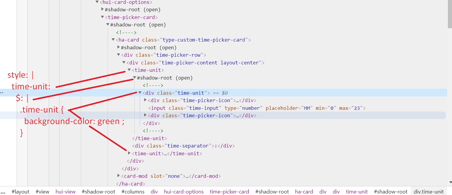
Sorry, thought you could figure it out from there. This should work:
style: |
  ha-card {
    background-color: rgba(0,0,0,0);
  }
  .time-picker-content {
    background-color: red;
  }
  time-unit:
    $: |
      .time-unit {
        background-color: green !important;
      }
Thanks for your answer.
it still doesn’t work.
I understand the tree structure of your code.
That’s why I don’t understand why it doesn’t work :
Does the style show in the styles tab? I don’t see card-mod, so maybe try saving and trying again.