šŸ”¹ Card-mod - Add css styles to any lovelace card

@Mariusthvdb
What I got:

type: vertical-stack
cards:
  - type: custom:auto-entities
    show_empty: false
    card:
      type: entities
    filter:
      include:
        - entity_id: media_player.*
          options:
            type: custom:hui-element
            card_type: markdown
            card_mod:
              style: |
                ha-card {
                  background-image: url({{state_attr(config.entity,'entity_picture')}});
                  background-repeat: no-repeat;
                  background-position: right;
                  background-size: contain;
                  text-align: left;
                  height: 200px !important;
                }
            content: |
              status = {{states(config.entity)}}
              add whatever you want


I do not want to put any text above the cover art.
The text may be allocated on the left half of the card.

can anyone help me get the text styled on a gauge card? iā€™ve tried literally every combination of shadow-root and non-shadow root styles i can think of and nothing works.

iā€™ve gotten the text to move over based on some of the tips i found previously in this thread (left: 70% !important;) but as soon as i try to use the same code to change the color or size of that text, it doesnā€™t workā€¦

i have the card-mod showing up (i think correctly), but i just canā€™t get the text to change any stylesā€¦

        card_mod:
          style:
            ha-gauge$:
              svg.text: |
                .value-text {
                  color: #ff0000 !important;
                }

Screen Shot 2021-10-09 at 2.32.16 AM

I am officially stuck.
There is a need to replace a variable:

some_element {
  --secondary-text-color: SOME_COLOR;
}

This works:

some_element {
  --secondary-text-color: red;
}

This works too if --some-variable is defined in the current theme:

some_element {
  --secondary-text-color: var(--some-variable, red);
}

This DOES NOT work:

some_element {
  --secondary-text-color: var(--some-variable, var(--secondary-text-color));
}

This DOES NOT work too:

some_element {
  --primary-text-color: var(--secondary-text-color);
  --secondary-text-color: var(--some-variable, var(--primary-text-color));
}

This works but gives errors in Inspector:

some_element {
  {% set COLOR = var(--secondary-text-color) %}
  --secondary-text-color: var(--some-variable, {{COLOR}});
}

Using card-mod for custom:bar-card to display 2 text lines:

Read here.

1 Like

Hello! I would like to change the color of the ā€œBadgesā€ icon. Day is on yellow color. Night, blue. operated so far. Iā€™ve updated (Core, Supervisor) and no longer working. can someone show a good config. thanks
2021-10-11_151530

Read the 1st post , you will find a link to examples.

How can I access Collapsable Card to e. g.

  1. remove box shadow?
  2. reposition title box text (text-align: center)?

For 1):
Using ha-card always styles the whole card (entities card) and the collapsable card (one of those entities).

For 2): Using the buttonStyle option either only accepts only one CSS style definition (font-size) or the syntax is not accepted. Pretty poor documentation unfortunately but a great card anyway.

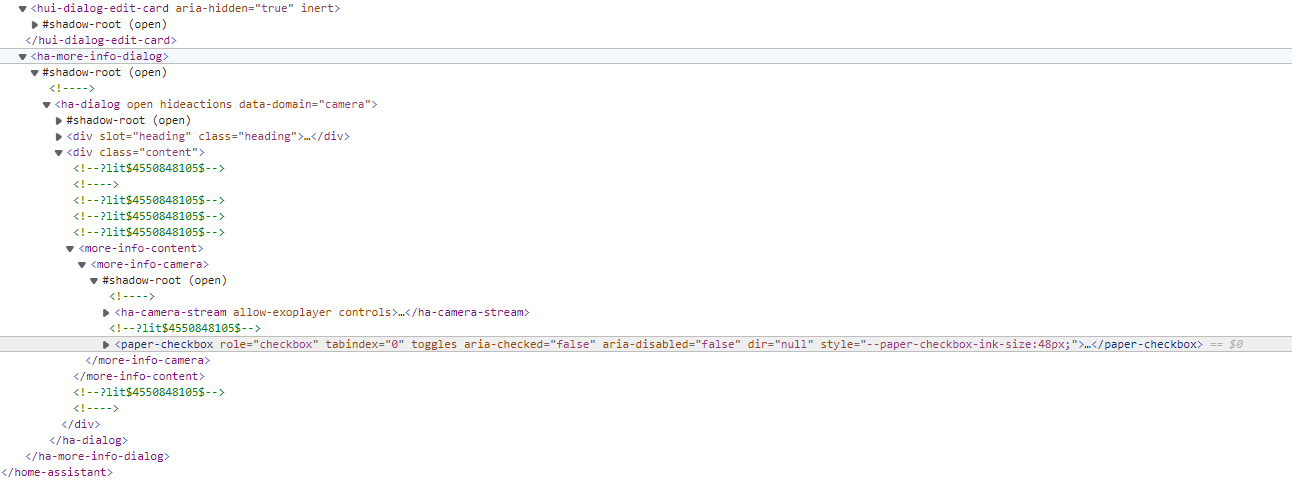
@Ildar_Gabdullin you got an idea? I really should start to learn how to inspect elements and get the name I need to address themā€¦ :slight_smile:

doesnā€™t work.

i use

  - entity: device_tracker.samsung
    name: child
    style:
      ha-state-label-badge:
        $:
          ha-label-badge:
            $:
              .value: |
                ha-icon {
                  color: {{ "var(--state-icon-active-color)" if is_state('device_tracker.samsung', 'home') }} !important;
                }

Worked for 2 years.
Now it doesnā€™t work

1 Like

This is a wrong code.
And it is wrong from the end of 2020 at least (the time when I started learning about styling badges).
I gave you a link already.
Try a bit harder.

Hi all,
Iā€™ve run into an interesting difficulty. When using custom:upcoming-media-card with the Plex component, I add two cards (recent movies and recent TV shows) within a custom:mod-card and then a custom:layout-card (same behaviour has been noticed when using picture-elements as base card). I then use card-mod to style each card to my liking (different styling for each card), but I end up with only the style for the second card being applied to both.

Hereā€™s a MWE:

type: 'custom:mod-card'
card_mod:
  style: |
    style-for-grid-layout
card:
  type: 'custom:layout-card'
  cards:
    - type: 'custom:upcoming-media-card'
      entity: sensor.recently_added_TV
      card_mod:
        style: |
          style A
    - type: 'custom:upcoming-media-card'
      entity: sensor.recently_added_movies
      card_mod:
        style: |
          style B

With this example, I end up with style B for both cards. It is important to note, that both cards of course use the same elements (e.g. #main.rece_poster or .rece_poster .rece_svg_poster

Anybody have an idea how to make style A stick to card A and style B stick to card B?

Hi, I am not using this card and cannot help you, unfortunately. Styling a new card is always step-by-step thing, sometimes need lots of time for tryingā€¦

I see. As this card is really gorgeous and quite simple AND powerful Iā€™d like to learn styling it.

ā€”> Can you kickstart me and point me to the right direction: how to inspect a cardā€˜s element and how to get the name of itā€˜s elements?

I saw some basic guide some time ago but canā€™t find it anymore.

Hi,
This is my first time using card-mod and I have gotten the basics right.
But I am trying to hide the ā€œpreload streamā€ selector of the picture entity card and I am not able to do it.
For now I have this:

main-theme:
  card-mod-theme: main-theme
  card-mod-more-info-yaml: |
      paper-checkbox {
          display: none !important;
      }

I am a person who used to be a programmer 15 years ago but was never related to web programming, so my explanation & ways are a bit specific. Initially I knew nothing about CSS.
BTW, this resource I am using for studying CSS - https://www.w3schools.com, I find it very helping.

So, there is a card - let it be Entities card.
The card contains elements inside a tree-like structure.
Every node has a name.
Some subnodes are inside a special node which is called ā€œshadow-rootā€.
Here is a primitive tree:

> card
>> header
>> rows
>>> row 1
>>>> state
>>>> shadow-root
>>>>> icon
>>>>> name
...

Each node has some properties (font-size, elementā€™s height, text color etc).
Sometimes a property on some node reflects on itā€™s subnodes - but sometimes some subnode overrides some property.
The Code Inspector is used to show the elementsā€™ tree & each elementā€™s properties.
Before using card-mod you may change some property instantly in the Inspector and see if it works.
As a result you know which property should be changed for which element.
Then you should find out a path to some particular element starting from some basic node.
There are two cases for the Entities card: either your basic node is ha-card element (i.e. the card itself - then you may change card-wide properties or a title) or the basis node is root level of some row.
Use examples from the 1st post and then you will easily get the point.
Also, sometimes we have to use mod-card but this is another story.

2 Likes

can anyone help me out with this? iā€™m stuck, iā€™ve tried literally everything i can think of and i just canā€™t get it to workā€¦

I wonder if there are parsing changes in combination with 2021.10.x? Before, this was working:

  - type: custom:restriction-card
    card_mod:
      style:
        hui-cover-entity-row:
          $:
            hui-generic-entity-row:
              $:
                state-badge:
                  $:
                    ha-icon:
                      $: |
                        ha-svg-icon {
                          {% if state_attr('cover.rolladen_kinderzimmer', 'current_position')|int < 100 %}
                            color: var(--hilf-color);
                          {% else %}
                            color: var(--hilf-active-color);
                          {% endif %}
                        }
    row: true
    card:
      entity: cover.rolladen_kinderzimmer
      name: Kinderzimmer
    restrictions:
      confirm:
        text: Schalter aktivieren?
    condition:
      entity: switch.shelly_hausturklingel_klingelstatus
      value: 'off'

and not anymore with 2021.10.3

And only by chance, duringig plaing around I saw that this additinal $ on same level (???) is now fixing this. But only at this position.

  - type: custom:restriction-card
    card_mod:
      style:
        $:
        hui-cover-entity-row:
          $:
            hui-generic-entity-row:
              $:
                state-badge:
                  $:
                    ha-icon:
                      $: |
                        ha-svg-icon {
                          {% if state_attr('cover.rolladen_kinderzimmer', 'current_position')|int < 100 %}
                            color: var(--hilf-color);
                          {% else %}
                            color: var(--hilf-active-color);
                          {% endif %}
                        }

And this problem is independent if the restriction is on or off.

Any ideo of this change and why it is working with such addational $ the same level?

Question: Is the custom:entity-attributes-card already investigated so it can be styled? Are you maybe using it already @Ildar_Gabdullin ?

What IĀ“m looking for:
IĀ“d like to highlight some lines (bold text), remove some empty space above the table area etc. Great card but doesnĀ“t look that great out of the box unfortunately.

Card: https://github.com/custom-cards/entity-attributes-card

Usage example:

type: conditional
conditions:
  - entity: sensor.dwd_wetterwarnung_current_warning_level
    state_not: '0'
card:
  type: custom:entity-attributes-card
  title: ā—ā—ā— Aktuelle Wetterwarnung ā—ā—ā—
  heading_name: ' '
  heading_state: ' '
  filter:
    include:
      - key: sensor.dwd_wetterwarnung_current_warning_level.warning_1_headline
        name: 'ā–¶'
      - key: sensor.dwd_wetterwarnung_current_warning_level.warning_1_description
        name: ' '
      - key: sensor.dwd_wetterwarnung_current_warning_level.warning_1_start
        name: 'Von:'
      - key: sensor.dwd_wetterwarnung_current_warning_level.warning_1_end
        name: 'Bis:'
  card_mod:
    style:
      .: |
        ha-card { # NOT WORKING BECAUSE NOT APPLIED TO CUSTOM CARD!!!
          margin-left: 1px;
          margin-right: 1px;
          #margin-top: -30px;
          #margin-bottom: -30px;
          #box-shadow: none;
        }

grafik
Want:

  1. first line BOLD
  2. remove empty space between card title and first line of custom card generated table

No, I am not

Iā€™ve been trying to reduce the amount of lovelace code I originally coded. When I first coded this I used conditional cards to change my styling. Now, I think I can use card-mod to help reduce code but Iā€™m missing something. It nevers bolds the label, please point me in the right direction.

      - type: state-label
        entity: input_text.br2
        tap_action:
          action: none
        hold_action:
          action: none
        style:
          top: *row_03
          left: *column_1
          max-width: 1px
        card_mod:
          style: |
            ha-card {
              font-weight:
                {% if is_state('sensor.room_presence', 'BR2') %}700{% else %}400{% endif %};
            }