šŸ”¹ Card-mod - Add css styles to any lovelace card

Well thatā€™s pretty much my issue (where I need help): I donā€™t know how to address this element. Still not familiar with CSS inspectors.

I always only see so many trees - but no forest :frowning:

Thatā€™s the biggest mountain to climb for me, the dark mode think afterwards seems to be a bit easier because of the example code you already provided.

I cannot see a header here.
What is hidden inside shadowRoot?

Hello Everyone!

I was trying to create a ā€œcustom:vertical-stack-in-cardā€ as an element of the main ā€œpicture-elementsā€ card.

This is the vertical-stack-in-card code:

  - type: custom:vertical-stack-in-card
    horizontal: true
    cards:
      - type: custom:button-card
        entity: script.alza_tutte_tapparelle
        tap_action:
          action: call-service
          service: script.alza_tutte_tapparelle
      - type: custom:slider-entity-row
        entity: cover.finestra_soggiorno
        full_row: true
      - type: custom:button-card
        entity: script.abbassa_tutte_tapparelle
        tap_action:
          action: call-service
          service: script.abbassa_tutte_tapparelle
      - type: custom:button-card
        color_type: blank-card
      - type: custom:button-card
        entity: script.arrivederci
        tap_action:
          action: call-service
          service: script.arrivederci
      - type: custom:button-card
        entity: script.buonanotte
        tap_action:
          action: call-service
          service: script.buonanotte
    style:
      top: 9%
      left: 32.5%
      width: 55%

I get the following:
Cattura.PNG

which is quite fine to me, but i would like to allign vertically the slider, and i canā€™t figure out how to do that! I tryed many card-mod configuration, but notthing actually works

Could you kindly help me?
Thank you in advance!

Best regards.
Carmin3

There we have:

Edit/Update:
I could find the style applied using the buttonStyle card settingā€¦

type: custom:collapsable-cards
title: šŸŽ„ Test
defaultOpen: false
buttonStyle: 'font-size: medium; color: cyan;'
cards:

ā€¦ here:

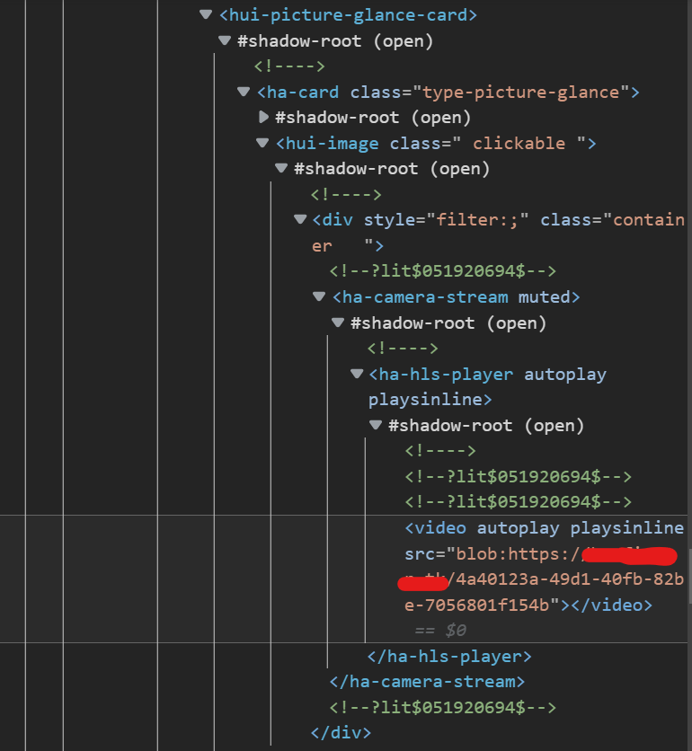
Now the only question is how to access/address this? I always struggle with that kind of ā€œreverse engineeringā€ of CSS with all that shadow rooting and stuff. Itā€™s magic! :smiley:

The light/dark mode depending settings afterwards are quite easy.

I am afraid I cannot help you by watching these pictures. Unless I install the card and start testing it. May be Iā€™ll do it a bit later.

1 Like

Oh that would be very kind Ildar. Probably the most efficient and effective way. Thank you in advance :pray:

    type: custom:vertical-stack-in-card
    card_mod:
      style: |
        ha-card div { align-items:center; }
    horizontal: true
    cards:

It works!
Thank you!
:slight_smile:

@e-raser

The simplified card:

type: custom:collapsable-cards
title: Card header
defaultOpen: desktop-only
buttonStyle: 'font-size: 26px; '
cards:
  - type: entities
    entities:
      - entity: sun.sun

Default theme, light mode:
ŠøŠ·Š¾Š±Ń€Š°Š¶ŠµŠ½ŠøŠµ

Dark mode:
ŠøŠ·Š¾Š±Ń€Š°Š¶ŠµŠ½ŠøŠµ

How to style a header in general:

type: custom:collapsable-cards
title: Card header
defaultOpen: desktop-only
buttonStyle: 'font-size: 26px; '
cards:
  - type: entities
    entities:
      - entity: sun.sun
card_mod:
  style: |
    .card-content {
      background: red;
    } 

which gives always a red header:
ŠøŠ·Š¾Š±Ń€Š°Š¶ŠµŠ½ŠøŠµ

Also you may specify a style for a ā€œfocusedā€ header:

    .card-content:focus {
      background: orange;
    } 

How to process a current mode (for simplicity - same colors for focused & non-focused):

card_mod:
  style: |
    @media (prefers-color-scheme: dark) {
      .card-content,
      .card-content:focus {
        background: red;
      } 
    }
    @media (prefers-color-scheme: light) {
      .card-content,
      .card-content:focus {
        background: green;
      } 
    }

which gives this:
ŠøŠ·Š¾Š±Ń€Š°Š¶ŠµŠ½ŠøŠµ

Uninstalled the card)))

2 Likes

Thank you very much. I have another use case where the light/dark mode styles are not applied.

To be more precise: dark mode setting seems to be ignored.

code
          - type: custom:mod-card
            style: |
              ha-card {
                margin-left: 1px;
                margin-right: 1px;
                margin-top: -15px;
                margin-bottom: 1px;
                padding-top: 15px;
                padding-bottom: 10px;
                box-shadow: none;
              }
              @media (prefers-color-scheme: light) {
                ha-card {background: #ffffff !important;}
              }
              @media (prefers-color-scheme: dark) {
                ha-card {background: #1c1c1c !important;}
              }
            card:
              type: horizontal-stack
              columns: 2
              cards:
                - type: entities
                  title: null
                  state_color: true
                  show_header_toggle: false
                  entities:
                    - type: custom:template-entity-row
                      entity: switch.router_guest_wifi
                      name: 'Scannen:'
                      secondary: ''
                      state: ''
                      icon: mdi:qrcode-scan
                      active: >-
                        {{ is_state('switch.router_guest_wifi', 'on')
                        }}
                  card_mod:
                    style:
                      .: |
                        ha-card {
                          #margin-left: 1px;
                          #margin-right: 1px;
                          margin-top: -20px;
                          margin-bottom: 1px;
                          padding-bottom: 30px;
                          box-shadow: none;
                        }
                - type: picture
                  image: /local/images/dashboards/wifi_guests_2022-07.png
                  tap_action:
                    action: url
                    url_path: >-
                      http://homeassistant.local:8123/local/images/dashboards/wifi_guests_2022-07.png
                  hold_action:
                    action: none
                  card_mod:
                    style:
                      .: |
                        ha-card {
                          #margin-left: 1px;
                          #margin-right: 1px;
                          margin-top: -15px;
                          #margin-bottom: 25px;
                          padding-right: 10px;
                          padding-top: 25px;
                          box-shadow: none;
                        }

Currently - during the day - light mode is active (setting ā€œautoā€ so HA/system setting). This gives perfect view as desired:
grafik

But when switching to dark mode (via profile settings) it gives (see the white line marked in orange):
grafik

Whereā€™s my mistake?

Are you sure that this code should work?

            style: |
              ha-card { ... }
              ha-card { ... }

Why not - I donā€™t see any syntactic difference to e. g.

card_mod:
  style: |
    @media (prefers-color-scheme: dark) {
      .card-content,
      .card-content:focus {
        background: red;
      } 
    }
    @media (prefers-color-scheme: light) {
      .card-content,
      .card-content:focus {
        background: green;
      } 
    }

Oh waitā€¦ is it the first ā€œstaticā€ ha-card section before the two @media sections?
Do I maybe need to move that part to both @media sections?

I think this is a solution))
Never tested ā€œ@mediaā€ by myself, probably there could be a way to define a particular CSS property dependently on dark_modeā€¦

I did not change anything. But tested again:

NOW we have night so dark mode is activated by default. And now it is vice versa:

  • dark mode: looking fine :white_check_mark:
    grafik

  • light mode (manually choosen from profile settings): :woozy_face:
    grafik

Donā€™t really get it. But in the end it should be fine as long as the theme setting is set to ā€œautomaticā€.

Update: Interestingly this only happens when using mod-card! On another place I donā€™t need the light + dark mode settings at all cause it looks fine by default (works perfect - light and dark mode shown correctly).
ā†’ Worth raising an issue on GitHub for mod-card?

Could someone help me with the correct syntax please iā€™m trying to apply object-fit: fill to the video tag in a picture-glance card

Iā€™ve tried everything I can think of without much success

camera_view: live
type: picture-glance
entities: []
camera_image: camera.doorbell_main_proxy
card_mod:
  style:
    video$: |
      :host, video {
        object-fit: fill !important;
      }
      video {
        object-fit: fill !important;  /* fill the whole card */
      }
    .: |
      ha-card {
        object-fit: fill !important;  /* fill the whole card */
      }
      ha-card, video {
        object-fit: fill !important;  /* fill the whole card */
      }
      ha-card video {
        object-fit: fill !important;  /* fill the whole card */
      }
      #video {
        object-fit: fill !important;  /* fill the whole card */
      }
      video {
        object-fit: fill !important;  /* fill the whole card */
      }
      :host, video {
        object-fit: fill !important;
      }

Probably you should try only possibly valid selectors instead of trying everything.

Which is why iā€™m asking for help.

There are examples for picture glance card (check the 1st post).
Since you know what a Code Inspector is you may construct a valid path to a needed element based on those examples.

Hi all, can you please let me know the correct attribute to a background colour to my vertical stack in my hui-element card.

I think the CSS element is the ā€œhui-vertical-stack-cardā€ but I havenā€™t had any success with the correct attribute to change the background value. I have removed all the backgrounds for the child cards.

type: custom:hui-element
card_type: vertical-stack
cards:
  - type: markdown
    content: Network UPS - {{ states['sensor.unifi_ups_status'].state }}
    style: |
      ha-card {
          --paper-card-background-color: 'rgba(0, 0, 0, 0.0)';
          --ha-card-background: "rgba(0, 0, 0, 0.0)";
          --ha-card-box-shadow: 'none';
          font-size: 18px;
          font-weight: bold;
          text-align: center;
          margin-bottom: -10px;
          margin-top: -10px;
      }

Thanks in advance

There 2 reasons to use hui-element for some card:
ā€“ if you want to place the card into Entities card for some reason;
ā€“ if you want to create a decluttering template for some entity-row element.
Assume you are having the 1st reason.

The ā€œvertical-stackā€ does not have itā€™s own ā€œha-cardā€ element.
If the stack is placed into the Entities card (which does have the ā€œha-cardā€ element) - there is a limited way to style the stack:

type: entities
entities:
  - type: custom:hui-element
    card_type: vertical-stack
    cards:
      - type: markdown
        content: Network UPS
        card_mod:
          style: |
            ha-card {
              --ha-card-background: red;
            }
      - type: entity
        entity: sun.sun
      - type: entities
        entities:
          - sun.sun
        card_mod:
          style: |
            ha-card {
              --ha-card-background: yellow;
            }
    card_mod:
      style: |
        :host {
          --ha-card-background: cyan;
        }
  - sun.sun

image

Here you may style something but not the ā€œouter spaceā€ between inserted cards, for example.

To do so - get rid of ā€œhui-elementā€ and place the stack into ā€œmod-cardā€:

type: entities
entities:
  - type: custom:mod-card
    card:
      type: vertical-stack
      cards:
        - type: markdown
          content: Network UPS
          card_mod:
            style: |
              ha-card {
                --ha-card-background: red;
              }
        - type: entity
          entity: sun.sun
        - type: entities
          entities:
            - sun.sun
          card_mod:
            style: |
              ha-card {
                --ha-card-background: yellow;
              }
    card_mod:
      style: |
        ha-card {
          --ha-card-background: cyan;
          background: blue;
        }
  - sun.sun

image