šŸ”¹ Card-mod - Add css styles to any lovelace card

It seems that it is no longer possible to style markdown cards. See issue 2. here:

I would raise an issue but am not sure if it should be for card-mod or the frontend. Do you have an opinion / guidance Thomas?

EDIT: Never mind. Some one has opened an issue in your repo:

then it would be more of a HTML card rather than markdown.

This is how I get around it, pretty much put each row in a div and target each for using

ha-markdown :nth-child(2) {
   text-align:center;
}

You can view my config here


but of course only ha-card level styles applies how that card-mod needs a rework after 0.111

@thomasloven, iā€™m having an issue where I am using a conditional ā€œcardā€ where it only displays if the entity is on.

My issue is style doesnā€™t work on this so Iā€™m using the mod-card, but i still am unable to get the height to work. Am I doing something incorrectly?

Have you tried applying the style to the gauge card? Regardless of whether itā€™s conditional, that ought to work.

I sure have. I have tried the custom card, the conditional , and the gauge card. It just doesnā€™t want to work. itā€™s being rude. :slight_smile:

Iā€™m playing around with the config from Mattias_Persson

I donā€™t have much height on my tablet (landscape) so Iā€™d like to remove the app-toolbar
My template is mostly the same as here Iā€™ve tried to use the debug_cardmod option but this does not display anything in my browser console?!

1 Like

Iā€™d really like to get my headers back to how they wereā€¦

image

I can do the font and border but I donā€™t seem to be able to style the actual card at the same time.

This does the markdown bit;

type: markdown
style: 
  ha-markdown:
    $: |
      h2 {
        font-family: {{ font_family }};
        font-size: {{ font_size }};
        font-weight: 100;
        color: {{ color }};
        padding-left: {{ padding_left }};
        border-left: {{ border_left }} {{border_left_color}};
      }

image
But how do I remove the box-shadow and background-color of the actual card?

this doesnā€™t do itā€¦

type: markdown
style: |
  ha-card {
    margin: {{ margin_top }};
    background-color: {{ background_color }};
    box-shadow: {{ box_shadow }};
  }
  ha-markdown:
    $: |
      h2 {
        font-family: {{ font_family }};
        font-size: {{ font_size }};
        font-weight: 100;
        color: {{ color }};
        padding-left: {{ padding_left }};
        border-left: {{ border_left }} {{border_left_color}};
      }

The selector changed. So your pathing is incorrect at this point in time.

Yeah I have that bit ok (I thought). It is the ha-card bit I canā€™t get right.

I think it would be

ha-markdown:
  $:
    ha-card:
      $: |
        div {

EDIT: I Donā€™t use markdown cards but Iā€™m using the lovelace demo to get the selector. So youā€™d have to test it out. Either way, thereā€™s 2 shadow roots now.

and you might have to replace div with card-header, seeing that it has a class.

style:
  .: |
    ha-card {...}
  ha-markdown:
    $: |
      h2 {...}

H2 is currently a special case with the markdown card, btw. In order to reliably set the font-size and font-weight youā€™ll have to use
ha-markdown-element:first-of-type h2 {instead of h2 { and add !important to the properties.
See end of this github issue: https://github.com/thomasloven/lovelace-card-mod/issues/52.

2 Likes

@petro, @thomasloven

Thanks for the pointers butā€¦
blimey, things are getting complex!!

I wonder if I might be better off just changing to using a custom button card. Itā€™s a pretty simple use case I have here and it means I donā€™t have to struggle so much with CSS.

Especially if the use of the word ā€˜currentlyā€™ hereā€¦

really does mean it might all change again in the future.

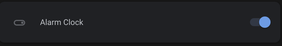
I have an input_boolean in an entities card, and I am trying to change the colour of the toggle switch (in the hui-toggle-entity-row) to be different from the theme. So, for example, I would want the toggle to be a colour other than blue in the sample below:

Is there a way to do this with card-mod as I havenā€™t found a a way yet?

Does this work for you?

      - type: entities
        style: |
          ha-card {
            --switch-checked-button-color: red;
          }
        entities:
          ...

This should change every toggle on the card. Youā€™d have to get into
ha-card div#states div:nth-of-type(n) type-stylings to set the variable at the individual entity level I think.

1 Like

That works brilliantly, thanks.

Hello,

How can i change the background color from: .text-divider::before/after?
Tried it for hours to change it but no success

Hi! Iā€™m trying to change the background color of the first column in the custom layout card. This is what is not working (and this is the closest I have come):

      - type: custom:mod-card
        debug_cardmod: true
        style: |
          "ha-card > layout-card":
            $: |
              #columns > div.column.cards {
                background: blue;
              }
        card:
          type: custom:layout-card
          layout: horizontal
          min_columns: 2
         ...

This is the structure I see when inspecting in the browser:

Here is what I see as the generated style (also showing in the picture above):

<card-mod><style>ha-card {
  background: none;
  box-shadow: none;
}"ha-card > layout-card":
  $: |
    #columns > div.column.cards {
      background: blue;
    }</style></card-mod>

This works, but is not what I want:

        style:
          .: |
            ha-card > layout-card {background: blue;}

I think you should just replace style: | with style: since you are passing it as a dictionary, so it should be:

        style:
          "ha-card > layout-card":
            $: |
              #columns > div.column.cards {
                background: blue;
              }

Thank you, thank you, thank you! The hours I spent!

In case this helps someone else, what I was not understanding from the docs was how the $: thing worked (and then leaving in one extra character).

This is the thinking that worked for meā€¦

Look at the path from the root of where the style is being applied down to the actual element. For example in my case (see picture in my previous post to this one):

ha-card > layout-card > #shadow-root > div#columns > div.column.cards

Whenever you see a #shadow-root break up the selector substituting $: | for the #shadow-root. In my case this is the final (take out the comments or it wonā€™t work):

        style:
          "ha-card > layout-card": # Part up to #shadow-root, quoted for safety
            $: |  # The #shadow-root
              #columns > div.column.cards {  # Part after the #shadow-root then the actual style
                background: blue;
              }

If this explanation is not correctā€¦ Iā€™d love to see it fixed.

Your understanding is correct.

If you need to go through several shadowroots, you keep iterating that way.

"ha-card > layout-card":
  $:
    ".cards > *":
      $:
        ha-card:
          $: |
            ha-card {
              background: red;
            }