Couldn’t get this code to work with the tile light card. The looong path may be necessary with this one.
1 Like
Here is our working solution, with the help of @Ildar_Gabdullin.
This changes the button colours and also the highlight colours when hovering to match the colour it will be if that’s the state.
      - type: tile
        entity: alarm_control_panel.home
        name: "Home Alarm"
        features:
          - type: "alarm-modes"
            modes:
              - armed_home
              - armed_away
              - disarmed
        card_mod:
          style:
            # hover colours
            hui-card-features $ hui-alarm-modes-card-feature $ div ha-control-select $ div: |
              #option-armed_home {
                --control-select-color: #ffa800 !important;
              }
              #option-armed_away {
                --control-select-color: #aa0000 !important;
              }
              #option-disarmed {
                --control-select-color: #40b100 !important;
              }
            .: |
              ha-tile-icon {
                --tile-color:
                    {% set status = states(config.entity) %}
                    {% set colors = {
                        'armed_home': '#ffa800',
                        'armed_away': '#aa0000',
                        'disarmed': '#40b100'
                      } %}
                    {{ colors.get(status, 'grey') }};
              }
              ha-card {
                --state-alarm_control_panel-armed_home-color: #ffa800;
                --state-alarm_control_panel-armed_away-color: #aa0000;
                --state-alarm_control_panel-disarmed-color: #40b100;
              }


2 Likes
Weird, but you are right, i have have no clue where/what happened in this end 

My Lazy nature played me ! … i never clicked save, just removed the long-path, and tested in editor … another reminder to me 
For the record - my proposed solution is a bit different:
type: tile
entity: alarm_control_panel.security
features:
  - type: alarm-modes
    modes:
      - armed_home
      - armed_away
      - disarmed
card_mod:
  style:
    hui-card-features $:
      hui-alarm-modes-card-feature $:
        ha-control-select $: |
          .option:nth-child(1)::before {
            background-color: magenta !important;
          }
          .option:nth-child(2)::before {
            background-color: orange !important;
          }
          .option:nth-child(3)::before {
            background-color: cyan !important;
          }
    .: |
      ha-card {
        --state-alarm_control_panel-armed_home-color: magenta;
        --state-alarm_control_panel-armed_away-color: orange;
        --state-alarm_control_panel-disarmed-color: cyan;
      }
It is not using these weird “–control-select-color” vars but depends on an order ))).

1 Like
An update to the prior solution.
If you want the colours to work for your history graph card too, then you can override the theme colour variables (introduced in 2022.12) in a custom.js file:
document.documentElement.style.setProperty('--state-alarm_control_panel-armed_home-color', '#ffa800');
document.documentElement.style.setProperty('--state-alarm_control_panel-armed_away-color', '#aa0000');
document.documentElement.style.setProperty('--state-alarm_control_panel-disarmed-color',   '#40b100');
You will then only need the card-mod section for the highlight/hover:
    card_mod:
      # this works in conjunction with www/custom.js
      style:
        hui-card-features $ hui-alarm-modes-card-feature $ div ha-control-select $ div: |
          #option-armed_home {
            --control-select-color: #ffa800 !important;
          }
          #option-armed_away {
            --control-select-color: #aa0000 !important;
          }
          #option-disarmed {
            --control-select-color: #40b100 !important;
          }
So you can remove this:
            .: |
              ha-tile-icon {
                --tile-color:
                    {% set status = states(config.entity) %}
                    {% set colors = {
                        'armed_home': '#ffa800',
                        'armed_away': '#aa0000',
                        'disarmed': '#40b100'
                      } %}
                    {{ colors.get(status, 'grey') }};
              }
              ha-card {
                --state-alarm_control_panel-armed_home-color: #ffa800;
                --state-alarm_control_panel-armed_away-color: #aa0000;
                --state-alarm_control_panel-disarmed-color: #40b100;
              }
Result:

PS: Of course, you can just create a full theme too, but that may be overkill.
1 Like
thanks for the tag, I did find some mods for the climate card here: Style Tile: more-info - #8 by Mariusthvdb
I am not a big fan of the numbered nth-child solutions, as they are hard coded to the order of things.
Prefer the named elements myself, and theme color variables if possible.
not always an option though. In my situation, I am still looking for a direct way to touch either the opacity (ha sets it to 1) or color of the selected button icon.
is there any way to change features icons as well?
Hello,
I’ve just found this topic and I have to say it’s a goldmine of information!
I have created a Tile Card into which I have added a cover that is linked to my garage door sensor.
It works as expected but I am unable to change the color of the garage icon depending on the sensor state (on/off) or cover state (open/closed).
using @Ildar_Gabdullin posts, I’ve tried this:
type: tile
entity: cover.garage_door
features:
  - type: cover-open-close
card_mod:
  style: |
    ha-card {
      {% if is_state('cover.garage_door', 'open') %}
        --tile-color: red !important;
      {% else %}
        --tile-color: green !important;
      {% endif %}
    }
But it does not work (same using the binary_sensor.porte_garage_ouverture value).
I’ve even tried removing the if/else conditions to check if I was able to set it to a fixed color:
type: tile
entity: cover.garage_door
features:
  - type: cover-open-close
card_mod:
  style: |
    ha-card {
        --tile-color: red !important;
    }
But that doesn’t work either.
Do you have any hints about what I am doing wrong?
Thanks for your help!
Far from any civilian pc now, cannot say for sure.
I bet that you will have to use a cover-specific css variable (kind of “state-cover-open” or whatever it is called).
Thanks for your input on tile card modifications.
I would like to modify tile card for lights with slider in such a way that - under the new dashboard with section - it effectively looks like a mushroom card in horizontal card.
Here some illustration:

Here my code for mushroom card:
type: custom:mushroom-light-card
entity: light.g089_uplights_master_bedroom
use_light_color: false
show_brightness_control: true
name: Uplights
collapsible_controls: true
layout: horizontal
and here my code for tile card (which I prefer due to its nice GUI features) nested inside a horizontal card so it stretches and with the card mod CSS to modify the slider. However, its not elegant and working properly:
type: horizontal-stack
cards:
  - features:
      - type: light-brightness
    type: tile
    name: Eaves
    state_content: brightness
    entity: light.g093_roof_eaves_lights_master_bedroom
    card_mod:
      style:
        hui-card-features$:
          hui-light-brightness-card-feature$:
            ha-control-slider$: |
              .slider {
                --control-slider-border-radius: 4px !important;
                 height:12px !important;
                 width: 70% !important;
                 margin-top: -30px;
                 margin-left: 90px;
                 #--control-slider-color: orange !important;
                 --control-slider-background: red !important;
                  }
        .: |
          ha-card {
           --tile-color: red !important;
            }
If anyone with better CSS skills than me can resolve this?
Thanks
Martin
This worked well for me

type: horizontal-stack
cards:
  - features:
      - type: light-brightness
    type: tile
    name: Eaves
    state_content: brightness
    entity: light.g089_uplights_master_bedroom
    color: red
    tap_action:
      action: toggle
    card_mod:
      style:
        hui-card-features$:
          hui-light-brightness-card-feature$:
            ha-control-slider$: |
              .slider {
               --control-slider-border-radius: 12px !important;
                height: 100% !important;
                width: 50% !important;
                --handle-size: 0px;
               --control-slider-color: red !important;
               --control-slider-background: red !important;
                 margin-top: -50px;
                 margin-left: 50%;
              }
1 Like
@LiQuid_cOOled thanks so much for your help. You seem to be much better at CSS than me. I never learned it properly.
I would like to use this in the new dashboard sections.
Here is my code to replicate on a new dashbboard:
 - type: sections
    max_columns: 4
    title: slider
    path: slider
    visible:
      - user: 3041326924d94e72b1278f029b152ea6
    sections:
      - type: grid
        cards:
          - type: horizontal-stack
            cards:
              - features:
                  - type: light-brightness
                type: tile
                name: Eaves
                state_content: brightness
                entity: light.g093_roof_eaves_lights_master_bedroom
                tap_action:
                  action: toggle
                card_mod:
                  style:
                    hui-card-features$:
                      hui-light-brightness-card-feature$:
                        ha-control-slider$: |
                          .slider {
                           --control-slider-border-radius: 12px !important;
                            height: 100% !important;
                            width: 50% !important;
                            #--handle-size: 0px;
                           --control-slider-color: red !important;
                           --control-slider-background: red !important;
                             margin-top: -50px;
                             margin-left: 50%;
                              }
                    .: |
                      ha-card {
                       --tile-color: red !important;
                        }
          - features:
              - type: light-brightness
            type: tile
            name: Eaves
            state_content: brightness
            entity: light.g093_roof_eaves_lights_master_bedroom
            tap_action:
              action: toggle
            card_mod:
              style:
                hui-card-features$:
                  hui-light-brightness-card-feature$:
                    ha-control-slider$: |
                      .slider {
                       --control-slider-border-radius: 12px !important;
                        height: 100% !important;
                        width: 50% !important;
                        #--handle-size: 0px;
                       --control-slider-color: red !important;
                       --control-slider-background: red !important;
                         margin-top: -50px;
                         margin-left: 50%;
                          }
                .: |
                  ha-card {
                   --tile-color: red !important;
                    }
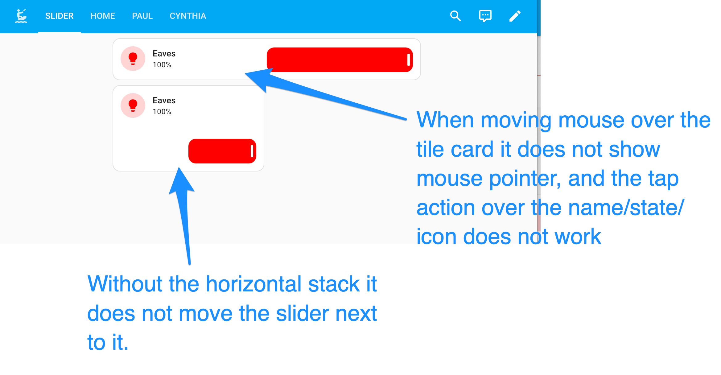
you can see the issues that I have in the above screenshot.
In an ideal case scenario I would like to use the tile card as a “compact” tile card (ie smaller version to fit into the grid) with the slider next to it.

See how the fans are small nice cards so just with the slider in it.
The other option (which you almost got perfect) is the bigger/wider card where I had to use the horizontal stack nesting but there the mouse pointer does not work in the tile card in some areas over icon/text (which also highlights the background of the card) and it would be nice to actually not nest it into a horizontal card if possible. .
Lastly - when you move the slider right and left, the percentage notification on top of the slider seems to move way over to the left when you get to <10% or so - it seems to use the very left card boarder as reference.
I am really trying to use the new section dashboard and make things as compact as possible
Once again, thanks for your help!
Martin
Let me see what I can do… Sections is going to be a great addition, but currently customizations are limited by the available layout types used within the Sections.
Thanks.
The mouse situation and the % notification is easily resolved by modifying the container instead of slider.
type: horizontal-stack
cards:
  - features:
      - type: light-brightness
    type: tile
    name: Eaves
    state_content: brightness
    entity: light.g093_roof_eaves_lights_master_bedroom
    tap_action:
      action: toggle
    card_mod:
      style:
        hui-card-features$:
          hui-light-brightness-card-feature$:
            ha-control-slider$: |
              .container {
               --control-slider-border-radius: 50px !important;
                height: 100% !important;
                width: 50% !important;
               --control-slider-color: red !important;
               --control-slider-background: red !important;
                 margin-top: -50px;
                 margin-left: 50%;
                 opacity: 0.3; /* Add this line for 30% transparency */
                  }
        .: |
          ha-card {
           --tile-color: red !important;
            }
the only thing that I have not figured out is how to do it without the horizontal stack for the bigger card, and how to fix it for the smaller card.
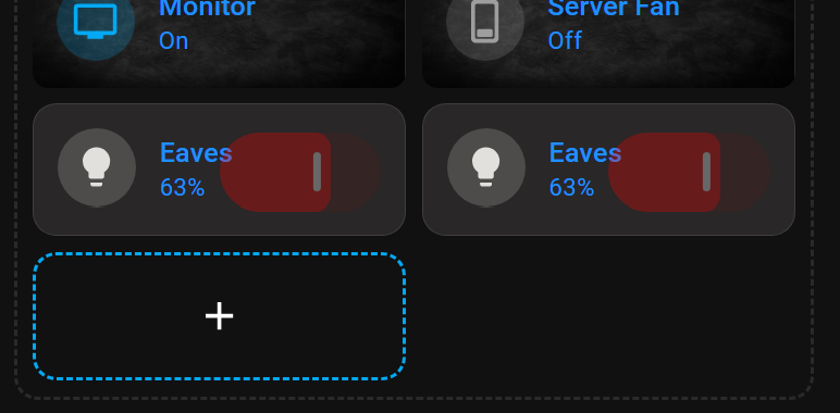
Like this

but you will still need to use the horizontal stack.
As soon as you add the feature it locks in the larger card size in Sections
type: horizontal-stack
cards:
  - type: tile
    name: Eaves
    state_content: brightness
    entity: light.pc_lights
    color: red
    tap_action:
      action: toggle
    features:
      - type: light-brightness
    card_mod:
      style:
        hui-card-features$:
          hui-light-brightness-card-feature$:
            ha-control-slider$: |

              .slider {
                --control-slider-border-radius: 12px !important;
                height: 100% !important;
                width: 42% !important;
                --handle-size: 0px;
                --control-slider-color: red !important;
                --control-slider-background: red !important;
                margin-top: -50px;
                margin-left: 60%;
               }
        .: |
          ha-card {
            height: 65px !important;
  - type: tile
    name: Eaves
    state_content: brightness
    entity: light.pc_lights
    color: red
    tap_action:
      action: toggle
    features:
      - type: light-brightness
    card_mod:
      style:
        hui-card-features$:
          hui-light-brightness-card-feature$:
            ha-control-slider$: |
              .slider {
                --control-slider-border-radius: 12px !important;
                height: 100% !important;
                width: 42% !important;
                --handle-size: 0px;
                --control-slider-color: red !important;
                --control-slider-background: red !important;
                margin-top: -50px;
                margin-left: 60%;
               }
        .: |
          ha-card {
            height: 65px !important;
              }
thanks - that is amazing. much appreciated.
Is there a way to “templatise” this like with the custom button?
then I could create a global template for this behaviour and add to those cards where I want to use this?
hm…looks like there is still an issue with the height of the card. although the slider height is correct, there is still some space below which corresponds with the max width of the normal tile card.

Any ideas?
Here the current code base:
views:
  - type: sections
    max_columns: 4
    title: slider
    path: slider
    visible:
      - user: 3041326924d94e72b1278f029b152ea6
    sections:
      - type: grid
        cards:
          - type: horizontal-stack
            cards:
              - features:
                  - type: light-brightness
                type: tile
                name: Eaves
                state_content: brightness
                entity: light.g093_roof_eaves_lights_master_bedroom
                tap_action:
                  action: toggle
                card_mod:
                  style:
                    hui-card-features$:
                      hui-light-brightness-card-feature$:
                        ha-control-slider$: |
                          .container {
                           #--control-slider-border-radius: 12px !important;
                           --control-slider-border-radius: 50px !important;
                            height: 100% !important;
                            width: 50% !important;
                            #--handle-size: 0px;
                           --control-slider-color: red !important;
                           --control-slider-background: red !important;
                             margin-top: -50px;
                             margin-left: 50%;
                             opacity: 0.3; /* Add this line for 30% transparency */
                              }
                    .: |
                      ha-card {
                       --tile-color: red !important;
                        }
          - features:
              - type: light-brightness
            type: tile
            name: Eaves
            state_content: brightness
            entity: light.g093_roof_eaves_lights_master_bedroom
            tap_action:
              action: toggle
            color: pink
            card_mod:
              style:
                hui-card-features$:
                  hui-light-brightness-card-feature$:
                    ha-control-slider$: |
                      .container {
                       --control-slider-border-radius: 12px !important;
                        height: 100% !important;
                        width: 50% !important;
                        #--handle-size: 0px;
                       #--control-slider-color: red !important;
                       #--control-slider-background: red !important;
                         margin-top: -50px;
                         margin-left: 50%;
                          }
                .: |
                  ha-card {
                   #--tile-color: red !important;
                   height: 65px !important;
                    }
          - type: custom:mushroom-light-card
            entity: light.g093_roof_eaves_lights_master_bedroom
Thanks
Martin

Copy this code and paste it in one of the squares
type: horizontal-stack
cards:
  - type: tile
    entity: light.g093_roof_eaves_lights_master_bedroom
    features:
      - type: light-brightness
    card_mod:
      style:
        hui-card-features$:
          hui-light-brightness-card-feature$:
            ha-control-slider$: |
              .container {
               #--control-slider-border-radius: 12px !important;
               --control-slider-border-radius: 50px !important;
                height: 100% !important;
                width: 50% !important;
                #--handle-size: 0px;
               --control-slider-color: red !important;
               --control-slider-background: red !important;
                 margin-top: -50px;
                 margin-left: 50%;
                 opacity: 0.3; /* Add this line for 30% transparency */
                  }
  - type: tile
    entity: light.g093_roof_eaves_lights_master_bedroom
    features:
      - type: light-brightness
    card_mod:
      style:
        hui-card-features$:
          hui-light-brightness-card-feature$:
            ha-control-slider$: |
              .container {
               --control-slider-border-radius: 12px !important;
               --control-slider-border-radius: 50px !important;
                height: 100% !important;
                width: 50% !important;
                #--handle-size: 0px;
               --control-slider-color: red !important;
               --control-slider-background: red !important;
                 margin-top: -50px;
                 margin-left: 50%;
                 opacity: 0.3; /* Add this line for 30% transparency */
                  }
You should see this with no space below
Entire Dashboard code… You need two horizontal stacks
type: grid
cards:
  - type: horizontal-stack
    cards:
      - features:
          - type: light-brightness
        type: tile
        name: Eaves
        state_content: brightness
        entity: light.g093_roof_eaves_lights_master_bedroom
        tap_action:
          action: toggle
        card_mod:
          style:
            hui-card-features$:
              hui-light-brightness-card-feature$:
                ha-control-slider$: |
                  .container {
                   #--control-slider-border-radius: 12px !important;
                   --control-slider-border-radius: 50px !important;
                    height: 100% !important;
                    width: 50% !important;
                    #--handle-size: 0px;
                   --control-slider-color: red !important;
                   --control-slider-background: red !important;
                     margin-top: -50px;
                     margin-left: 50%;
                     opacity: 0.3; /* Add this line for 30% transparency */
                      }
            .: |
              ha-card {
               --tile-color: red !important;
                }