Ok thank you.
I prefer rest by Musshroom, it’s to complicated in tile.
PS: I don’t have tag, I just respond to his post.
Have an Nice day.
An update for my alarm panel tile mods for HA 2025.07:
I’ve eliminated the need for overriding colours in my custom.js resource. Everything now uses card-mod.
      - type: tile
        entity: alarm_control_panel.home
        name: "Home Alarm"
        features:
          - type: "alarm-modes"
            modes:
              - armed_home
              - armed_away
              - disarmed
        card_mod:
          style:
            # button hover colours
            hui-card-features $ hui-card-feature $ hui-alarm-modes-card-feature $ ha-control-select $ div: |
              #option-armed_home {
                --control-select-color: #ffa800 !important;
              }
              #option-armed_away {
                --control-select-color: #aa0000 !important;
              }
              #option-disarmed {
                --control-select-color: #40b100 !important;
              }
            # button and card hover colours
            .: |
              :host {
                --state-alarm_control_panel-armed_home-color: #ffa800 !important;
                --state-alarm_control_panel-armed_away-color: #aa0000 !important;
                --state-alarm_control_panel-disarmed-color: #40b100 !important;
                --state-alarm_control_panel-triggered-color: #135dd8 !important;
              }
              .type-tile {
                --ha-ripple-hover-opacity: 0;
              }
      - type: history-graph
        name: Alarm
        hours_to_show: 24
        entities:
          - entity: alarm_control_panel.home
            name: Alarm
        card_mod:
          style: |
            :host {
              --state-alarm_control_panel-armed_home-color: #ffa800;
              --state-alarm_control_panel-armed_away-color: #aa0000;
              --state-alarm_control_panel-armed_custom_bypass-color: #aa0000;
              --state-alarm_control_panel-disarmed-color: #40b100;
              --state-alarm_control_panel-triggered-color: #135dd8;
            }
2 Likes
do you have a special reason not to just set the alarm colors in your theme? you can completely forgo with card_mod in that case
I’d be happy to take some guidance on that front, but I’m not sure it’s possible without some overhead: I have a custom light mode theme, and I use the slate third-party theme for dark mode. I can add it to my own theme, but whenever there’s a change to the slate theme, I’d need to apply the change again. Not a huge overhead, granted, but still.
a yes, I see.
tbh, I have the alarm colors set in the generic bit of my themes, and that is imported in all others… Didnt want to change those colors, as for me they had to be universally recognized no matter the current theme.
but I guess it would be just as simple to not do that and set the 4 or five colors per theme.
it’s nothing more than setting these (select only the ones you need)
    state-alarm_control_panel-armed_away-color: var(--red-color)
    state-alarm_control_panel-armed_custom_bypass-color: var(--warning-color)
    state-alarm_control_panel-armed_home-color: var(--warning-color)
    state-alarm_control_panel-armed_night-color: var(--red-color)
    state-alarm_control_panel-armed_vacation-color: var(--warning-color)
    state-alarm_control_panel-arming-color: var(--warning-color)
    state-alarm_control_panel-disarmed-color: var(--success-color)
    state-alarm_control_panel-disarming-color: var(--info-color)
    state-alarm_control_panel-pending-color: var(--orange-color)
    state-alarm_control_panel-triggered-color: var(--alert-color)
you could even simply that by leaving this in the generic part and load it with your own variables
state-alarm_control_panel-disarmed-color: var(--my-own-disarmed-color)
and then just set the
my-own-disarmed-color: '#40b100'
in any of your themes.
The huge advantage of using themes is that it is 100% robust, and immediate. Having the customizations in pure core, not relying on third party custom, is always my first option.
If that cant be had… turn to card_mod  that overhead is way bigger than 3 or 4 lines in the themes file
I must’ve missed something in the theme docs for years. How do you do this?
The only way I’ve known to apply global overrides is via this gist, but it didn’t work in this case, for some reason.
I use a couple of yaml anchors
check my themes gist
(I do have all of my themes in 1 file…well, except for the card-mod theme section, but the is imported per definition)
Oh, I can see it working if you’re maintaining all of your own themes, or just overriding the default. I thought you meant there’s a way to set overrides that will override all themes (or I misunderstood you). 
This thread helped a lot!
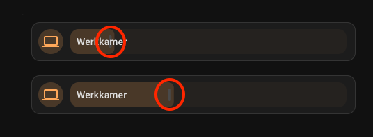
I’m trying to create a simple tile card mod with an inline slider that moves the slider behind the name of the light, to save space.
I’m very happy with this layout, but I’m having trouble removing the tiny white line on the slider, because that interferes with the text. (.slider-track-bar::after ???)
Any help is much appreciated!
type: tile
entity: light.werkkamer
hide_state: true
vertical: false
features_position: inline
features:
  - type: light-brightness
card_mod:
  style:
    .: |
      hui-card-features {
        width: calc(100% - 55px) !important;
        position: absolute;
        top: 9px;
        left: 55px;
        opacity: 0.2;
      }
      ha-tile-info {
       left: 9px;
       z-index: 2;
      }
I use
style:
  hui-card-features $:
    hui-card-feature $:
      hui-light-color-temp-card-feature $:
        ha-control-slider$: |
          .slider .slider-track-cursor::after {
            border-radius: var(--ha-card-border-radius) !important;
          }
      hui-light-brightness-card-feature $:
        ha-control-slider$: |
          .slider .slider-track-bar::after {
            border-radius: var(--ha-card-border-radius) !important;
          }
to style that ‘handle’, maybe you can try the same for your wishes
Thank you! That helped.
Very happy with this setup. It takes up way less space and still looks like the regular tile cards, so it works with any theme. It’s especially good for mobile.
Here’s my streamline template card that I currently use for all my lights:
light_template:
  card:
    type: tile
    entity: '[[light]]'
    hide_state: true
    vertical: false
    tap_action:
      action: toggle
    hold_action:
      action: more-info
    icon_tap_action:
      action: toggle
    icon_hold_action:
      action: more-info
    features:
      - type: light-brightness
    features_position: inline
    card_mod:
      style:
        .: |
          hui-card-features {
            width: calc(100% - 55px) !important;
            position: absolute;
            top: 9px;
            left: 56px;
          }
          ha-tile-info {
           left: 9px;
           z-index: 2;
          }
        hui-card-features $:
          hui-card-feature $:
            hui-light-brightness-card-feature $:
              ha-control-slider$: |
                .slider .slider-track-bar::after {
                  background-color: transparent !important;
                }
                .slider {
                  opacity: 0.2;
                }
question i made a card which color dependes on the temperature it worked for a time now it is not anymore what is changed in cvard mod that i mised
- type: tile
        entity: sensor.indoor_humidity
        name: "Binnen "
        layout_options:
          grid_columns: 2
          grid_rows: 1null
        card_mod:
          style: |
            ha-card {
              {% if states('sensor.indoor_humidity') | float(0) >= 60 %}
                --tile-color: red !important;
              {% elif states('sensor.indoor_humidity') | float(0) >= 40 %}
                --tile-color: green !important;
              {% elif states('sensor.indoor_humidity') | float(0) >= 10 %}
                --tile-color: blue !important;
              {% endif %}
             }
I have tested your config and works fine. Have a check of Issues after upgrading any version - 3.x.x, 4.x.x · Issue #525 · thomasloven/lovelace-card-mod · GitHub and specifically check you are following recommendations in Frontend performance if you use extra_module_url.
i had done the recommandation bud i had the older version stil in my configuration yaml i deleted it and it now seems to work
1 Like
Just started working with tile cards and card-mod and you really helped me!
I am now trying to remake a light slider made with custom:button-card and my-slider-v2 and cannot get the gradient on the slider to work. am I modifying the wrong class or something?
Appreciate any assistance!
In the screenshot we can see:
- my button-card reference with a gradient slider and background,
- my tilecard with slider-color as a solid color,
- and my tilecard with a gradient, resulting in no color and we only see the gradient background.
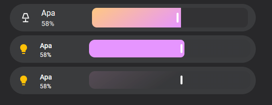
type: tile
entity: light.apa_bibliotek
name:
  - type: text
    text: Apa
show_entity_picture: true
hide_state: false
state_content: brightness
vertical: false
tap_action:
  action: toggle
hold_action:
  action: more-info
icon_tap_action:
  action: none
icon_hold_action:
  action: none
features:
  - type: light-brightness
features_position: inline
card_mod:
  style:
    .: |
      hui-card-features {
        width: calc(100% - 160px) !important;
        position: absolute;
        top: 9px;
        left: 161px;
      }
      ha-tile-info {
       left: 5px;
       z-index: 2;
      }
    hui-card-features $:
      hui-card-feature $:
        hui-light-brightness-card-feature $:
          ha-control-slider$: |
            .slider {

              # Works
              --control-slider-color: rgba(230,149,255,1);

              # Doesn't work
              --control-slider-color: linear-gradient(145deg, rgba(230,149,255,1) 0%, rgba(230,249,155,1) 50%);

              --control-slider-background: linear-gradient(145deg, rgba(255,176,233,0.7) 0%, rgba(50,50,52,1) 50%);
            }
Well, with some debugging more I noticed it seems to be that background-color cannot take a linear-gradient?
I found an alternative to my own problem so:
    hui-card-features $:
      hui-card-feature $:
        hui-light-brightness-card-feature $:
          ha-control-slider$: |
            .slider {
              --control-slider-background: linear-gradient(145deg, rgba(255,176,233,0.7) 0%, rgba(50,50,52,1) 50%);
            }
            .slider-track-bar {
              background: linear-gradient(145deg, rgba(230,149,255,1) 0%, rgba(230,249,155,1) 50%);
            }
(The color-valuess was only taken as example)
yes that’s a known aspect of background-color. You should be looking for an element that can be styled with background alone.