I am speechless. Perfect. Thanks!
I am speechless. Perfect. Thanks!
It could be a bit different:
    .: |
      .heading ha-header-bar {
        display: none;
      }
Otherwise you will not see this panel for some sensors:

So this is just great. Finally I got the more-info to look the way I have wanted for so long. Thanks!
One final (?) question - is it also possible to hide the “Tips” in Settings and in System?
I find them really annoying (I guess it’s my OCD talking).
Do not think it is possible.
…trying to summarize my experience here…
How to customize tabs
Here I will show how to customize several tabs.
The “several” word is important since there are tricks to avoid a repeating code.
First, create files for tabs - let it be 3 tabs with names “test_tab_1”, “test_tab_2”, “test_tab_3”:
title: "test_tab_1"
path: test-card-mod-themes-test-tab-1
# icon: mdi:car
badges: []
cards: []
Add these tabs to the dashboard:
views:
  - !include views/test/test-card-mod-themes-test-tab-1.yaml
  - !include views/test/test-card-mod-themes-test-tab-2.yaml
  - !include views/test/test-card-mod-themes-test-tab-3.yaml
How it is displayed with a default theme:

If the “icon” line is uncommented:

1. Display “icon+text”,“image”, “image+text”:
There are 6 methods:
":after" pseudo-class to the ICON,":before" pseudo-class to the ICON,":before" pseudo-class to the ICON,":after" pseudo-class to the ICON,":before" pseudo-class to the TEXT,":before" pseudo-class to the TEXT,":before" pseudo-class to the TEXT,":after" pseudo-class to the TEXT,Methods 1…3 need a presence of the ICON - the “icon” line must be present (or uncommented).
Method 6 is supposed to be used to display a text with whitespaces (see Notes below).
Method 1:
  card-mod-root-yaml: |
    .: |
      paper-tab[aria-label='test_tab_1'] ha-icon::after,
      paper-tab[aria-label='test_tab_2'] ha-icon::after,
      paper-tab[aria-label='test_tab_3'] ha-icon::after {
        margin-left: 4px;
      }
      paper-tab[aria-label='test_tab_1'] ha-icon::after {
        content: "test_tab_1";
      }
      paper-tab[aria-label='test_tab_2'] ha-icon::after {
        content: "test_tab_2";
      }
      paper-tab[aria-label='test_tab_3'] ha-icon::after {
        content: "test_tab_3";
      }

Method 2:
  card-mod-root-yaml: |
    paper-tab[aria-label='test_tab_1']: &ref_tab_style
      $: |
        .tab-content {
          opacity: 1 !important;
        }
      ha-icon $: |
        ha-svg-icon {
          display: none !important;
        }
    paper-tab[aria-label='test_tab_2']: *ref_tab_style
    paper-tab[aria-label='test_tab_3']: *ref_tab_style

    .: |

      paper-tab[aria-label='test_tab_1'] ha-icon::before,
      paper-tab[aria-label='test_tab_2'] ha-icon::before,
      paper-tab[aria-label='test_tab_3'] ha-icon::before {
        content: "-";
        color: transparent;
        background-size: 100% 100% !important;
        height: 32px;
        width: 32px;
      }
      paper-tab[aria-label='test_tab_1'] ha-icon::before {
        background: url("/local/images/persons/ildar.png");
      }
      paper-tab[aria-label='test_tab_2'] ha-icon::before {
        background: url("/local/images/persons/ildar.png");
      }
      paper-tab[aria-label='test_tab_3'] ha-icon::before {
        background: url("/local/images/persons/ildar.png");
      }

      paper-tab[aria-label='test_tab_1'] ha-icon,
      paper-tab[aria-label='test_tab_2'] ha-icon,
      paper-tab[aria-label='test_tab_3'] ha-icon {
        display: contents;
      }

Method 3:
Same code as for Method 2 + add this:
      paper-tab[aria-label='test_tab_1'] ha-icon::after,
      paper-tab[aria-label='test_tab_2'] ha-icon::after,
      paper-tab[aria-label='test_tab_3'] ha-icon::after {
        margin-left: 4px;
      }
      paper-tab[aria-label='test_tab_1'] ha-icon::after {
        content: "test_tab_1";
      }
      paper-tab[aria-label='test_tab_2'] ha-icon::after {
        content: "test_tab_2";
      }
      paper-tab[aria-label='test_tab_3'] ha-icon::after {
        content: "test_tab_3";
      }

Method 4:
  card-mod-root-yaml: |

    paper-tab[aria-label='test_tab_1']: &ref_tab_style
      $: |
        .tab-content {
          opacity: 1 !important;
        }
        .tab-content::before {
          content: "-";
          color: transparent;
          background-size: 100% 100% !important;
          height: 32px;
          width: 32px;
          margin-right: 10px;
        }
    paper-tab[aria-label='test_tab_2']: *ref_tab_style
    paper-tab[aria-label='test_tab_3']: *ref_tab_style

    paper-tab[aria-label='test_tab_1'] $: |
      .tab-content::before {
        background: url("/local/images/persons/ildar.png");
      }
    paper-tab[aria-label='test_tab_2'] $: |
      .tab-content::before {
        background: url("/local/images/persons/ildar.png");
      }
    paper-tab[aria-label='test_tab_3'] $: |
      .tab-content::before {
        background: url("/local/images/persons/ildar.png");
      }

    .: |

Method 5:
A similar code as for Method 4; the anchor is modified, the "margin-right: 0px" is removed.
  card-mod-root-yaml: |

    paper-tab[aria-label='test_tab_1']: &ref_tab_style
      $: |
        .tab-content {
          opacity: 1 !important;
        }
        .tab-content slot {
          display: none;
        }
        .tab-content::before {
          content: "-";
          color: transparent;
          background-size: 100% 100% !important;
          height: 32px;
          width: 32px;
        }
    paper-tab[aria-label='test_tab_2']: *ref_tab_style
    paper-tab[aria-label='test_tab_3']: *ref_tab_style

    paper-tab[aria-label='test_tab_1'] $: |
      .tab-content::before {
        background: url("/local/images/persons/ildar.png");
      }
    paper-tab[aria-label='test_tab_2'] $: |
      .tab-content::before {
        background: url("/local/images/persons/ildar.png");
      }
    paper-tab[aria-label='test_tab_3'] $: |
      .tab-content::before {
        background: url("/local/images/persons/ildar.png");
      }

    .: |

Method 6:
  card-mod-root-yaml: |

    paper-tab[aria-label='test_tab_1']: &ref_tab_style
      $: |
        .tab-content {
          opacity: 1 !important;
        }
        .tab-content slot {
          display: none;
        }
        .tab-content::before {
          content: "-";
          color: transparent;
          background-size: 100% 100% !important;
          height: 32px;
          width: 32px;
          margin-right: 10px;
        }
    paper-tab[aria-label='test_tab_2']: *ref_tab_style
    paper-tab[aria-label='test_tab_3']: *ref_tab_style

    paper-tab[aria-label='test_tab_1'] $: |
      .tab-content::before {
        background: url("/local/images/persons/ildar.png");
      }
      .tab-content::after {
        content: "test tab 1";
      }
    paper-tab[aria-label='test_tab_2'] $: |
      .tab-content::before {
        background: url("/local/images/persons/ildar.png");
      }
      .tab-content::after {
        content: "test tab 2";
      }
    paper-tab[aria-label='test_tab_3'] $: |
      .tab-content::before {
        background: url("/local/images/persons/ildar.png");
      }
      .tab-content::after {
        content: "test tab 3";
      }

    .: |

Notes:
The “opacity: 1 !important” style removes a greyish mask on unselected tabs; imho for IMAGE tabs this mask is undesired, for ICON tabs it seems to be OK.
BTW, you cannot remove the mask from an image only and leave it for a text.
All tabs are supposed to use different images; in my examples I use the same image.
If some tab has a name with whitespaces:
"paper-tab[aria-label='my long name']") in the non-shadowRoot part of the "card-mod-root-yaml" section;"card-mod-root-yaml" section - seems to be a BUG (see an issue on Github).2. Colored icon or text:
  card-mod-root-yaml: |

    .: |

      paper-tab[aria-label='test_tab_1'],
      paper-tab[aria-label='test_tab_2'] {
        color: red;
      }
      paper-tab[aria-label='test_tab_3'] {
        color: orange;
      }


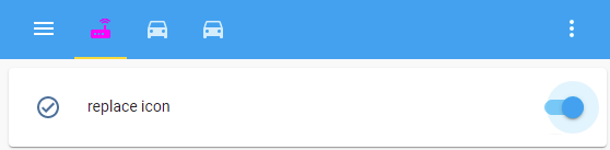
3. Replaced icon: (Chrome only)
  card-mod-root-yaml: |

    paper-tab[aria-label='test_tab_1'] ha-icon $ ha-svg-icon $: |
      path {
        {% if is_state('input_boolean.test_card_mod_themes_header_change_tabs','on') %}
        d: path("M 20.2 5.9 L 21 5.1 C 19.6 3.7 17.8 3 16 3 C 14.2 3 12.4 3.7 11 5.1 L 11.8 5.9 C 13 4.8 14.5 4.2 16 4.2 C 17.5 4.2 19 4.8 20.2 5.9 M 19.3 6.7 C 18.4 5.8 17.2 5.3 16 5.3 C 14.8 5.3 13.6 5.8 12.7 6.7 L 13.5 7.5 C 14.2 6.8 15.1 6.5 16 6.5 C 16.9 6.5 17.8 6.8 18.5 7.5 L 19.3 6.7 M 19 13 H 17 V 9 H 15 V 13 H 5 A 2 2 0 0 0 3 15 V 19 A 2 2 0 0 0 5 21 H 19 A 2 2 0 0 0 21 19 V 15 A 2 2 0 0 0 19 13 M 8 18 H 6 V 16 H 8 V 18 M 11.5 18 H 9.5 V 16 H 11.5 V 18 M 15 18 H 13 V 16 H 15 V 18 Z") !important;
        color: magenta !important;
        {% else %}
        d: path("M 12 2 A 10 10 0 0 0 2 12 A 10 10 0 0 0 12 22 A 10 10 0 0 0 22 12 A 10 10 0 0 0 12 2 M 16.2 16.2 L 11 13 V 7 H 12.5 V 12.2 L 17 14.9 L 16.2 16.2 Z") !important;
        color: cyan !important;
        {% endif %}
      }

    .: |

4. Font transformation:
  card-mod-root-yaml: |

    .: |

      paper-tab[aria-label='test_tab_1'],
      paper-tab[aria-label='test_tab_2'] {
        font-size: 8px;
      }
      paper-tab[aria-label='test_tab_3'] {
        font-size: 11px;
      }
      paper-tab {
        text-transform: none;
      }

5. Word-wrapping for long text:
For this we need to create a tab with a long name:
# title: "test_tab_2"
title: "test tab 2: Very Very Long Long Name"
path: test-card-mod-themes-test-tab-2
# icon: mdi:car
badges: []
cards: []
  card-mod-root-yaml: |

    .: |

      paper-tab[aria-label='test tab 2: Very Very Long Long Name'] {
        font-size: 12px !important;
        width: 85px;
        justify-content: flex-start;
        white-space: normal;
        line-height: 14px;
        text-transform: none;
      }

6. Animated text or icon:
  card-mod-root-yaml: |

    .: |

      paper-tab[aria-label='test_tab_2'] {
        animation: blinkhard 1.5s linear infinite;
        color: red;
      }
      @keyframes blinkhard {
        0%,49% {
          opacity: 0;
        }
        50%,100% {
          opacity: 1;
        }
      }


7. Separators between tabs:
post


All these styles were also tested on iOS devices:
content: "----" (in fact, as many “-” as needed to get a square image);display: none" does not work for the "slot" element).One more example - list of batteries:
Each tab represents some device:
title: "Device-1"
path: test-card-mod-themes-test-tab-1
badges: []
cards:
  ...
  card-mod-root-yaml: |

    paper-tab[aria-label='Device-1']: &ref_tab_style
      $: |
        .tab-content {
          height: 30px;
          width: 120px;
          outline: 1px solid var(--text-primary-color);
          outline-offset: 0px;
          border-radius: 4px;
          opacity: 1 !important;
        }
    paper-tab[aria-label='Device-2']: *ref_tab_style
    paper-tab[aria-label='Device-3']: *ref_tab_style

    paper-tab[aria-label='Device-1'] $: |
      .tab-content {
        {% set BATTERY_LEVEL = states('input_number.test_level_1') %}
        {% if BATTERY_LEVEL | int(0) <= 33 %}
        {% set COLOR = 'rgba(255,0,0,0.5)' %}
        {% elif BATTERY_LEVEL | int(0) <= 66 %}
        {% set COLOR = 'rgba(255,165,0,0.5)' %}
        {% else %}
        {% set COLOR = 'rgba(0,255,0,0.5)' %}
        {% endif %}
        background: linear-gradient(to right, {{COLOR}}, {{BATTERY_LEVEL}}%, var(--mdc-theme-primary) {{BATTERY_LEVEL}}%);
      }
    paper-tab[aria-label='Device-2'] $: |
      .tab-content {
        {% set BATTERY_LEVEL = states('input_number.test_level_2') %}
        {% if BATTERY_LEVEL | int(0) <= 33 %}
        {% set COLOR = 'rgba(255,0,0,0.5)' %}
        {% elif BATTERY_LEVEL | int(0) <= 66 %}
        {% set COLOR = 'rgba(255,165,0,0.5)' %}
        {% else %}
        {% set COLOR = 'rgba(0,255,0,0.5)' %}
        {% endif %}
        background: linear-gradient(to right, {{COLOR}}, {{BATTERY_LEVEL}}%, var(--mdc-theme-primary) {{BATTERY_LEVEL}}%);
      }
    paper-tab[aria-label='Device-3'] $: |
      .tab-content {
        {% set BATTERY_LEVEL = states('input_number.test_level_3') %}
        {% if BATTERY_LEVEL | int(0) <= 33 %}
        {% set COLOR = 'rgba(255,0,0,0.5)' %}
        {% elif BATTERY_LEVEL | int(0) <= 66 %}
        {% set COLOR = 'rgba(255,165,0,0.5)' %}
        {% else %}
        {% set COLOR = 'rgba(0,255,0,0.5)' %}
        {% endif %}
        background: linear-gradient(to right, {{COLOR}}, {{BATTERY_LEVEL}}%, var(--mdc-theme-primary) {{BATTERY_LEVEL}}%);
      }

    .: |

      paper-tab {
        text-transform: none;
      }

Hi All,
At this moment would we still be able to change a sensor card’s line/graph color using card-mod as by default it cant be changed?
This is not related to themes.
Whoops, sorry, put it in the wrong mod thread
Hi guys,
I am using dwains dashboard v3 Dwains Lovelace Dashboard | An fully auto generating Home Assistant UI dashboard for desktop, tablet and mobile by Dwains for desktop, tablet, mobile and the cyberpunk 2077 theme. https://github.com/flejz/hass-cyberpunk-2077-theme
It looks great together but dwains area cards are not labeled as ha-card. So the card mod section of the theme is not applied to all elements. I want to change the theme to style every element.

The area cards are not labeled as ha-cards when I inspect them with dev tools.
It should work when the card mod section would be added at <div class=“flex justify-between h-44 p-3 area-button” … > but for now there is no "<card-mod slot=“none” in this div.
This is the yaml code which is added right now to change the style of ha-card. This works and styles the card like in my first screenshot.
  card-mod-card: |
    ha-card {
      border-radius: 1px;
      clip-path: polygon(
        0% 0%,
        40px 0%,
        45px 4px,
        100% 4px,
        100% calc(100% - 20px),
        calc(100% - 20px) 100%,
        0% 100%
      );
    }
I thought chasing the code to this should work:
 card-mod-card: |
    .area-button {
      border-radius: 1px;
      clip-path: polygon(
        0% 0%,
        40px 0%,
        45px 4px,
        100% 4px,
        100% calc(100% - 20px),
        calc(100% - 20px) 100%,
        0% 100%
      );
    }
But this code isn’t changing anything for me. I think I am wrong with calling the .area-button so I need help with this.
When I try to add the same code on .area-button in developer tools it works but not from my theme file.
I am thankful for any help!
I’ve got a new tablet for use on the wall.
I’m having trouble hiding the header.
Can someone help please?
This is my theme:
hall_panel_theme:
  card-mod-theme: hall_panel_theme

  card-mod-row: |
    :host {
      display: block;
      border: 1px solid black;
    }

  card-mod-root: |
    app-toolbar {
      display: none;
    }
This is my view:
title: Test View
path: test_view
background: center / cover no-repeat url("/local/panel/main_section.svg") fixed
theme: hall_panel_theme
cards:

  - type: entities
    title: Test title
    entities:
      - sensor.irrigation_zone1_total_time_yesterday
      - input_datetime.irrigation_cycle1_start_time
You can see that the theme is being used because the black borders appear around the rows but the header is still there…
app-header
Thanks but it didn’t work 
(I changed the border colour to prove the new theme was loaded)
  card-mod-row: |
    :host {
      display: block;
      border: 1px solid red;
    }

  card-mod-root: |
    app-header {
      display: none;
    }

Do not know it it matters - but check my config:
  card-mod-root-yaml: |

    .: |

      app-header {
        display: none;
      }
You helped me to hide a lot of things in more-info which works great.
Today I started to migrate a few lights to Zigbee2MQTT, and then a new field appeared, “Effect”

This an option I really don’t want my kids to find, so the question is obvious 
Is it possible to hide in the same manner as all the other parts of more-info?
Preferred layout (Effect hidden):

Afraid no change
  card-mod-root-yaml: |
    .: |
      app-header {
        display: none;
      }
Seems there is something wrong in your theme. I suggest you to remove everything except “card-mod-root-yaml” thing , then find out what causes the problem.
If you only have “card-mod-row” & “card-mod-root-yaml” and the 2nd thing works when the 1st thing is removed, then try to replace “card-mod-row” with
  card-mod-row-yaml: |
    .: |
      :host {
        display: block;
        border: 1px solid red;
      }
…and I am out of other ideas.
Try to remove it similarly as you removed other stuff, use a Code Inspector to select a proper element - or wait for people who use Zigbee2MQTT too.
Me too. I tried a really minimal config…
(Perhaps someone wouldn’t mind trying it?)
ui-lovelace.yaml
views:
  - path: test_view
    theme: hall_panel_theme
    cards:
      - type: entities
        entities:
          - sun.sun
hall_panel_theme.yaml
hall_panel_theme:
  card-mod-theme: hall_panel_theme

   card-mod-root-yaml: |
    .: |
      app-header {
        display: none;
      }
Also tried these
  card-mod-root-yaml: |
    .: |
      app-toolbar {
        display: none;
      }
  card-mod-root: |
    app-header {
      display: none;
    }
  card-mod-root: |
    app-toolbar {
      display: none;
    }


