šŸ”¹ Card-mod - Super-charge your themes!

One final thing and my supercharged theme will be complete.

I can not get this style:

    style:
      .: |
        ha-card {
          border: solid 1px var(--primary-color);
        }
      mmp-shortcuts:
        $: |
          mmp-button {
            box-shadow: none;
            background: none;
            border: solid 1px var(--primary-color);
            border-radius: 10px;
          } 

To work as class: media-player . This is what I have:

    ha-card.media-player {
      border: solid 1px var(--secondary-text-color);
    }

    mmp-shortcuts.media-player {
      $: |
        mmp-button {
          box-shadow: none;
          background: none;
          border: solid 1px var(--secondary-text-color);
          border-radius: 10px;
        }
    }

But it only shows the border. The button stying does not occur. I have tried with and without the pipe symbol after the shadow root.

The ha-card element is the one that gets the class added, and the mmp-shortcuts element is a child of that, so ha-card.media-player mmp-shortcuts { may work.

I have a weird issue. I finally decided to bite the bullet to 113 and updated many card-mod and browser-mod related stuff. All works great now (a few minor glitches aside). One thing I do notice though: the more-info styling doesnā€™t work properly on iOS. I used to have a backdrop filter with a blurred effect. That pluging doesnā€™t work anymore, but card-mod 2.0 supports that as well. I use the exact same theme across all my devices (iOS, Android and Chrome browser on Win10) and the following style (under theme yaml) works excellent on desktop/Android:

  card-mod-theme: hohm-one-black
  card-mod-more-info-yaml: |
    $: |
      .mdc-dialog {
        backdrop-filter: blur(17px);
        background: rgba(0,0,0,0.5);
      }
      .mdc-dialog .mdc-dialog__container .mdc-dialog__surface {
        background: none !important;
        box-shadow: none;
        border-radius: 20px;
      }
    ha-header-bar:
      $: |
        .mdc-top-app-bar {
          background: none !important;
        }   

It gives me a nice blurred darkened background. On iOS however, it does not apply the blur. It does apply the darkened effect. Is this an iOS related issue? I havenā€™t seen a post yet, so thatā€™s why I wanted to ask around. I cleared cache withing HA app (also withing iOS settings for Safari) and tried with the HA app and Safari on iOS.

I also notice the header bar is white on iOS, while it is transparent as it should be on desktop. It seems to take the primary-color (or background-color, those are same color on my theme). When I use my night theme, the status bar is black on iOS (while transparent on desktop).

This is on Edge (Chromium) on Win10.
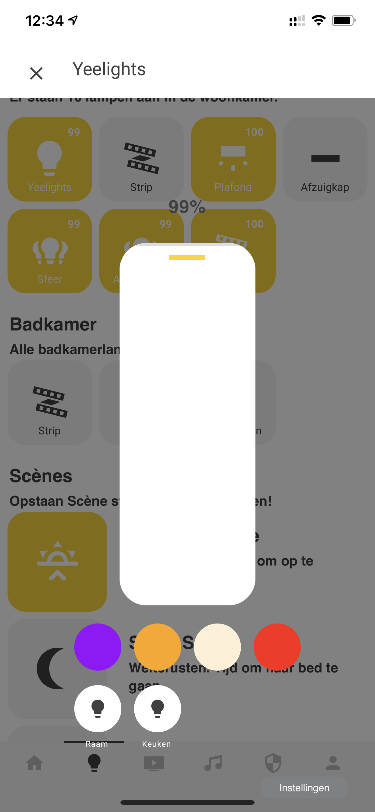
This is on iOS

To be fully informative, I use light-popup-slider card with the following styling:

      $: |
        .mdc-dialog .mdc-dialog__container {
          width: 100%;
        }
        .mdc-dialog .mdc-dialog__container .mdc-dialog__surface {
          width:100%;
          box-shadow:none;
        }
      .: |
        :host {
          --mdc-theme-surface: rgba(0,0,0,0);
          --secondary-background-color: rgba(0,0,0,0);
          # --ha-card-background: rgba(0,0,0,8);
          # --mdc-dialog-scrim-color: rgba(0,0,0,0.8);
          --mdc-dialog-min-height: 100%;
          --mdc-dialog-min-width: 100%;
          --mdc-dialog-max-width: 100%;
        }
        mwc-icon-button {
          color: var(--text-color);
        }

Perhaps these stylings are working against each other?

Any help if you have the time is greatly appreciated.

1 Like

Can you please tell me about the ā€œclassā€ section you have under the Lovelace card setup? I didnā€™t see any of this in the example theme, unless Iā€™m missing a file. Does that need to be on every card? Can you define multiple themes for the same Lovelace card type? Inheritance? Overrides?

Thomas did a quick explanation here:

HI Thomas, might I ask in this thread about an issue I have since updating (either to HA 113, or card-mod, I cant say honestly) and point here to prevent crossposting too much?

Having an inspector error, while HA seems to do alright in the frontend.
Hope you ca have a look, thanks.

Thanks Thomas, but unfortunately no, this does not replace the button style either.

  card-mod-theme: night
  card-mod-card: |

    ha-card.media-player {
      border: solid 1px var(--secondary-text-color);
    }

    ha-card.media-player mmp-shortcuts {
      $: |
        mmp-button {
          box-shadow: none;
          background: none;
          border: solid 1px var(--secondary-text-color);
          border-radius: 10px;
        }
    }

https://caniuse.com/#feat=css-backdrop-filter
Try with the -webkit- prefix.

2 Likes

That did the trick! I added that as an extra line so I have it on both iOS devices and Android/Chromium.

I think the status bar not becoming transparant on iOS has something to with the popup-light-card Iā€™m using. Standard ā€˜more infoā€™ views are transparent. Gonna dig deeper into that.

Thanks a lot for your time and help, once again :slight_smile:

edit:

I did some more digging around, and found out that the popup bar changes to background-color depending on the size. When I resize it untill it goes white on desktop, I see the following line:

@media (max-width: 450px), (max-height: 500px)
app-toolbar {
    background-color: #FFFFFF;
    color: #404040;
}

The weird thing is, I donā€™t know why this happens with popup cards only. More info dialogs donā€™t have that but opening any other popup card does.

I would like to be able to specify the theme in the Dashboard/View and have that apply to the system more-info dialogue. Best I can tell right now is that I have to change the theme in user preferences for this to apply. Is that possible? Am I just doing it wrong? Thanks for any help.

BTW, love this, extremely powerful yet can manage things centrally without having to go through my entire set of YAML dashboard file every time i change something. Only challenge is that my CSS skills are next to non-existence, it is a bit like trying to read Egyptian Hieroglyphs; but I am getting there.

Well letā€™s just say that you are not aware that it can be done. There are theme options for just the more info dialogue box. e.g.

mdc-theme-surface: '#041D42'   # Pop-up background colour

And the current theme can be automated to be selected from the front end:

Screenshot_2020-08-07 Administration - Home Assistant

- id: select_theme
  alias: 'Select Theme'
  trigger:
  - platform: state
    entity_id: input_select.select_theme
  action:
    service: frontend.set_theme
    data_template:
      name: >
        {% if is_state('input_select.select_theme', 'Night') %}
          night
        {% else %}
          day
        {% endif %}

Just set your profile theme to ā€œback-end selectedā€ and this will work.

None of this needs card mod.

Perfect, and easy to boot. Thanks

Is it possible to apply CSS to ha-panel-lovelace instead of hui-root?

Why would you need that? To style the error screen?

Mainly to apply stuff to other panels and some editors.

1 Like

Any updates on how to do this? For my theme the integrations page looks bad:


UPDATE: I was able to fix with ha-card-border-color.

Just heads up, thank you so much @thomasloven for your contributions to the Lovelace stuff. Half of the custom modules Iā€™m using are yours including card-mod. I recently made Windows 10 inspired themes and I used card-mod to supercharge them. Hereā€™s a repo for anyone interested.

2 Likes

I canā€™t get header theming to work in 0.115, anyone else?
Forgot to set --card-mod-theme correctly.

I canā€™t get backend-selected themes to work now with 0.115. If I set the theme manually, then it works. Any fixes?

Iā€™ve been banging away at this one without success for days, so if anyone could help it would be apreciated.

Iā€™m trying to remove the padding in a conditional card:

Card config (works):

  - type: 'custom:hui-element'
    card_type: conditional
    conditions:
      - entity: media_player.lounge_av_rx
        state_not: 'off'
    card:
      type: entities
      class: inline-card  ### < --- into here
      style: |            ### < --- this
        .card-content {
          padding-top: 0px;
          padding-right: 12px;
          padding-bottom: 8px;
          padding-left: 0px;
        }
      entities:
        - entity: input_select.lounge_surround_mode

How do I get the .card-content style above into the existing class:

  card-mod-theme: night
  card-mod-card: |
    ha-card.inline-card {
      border: solid 1px var(--primary-color);
      box-shadow: none;
      --ha-card-background: rgba(0, 0, 0, 0);
    }