 Bring a custom layout to Sections dashboard
Now card_mod supports Section grid and stack cards, I was thinking if it is possible to bring a custom layout to a Section Dashboard, thus replacing the new for layout-card. Below is my preliminry afternoon’s investigation.
A. Use theme to style card-mod-view. Not mandatory, but makes the main wrapper and container have no padding or margin, so you can style all those with card_mod on the Section you will use on the Dashboard.
Theming for card-mod-view
Here I am using a template to only apply to the view with viewUrlPath of test-layout.
  card-mod-view-yaml: |
    hui-sections-view $: |
      {# card_mod.debug #}
      {% set viewUrlPath = panel.viewUrlPath if 'viewUrlPath' in panel else '' %}
      {% if viewUrlPath == 'test-layout' %}
      .wrapper {
        max-width: unset;
        padding: 0px;
        margin: 0px;
      }
      .wrapper > .container {
        padding: 0px;
        margin: 0px;
      }
      {% endif %}
B. Dashboard YAML. Place a Section, 1 section max wide, edit in Yaml to add the initial code to allow for grid-template-areas etc. My example uses a few areas, with a footer that sticks to the bottom.
Base Section YAML
type: grid
cards: []
card_mod:
  style: |
    .container {
      padding: 0 10px;
      height: calc(100vh - 56px);
      --base-column-count: 1;
    }
    @media (min-width: 601px)
    {
      .container {
        grid-template-columns: 2fr 2fr 2fr 2fr 2fr 2fr;
        grid-template-rows: min-content min-content 1fr min-content;
        grid-template-areas: 'title title title title title title'
                            'a a b b b b'
                            'z z z z z z'
                            'footer footer footer footer footer footer';
      }
    }
    @media (max-width: 600px)
    {
      .container {
        grid-template-columns: 1fr;
        grid-template-rows: min-content min-content min-content 1fr min-content;
        grid-template-areas: 'title'
                             'b'
                             'a'
                             'z'
                             'footer';
      }
    }
    div.card:has(.area-title) {
      grid-area: title;
    }
    div.card:has(.area-a) {
      grid-area: a;
    }
    div.card:has(.area-b) {
      grid-area: b;
    }
    div.card:has(.area-footer) {
      grid-area: footer;
    }
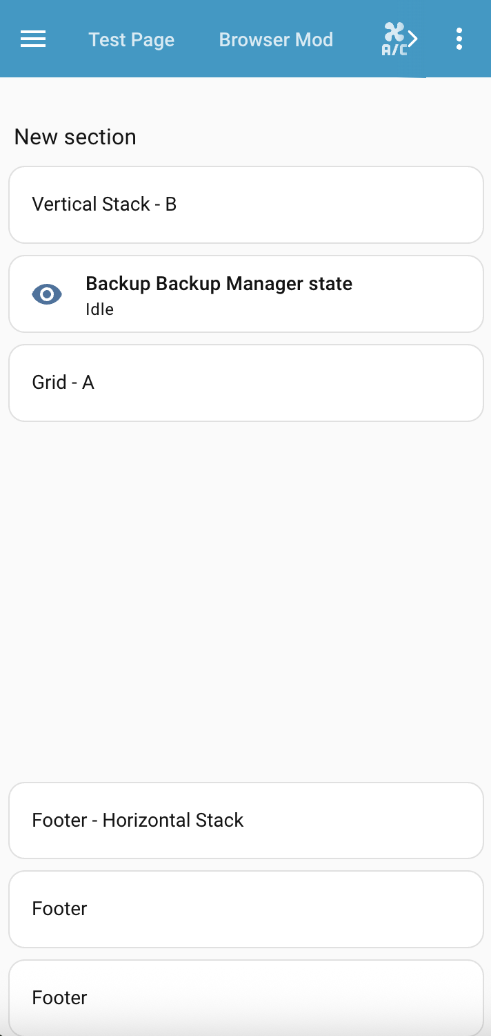
C. Add some container cards or just a single card. Container cards card_mod supports are grid and vertical-stack and horizontal-stack. For the card you add, use card_mod to set a class that matches the div.card:has(.area-X). e.g. in my example I have area-title matching grid-template-area title. Use whatever suits.
Example also shows the footer as a horizontal-stack that switches to vertical on small screen width.
Cards
  - type: heading
    heading: New section
    heading_style: title
    card_mod:
      class: area-title
  - square: false
    type: grid
    cards:
      - type: markdown
        content: Grid - A
    columns: 1
    card_mod:
      class: area-a
  - type: vertical-stack
    cards:
      - type: markdown
        content: Vertical Stack - B
      - type: tile
        entity: sensor.backup_backup_manager_state
        vertical: false
        features_position: bottom
    card_mod:
      class: area-b
  - type: horizontal-stack
    cards:
      - type: markdown
        content: Footer - Horizontal Stack
      - type: markdown
        content: Footer
      - type: markdown
        content: Footer
    card_mod:
      class: area-footer
      style: |
        @media (max-width: 600px) {
          #root {
            flex-direction: column;
          }
        }
Putting it all together
Full Section YAML
The main Section is the only card, with all cards within the Section
type: grid
cards:
  - type: heading
    heading: New section
    heading_style: title
    card_mod:
      class: area-title
  - square: false
    type: grid
    cards:
      - type: markdown
        content: Grid - A
    columns: 1
    card_mod:
      class: area-a
  - type: vertical-stack
    cards:
      - type: markdown
        content: Vertical Stack - B
      - type: tile
        entity: sensor.backup_backup_manager_state
        vertical: false
        features_position: bottom
    card_mod:
      class: area-b
  - type: horizontal-stack
    cards:
      - type: markdown
        content: Footer - Horizontal Stack
      - type: markdown
        content: Footer
      - type: markdown
        content: Footer
    card_mod:
      class: area-footer
      style: |
        @media (max-width: 600px) {
          #root {
            flex-direction: column;
          }
        }
card_mod:
  style: |
    .container {
      padding: 0 10px;
      height: calc(100vh - 56px);
      --base-column-count: 1;
    }
    @media (min-width: 601px)
    {
      .container {
        grid-template-columns: 2fr 2fr 2fr 2fr 2fr 2fr;
        grid-template-rows: min-content min-content 1fr min-content;
        grid-template-areas: 'title title title title title title'
                            'a a b b b b'
                            'z z z z z z'
                            'footer footer footer footer footer footer';
      }
    }
    @media (max-width: 600px)
    {
      .container {
        grid-template-columns: 1fr;
        grid-template-rows: min-content min-content min-content 1fr min-content;
        grid-template-areas: 'title'
                             'b'
                             'a'
                             'z'
                             'footer';
      }
    }
    div.card:has(.area-title) {
      grid-area: title;
    }
    div.card:has(.area-a) {
      grid-area: a;
    }
    div.card:has(.area-b) {
      grid-area: b;
    }
    div.card:has(.area-footer) {
      grid-area: footer;
    }
Full Dashboard view YAML
type: sections
title: Test Layout
path: test-layout
max_columns: 1
sections:
  - type: grid
    cards:
      - type: heading
        heading: New section
        heading_style: title
        card_mod:
          class: area-title
      - square: false
        type: grid
        cards:
          - type: markdown
            content: Grid - A
        columns: 1
        card_mod:
          class: area-a
      - type: vertical-stack
        cards:
          - type: markdown
            content: Vertical Stack - B
          - type: tile
            entity: sensor.backup_backup_manager_state
            vertical: false
            features_position: bottom
        card_mod:
          class: area-b
      - type: horizontal-stack
        cards:
          - type: markdown
            content: Footer - Horizontal Stack
          - type: markdown
            content: Footer
          - type: markdown
            content: Footer
        card_mod:
          class: area-footer
          style: |
            @media (max-width: 600px) {
              #root {
                flex-direction: column;
              }
            }
    card_mod:
      style: |
        .container {
          padding: 0 10px;
          height: calc(100vh - 56px);
          --base-column-count: 1;
        }
        @media (min-width: 601px)
        {
          .container {
            grid-template-columns: 2fr 2fr 2fr 2fr 2fr 2fr;
            grid-template-rows: min-content min-content 1fr min-content;
            grid-template-areas: 'title title title title title title'
                                'a a b b b b'
                                'z z z z z z'
                                'footer footer footer footer footer footer';
          }
        }
        @media (max-width: 600px)
        {
          .container {
            grid-template-columns: 1fr;
            grid-template-rows: min-content min-content min-content 1fr min-content;
            grid-template-areas: 'title'
                                 'b'
                                 'a'
                                 'z'
                                 'footer';
          }
        }
        div.card:has(.area-title) {
          grid-area: title;
        }
        div.card:has(.area-a) {
          grid-area: a;
        }
        div.card:has(.area-b) {
          grid-area: b;
        }
        div.card:has(.area-footer) {
          grid-area: footer;
        }
cards: []
This may be starter for what you want in a Section coming from layout_card, be it simply to adjust card order when on small screen etc.
If you have any question on possibilities, I am very happy to discuss further.