No luck.
Tried div#tabsContainer as well.
Works fine in general:
test_minimal:
  card-mod-theme: test_minimal
  card-mod-root-yaml: |
    ha-tabs $: |
      #tabsContainer {
        color: red;
      }

1 Like
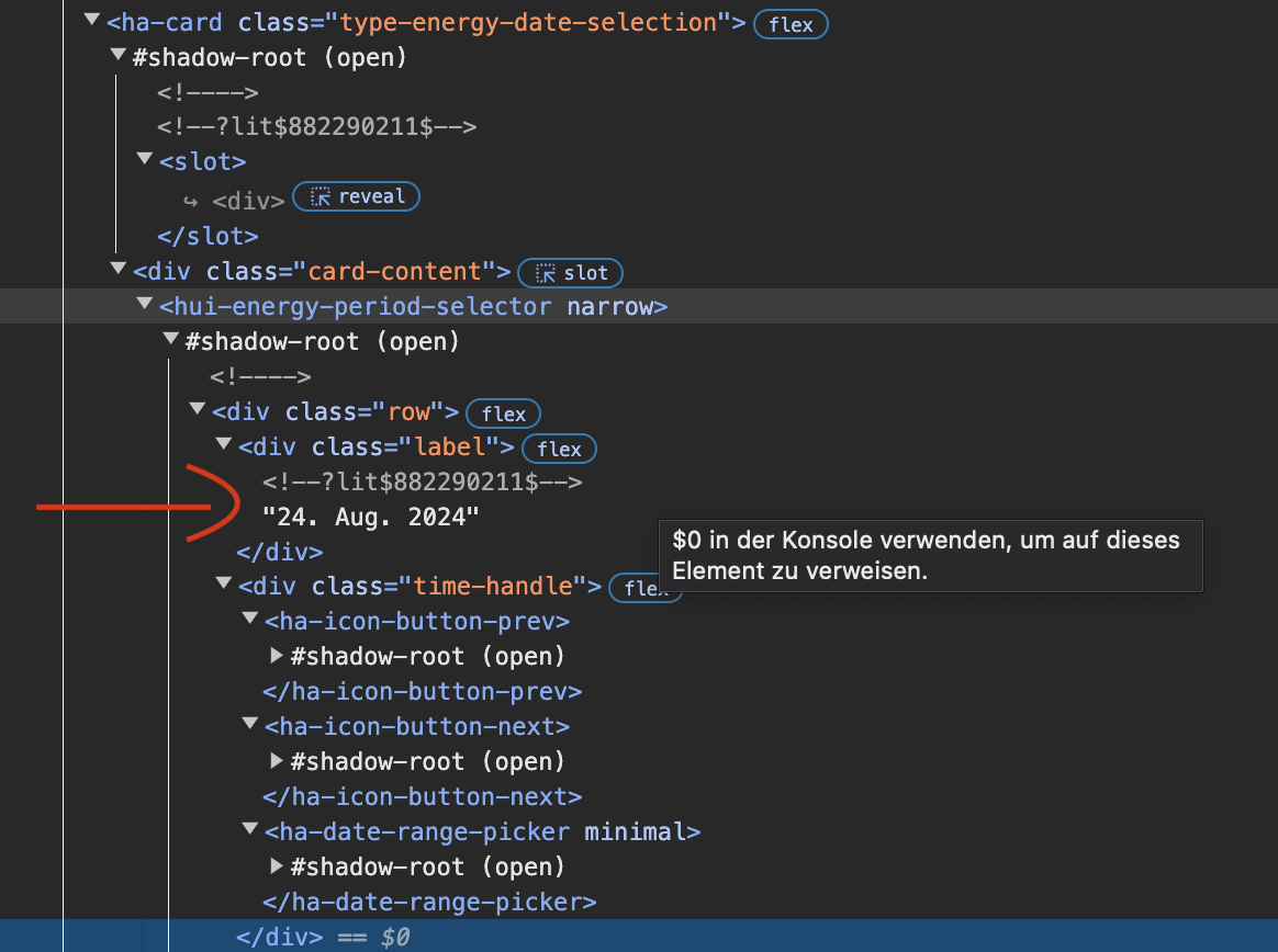
Hello,
im l0oking to make the font smaller of the date

this is the Built in HA Card: Energy Date Picker
type: energy-date-selection
the Basics unfortunately dont work
card_mod:
  style: |
    ha-card {
      font-size: 10px !important;
    }
please have anybody a tip. i was trying to find it with the goole browser inspector, but failed
Sorry to direct my question to you but my original post 🔹 Card-mod - Super-charge your themes! - #1754 by Duke_box didn’t get any responses.
Unlike the question that prompted your answer, which was very helpful, I want to able to change things at the badge level, “div.badge-complete” specifically the “border width” and “border color” elements.
I now know my original post was total rubbish as I can now edit both “border-width” and “border-color” elements in the Dev tools console and get my desired result.
I have tried various card-mod stuff in my theme yaml but to no effect. for example:
card-mod-view-yaml: |
    hui-masonry-view:
      $:
        hui-view-badge.complete $: |
          .badge {
            border-width: 1px;
          }
However I am useless at navigating the Dom tree using card-mod.
Can anyone please help me with pointers and examples please?
Thanks
I am not using badges.
That was my recent quick try:
card-mod-view-yaml: |
    hui-masonry-view:
      $:
        hui-view-badges $: |
          .badges {
            flex-direction: column;
          }
Since you need to go to a particular badge - you should go deeper:
  card-mod-view-yaml: |
    hui-masonry-view:
      $:
        hui-view-badges $:
          hui-badge:
            hui-entity-badge $: |
              .badge {
                background-color: cyan !important;
                --badge-color: red !important;
                --mdc-icon-size: 32px !important;
                --primary-text-color: orange !important;
              }
to get this beautiful look:

And this is a very “brute” way since badges currently do not seem to have CSS variables (not to mention a nasty look of new badges in general).
2 Likes
Thanks for the example.
I agree with your sentiment about the new badges.
Update: Based on your example I have now got my desired result of having the border and border colour of the new badges changed independently of the rest of the dashboard.
If anyone is interested, here is my code snippet that changes the border colour of the new badge as per my original request.
  card-mod-view-yaml: |
    hui-masonry-view:
      $:
        hui-view-badges $:
          hui-badge:
            hui-entity-badge $: |
              .badge {
                border-width: 0.25px !important;
                border-color: #039BE5 !important;
              }
1 Like
unbelieveable what magic you had found again - great job
Thanks a lot
What does it require to run the card-mod-sidebar ?
I have installed hacs and card-mod too, but the left menu items in the sidebar are not highlighted.
Finally: How can I rename an icons title like here from “evcc” to “CHARGER”

And is there a way to make the icons bigger too ?
thanks a lot !
If this dashboard was created by you - why do not you want to edit the title in the first place?
UPDATED VERSION
not sure if that is possible cause i have installed the add on and clicked an option in the addon configuration to show evcc add on in the sidebar.
And evcc seems to have a “fixed add on title” or I missed something.
I can resort the order of the side bar elements on each device, but I have never seen an “edit title” button except the option for all those sidebar elements which I have added in configuration yaml manually.
So for now i have no clue where to change the title of such add on element in the sidebar and someone had linked me to your comment above that it should or could be possible this way.
I also have tried to use your “sidebar highlighter” in my configuration.yaml but it did not work for whatever reason and therefore looked for a “card-mod-sidebar” if that would be needed cause I could not read all the comments, I have followed your link where you described how you had found the undocumented feature (madalena or so had commented his / her experience and asked you)
I have installed card-mod, I have checked if it works with an entity card and it did.
I assume that /hacsfiles is a placeholde for the
HACS installation folder (HA OS) /homeinstallation/www/community`
my configuration.yaml
 extra_module_url:
    - /hacsfiles/lovelace-card-mod/card-mod.js

##############################################################################################
###  sidebar colourfull selector                                                           ###
###  https://community.home-assistant.io/t/card-mod-super-charge-your-themes/212176/1236   ###
###                                                                                        ###
##############################################################################################

card-mod-sidebar-yaml: |
  .: |
    a:hover paper-icon-item ha-icon {
      color: red !important;
    }
    a:hover paper-icon-item .item-text{
      color: red;
    }
    a:hover paper-icon-item {
      background: yellow;
    }
But this did not work out.
And after HA restart I got an error about “card-mod-sidebar-yaml” not found

Any ideas what I have to change ?
thanks
Please read in card_mod wiki on card_mod github page how to use card_mod themes. It is well and detailed described there. It should not be necessary to do it here again.
2 Likes
Thanks,
I will have a look this evening cause there is a lot more to do than what I had assumed HACS would have done. Had not much time, but saw pieces missing in my yaml.
Hey all. Beginner here. Is it possible to use card-mod to hide elements of a webpage I’m pulling in to my dashboard using a website card, presumably using an iframe?
I’ve seen various examples on here of scaling the iframe contents, but nothing where people are styling the actual contents within. Perhaps that’s not possible?
It’s not, by definition of how an iframe works. It’s like trying to style a page open in another tab in your browser.
Also note that this is the card-mod theme topic and not the general one.
Thanks Pieter.
I’m trying to toggle the sidebar and topbar which is enabled (hidden for mobile view) by the Bubble theme.
card-mod-view-yaml: |
    hui-sidebar-view:
      $: |
        .container {
            overflow: hidden;
            /* padding: 6px; */
        }
        @media only screen and (min-width: 768px) {
            .container {
              max-width: 520px;
              margin: auto !important;
              width: -webkit-fill-available;
            }
        }
        #wrapper: |
          $: |
            #progressContainer {
                border-radius: 14px !important;
        }
      .: |
        "#view>hui-view>hui-sidebar-view$#main>hui-card-options:nth-child(7)>vertical-stack-in-card$ha-card>div>hui-horizontal-stack-card$#root>hui-grid-card$#root>hui-entities-card$#states>div:nth-child(4)>slider-entity-row$div>ha-slider$#sliderBar$#progressContainer" {
            border-radius: 14px !important;
        }
How I do that by just a simple toggle button ?
Hi, is there a way to change colors of a view header (a.k.a. app-header/app-toolbar) when a theme is assigned in the definition of the view?
- view
- title: Test
  path: overview-test
  theme: my_attempt
- theme
my_attempt:
  # both variables work only if theme is set in user settings
  app-header-background-color: "#963484"
  app-header-text-color: "#EFD6D2"

  # card_mod theme also works only if theme is set in user settings
  card-mod-theme: my_attempt
  card-mod-root-yaml: |
    .: |
      app-header {
        --app-header-background-color: "#963484" !important;
        background-color: "#963484" !important;
      }
I also tried things like:
card-mod-root-yaml: |
    .: |
      div>div.header {
        --app-header-background-color: "#963484" !important;
      }
card-mod-root: |
  :host {
    --app-header-background-color: "#963484" !important;
  }
Because that seem to do the job in dev tools:

I’ve tried the following code to Hide/Show the sidebars but its not working
Bubble:
  # Existing theme settings...

  card-mod-theme: Bubble

  card-mod-root-yaml: |
    .: |
      @media only screen and (max-width: 768px) {
          .header {
            display: none;
            opacity: 0;
          }
          #view {
            padding-top: 0 !important;
            margin-top: 0 !important;
            height: calc(100vh - env(safe-area-inset-top)) !important;
          }
      }

  card-mod-more-info-yaml: |
     $: |
      .mdc-dialog .mdc-dialog__scrim {
         backdrop-filter: blur(15px);
         -webkit-backdrop-filter: blur(15px);
         background: rgba(0,0,0,.6);
      }
      .mdc-dialog .mdc-dialog__container .mdc-dialog__surface {
         box-shadow: none !important;
         border-radius: var(--ha-card-border-radius);
      }
     .: |
      :host {
         --ha-card-box-shadow: none;
      }

  card-mod-view-yaml: |
    hui-sidebar-view:
      $: |
        .container {
            overflow: hidden;
            display: {{ 'none' if states('input_select.sidebar_topbar_visibility') == 'Hide' else 'block' }};
        }
        @media only screen and (min-width: 768px) {
            .container {
              max-width: 520px;
              margin: auto !important;
              width: -webkit-fill-available;
            }
        }
        #wrapper: |
          $: |
            #progressContainer {
                border-radius: 14px !important;
        }
      .: |
        "#view>hui-view>hui-sidebar-view$#main>hui-card-options:nth-child(7)>vertical-stack-in-card$ha-card>div>hui-horizontal-stack-card$#root>hui-grid-card$#root>hui-entities-card$#states>div:nth-child(4)>slider-entity-row$div>ha-slider$#sliderBar$#progressContainer" {
            border-radius: 14px !important;
        }
I’ve tried solutions Frontend.set_theme not working - #25 by ausfas
but none working
templates like this should work:
{% set kerst = is_state('input_select.theme','Kerst') %}
 overflow: {{'hidden' if is_state('input_boolean.hide_card_overflow','on')}};
 background: {{'repeat url("/local/season/kerst_smurfen.png")' if kerst}};
maybe start experimenting with a subset (the minimal you want to customize) and then build from there
Finally some progress.
The following allows switching of the theme … that is working 
input_select:
  theme_selector:
    name: Theme Selector
    options:
      - "default"
      - "ios-dark-mode"
    initial: "default"
    icon: "mdi:theme-light-dark"
alias: Switch Theme
description: ""
trigger:
  - platform: state
    entity_id: input_select.theme_selector
action:
  - data_template:
      name: "{{ states('input_select.theme_selector') }}"
    action: frontend.set_theme
Now need to make the browser_mod and card-mod to work ( the reason I came to this thread), so that I can enable and disable side and topbars by injecting the code within the Bubble theme.
Once I’m all done will document this for everyone on a separate thread for inexperience users before they dive into more complicate experiments.
the following isn’t working yet.
  - action: browser_mod.set_theme
    data:
      dark: dark
      theme: auto