As said. It’s not the scrollbar of the custom sidebar, it is the right browser scrollbar.
right, I misread that dom path you posted, sorry.
fwiw, that theme variable should also apply to the window scrollbar:
but even that is no longer applied, even directed via a theme (so not card-mod theme, but HA theme)
Don’t think so. This is a class. And this is only applied in main style to the nevigation bar and not to body or whatever else. But might be, that I’m wrong.
OT: I’m doing it now via custom js added in config.
const style = document.createElement('style');
style.textContent = `
  ::-webkit-scrollbar {
    background: #212121 transparent;
    width: 10px;
  }
  ::-webkit-scrollbar-thumb {
    background:rgb(255, 0, 0);
    border-radius: 5px;
    width: 10px;
  }
  ::-webkit-scrollbar-button {
    background:rgb(200, 255, 0);
    width: 10px;
  }
  ::-webkit-scrollbar-track {
    background:rgb(33, 131, 8);
    width: 10px;
  }`;
  document.head.appendChild(style);
beware that in 2025.6 the card-headers where changed, and if you mod those, you need to adjust them.
internal padding decreased, and I had to change my classes from
        :host(.class-header-margin) ha-card .card-header {
          background: var(--background-color-off);
          color: var(--text-color-off);
          font-weight: 400;
          font-size: 20px;
          padding: 0 12px;
          margin: 0 0 16px 0px;
        }
to
        :host(.class-header-margin) ha-card .card-header {
          background: var(--background-color-off);
          color: var(--text-color-off);
          font-weight: 400;
          font-size: 20px;
          padding: 4px 12px; /* added the 4px here for top and bottom padding */
          margin: 0 0 16px 0px;
        }
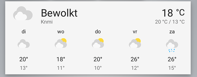
so ultimately I am trying to create a new class for the weather-forecast cards, which in 2025.6 have been redesigned to show even more whitespace…
It’s not making it easier to read for bad eyes like mine (the fonts etc are not changed), it’s only introducing more lost space.
Trying to mod the card is going well:
          style: |
            ha-card {
              height: 80% !important;
            }
            .forecast {
              padding: 0 !important;
            }
which makes it look like
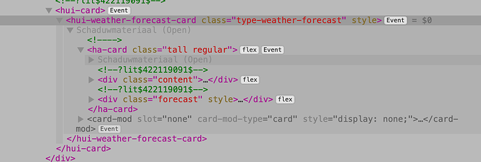
however, there is another element to that card I cant get hold of:
Of course I need to delete/resize that bottom piece of the weather-forecast-card too, but setting the 80% height to is only makes the rest of the card shrink also, and keeps the gap…
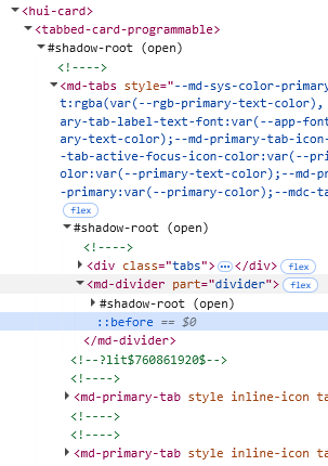
this is Inspector
Maybe anyone of you can help me here, to target that main structure?
And re-writei it to a class…
btw the card behaves differently when in Masonry, see the unchanged card being more compact than the top card I posted
we can add:
        layout_options:
          grid_rows: 4
but that doesn’t really help, and still messes with the new and costly styling
wrong thread. sorry
Wrong thread…Post here ![]()
Once this was working but i can not get it to work again.
What’s wrong?
  card-mod-card-yaml: |
   hui-card-features$:
      hui-light-brightness-card-feature$:
        ha-control-slider$: |
          .slider {
             height: 20px !important;
             --control-slider-color: lime !important;
                    }
in my config I use an extra hui-card-feature in the card-mod’s. (so not in theme, but direct on the element)
style:
  hui-card-features $:
    hui-card-feature $:
      hui-numeric-input-card-feature $:
        ha-control-slider$: |
          .container {
            --control-slider-border-radius: var(--ha-card-border-radius);
          }
          .slider .slider-track-bar {
            border-radius: var(--ha-card-border-radius) !important;
          }
          .slider .slider-track-bar::after {
            border-radius: var(--ha-card-border-radius) !important;
          }
      hui-numeric-input-card-feature$: |
        {% set vol = states(config.entity)|float(0) %}
        ha-control-slider {
          --control-slider-color:
            {% if vol == 0.0 %} gray
            {% elif vol <= 0.3 %} dodgerblue
            {% elif vol <= 0.6 %} green
            {% elif vol <= 0.8 %} orange
            {% else %} red
            {% endif %} !important;
          --control-slider-background:
            {% if vol == 0.0 %} gray
            {% elif vol <= 0.3 %} dodgerblue
            {% elif vol <= 0.6 %} green
            {% elif vol <= 0.8 %} orange
            {% else %} red
            {% endif %} !important;
        }
        ha-control-number-buttons {
          color: var(--primary-color);
          {% set state = states(config.entity) %}
          --control-number-buttons-background-color: var(--primary-color);
          --control-number-buttons-border-radius: var(--ha-card-border-radius);
        }
Good morning, I’m trying to use card-mod-root-yaml in an existing “Material You” theme, but I’d like to make the changes I need in a separate file
If I put things in the theme file it works, but if the theme is updated I’ll lose my changes…
Is it possible to create a theme based on another theme with my changes, expand an existing theme or put the card-mod configuration in a view to be executed globally?
Thanks
Put a content of this key into a separate file and then include it.
Thanks Marius,
that;s my problem, the card is imported in my dashboard and i can not change it therefore. In past it worked added in a theme but since a short time it doesn’t anymore.
why not? you can add any yaml you like?
really need to get back to this, and for a specific reason: as you can see in the screen shot, there is a sharp horizontal line below the badges.
It was like this with the manual card-mod theme yaml in our themes, but it also is happing now we have the core option for badge in the header:
header:
  badges_wrap: scroll
I have only found a single variable in the frontend source that could be influencing this, but since it was also happening in the manual card-mod theme, I am still not 100% sure that is it. see the issue I filed here, but was closed too soon imho setting badges_wrap to a view badge (with box-shadows) causes horizontal line//border of the section below · Issue #25691 · home-assistant/frontend · GitHub
bottom line: when applying a box-shadow to the badges, and use the scrolling style, either in card-mod theme or in core frontend options, the line is show. leave out the scroll and all is well.
I really need help identifying what I am seeing here, I mean which element it is that causes the sharp line. Is it the .badges, or is it the sections section itself, to maybe even another element in the view
silliest thing of all, it does even happening when there is nothing to scroll at all…:
without badges_wrap: scroll
I can apply:
    :first-child $:
      hui-view-header:
        $:
          hui-view-badges $: |
            .badges {
              padding-bottom: 18px;
            }
to make the cut-off less obvious, (looking closely it still is there…)but that is no good either, because it moves everything down, creating a waste of space.
How do I change the secondary text for the Tile card at theme level?
As this is a integrated card, I was hoping to do this without card-mod if possible.
I’ve tried the following and rebooted, but it makes no difference:
secondary-text-color:
card-secondary-color:
Thanks
sweet new option in HA 2025.7: set the spacing of the menu bar icons
I always had 7 tabs per dashboard but recently the spacing was made wider, so I had to scroll because of that. Didn’t like it so went all in to max tabs in a dashboard to 6.
from 2025.7 we can set to variable in our themes
    ha-tab-padding-start: 14px
    ha-tab-padding-end: 14px
or maybe even better to make them relative Rem units:
    ha-tab-padding-start: 1rem #14px
    ha-tab-padding-end: 1rem #14px
to follow the core code setting at sl-tab-group.ts
in themes, and see the 7 tabs without scrolling again.
Card-mod theming enters to make it device dependent (because we don’t need it on desktop obviously):
  card-mod-root-yaml: |
    .header: |
      .toolbar {
        padding-left: 1px !important;
      }
      sl-tab {
        text-transform: uppercase !important;
      }

    .header sl-tab-group$: |
      sl-icon-button[name='chevron-left'], sl-icon-button[name='chevron-right'] {
        display: {{'none' if is_state('input_boolean.toon_chevrons','off')}};
      }
      @media (orientation: portrait) and (max-width: 569px) {
        :host {
          --ha-tab-padding-start: 1rem !important;
          --ha-tab-padding-end: 1rem !important;
        }
      }
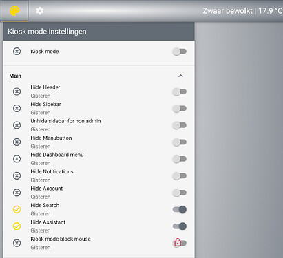
Can this still be used to remove the entities search button with latest 2025.7.xx ? I’ve tried a few things but couldn’t get to remove it.
TIA

