Current version, to be changed in future. Header change condition card

after toggle

Current work in progress, ble room assist to automatic toggle full view of cards
Current version, to be changed in future. Header change condition card
Current work in progress, ble room assist to automatic toggle full view of cards
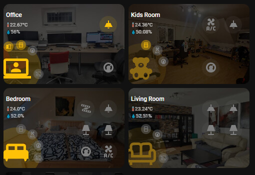
I’ve got in a different direction and use stack-in-card with my regular cards.
This way I feel more flexible on what to show and how to show them.
With bubble card separator I change the line to my primary color if there is presense.
This looks very nice!
Which card are you using here? Can you share the yaml code?
Yes, of course. I use mushroom-template and mushroom-chips-cards as well as custom:stack-in-card.
If you replace
type: custom:stack-in-card
mode: vertical
with these:
type: vertical-stack
you can edit everything in the visual editor. Then simply change it back again and the look will fit again.
type: custom:stack-in-card
mode: vertical
cards:
  - type: horizontal-stack
    cards:
      - type: custom:mushroom-template-card
        primary: Wohnzimmer
        secondary: ""
        icon: mdi:sofa
        layout: horizontal
        entity: light.alle_lichter_eg_wohnzimmer
        icon_color: >-
          {{ 'grey' if states("sensor.number_lights_on_eg_wohnzimmer") | int ==0
          else 'amber' }}
        tap_action:
          action: navigate
          navigation_path: /dashboard-smartphone/eg-wohnzimmer
        hold_action:
          action: toggle
        double_tap_action:
          action: none
        fill_container: true
        card_mod:
          style:
            mushroom-shape-icon$: |
              @keyframes ping {
                0% { box-shadow: 0 0 1px 1px rgba(var(--rgb-{{ config.icon_color }}), 0.7); }
                100% { box-shadow: 0 0 5px 15px transparent; }
              }
            .: |
              mushroom-shape-icon {
                --icon-size: 76px;
                display: flex;
                margin: -21px -5px 0px -21px !important;
              }
              ha-card {
                clip-path: inset(0 0 0 0 round var(--ha-card-border-radius, 12px));
                width: 180px;
                background: none;
                border: none;
              }
      - type: vertical-stack
        cards:
          - type: custom:mushroom-chips-card
            chips:
              - type: entity
                entity: sensor.eg_wohnzimmer_hg_int0000005_temperatur
                icon_color: blue
            alignment: end
            card_mod:
              style: |
                ha-card {
                  --chip-font-size: 0.3em;
                  --chip-icon-size: 0.0em;
                  --chip-border-width: 0;
                  --chip-box-shadow: none;
                  --chip-background: none;
                  --chip-border: none;
                  --chip-spacing: none;
                  --chip-font-weight: bold;
                  top: 0px;
                  opacity: 0.7
                }
          - type: custom:mushroom-chips-card
            chips:
              - type: entity
                entity: sensor.eg_wohnzimmer_hg_int0000005_luftfeuchtigkeit
                icon_color: blue
            alignment: end
            card_mod:
              style: |
                ha-card {
                  --chip-font-size: 0.3em;
                  --chip-icon-size: 0.0em;
                  --chip-border-width: 0;
                  --chip-box-shadow: none;
                  --chip-background: none;
                  --chip-border: none;
                  --chip-spacing: none;
                  --chip-font-weight: bold;
                  top: -20px;
                  opacity: 0.7
                }
  - type: custom:mushroom-chips-card
    chips:
      - type: template
        entity: sensor.number_lights_on_eg_wohnzimmer
        icon: |-
          {% if states("sensor.number_lights_on_eg_wohnzimmer") | int ==0 %}
          mdi:lightbulb-group-off
          {% else %}
          mdi:lightbulb-group
          {% endif %}
        icon_color: >-
          {{ 'grey' if states("sensor.number_lights_on_eg_wohnzimmer") | int ==0
          else 'amber' }}
        picture: ""
        tap_action:
          action: none
      - type: template
        entity: sensor.number_skd_on_eg_wohnzimmer
        icon: |-
          {% if states("sensor.number_skd_on_eg_wohnzimmer") | int ==0 %}
          mdi:power-plug-off-outline
          {% else %}
          mdi:power-plug
          {% endif %}
        icon_color: >-
          {{ 'grey' if states("sensor.number_skd_on_eg_wohnzimmer") | int ==0
          else 'amber' }}
        picture: ""
        tap_action:
          action: none
      - type: template
        entity: sensor.number_windows_open
        icon: |-
          {% if states("sensor.number_windows_open_eg_wohnzimmer") | int ==0 %}
          mdi:window-closed-variant
          {% else %}
          mdi:window-open-variant
          {% endif %}
        icon_color: >-
          {{ 'grey' if states("sensor.number_windows_open_eg_wohnzimmer") | int
          ==0 else 'amber' }}
        picture: ""
        tap_action:
          action: none
      - type: template
        entity: sensor.number_doors_open
        icon: |-
          {% if states("sensor.number_doors_open_eg_wohnzimmer") | int ==0 %}
          mdi:door-closed
          {% else %}
          mdi:door
          {% endif %}
        icon_color: >-
          {{ 'grey' if states("sensor.number_doors_open_eg_wohnzimmer") | int
          ==0 else 'amber' }}
        picture: ""
        tap_action:
          action: none
      - type: template
        entity: sensor.number_motion_detected
        icon: |-
          {% if states("sensor.number_motion_detected") | int ==0 %}
          mdi:motion-sensor-off
          {% else %}
          mdi:motion-sensor
          {% endif %}
        icon_color: |-
          {% if states("sensor.number_motion_detected") | int ==0 %}
          grey
          {% else %}
          red
          {% endif %}
        picture: ""
        tap_action:
          action: none
      - type: template
        entity: switch.dr_schuppen_skd_poolpumpe
        icon: mdi:pool
        icon_color: >-
          {{ 'blue' if is_state("switch.dr_schuppen_skd_poolpumpe",'on') else
          'grey' }}
        picture: ""
        tap_action:
          action: none
    alignment: justify
    card_mod:
      style: |
        ha-card {
          --chip-font-size: 0.3em;
          --chip-icon-size: 0.6em;
          --chip-border-width: 0;
          --chip-box-shadow: none;
          --chip-background: none;
          --chip-border: none;
          --chip-spacing: none;
          --chip-font-weight: bold;
          top: -25px;
          height: 15px;
        }
layout_options:
  grid_columns: 3
  grid_rows: 2
Thank you very much. 
Nice one, would it be possible to put the text of the room below the icon aligned to the left?
Yes, you can change the layout:
- type: custom:mushroom-template-card
        primary: Wohnzimmer
        secondary: ""
        icon: mdi:sofa
        layout: horizontal
to vertical.
But I think you will have to adjust the position of the icon and the text
Thank you very much! I didn’t know this trick yet, very helpful. 
How did you manage the multiple vertical stacks with the icons on the right?
I have 8 entities all stacked one below the other, but I’d like them in two rows.
Looks awesome. Would like to know how you achieved it as well.
This card looks amazing. I love how simple, polished, and clear the layout is—exactly what I was looking for.
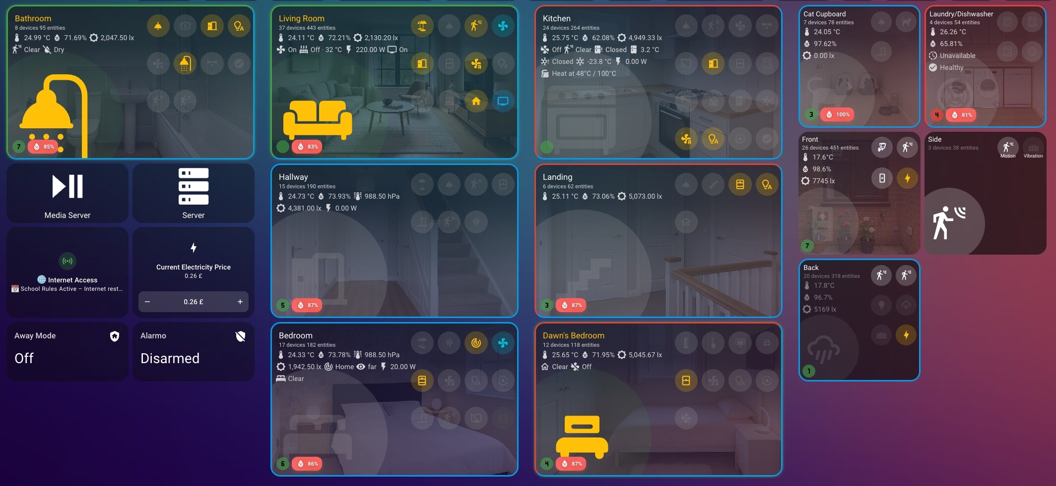
Work in progress still. Temperatu, Humidity, background image can be configured manually but in default it take settings from room.
Badges action are in default config showing More-Info. Buttons default action Toggle.
Main icon light if occupancy is detected. Dark if room is clear.
Looks great, can you share the code?
 Lovelace Bubble Room v5
 Lovelace Bubble Room v5 is here!
Lovelace Bubble Room v5 brings a completely redesigned experience, keeping the original style but adding powerful new options and full modularity.
 Important note: If you were using v4, you will need to recreate the card from scratch, since the internal structure has been rebuilt to provide better performance and more features.
 What’s new
 Code rewritten from scratch → faster, more stable, easier to maintain.
 Modular panels → add and combine different sections around the main bubble.
 Advanced configuration → each panel has its own filters, controls, and reset.
 “Clear” and “Reset” buttons → quickly reset filters and panel settings.
 Smart auto-discovery → automatically detects available entities.
 New glass design → modern, elegant look that fits any dashboard. Available panels
Lovelace Bubble Room v5 introduces specialized panels that you can freely combine:
Sub-Button Panel → up to 4 additional buttons around the bubble, each with entity, icon, and customizable actions. Mushroom Panel → up to 5 extra entities (lights, switches, media players, etc.) for quick access.
 Sensor Panel → up to 5 sensors (temperature, energy, battery, etc.) with integrated history graph.
 Color Panel → RGB and color temperature controls with dedicated sliders.
 Camera Panel → display live camera feeds.
 Climate Panel → control climate devices with target temperature and modes.
 Room Panel → presence/occupancy management with binary_sensor support and multiple filters. Why upgrade to v5? Migration from v4
This is a major release and not compatible with v4.
 You will need to recreate your card from scratch to take full advantage of the new features.
Hello, I think this map is great, good work. I’m currently trying to recreate it and edit your code. Unfortunately, the background of the entire map is 100% transparent for me, so it’s not there. How did you manage to have a constant background behind the entire room map?
Hello, you have to install "stack in card " via hacs. then the background should be behind the room map. i hope it helps and i understand your question correctly
I made a YouTube video about my custom room card and how I am using it: https://youtu.be/47J4fdbGP8I
Hope you like it!
I have a very condensed view of the rooms (and sadly, too many rooms), simply because I like having a good overview and getting to the setting I want as fast as possible.
This is the main overview page:
The room section is at the bottom, each line represents a room. The following information is shown:
Currently trying to somehow show the correct tab depending on the AP my mobile is connected to, but that has some roadblocks left…