I just jumped in this topic as i was “fiddling” with custom:header-card
In Regards to energy-data in common there are lots of “choice”, depending upon what you want to have an overview over, and how , it all comes to ones “taste” and opinion, using different cards/views and using card-mod.
as for the header-card, it will have 2 rows as shown above, another card worth mention is custom:history-explorer-card.
Works with “sensors” of different “measurements” and “graphs/staples/time-line”
For “inspiration” custom:history-explorer-card in a Panel-View mode , and as a single card “cut out of another standard-View, with 3 columns”
Do you mind sharing the code for the layout you used in your custom energy dashboard? As it’s matching the standard energy dashboard ( the graphs are shown bigger). Want to do exactly the same😁. On a mobile phobe I suppose all card are behind eachother? Many thanks!
Did you use the custom-layout-card for creating the layout of all cards in your dashboard? And what config? Great to have the graphs bigger than the gauge cards
if you want a card to “span” more than 1 column, in a View/Dashboard, you can use grid
… or place gauge-cards in Horizontal stack card(1 “view/Dashboard” column) ( to make them smaller )
PS, as your questions have nothing to do with “energy-selection card in header, i suggest you search elsewhere( for i.e energy dashboards in layouts, grid or Vertical / Horizontal-stack) or open another Topic”
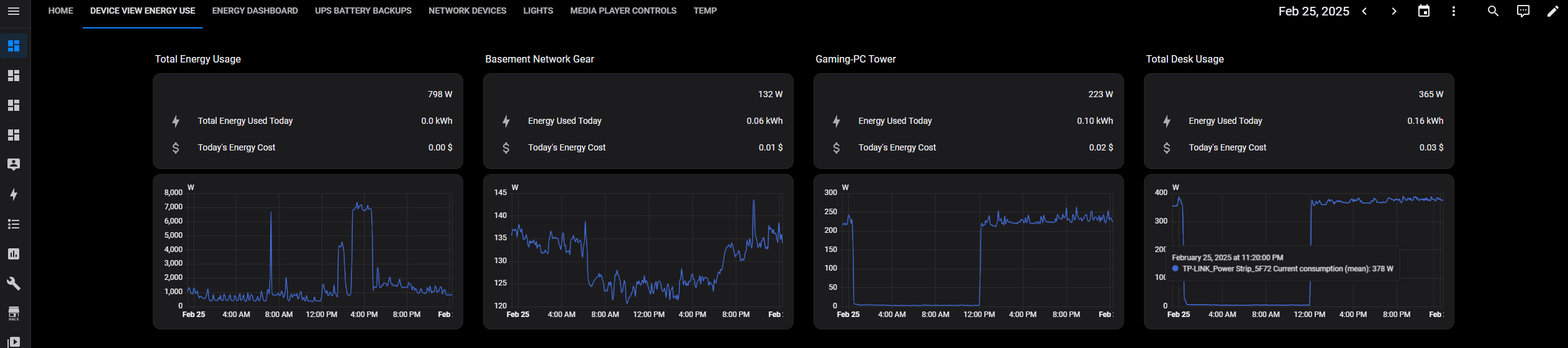
As the first card “seems” so big is because then i only had 2 columns i the that View, so what you need to do is decide how you want to structure your Energy-View. Dashboard, and for best “adaptive” look, i.e viewing from phone, laptop, tv, use masonry-view ( Grid can be a pain in the ass, in specific if you use px , in height/width )
Thanks, great work!
I added the card and have some questions.
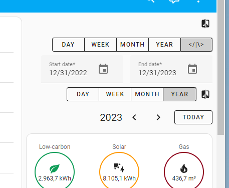
Does the date selector take the locale settings into account? I am using English as language but am using the Dutch locale settings. So the date should be 31/12/2022 instead of 12/31/2022
For some reason the compare button is placed on a separate row. In the editor it is shown on the same row als the day/week/month/year selector. I am using the sidebar layout (same as the original energy dashboard)
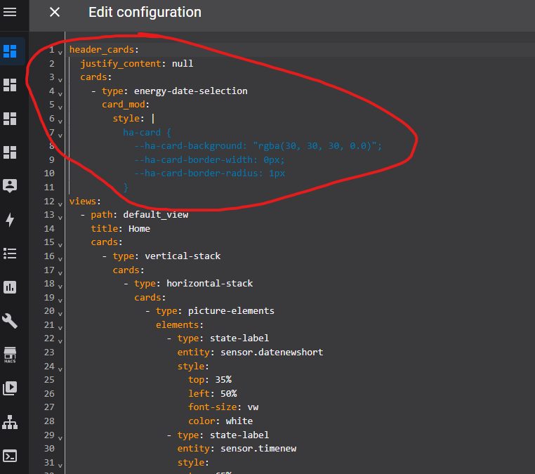
The above code wasn’t working for me and this was driving me crazy for days but it turned out the solution is so simple (duh…)… Just use a vertical-stack card in header_cards, with only the energy-date-selection in it. You can style the vertical-stack card easily like most other cards.
Are you using the header card to filter data on your charts? If so, I would love to see how this works - I’m wanting to do the same thing without needing to use Influx and Grafana