Custom Features for Home Assistant Cards - Buttons, Dropdowns, Selectors, Sliders, Spinboxes, and Toggles

Your options don’t match the numbers because of the extra text you added. Fix those and use labels to change their display instead.

If by hide the state value you mean the number on the tile, that’s configurable within tile card itself using the hide state toggle.

Could you please guide me on the label?

I changed the option and it gets selected but as you said I would like to display a friendly name:

          - entity_id: input_select.pool_modus_select
            option: "2"
            tap_action:
              action: perform-action
              perform_action: input_select.select_option
              data:
                option: "2"
              target:
                entity_id: input_select.pool_modus_select
            value_attribute: friendly_name

Just found it myself :slight_smile:

          - entity_id: input_select.pool_modus_select
            option: "2"
            label: 2 - Heizen
            tap_action:
              action: perform-action
              perform_action: input_select.select_option
              data:
                option: "2"
              target:
                entity_id: input_select.pool_modus_select
            value_attribute: friendly_name

Version 4.4.(1) is here. It’s a refactor of the sliders to be much more performant and use CSS for its translation and animation instead of JS.

3 Likes

Version 4.5.0 adds a new feature - Inputs. Inputs are HTML input elements that have been optimized for use as card features. While all HTML input element types are available to use, only a subset which have been optimized for use are available through the configuration UI. The others are redundant or better handled through other custom features.

This release also has a new slider type - Material Design 3. Like the Material Design 3 toggle switch, the Material Design 3 slider follows the Material Design specification and will use material design colors when used with Material You Theme and its companion module.

1 Like

I know there is a ‘Buttons’, but it would be nice if you could add an ‘Entity’ type option, where it displays just like an default entity card. This way you don’t have to manually setup icons/name/state etc. Thanks

1 Like

Hello,

Thank you very much for your crazy work, I’m using all your features that are awesome.
I tested the new input features, it works great but the only problem is that I don’t get anything with the css, I tried to change the background color or I tried to change the radius, but it doesn’t work like the other features, like I can do?

features:
  - type: custom:service-call
    entries:
      - type: input
        entity_id: input_datetime.volet_laurent_heure_coucher
        tap_action:
          action: perform-action
          target:
            entity_id:
              - input_datetime.volet_laurent_heure_coucher
          perform_action: input_datetime.set_datetime
          data:
            time: "{{ value }}"
        range:
          - 0
          - 100
        styles: |-
            :host  { 
              border-radius: 22px;
            }
        thumb: time
        icon: mdi:timer-edit-outline
type: tile
entity: input_datetime.volet_laurent_heure_coucher
icon_tap_action:
  action: perform-action
  perform_action: light.toggle
  target:
    entity_id: input_datetime.volet_laurent_heure_coucher
  confirmation: true
features_position: inline
vertical: false
grid_options:
  columns: full

My bad, I forgot to apply user styles to this feature. Fixed in 4.5.2.

WOW, thank you very much for the speed of response and problem solving, I went to 4.5.2 and it works. Thank you very much.

Do not use card-mod with these features. The built in style options are just as capable and more performant. Use templates to apply styles on state. See example 5.

{% if is_state(config.entity, "on") %}
:host {
  display: none;
}
{% endif %}
1 Like

Version 4.6.0 doesn’t add a new feature, it adds a custom card. Custom features card is like a vertical stack but for this projects custom features rows. You’ll now be able to create these features without the top section found in default cards that support card features.

6 Likes

This is brilliant! Means I can replace several display: none card-mod hacks on tile cards where I only want to display one your custom features.

1 Like

I didn’t see in your nunchucks documentation – is there a way to check for states.domain? Using card-mod code, this works for other elements – but I’d rather keep as much of the styling within the feature and keep a minimum amount in the card-mod layer. I still fumble over targeting the right css elements with card-mod.

{% if states[config.entity].domain == 'light' %}

domain isn’t in the frontend HassEntity object, but it is in the backend one used by the default templating system. Splitting the entity ID on the . character and taking the first entry of the array works in both the default backend templating system and ha-nunjucks.

{{ config.entity.split('.')[0] }}

FYI in ha-nunjucks states is just the function and doesn’t work for looking up the entity state object due to a name collision. hass.states[config.entity] or _states.domain.id can instead be used to get the frontend hass entity ID state object.

Not sure if your way is better, but what I ended muddling through is:

{% if config.entity is match('light') %}

This has the bonus that I can also do an additional check to see if match(‘light.hue_play’ and do a separate action for those specific lights. – I’ll post my efforts when I stop breaking things, it’s sorta nuts. Hoping for feedback to do things better if there’s anything obvisous.

1 Like

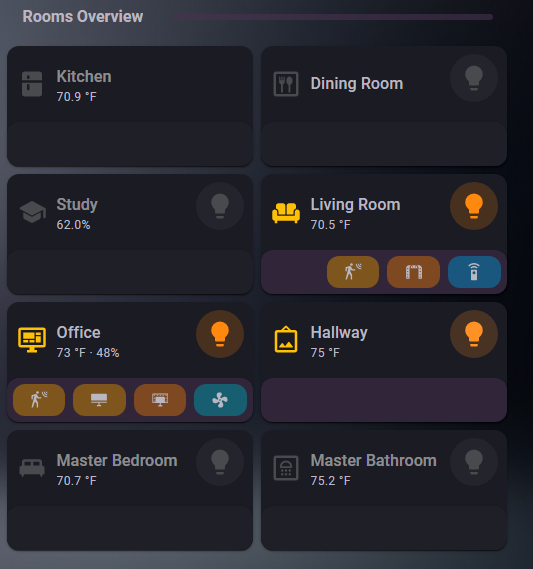
I’m not completely finished with these room cards yet – haven’t set up navigation or popups. There is a ton of logic that I’ve “stolen”, mostly from the card-mod pages – but I’m pretty dense when it comes to css navigation. Theme is Material You (thank you for that!), Background is from Frosted Glass

  • Dimmed rooms are unoccupied
  • Purple bar does follow the theme colorings
  • TBD: alternative color main icon and maybe feature row when the room is set to sleep mode (from adaptive lighting)
  • Lightbulb does work, color/background changes with the rgbvalues of the bulb as is default with a tile button. Long press turns it off and on, single tap brings up more-info – for now.
  • SubButtons are reverse-row, and go in an order that makes sense to me.
  • SubButtons hide when they are off/inactive.
  • I’m a huge fan of bias lighting, so when the light syncs are active those buttons turn mediaplayer blue to indicate they are in sync mode.
  • The motion and presence detectors (really it’s the default color I guess) is var(–warning-color); all other button colors are some sort of state color depending on the entity.

home.yaml – only including 1 room to cut down on length

    - type: grid
      column_span: 1
      cards:
        - type: custom:bubble-card
          card_type: separator
          name: Rooms Overview
          modules:
            # - "!default"
            - "!home-assistant-default"
        - type: custom:streamline-card
          template: roomsum_tile
          grid_options:
            columns: 6
            rows: 2
          variables:
            area: office
            entity1: fan.z_wave_outlet_attic
            entity1_icon: mdi:fan
            entity2: light.hue_play_monitor_backlight_office
            entity2_icon: hue:lightstrip-tv
            entity3: binary_sensor.helper_pc_presence_office
            entity3_icon: hue:room-computer
            entity4: binary_sensor.helper_group_office_motion_sensors
            entity4_icon: mdi:motion-sensor

roomsum_tile.yaml (using streamline-card, successorish to decluttering card)

roomsum_tile:
  default:
    - entity1: input_boolean.dashboard_placeholder
    - entity1_icon: mdi:flask-empty-outline
    - entity2: input_boolean.dashboard_placeholder
    - entity2_icon: mdi:flask-empty-outline
    - entity3: input_boolean.dashboard_placeholder
    - entity3_icon: mdi:flask-empty-outline
    - entity4: input_boolean.dashboard_placeholder
    - entity4_icon: mdi:flask-empty-outline
  card:
    type: custom:mod-card
    card_mod:
      style:
        hui-horizontal-stack-card:
          $: |
            div#root {
              display: grid;
            }
            div#root > * {
              grid-column-start: 1;
              grid-row-start: 1;
              display: block !important;
            }
            div#root > *:nth-child(2) > :first-child {
              --ha-card-border-width: 0px;
              --ha-card-background: rgba(0,0,0,0.0);
              width: calc(36px + 2 * 10px);
              display: block;
              margin-left: auto;
            }
        .: |
          ha-card {
          border: none;
          height: calc((var(--row-size, 1) * (var(--row-height) + var(--row-gap))) - var(--row-gap));
          } 
    card:
      type: horizontal-stack
      cards:
        - type: area
          area: '[[area]]'
          display_type: compact
          alert_classes: []
          sensor_classes:
            - temperature
            - humidity
          features_position: bottom
          features:
            - type: custom:service-call
              entries:
                - type: button
                  entity_id: '[[entity1]]'
                  icon: '[[entity1_icon]]'
                  autofill_entity_id: true
                  hold_action:
                    action: toggle
                    target:
                      entity_id: "{{ config.entity }}"
                    data: {}
                  haptics: true
                  styles: !include roomsum_feature_style.yaml
                - type: button
                  entity_id: '[[entity2]]'
                  icon: '[[entity2_icon]]'
                  autofill_entity_id: true
                  hold_action:
                    action: toggle
                    target:
                      entity_id: "{{ config.entity }}"
                    data: {}
                  haptics: true
                  styles: !include roomsum_feature_style.yaml
                - type: button
                  entity_id: '[[entity3]]'
                  icon: '[[entity3_icon]]'
                  autofill_entity_id: true
                  hold_action:
                    action: toggle
                    target:
                      entity_id: "{{ config.entity }}"
                    data: {}
                  haptics: true
                  styles: !include roomsum_feature_style.yaml
                - type: button
                  entity_id: '[[entity4]]'
                  icon: '[[entity4_icon]]'
                  autofill_entity_id: true
                  hold_action:
                    action: toggle
                    target:
                      entity_id: "{{ config.entity }}"
                    data: {}
                  haptics: true
                  styles: !include roomsum_feature_style.yaml
              styles: |-
                :host {
                  --feature-height: 32px;
                  --mdc-icon-size: 18px;
                  --feature-button-spacing: 8px;
                }
                .row {
                  justify-content: end;
                  flex-flow: row-reverse;
                }
          card_mod:
            style:
              ha-tile-info $: |
                .primary {
                  font-size: var(--ha-font-size-l) !important;
                  white-space: unset;
                  {% if is_state('binary_sensor.helper_occupancy_[[area]]','off') %}
                    color: var(--disabled-text-color) !important;
                  {% endif %} 
                }
                @media (max-width: 800px) {
                  .primary {
                      font-size: var(--ha-font-size-m) !important;
                      max-width: 65px !important;
                  }
                }
              ha-tile-icon $: |
                .container {
                  --mdc-icon-size: 30px !important;
                  height: 48px !important;
                  width: 48px !important;
                  border-radius: 24px !important;
                  margin: -9px;
                  {% if is_state('binary_sensor.helper_occupancy_[[area]]','on') %}
                    --tile-icon-color: var(--state-active-color);
                  {% else %}
                    --tile-icon-color: var(--state-inactive-color);
                  {% endif %}
                }
              .: |
                .container > hui-card-features {
                  min-height: 44px;
                  padding: 6px;
                  border-radius: var(--ha-card-border-radius, 12px);
                  box-shadow: var(--ha-card-box-shadow);
                  {% if is_state('binary_sensor.helper_occupancy_[[area]]','on') %}
                    background: rgba(from var(--secondary-background-color) r g b / .5);
                  {% else %}
                    background: var(--primary-background-color);
                  {% endif %}
                }
        - type: tile
          entity: light.helper_group_[[area]]
          visibility:
          - condition: state
            entity: light.helper_group_[[area]]
            state_not: unknown
          name: " "
          icon: mdi:lightbulb
          icon_tap_action:
            action: more-info
          icon_hold_action:
            action: toggle
          card_mod:
            style:
              ha-tile-info $: |
                .info .secondary {
                  display: none !important;
                }
              ha-tile-icon $: |
                .container {
                  --mdc-icon-size: 30px !important;
                  height: 48px !important;
                  width: 48px !important;
                  border-radius: 24px !important;
                }
              .: |
                mwc-ripple {
                  display: none;
                }
                ha-card .container .content {
                  justify-content: center;
                }
                ha-card {
                  height: calc((var(--row-size, 1) * (var(--row-height) + var(--row-gap))) - var(--row-gap) - 50px)  !important;
                  margin: -3px;
                  box-shadow: none;
                  --ha-ripple-color: none !important;
                }

The random include the style key made getting the backgrounds and settings for all 4 badges so much easier – as much trial and error I was doing, I’m happy I found a way to only do it once.

roomsum_feature_style.yaml

|
  :host {
    flex-basis: 22.5%;
    {% if is_state(config.entity,'off') %}
      display: none;
    {% endif %}
  }
  .background {
    opacity: .5;
  }
  {% if config.entity is match('light.hue_play_') and is_state('binary_sensor.helper_hue_sync_[[area]]', 'on') %}
    .background {
        background: var(--state-media_player-active-color);
      }
  {% elif config.entity is match('light') %}
    .background {
      background: rgb({{ state_attr(config.entity,'rgb_color') -}});
    }
  {% elif config.entity is match('remote') %}
    .background {
      background: var(--state-media_player-active-color);
    }
  {% elif config.entity is match('fan') %}
    .background {
      background: var(--state-fan-active-color);
    }
    .icon {
      animation: spin 1s linear infinite;
    }
  {% else %}
    .background {
      background: var(--warning-color);
    }
  {% endif %}
  @keyframes spin {
    100% {
      transform: rotate(360deg)
    }
  }

Initially I had something different for the light.hue_play/sync detection.

{% if config.entity is match('light.hue_play_') and is_state((area_entities(area_id(config.entity)) | select('match','switch.hue_sync') | first), 'on') %}

Which did work, but the frontend was not aware that those entities were set to 'living_room" when the device was set to ‘infrastructure’ – so it refused to find the sensor. 1 room worked because that room has it’s own bridge, but not the other. Even creating a helper for that room with the correct area label didn’t work. The current code simplifies by just calling the helper sensors directly; I’m sure skipping the area_entities(area_id(config.entity)) is less compute anyways.

1 Like

Has anyone tried using the custom features row in the redesigned area card? I have tried, but it doesn’t seem to actually show up.

Make sure that you’re on the latest version of this project. Area card support was fixed in 4.5.1. Double check your browser dev tools log to make sure that the latest version (4.6.0 at time of writing) is loading, some users have an issue where the old name for this repo wasn’t properly uninstalled by HACS and overwrites the new installation.

1 Like

Nice card. How to control how much horizontal space is used by the “Features” when using the inline option?

I am not satisfied by my result.

Desktop:

Mobile:

The problem is that the “Feature” buttons seem to use only the right 50% part of the full row. Is there a style option to control it, to better use the horizonal space (e.g. avoid blank unused space)?

That’s a Home Assistant design decision outside of the scope of this project. The best way to modify the inline horizontal features width is using card mod:

card_mod:
  style: |
    .horizontal hui-card-features {
      width: 70% !important;
    }

You can also do it with this project’s built in styles at the row level, which would be more efficient but not as correct.

:host {
  display: block;
  width: 150%;
  position: relative;
  right: 50%;
}
1 Like