Custom Features for Home Assistant Cards - Buttons, Sliders, Selectors, and Spinboxes

Whoops, the example is missing the service call data and the service itself. It should be:

tap_action:
  action: call-service
  service: climate.set_temperature
  target:
    entity_id: climate.downstairs_thermostat
  data:
    temperature: '{{ value }}'

Of course! I should have noticed as much, lol. Cheers for a quick reply

Installed the latest version via HACS and still can’t get it to work.
The custom feature row doesn’t show up on any tile card just the ones that are already provided by the entity itself such as color temperature, brightness, fan speed, temperature etc.

Example tile card thermostat:

just stumbled on this HACS integration as I just asked for all of this to be built into the tile card! This is awesome.

Im not having much luck at closing the gap between my icon and text. Below is the CSS code I have. how do move the text and the icon closer together so they are both in the middle but separated. Like a Mushroom Chip card

:host {
  --icon-color: var(--green-color);
  flex-flow: row;
}

image

I recommend using the .icon and .label selectors when modifying those elements, and adding a 10px padding to the icon (or at least it’s left). But what you need is to add justify-content: left to the label.

:host {
  flex-flow: row;
}
.icon {
  padding: 10px;
  color: var(--green-color);
}
.label {
  justify-content: left;
}

Edit: misread your question, try this to center the icon and label horizontally:

:host {
  flex-flow: row;
  justify-content: center;
  border-radius: var(--feature-height);
}
.icon {
  padding: 10px;
  color: var(--green-color);
}
.label {
  width: unset;
}
1 Like

Thank you so much!

ONe last question, im trying to change the state of my sensor so it uses a more friendly time stamp, but nothing is working?

I have tried

{% set dt = as_datetime(timestamp) %}
{{ dt.strftime('%Y-%m-%d %H:%M:%S') }}
{% set dt = as_datetime(timestamp) %}
{{ dt.strftime('%d %B %Y at %-I:%M %p') | lower }}
{{ as_datetime(states('sensor.sally_home_weather_station_last_lightning_strike')).strftime('%d %B %Y at %-I:%M %p') }}
{{ as_timestamp(states('sensor.sally_home_weather_station_last_lightning_strike')) | timestamp_custom('%d %B %Y at %-I:%M %p') }}
 {% set timestamp = states('sensor.sally_home_weather_station_last_lightning_strike') %}
  {% if timestamp %}
    {{ as_datetime(timestamp).strftime('%d %B %Y at %-I:%M') }}
  {% else %}
    No data available
  {% endif %}

Per the README this card uses an alternate templating system that’s faster and processed entirely in the frontend, but doesn’t support all of the functions and filters that native Home Assistant templates do (like datetimes and timestamps). You can create a feature request to support these in the ha-nunjucks repo, but it’ll be a while before I get around to implementing them.

2 Likes

No dramas thank for getting back to me

Thank you so much for this custom feature, I just discovered it today and it looks extremely promising for my lovelace “old” dashboard complete overhaul with tiles.

I was wondering how to make a button “disabled” with CSS (I mean grayed out and not completely hidden like ‘display: none;’). The goal is to replicate the button behavior from the original cover tile open/close feature where for example the up arrow would be shown disabled if the cover is already up.

Thank you very much !

I have just started using these cards and I am like the ability to hide the custom row using this method but I find that it doesn’t seem to completely disappear and leaves some extra padding.

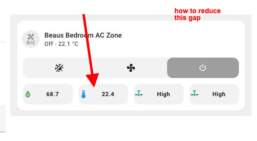
Is there a way to fix this spacing between manual and vacuum buttons?
image

I am currently just using:

{% if is_state("select.l10s_pro_ultra_heat_cleangenius", "unavailable")  %}
    :host {
    display: none;
    }
{% endif %}

A recent change in 2024.8 to how card features was laid out added a gap between features (defined in CSS by --feature-padding). Unfortunately this ends up creating two gaps when a custom feature is hidden. There isn’t a good way to fix it other than grouping all of the custom features on the same row and hiding them selectively there. This example has been updated to do so, but it’s not nearly as convenient.

I just noticed that the “style” options do no work when a card is seen wihtin the “Fully Kiosk Browser” app (it works with chrome on the same device). Note that cardmod styling works though. Any idea what could cause that ? Thanks !

Edit: the same behavior happens with the offical HA app, so I guess that the problem comes from the webview version on my device

Share your config. Do you have nested CSS styles? I know those don’t work with older Android webviews.

Here is an example :

features:
  - type: custom:service-call
    entries:
      - type: button
        entity_id: switch.cuisine_screen_automatic_control
        tap_action:
          action: toggle
          target:
            entity_id: switch.cuisine_screen_automatic_control
        label: Auto
        haptics: true
        styles: |-
          :host {
            {% if is_state("switch.cuisine_screen_automatic_control", "on") %}
            --color: green
            {% endif %}
            ;
          }
          .label {
            justify-content: center;
          }
      - type: button
        entity_id: switch.cuisine_screen_block
        tap_action:
          action: toggle
          target:
            entity_id: switch.cuisine_screen_block
        label: Block
        haptics: true
        styles: |-
          :host {
            {% if is_state("switch.cuisine_screen_block", "on") %}
            --color: rgb(255,0,0);
            {% endif %}
            ;
          }
      - type: button
        entity_id: cover.cuisine_screen
        icon: mdi:arrow-up
        tap_action:
          action: perform-action
          perform_action: cover.open_cover
          target:
            entity_id:
              - cover.cuisine_screen
          data: {}
        hold_action:
          action: perform-action
          perform_action: cover.stop_cover
          target:
            entity_id:
              - cover.cuisine_screen
          data: {}
        haptics: true
        styles: |-
          :host {
            {% if (is_state_attr("cover.cuisine_screen", "current_position", "100") or is_state("cover.cuisine_screen", "opening")) %}
            display: none;
            {% endif %}
          }
      - type: button
        entity_id: cover.cuisine_screen
        icon: mdi:stop
        tap_action:
          action: perform-action
          perform_action: cover.stop_cover
          target:
            entity_id:
              - cover.cuisine_screen
          data: {}
        hold_action:
          action: perform-action
          perform_action: cover.stop_cover
          target:
            entity_id:
              - cover.cuisine_screen
          data: {}
        haptics: true
        styles: |-
          :host {
            {% if (not is_state("cover.cuisine_screen", "opening") and not is_state("cover.cuisine_screen", "closing")) %}
            display: none;
            {% endif %}
          }
      - type: button
        entity_id: cover.cuisine_screen
        icon: mdi:arrow-down
        tap_action:
          action: perform-action
          perform_action: cover.close_cover
          target:
            entity_id:
              - cover.cuisine_screen
          data: {}
        hold_action:
          action: perform-action
          perform_action: cover.stop_cover
          target:
            entity_id:
              - cover.cuisine_screen
          data: {}
        haptics: true
        styles: |-
          :host {
            {% if (is_state_attr("cover.cuisine_screen", "current_position", "0") or is_state("cover.cuisine_screen", "closing")) %}
            display: none;
            {% endif %}
          }
type: tile
entity: cover.cuisine_screen
show_entity_picture: false
vertical: false
layout_options:
  grid_columns: 4
  grid_rows: 2
name: Screen Cuisine
icon: ''
hide_state: false
state_content: state
card_mod:
  style:
    .: |
      ha-card {
        --tile-color:
            {% set status = states(config.entity) %}
            {% if (is_state('binary_sensor.meteo_vent_limite_1','on')) %}
              {% set status = 'wind' %}
            {% endif %}
            {% set colors = {
              'open': 'grey',
              'closed': '#ffc105',
              'opening': '#663399',
              'closing': '#d3bd79',
              'unknown': 'white',
              'wind': 'red'
              } %}
            {{ colors.get(status, 'blue') }} !important; 
        }

How it should appear (works fine in Chrome, Edge, etc.) :

Capture d'écran 2024-09-03 083325

And how it appears on a device with an older webview, using Fully Kiosk Browser or the official HA app (Huawei MatePad Pro 12.4) :

So neither the “display: none;” nor the “–color: green;” styles work in this example.

Note that on my Pixel 8, with up to date webview, the card is showing correctly within the HA app.

Have you tried sideloading a newer version of Android System WebView? I was able to do something similar on Fire Tablets with Amazon System WebView a while ago and it fixed some performance and render issues for me.

who has got a good plex media card card for users you are sharing with?

You may want to check out Universal Remote Card, which is optimized for media use.

yeah i have that but im looking for plex card to show plex relate sensors, thanks though

Anyone with a quick tip on how to animate feature button icons? I struggle navigating into the shadow root and was not successful using .icon{} with any know commands.

You shouldn’t have to deal with any shadow roots for styles in these custom features? This works for me:

.icon {
  animation: spin 1s linear infinite;
}
@keyframes spin {
  100% {
    transform: rotate(360deg)
  }
}