I added an option to do this in V1.0.10. I have to query the database, so it can take a few seconds. It’s done asynchronously, so you can keep using the card normally until the list drop down becomes available when the data comes in. The option can be enabled in the YAML with the recordedEntitiesOnly key. See readme under Interactive configuration.
Feedback on how well this option works would be appreciated !
In V1.0.10 I added an option to (globally) disable the min or max (or both) extra margins. See readme under line interpolation modes. An option to do this by device class (for dynamic entities) or entity_id (for YAML) is on my todo list.
nice, and working fine, recorded entities are preselected correctly which makes selecting entities in this panel useful. thanks for adding that option!
question: below is a power sensor which creates a nice curve from between the off and next on state. This is incorrect, as it should be a flatline until the next on state. Did I miss some setting in the config? or would this be a ‘bug’
config:
- title: History
  icon: mdi:history
  path: history
  type: panel
  cards:
    - type: custom:history-explorer-card
      showUnavailable: false
      recordedEntitiesOnly: true
You need to use stepped line mode for these kind of graphs. It’s actually a bug - in the HA recorder component. The problem is due to the fundamental way the HA database engine works. It only stores state changes, even on time series data. That’s a problem.
So in your example at around 12:30 pm the power usage drops to 0, so the DB stores zero. So far so good. Then nothing happens until around 7pm and the database will not store anything at all during that time. And suddenly at 7pm the power use goes up and the database will store something like 1000W. So you end up with two datapoint: 0W at 12:30 and 1000W at 7pm, nothing inbetween. So the graph will interpolate a nice curve
I plan on being able to set the line mode per device class at some point, so you could set all your power consumption sensors to stepped, while keeping others on some other mode.
what still is a bit buggy is when adding a first entity to graph. In my Chrome browser this simply wont go most of the time, eg selecting a recorded person. The mouse handle doesnt change shape when above the +, so it feels kind of awkward too.
after selecting a sensor, which then goes alright and really swiftly , I can select the person and next entities. Seems the card somehow just wont startup correctly.
maybe I should simply add a fixed entity in the config, ill try that and see what happens in the response of the card
So let me try to get that right. You are selecting a sensor from the list once it loaded. Then you’re clicking the plus sign (it’s normal that the mouse pointer doesn’t change at this time) and then nothing happens ? If you click it again after a few seconds, will it work then ? If not, how do you get the first entity to appear ?
Also you should reload the page if you changed the YAML settings manually. You probably already do, but just wanted to mention this.
yes thats my procedure, (and yes its correctly refreshed).
How did I get it to show? not sure really, after a few tries, it just did, and as said, it was using a sensor entity, my person entities wouldn’t show.
After the first entity, all is fine and I can add any entity I select from the list
another question: without any further settings on graph colors, is the graph supposed to pick a random color? Asking because every time I navigate from and to the Panel, the graphs of my power sensor shows in a different color
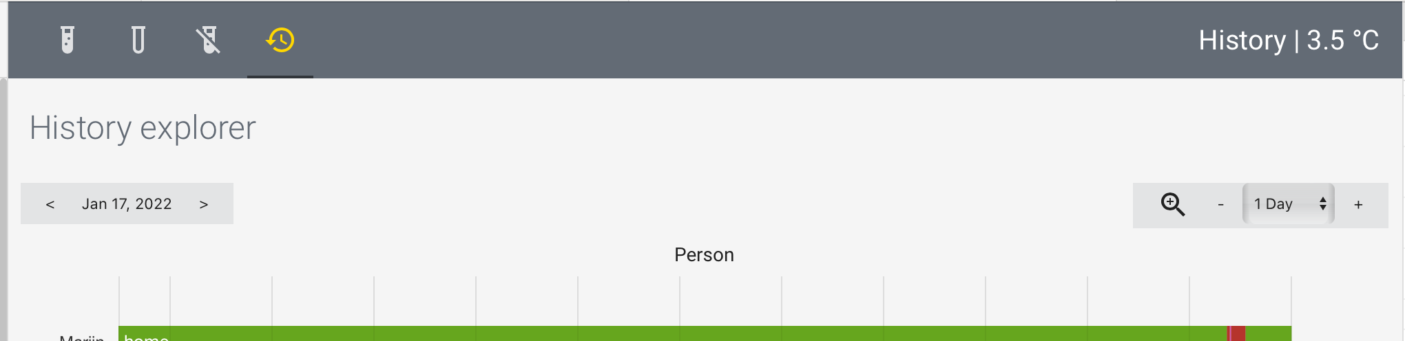
- title: History
  icon: mdi:history
  path: history
  type: panel
  cards:
    - type: custom:history-explorer-card
      showUnavailable: false
      recordedEntitiesOnly: true
      lineMode: stepped
      graphs:
        - type: timeline
          title: Person
          entities:
            - entity: person.me
              name: Me
Ok, found it. Was a database call that wasn’t properly async’ed when adding the first entity onto an empty graph. That made the add button unresponsive for the time it took to finish the query, which could take some time to complete. The fix will be in the next release.
Haha, yeah, pretty much It just uses whatever color is next on the stack. On most browsers that gives pretty stable colors even when switching around, unless you have multiple explorer cards open. Some browsers like to switch it around more. Not sure why. Needs more research.
experimenting with the card made me scroll al lot now, and hence figure it might be nice if the dropdown box were to be place atop of the card, instead of below all graphs?
I like the looks of it. It would work well on a wide screen, but not doable for small ones (phones), there’s just barely enough space for the two existing toolbars on a vertically held phone screen. Alternatively adding the entity selector below the timeline buttons but above the first chart is going to be problematic for horizontal phone screens, as the vertical screen estate is extremely limited there. Ideally it would need some type of responsive UI that changes with screen size and ratio. But as a backend developer, designing responsive web UIs isn’t really my strong point
Other quick to implement alternative: YAML option on where to put the entity bar (bottom, top inbetween toolbars, top below toolbars, or hide entirely). For very long histories where you would scroll a lot vertically, we could even have duplicates of the toolbar on the top and the bottom for easier access. I ran into that issue myself a few times now, where I had to scroll all the way up to get to the zoom button and then all the way down again. Annoying.
I really like your card and how you can navigate through the datas. Could it be possible to remove the entity field to add a new graph ? And as well, I would like to give an other title and change the “History explorer” to something else. Thanks for your help !
About removing the entry field, there had been some discussion above about making UI element placement more configurable and that would include hiding certain elements. So not yet, but possibly in a future update.
About the header, yeah you can change it using the header key in the YAML. It’s not super well explained in the docs, but there’s an example in the README all the way down, under the advanced YAML.
New version V1.0.11 is up and includes an option to customize the UI layout (including removing parts or all of it). Check the README under Configuring the UI !
nice! the selector is very nicely located , thanks for that.
the + sign still is not showing when active? (thought the release note said it would be fixed, unless that refers to something else being unresponsive)
oddity:
I have a fixed graph for a person me. When I add a few others (sensors, different domain) and then again a person, that is added at the bottom, and not added to the first listed fixed person graph. What’s more, I can even add several graphs for the same entity. Is that supposed to be possible in the first place?
Hello.
As a brand new user of this card, I spotted minor issue which impacts mostly new users. After adding new card, the card (I did it to dashboard) drop box of the card suggest to “Type to search…”. But the drop box is empty so nothing can be added.
To make it working you have to refresh the page to load list of entitites.
Not big deal but confusing for a moment.
Also, time range is not saved. Everytime I switch to other dashboard and back, it resets to 1 day
Hi , could you add a “default” configuration-exaple of this card, to the documentation, as im kind of new here, as i followed the installation-guide ( added via HACS ), i added the card, but typing anything in the “box” to find entities give me no results, so what am i missing here ?, do i have to add something in configuration.yalm, or in the “dashboard lovelave config, where this particular card is added” ?
BR Jorgen