Thanks. That was very easy
Here is my project… Vertrektijden (departures) of a specific trainstation.

Card
type: custom:flex-table-card
title: Utrecht
entities:
  include:
    - sensor.utrecht_vertrektijden
max_rows: 5
columns:
  - name: Vertrek
    data: departures
    modify: >-
      var dep_time = new Date(x.departureTime);  dep_time =
      String(dep_time.getHours()).padStart(2,'0')+":"
      +String(dep_time.getMinutes()).padStart(2,'0'); dep_time; if (x.delay ==
      '0')
        dep_time
      else  {
        dep_time + '<div style="font-size: 14px;color: red">' + " +" + x.delay +'</div>';
      }
  - name: Naar/Opmerking
    data: departures
    modify: |-
      if (x.via == null)
         x.destination
      else {
        x.destination + '\n' + '<div style="font-size: 14px">' + x.via + '</div>'
      }
  - name: Spoor
    data: departures
    modify: >-
      '<img src="/local/images/NS/platform.png" style="position: absolute";>' +
      '<div style="position: relative;top:50%;left:50%;transform:
      translate(-50%, 50%);text-align: center;";>' + x.platform + '</div>'
  - name: ' '
    data: departures
    modify: |-
      if (x.company="NS")
        '<img src="/local/images/NS/NS_logo.png" style="height: 10px;">' + '<br>' + x.transportType
      else {
        x.company + x.transportType
      }
css:
  table+: 'border-spacing: 0px;'
  tbody tr:nth-child(odd): >-
    background-color: #FFFFFF; color: #1C316C ; font-weight:bold;
    vertical-align: top;
  tbody tr:nth-child(even): >-
    background-color: #D7E0EC; color: #1C316C ; font-weight:bold;
    vertical-align: top;
  thead th: 'background-color: #D7E0EC;  color: #1C316C;  text-align:left !important;'
  td:nth-child(1)+: 'color: #1C316C; font-size: 18px'
  td:nth-child(2)+: 'color: #1C316C; font-size: 18px'
  td:nth-child(3)+: 'color: #1C316C; font-size: 18px;'
configuration.yaml
rest:
  - authentication: basic
    scan_interval: 60
    resource: 'https://www.rijdendetreinen.nl/ajax/departures?station=Ut'
    sensor:
      - name: "Utrecht vertrektijden"
        value_template: "OK"
        json_attributes:
          - "departures"
2 Likes
So, I am working on some system monitoring views with my glances data. Rather than use a bar chart or apexcharts for one of my NAS’ hard drives, I thought I would use a declutter template and flex-table. I have the data perfectly, but thought I could build on other’s work here to show the percentage in a cell.
Here is what I have so far:
decluttering_templates:
  raid:
    card:
      type: custom:auto-entities
      filter:
        include: '[[entity]]'
      card:
        type: custom:flex-table-card
        title: '[[title]]'
        css:
          table+: 'padding: 0px; width: 99%!important;'
          tbody tr:hover: 'background-color: green!important; color:white!important;'
          tbody tr:nth-child(odd)+: 'background-color: medium-grey;'
          tbody td:nth-child(2)+: >-
            background-color: green;
            width: 80px!important;
            line-height: 24px!important;
        card_mod:
          style:
            .: |
              ha-card {
                overflow: auto;
                padding-bottom: 4px!important;
                font-size: 18px !important;
                line-height: 24px!important;
              }
            $: |
              .card-header {
                 background-color: green;
                 padding-top: 6px!important;
                 font-size: 20px!important;
                 line-height: 20px!important;
                 font-weight: bold!important;
               }
        entities:
          include: '[[entity]]'
          exclude: '[[excluded_entities]]'
        columns:
          - name: <div title="Name">Name </div>
            data: '[[attribute]]'
            modify: x.name
          - name: image
            data: entity_picture
            modify: '''<img src="" style="background-color: red!important; line-height: 24px!important;width: ''+ 40 + ''px;">'''
          - name: <div title="GB">Available </div>
            data: '[[attribute]]'
            modify: x.Available
          - name: <div title="GB">Used </div>
            data: '[[attribute]]'
            modify: x.Used
          - name: <div title="GB">Total </div>
            data: '[[attribute]]'
            modify: x.Total
          - name: <div title="GB">Pct </div>
            data: '[[attribute]]'
            modify: x.Pct
and my card:
          - type: custom:decluttering-card
            template: raid
            variables:
              - title: TVS RAID
              - entity: sensor.tvs_raids
              - attribute: entries
which gives me:

Any ideas on how to turn that image into more of a barchart?
Is it possible to use somehow templates in the column name? I would like to add dates to the column for the last 7 days in descending order.
Use a data template with a small table (depending on how granular you want it). Like for instance if 10% increments are OK, then a table with 10 columns and color the appropriate number of cells based in the value %.
Possible with using card-mod:
type: vertical-stack
cards:
  - type: entities
    entities:
      - input_boolean.test_boolean
  - type: custom:auto-entities
    filter:
      include:
        - domain: light
    card:
      type: custom:flex-table-card
      columns:
        - name: name
          data: name
        - name: ''
          data: brightness
      card_mod:
        style: |
          thead th:nth-child(2)::after {
            {% if is_state('input_boolean.test_boolean','on') -%}
            content: "flag is 1";
            {%- else -%}
            content: "flag is 0";
            {%- endif %}
          }

1 Like
any solution?
Nope, haven’t found anything myself and there were no answer on this topic either. Don’t think it’s possible.
I think you need auto-entities to template the selection before passing it to the flex-table-card.
Are there any CARD alternatives for showing a table ?
I had been searching and this was my first hit in the forum therefore the question about alternatives before I start digging into this one cause tables will make a lot of work I guess.
thanks
A standard markdown can be used in some cases.
In fact, using jinja in markdown allows to create complex loops/logics - and some cases may be not implemented by flex-table-card + auto-entities.
But markdown do not have features like “sort by a header”.
1 Like
Okay, thanks for your fast reply cause you can judge about that.
I have no clue what jinja is as I had no clue what flex table card was till I started reading your topic this morning and saw a lot of nice example and a vivid community.
I just wanna make sure that I would not choose the wrong card if there would be something else easier to achieve.
Here is my current “basic solution” for a solar power roof which is powering 7 or 8 inverters finally and comes along with about 12 strings. And those are not equal cause different parts of the roof got smaller or bigger panels, so each of these strings can have a different Wp even though all facing south.
What I wanted to check and analyze is the perfomance or power / 1 kWp installed.
Just to make these strings comparable.
Maybe 4 items below each other x 11 strings are 44 elements
but that is not possible with basic HA as you can see here with just 8 strings

Yes, horrible, but if you start from scratch and simply need the figures and get behind how to format these then it is a good point to start with.
Do you have any idea which kind of table you would recommand cause there have been presented a lot in the whole topic ?
My focus is good readability, so bigger fonts than the tiny stuff cause my dad has only 1 eye left is just 85 years but loves to get into new modern stuff and therefore it must fit his needs and please his eyes
The items per string will be
Watt per kWp
Watt of the string
kWh per kWp
kWh of the string
Wp installed of the string
It is just a visualisation of sensors and the math is done in the yaml file.
Pi 4 reboot time has increased since I started the inverter sensor implementation cause 8 inverter x 34 sensors means a support of 270 sensors feeded by mqtt and now the reboot time has increased a lot cause I have now gaps, missing data cause by a full reboot.
I have installed it and started reading but it looks like that most examples are based on node red and also are extracting data out of a sensor which then are sorted or displayed.
Maybe I have not found the right example to start with.
I just need a kind of table with heade on the top and first column a line description and then I would place a sensor into each cell.
Any ideas about that ?
Hi, I am struggling to construct modify / js but ‘x’ behaves not as expected (for me)
Can anyone maybe explain how to return data from a modify?
I have the following
{
  aircraft: {
    'F-GRXB': {
      'callsign': 'AFR15MQ ',
      'registration': 'F-GRXB',
      'icao24': '3946e1',
      'type': 'A319'
    },
    'OE-FZA': {
      'callsign': 'EJU300Q ',
      'registration': 'OE-FZA',
      'icao24': '44058f',
      'type': 'C510'
    }
  }
}
I tried this but it only kicks back the last element

I tried building an array but then it only kicks back the array.

I would suggest you align your 8 “inverters” Vertically, and “divide” the Multiple Strings in 2 or more Separate Tables ( Depending upon what the “Values” presents (i.e in Categories)
|Unit “inverter, what ever” | Leistung 1 | Leistung 2 | Energ… | etc.
.......................................................................................................
U1.1:01                264 W     739 W   0.7 kWh   Etc.
U1.2:W1.3              251 W     672 W   0.6 kWh
U2.1:W1.2              264 W
etc ...
Yes with 11 “strings” you have to use Several Tables, use your imagination to “combine” relevant Numbers/results/Values, in Separate Tables ( Or use custom:multiple-entity-row, if it suits you )
( Not that i know why you want to “repeat” … #1LEISTUNG , in All Columns
PS: The 14 Digits Number seems quite irrelevant to “Show” for a 85 year old, with bad vision ! , consider i.e “Multiply” & “Rounding” this to something “meaningful” , If it’s meaningful at all !
1 Like
Thanks for the idea and suggestions.
What I have shared were simply all sensors added by the integration and for my own comparison and first impressions.
The old men is interesting in tech, so he is aware that strings are beneficial especially in such circumstances where you have 2 chimneys for the oil central heating and a second one from the wood oven, then also a central dormer of 7m width causing shadowing issues as the trees beyond the border of the property.
So he wants to know the current power and the energy produced so far which now has been moved for him into a floorpanel of the roof .
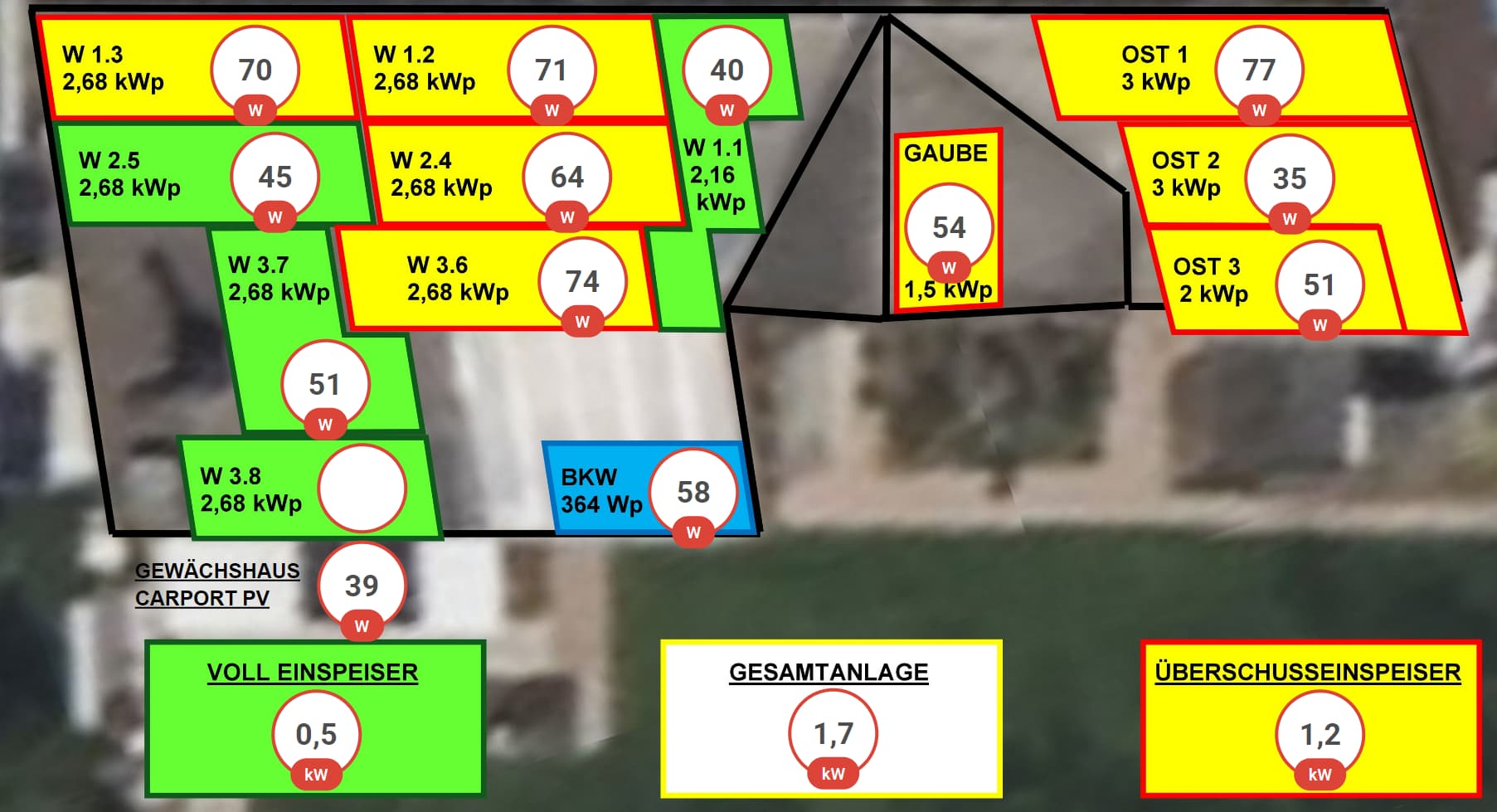
As you can see the dormer is dividing the souther roof in 2 halfs which have 2 different angles cause in the west or left part the white part is a a wintergarden with a glas roof and left of that green panel you can see the wood oven chimney and its shadow nearly reaching the second line of panels.
But I will use your suggestion for the table needed for the analysis during the day.
Thanks a lot !
UPDATE: the figures on the panels are showing current power in W / kWp and not per string cause the strings have different sizes and some use different panels.
Therefore this is power per kWp for a string.
The 3 totals below on the bottom are for 2 different accounting systems with green and yellow while the total / sum is in the middle:
right now 1,7 kW power in the late noon
the floor plan has a title which I had cut away to keep it more compact where it is refering to power / kWp
Did you get anywhere with not scrolling the column titles, just the body? Thanks.
Hello everyone,
an unusual question regarding @Ildar_Gabdullin’s card:
How can I represent the attribute values of the following sensor in a table with two columns (name and value)?
Thanks

Not my card, I just created the thread.
Ok, so congratulations for creating the thread.
Do you have any suggestions regarding my question?
Thanks