Fun with custom:button-card

Sure

type: vertical-stack
cards:
  - type: vertical-stack
    cards:
      - type: grid
        columns: 4
        square: true
        title: Living
        cards:
          - type: 'custom:button-card'
            layout: icon_label
            color: auto
            show_state: false
            show_name: true
            show_label: true
            label_template: >
              var bri = Math.round(entity.attributes.brightness / 2.55); return
              (bri ? bri : '0') + '%';
            styles:
              grid:
                - grid-template-rows: 52px auto 1
                - grid-template-columns: 100px auto
              card:
                - border-radius: 15px
                - height: 85px
                - width: 55px
                - margin: 5% 5% 5% 5%
                - padding: 0px 0px
              icon:
                - height: 60px
                - width: 60px
                - margin: 5% 47% 5% 5%
              name:
                - justify-self: start
                - padding: 2px 10%
                - font-size: 13px
              label:
                - align-self: end
                - padding: 7px
                - font-size: 10px
                - font-weight: bold
                - font-family: Helvetica
              state:
                - font-size: 11px
                - font-family: Helvetica
                - text-transform: capitalize
                - font-weight: bold
                - align-self: end
                - justify-self: start
                - padding: 9px 10px
              lock:
                - align-items: flex-end
            state:
              - value: 'on'
                styles:
                  card:
                    - '--paper-card-background-color': 'rgba(40, 40, 40)'
                    - box-shadow: 0px 0px 10px 3px var(--button-card-light-color)
                  name:
                    - color: white
                  state:
                    - color: white
                  label:
                    - color: white
              - value: 'off'
                styles:
                  label:
                    - color: 'rgba(0, 0, 0, 0.0)'
            tap_action:
              action: toggle
            hold_action:
              action: more-info
            entity: switch.shelly1_68c63afb56f0

box-shadow is the key to it.

2 Likes

Hello Everyone!

any idea why this glow animation is not working? Any help really appreciated…

entity: sensor.netatmo_rain
icon: 'mdi:minus-thick'
name: Rain
extra_styles: | 
  @keyframes glow {
    50% {box-shadow: 0 0 20px cyan;}
     }
state:
  - color: cyan
    operator: '>'
    value: 0
    icon: 'mdi:water'
    styles:
      card:
        - animation: glow 2s infinite

type: custom:button-card

if I am using blink, pulse, rotating… even without defining them with extra_styles it works perfectly.

Hello to all

Anyone have success using the button-card with a video camera stream loaded?

I try like this way:

stream: component activated in the configuration.yaml

type: custom:button-card
camera_image: camera.reolink
show_live_stream: true

But I still need to click over the button in order to get video streaming …

I still have the card grey out …

image

By the way the camera that I’m traying is a dual lens, and I want if possible when I click over the one of the “buttons” Open the 2 buttons streaming at the same time to view the stream like a panoramic view, is this possible ?

image

Thank you for your support and best regards

Hi there,
is it possible to set the icon color from climate entity with “preset_mode” ?
My climate has two preset_modes: ‘comfort’ and ‘eco’ both are with state ‘heat’ so there is no difference in the color whether comfort or eco.

Thanks for help !

Sure. You could use something like the following as part of your card definition.

    styles:
      icon:
        - color: |
            [[[
              if is_state_attr('climate.thermostat', 'preset_mode', 'comfort') return 'lightGrey';
              if is_state_attr('climate.thermostat', 'preset_mode', 'eco') return 'lightPink';
              return 'lightGreen';
            ]]]

Thanks ! I tried it out but it doesn’t work.


type: custom:button-card
entity: climate.heizung_buero
icon: mdi:radiator-disabled
show_name: false
styles:
  card:
    - height: 89.5px
    - width: null
  icon:
    - color: |
        [[[ 
          if is_state_attr('climate.heizung_buero', 'preset_mode', 'comfort') return 'orange';
          if is_state_attr('climate.heizung_buero', 'preset_mode', 'eco') return 'green';
          return 'white';
        ]]]

and got the following Error:

ButtonCardJSTemplateError: SyntaxError: missing ( before condition in ‘if is_state_attr(‘climate.heizung_buero’, ‘preset_mode’, ‘comfort’) return ‘orange’; if is_stat…’

Looks like you may have to add parentheses about the is_state function:

        [[[ 
          if (is_state_attr('climate.heizung_buero', 'preset_mode', 'comfort')) return 'orange';
          if (is_state_attr('climate.heizung_buero', 'preset_mode', 'eco')) return 'green';
          return 'white';
        ]]]

Hi, I think the problem is that your code is in Jinja2 and JavaScript is needed :see_no_evil:

I did it another way… I created a sensor which uses the attribute preset_mode of the cliamte entity. Than you can work with “value” :+1:

i guess that depends on where you put it. I’ve got code exactly like that in my ui-lovelace.yaml file. I am using it within the context of custom:button-card templates though.

Hey. I may have a stupid question but I can’t figure that out.

How to get this code to work?

type: custom:button-card
name: Open
show_icon: false
styles:
  card:
    - background-color: |
        {% if is_state_attr('cover.master_bedroom_shutter_1', 'current_position', 100) %}
          green;
        {% else %}
          white
        {% endif %}

While this works:

type: custom:button-card
name: Open
show_icon: false
styles:
  card:
    - background-color: green

Anyone know if it’s possible to create configuration templates with entity id’s as variables?

What I want is to have almost the full config in the template and insert the entity id in the card config.

Example in the template:

custom_fields:
  temp: |
    [[[
       return `<ha-icon
         icon="mdi:thermometer"
         style="width: 25px; height: 25px;">
         </ha-icon><span<span style="color: var(--text-color-sensor);">${states['**ENTITY_ID_GOES_HERE**'].state}</span>°C</span>`
     ]]]

Example in the card:

custom_fields:
  temp: |
 {{some.entity.id}}}

I am working based off your design, and making a lot of progress. I am loving it. Question is, what is the best way to change the layout for a phone vs desktop? Should I go down the path of having a layout-card inside the container template instead of the grid and columns as you have originally defined? So I can have 4 columns on a desktop, and 2 on a phone for example for each of the containers?
Thoughts? I am going to try it out, but wondering in parallel if that’s the best approach.

@Haze, I haven’t tried using the layout-card yet. I’m interested to see how your attempt works out.

will do.
Just for reference, I started with the original design, and here is how it looks like. Heck of a learning curve. Still lots to learn.
SwipeScreen
Starting to look good.
All my code is modular.
Let me know if anything specific is of interest and I will share. Learn and share.

1 Like

What I did was to go with two columns of four buttons each which shows up nicely on a phone. If you don’t wrap that in a single column, then it would be responsive to more width (as on a tablet) and you would have three or even four columns across a single line.
The other option, which is a lot more work, would be to specify which layouts are used for each device and create a separate phone and laptop layout. I’m not really fond of that approach. It involves too much redundancy and thus having to make changes in two (or more) places.

I couldn’t figure out how to do this with just the custom:button-card, but I was able to do it by using the decluttering-card: GitHub - custom-cards/decluttering-card
Here’s one of my definitions using the decluttering card. As you can see, entity IDs are used as variables, which allows the one definition to be used in multiple actual cards.

# card to show various (on/off) modes
  mode-thing:
    card:
      type: custom:button-card
      entity: '[[thing_entity]]'
      name: '[[thing_name]]'
      state_color: true
      triggers_update: all
      aspect_ratio: '[[aspect_ratio]]'
      hold_action:
        action: fire-dom-event
        browser_mod:
          command: call-service
          service: browser_mod.popup
          service_data:
            deviceID: this
            title: Modes
            hide_header: false
            card:
              type: entities
              entities:
                - type: custom:template-entity-row
                  entity: '[[thing_entity]]'
                  icon: "{% if is_state('[[thing_entity]]','on') %} [[thing_icon_on]] {% else %} [[thing_icon_off]] {% endif %}"
                  active: "{{ is_state('[[thing_entity]]','on') }}"
                  state: "{% if is_state('[[thing_entity]]','on') %} [[thing_name_on]] {% else %} [[thing_name_off]] {% endif %}"
                  toggle: '[[thing_toggle]]'
                - type: custom:template-entity-row
                  entity: '[[m0_entity]]'
                  icon: "{% if is_state('[[m0_entity]]','[[m0_on_state]]') %} [[m0_icon_on]] {% else %} [[m0_icon_off]] {% endif %}"
                  active: "{{ is_state('[[m0_entity]]','[[m0_on_state]]') }}"
                  state: "{% if is_state('[[m0_entity]]','[[m0_on_state]]') %} [[m0_status_on]] {% else %} [[m0_status_off]] {% endif %}"
                  toggle: '[[m0_toggle]]'
                  condition: '[[m0_show]]'
                - type: custom:template-entity-row
                  entity: '[[m1_entity]]'
                  icon: "{% if is_state('[[m1_entity]]','[[m1_on_state]]') %} [[m1_icon_on]] {% else %} [[m1_icon_off]] {% endif %}"
                  active: "{{ is_state('[[m1_entity]]','[[m1_on_state]]') }}"
                  state: "{% if is_state('[[m1_entity]]','[[m1_on_state]]') %} [[m1_status_on]] {% else %} [[m1_status_off]] {% endif %}"
                  toggle: '[[m1_toggle]]'
                  condition: '[[m1_show]]'
                - type: custom:template-entity-row
                  entity: '[[m2_entity]]'
                  icon: "{% if is_state('[[m2_entity]]','[[m2_on_state]]') %} [[m2_icon_on]] {% else %} [[m2_icon_off]] {% endif %}"
                  active: "{{ is_state('[[m2_entity]]','[[m2_on_state]]') }}"
                  state: "{% if is_state('[[m2_entity]]','[[m2_on_state]]') %} [[m2_status_on]] {% else %} [[m2_status_off]] {% endif %}"
                  toggle: '[[m2_toggle]]'
                  condition: '[[m2_show]]'
                - type: custom:template-entity-row
                  entity: '[[m3_entity]]'
                  icon: "{% if is_state('[[m3_entity]]','[[m3_on_state]]') %} [[m3_icon_on]] {% else %} [[m3_icon_off]] {% endif %}"
                  active: "{{ is_state('[[m3_entity]]','[[m3_on_state]]') }}"
                  state: "{% if is_state('[[m3_entity]]','[[m3_on_state]]') %} [[m3_status_on]] {% else %} [[m3_status_off]] {% endif %}"
                  toggle: '[[m3_toggle]]'
                  condition: '[[m3_show]]'
      styles:
        card:
          - background-color: '[[card_background_color]]'
          - border-radius: 0%
          - padding: 1%
          - color: ivory
          - font-size: 12px
          - text-transform: capitalize
        grid:
          - grid-template-areas: '"n n m0 m0 m0" "i i m1 m1 m1" "i i m2 m2 m2" "stat stat m3 m3 m3"'
          - grid-template-columns: 1fr 1fr 1fr 1fr 1fr
          - grid-template-rows: 1fr 1fr 1fr 1fr
        name:
          - font-weight: bold
          - font-size: 13px
          - color: white
          - align-self: middle
          - justify-self: start
          - padding-bottom: 0px
        img_cell:
          - justify-content: start
          - align-items: start
          - margin: 0%
        icon:
          - color: |
              [[[
                if (entity.state == 'on') return '[[thing_icon_color_on]]';
                else return '[[thing_icon_color_off]]';
              ]]]
          - width: 80%
          - margin-top: 0%
        custom_fields:
          stat:
            - font-size: 12px
            - align-self: middle
            - justify-self: start
          m0:
            - align-self: middle
            - justify-self: start
          m1:
            - align-self: middle
            - justify-self: start
          m2:
            - align-self: middle
            - justify-self: start
          m3:
            - align-self: middle
            - justify-self: start
      state:
        - value: 'on'
          id: value_on
          icon: '[[thing_icon_on]]'
        - value: 'off'
          id: value_off
          icon: '[[thing_icon_off]]'
      custom_fields:
        stat: |
          [[[
            var status = '[[thing_name_off]]';
            if (entity.state == "on") status = '[[thing_name_on]]';
            return `<span>${status}</span>`
          ]]]
        m0: |
          [[[
            if ('[[m0_show]]' == 'true') {
              var icon = '[[m0_icon_off]]';
              var icon_color = '[[m0_icon_color_off]]';
              var status = '[[m0_status_off]]';
              if (states['[[m0_entity]]'].state == '[[m0_on_state]]') {
                icon = '[[m0_icon_on]]';
                status = '[[m0_status_on]]';
                icon_color = '[[m0_icon_color_on]]';
              }
              return `<ha-icon icon=${icon}
              style="width: 14px; height: 14px; color: ${icon_color};">
              </ha-icon><span style="color: white";> ${status}</span>`
            }
            return ``
          ]]]
        m1: |
          [[[
            if ('[[m1_show]]' == 'true') {
              var icon = '[[m1_icon_off]]';
              var icon_color = '[[m1_icon_color_off]]';
              var status = '[[m1_status_off]]';
              if (states['[[m1_entity]]'].state == '[[m1_on_state]]') {
                icon = '[[m1_icon_on]]';
                status = '[[m1_status_on]]';
                icon_color = '[[m1_icon_color_on]]';
              }
              return `<ha-icon icon=${icon}
              style="width: 14px; height: 14px; color: ${icon_color};">
              </ha-icon><span style="color: white";> ${status}</span>`
            }
            return ``
          ]]]
        m2: |
          [[[
            if ('[[m2_show]]' == 'true') {
              var icon = '[[m2_icon_off]]';
              var icon_color = '[[m2_icon_color_off]]';
              var status = '[[m2_status_off]]';
              if (states['[[m2_entity]]'].state == '[[m2_on_state]]') {
                icon = '[[m2_icon_on]]';
                icon_color = '[[m2_icon_color_on]]';
                status = '[[m2_status_on]]';
              }
              return `<ha-icon icon=${icon}
              style="width: 14px; height: 14px; color: ${icon_color};">
              </ha-icon><span style="color: white";> ${status}</span>`
            }
            return ``
          ]]]
        m3: |
          [[[
            if ('[[m3_show]]' == 'true') {
              var icon = '[[m3_icon_off]]';
              var icon_color = '[[m3_icon_color_off]]';
              var status = '[[m3_status_off]]';
              if (states['[[m3_entity]]'].state == '[[m3_on_state]]') {
                icon = '[[m3_icon_on]]';
                icon_color = '[[m3_icon_color_on]]';
                status = '[[m3_status_on]]';
              }
              return `<ha-icon icon=${icon}
              style="width: 14px; height: 14px; color: ${icon_color};">
              </ha-icon><span style="color: white";> ${status}</span>`
           }
            return ``
          ]]]
1 Like

Here is what I got:
Layout-card container2

I am still using the container template, and added the code to my card. Next step is moving the code to the button-card template of container…not sure how to go about it yet, but will learn!
You can notice some of my cards are not “responsive” and the alarm card on the side does not look too good, etc. Those are standard cards, so I need to dig into it.
Let me know if there is a better way of doing it, but it looks good on my phone and when I resize on the PC, but I am sure there are cases I am missing and will identify with time.
Here is the code for it. You need to change the max-width under the mediaquery for your own layout cutoff.

btw, how can I show the icon on the container?

type: custom:button-card
template: container
color: var(--light-primary-color)
name: Office
custom_fields:
  buttons:
    card:
      type: custom:layout-card
      layout_type: custom:grid-layout
      icon: 'mdi:chair-rolling'
      square: true
      layout:
        grid-template-areas: '"i i" "n n" "buttons1 buttons2 buttons3 buttons4"'
        grid-template-columns: 1fr 1fr 1fr 1fr
        grid-template-rows: 1fr 1fr 1fr
        mediaquery:
          "(max-width: 1000px)":
            grid-template-columns: 100%
            grid-template-rows: 1fr 1fr 1fr
            grid-template-areas: |
              "i i"
              "n n"
              "buttons1"
              "buttons2"
              "buttons3"
              "buttons4"
          "(max-width: 1200px)":
            grid-template-columns: 1fr 1fr
            grid-template-rows: 1fr 1fr 1fr 1fr
            grid-template-areas: |
              "i i"
              "n n"
              "buttons1 buttons2"
              "buttons3 buttons4"
      cards:
        - entity: switch.front_porch_light
          name: Fan
          template: fan-button
          type: custom:button-card
          aspect_ratio: 1/1.1
        - entity: switch.front_porch_light
          name: Cabinet Light
          template: light-button
          type: custom:button-card
          aspect_ratio: 1/1.1

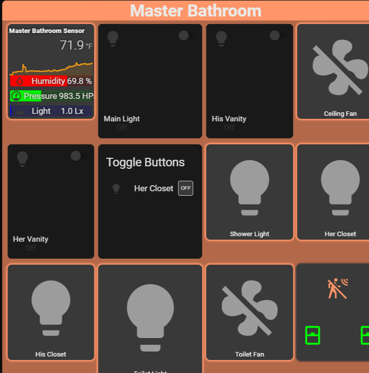
Trying to combine a few on/off lights into a single button, and came across the button-entity-row card. Has anyone tried to use this into a button-card? I am trying to maintain the look and feel by using aspect_ratio 1/1.1 buttons throughout, and embedding the button-entity-row in it.
I got the code to appear, so step 1, but can’t seem to get it right as a button-card. Any insights?
This is what the code looks like now, without the button-card

- type: entities
          title: Toggle Buttons
          show_header_toggle: false
          aspect_ration: 1/1.1
          entities:
          ## USE THIS CONFIG TO HAVE IT MATCH YOUR THEME ##
            - type: custom:toggle-control-button-row
              name: Her Closet
              entity: light.home_master_bath_her_closet_light
              customTheme: false

and this is how it shows. Expected, given the code, but need to contain it into the button-card. I plan on having 3 or so rows.

Hi all. I have a question about the problem which I can’t find the right answer.
On my lovelace dashboard I have custom:button-card to control my 3DPrinter (octoprint). I have a webcam set up as well so I can see and check the progress of the print. To do that, I use a picture-elements card with the feed from the webcam.
And here is my problem: what I’m trying achieve is to display either a static image or live web-cam feed based on a sensors value (sensor.octoprint_current_state).
In the other words, if the Octoprint state is “unavailable”, I would like to display a printer’s logo (static image) instead of the feed from the web-cam. And as soon as the Octoprint is enabled and become “Operational” I want to switch to live web-cam feed.

Here is my code for the custom:button-card:

         custom_fields:
            btemp:...
            ttemp:...
            ico1:...
            cam:
              card:
                type: picture-elements
                camera_image: camera.octowebcam
                camera_view: live
                elements:
                  - type: conditional
                    conditions:
                      - entity: "sensor.octoprint_current_state"
                        state: "unavailable"
                    elements:
                      - type: image
                        image: /local/ender_logo.png
                        style:
                          top: -6%
                          height: 100%
                          width: 100%
                        tap_action:
                          action: more-info

and here is how it should look like:
octoprint_off
when the printer (octoprint) is off

and octoprint_on
when printer is on

To me, so far I achieved to display ether picture or web-cam feed. But I can’t make it work to switch between picture/live feed based on sensor value.

Any ideas or suggestions would be greatly appreciated.
thanks