EddieFAF
January 4, 2022, 7:41am
269
I have created a template_sensor for that:
- platform: template
  sensors:
    geschirrspuler_programm:
      friendly_name: Geschirrspüler Programm
      value_template: >
        {% if is_state('switch.geschirrspuler_program_auto1', 'on') %}
        Auto1
        {% elif is_state('switch.geschirrspuler_program_auto2', 'on') %}
        Auto2
        {% elif is_state('switch.geschirrspuler_program_auto3', 'on') %}
        Auto3
        {% else %}
        Kein Programm
        {% endif %}
      icon_template: mdi:dishwasher
and one template_sensor for remaining_time:
    geschirrspuler_remaining:
      friendly_name: "Geschirrspüler verbleibend"
      value_template: >
        {% if states('sensor.geschirrspuler_operation_state') == 'Inactive' %} -
        {% elif states('sensor.geschirrspuler_operation_state') == 'Finished' %} -
        {% elif states('sensor.geschirrspuler_remaining_program_time') == 'unavailable' %} -
        {% elif (as_timestamp(states('sensor.geschirrspuler_remaining_program_time')) - as_timestamp(now())) < 61 %} < 1 min
        {% else %}
          {{ (((as_timestamp(states('sensor.geschirrspuler_remaining_program_time')) - as_timestamp(now())) / 60) | round(0)) | string + " min" }}
        {% endif %}
In your card you could use those sensors to display what you want.
Bojkas
January 4, 2022, 8:33am
270
This is great idea! That help. Thank you very much.
pedolsky
January 4, 2022, 8:59am
271
Ad 1.: The only thing I see is that you mixed colon styles. But as I can see in your posted image the program is displayed with „Auto“. So what do you want to achieve?
Ad 2.: You can try a little bit slicing by using
time: |
  [[[
    var t = states['sensor.mycka_nadobi_remaining_program_time'].state;
    var r = t.slice(11, -6);
    return r
  ]]]
11 = cut 11 characters at the beginning = 2022-01-03T
-6 = cut 6 characters at the end = +00:00
A template sensor as suggested above is also a nice solution.
Bojkas
January 4, 2022, 9:37am
272
ad.: I wanted to get him to display the active program. It showed Auto, but it didn’t change. I used your code and it seems ok now.
Gaston
January 4, 2022, 1:00pm
273
Thank you for your help. I got it as I wanted.
I still have to figure out how to display time in military state example 23:00 instead of 11:00 PM and how to use Sunrise and Sunset in input_datetime helper.
bolle
January 5, 2022, 6:49pm
274
I am using this custom buttom card - Apple homekit-lookalike card too view my light on a tablet. Is there possible to change this on/off view to brightness percent?
type: custom:button-card
entity: light.ute
name: Utelys
hold_action:
  action: more-info
icon: mdi:coach-lamp
color_type: card
show_state: true
styles:
  card:
    - width: 100px
    - height: 100px
  grid:
    - grid-template-areas: '"i" "n" "s"'
    - grid-template-columns: 1fr
    - grid-template-rows: 1fr min-content min-content
  img_cell:
    - align-self: start
    - text-align: start
  name:
    - justify-self: start
    - padding-left: 10px
    - font-weight: bold
  state:
    - justify-self: start
    - padding-left: 10px
state:
  - value: 'off'
    styles:
      card:
        - filter: opacity(50%)
      icon:
        - filter: grayscale(100%)
pedolsky
January 5, 2022, 9:46pm
275
Yes, that’s possible:
show_label: true
label: |
  [[[
    if (entity.state == 'on' && entity.attributes.brightness)
    return (Math.round(entity.attributes.brightness / 2.55)) + ' %';
  ]]]
sumur1au
January 6, 2022, 8:14am
276
Is it possible to template the tap action based on state
action_button:
pedolsky
January 6, 2022, 1:55pm
277
This should do the trick:
type: custom:button-card
entity: light.YOUR_LIGHT
show_name: true
name: only allow toggling if entity is on
show_state: true
tap_action:
  action: |
    [[[ return entity.state == 'on' ? 'toggle' : 'none' ]]]
1 Like
This works for me:
tap_action:
  action: |
    [[[
    if (states['binary_sensor.tecnoalarm_in1'].state =='off')
      return 'null'
    else
      return 'toggle'
Note that this binary sensor is not main entitiy of my button card.
1 Like
seldom
January 7, 2022, 11:12pm
279
Gaston
January 7, 2022, 11:20pm
280
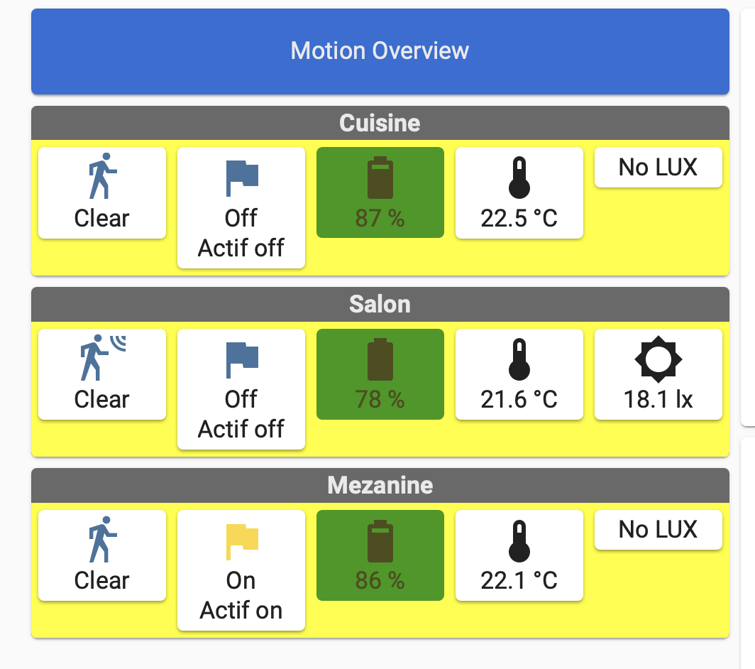
Here is my Lovelace custom:button-card
It is a type grid card. First is title Lebel, then the overview for 3 motion sensors.
Here is my code in Lovelace
type: grid
cards:
  - type: custom:button-card
    color_type: label-card
    color: rgb(44, 109, 214)
    name: Motion Overview
  - type: custom:button-card
    template: motion_all_attributes
    name: Cuisine
    variables:
      var_status: binary_sensor.motion_cuisine_motion
      var_battery: sensor.motion_cuisine_battery
      var_actif_flag: input_boolean.cuisine_motion_flag
      var_temp: sensor.motion_cuisine_temperature_measurement
      var_lux: N/A
  - type: custom:button-card
    template: motion_all_attributes
    name: Salon
    variables:
      var_status: binary_sensor.philips_sml001_fef50302_occupancy
      var_battery: sensor.philips_sml001_fef50302_power
      var_actif_flag: input_boolean.salon_motion_flag
      var_temp: sensor.philips_sml001_fef50302_temperature
      var_lux: sensor.philips_sml001_fef50302_illuminance
  - type: custom:button-card
    template: motion_all_attributes
    name: Mezanine
    variables:
      var_status: binary_sensor.motion_mezzanine_ias_zone
      var_battery: sensor.motion_mezzanine_power
      var_actif_flag: input_boolean.mezzanine_motion_flag
      var_temp: sensor.motion_mezzanine_temperature
      var_lux: N/A
columns: 1
square: false
As you can see I am using a template with variables for each motion detector.
Here is the code in my template
motion_all_attributes:
    template: container
    name: Motion
    custom_fields:
      buttons:
        card:
          type: horizontal-stack
          cards:
            - type: custom:button-card
              entity: '[[[ return variables.var_status ]]]'
              show_name: false
              show_state: true
            - type: custom:button-card
              entity: >-
                [[[ return variables.var_actif_flag != "N/A" ?
                variables.var_actif_flag : " " ]]]
              tap_action:
                action: toggle
              label: >-
                [[[ return variables.var_actif_flag == "N/A" ? "NO FLAG" :
                "Actif  "+ states[variables.var_actif_flag].state ]]]
              show_name: false
              show_label: true
              show_state: true
            - type: custom:button-card
              entity: '[[[ return variables.var_battery]]]'
              template: battery
            - type: custom:button-card
              entity: '    [[[ return variables.var_temp ]]]'
              show_name: false
              show_state: true
            - type: custom:button-card
              entity: >-
                [[[ return variables.var_lux != "N/A" ? variables.var_lux : " "
                ]]]
              label: >-
                [[[ return variables.var_lux == "N/A" ? "No LUX" :
                variables.var_message ]]]
              show_name: false
              show_state: true
              show_label: true
Here is my problem;
label: >-
If my variable is N/A the it return NO FLAG. If not then it return Actif with the state of the entity.
Any suggestion to change the label when the entity does toggle?
pedolsky
January 8, 2022, 10:50am
281
Add triggers_update: all to the main button card, refresh your dashboard and try again.
motion_all_attributes:
    template: container
    triggers_update: all
    name: Motion
    custom_fields:
Gaston
January 8, 2022, 1:55pm
282
Great, it works. Thank you.
pedolsky
January 8, 2022, 2:03pm
283
According to the documentation it’s recommended to all JS templates:
triggers_update
Bojkas
January 9, 2022, 3:15pm
284
Hello again,
Here is my code:
type: grid
cards:
  - type: custom:button-card
    entity: calendar.komunal
    icon: mdi:trash-can-outline
    aspect_ratio: 1/1
    show_name: true
    name: Komunál
    styles:
      icon:
        - color: black
      grid:
        - grid-template-areas: '"i" "date" "n"'
        - grid-template-columns: 1fr
        - grid-template-rows: 50% 1fr
      name:
        - font-size: 13px
      custom_fields:
        date:
          - justify-self: null
    custom_fields:
      date: |
        [[[
          var d = states['calendar.komunal'].attributes.start_time;
          var r = d.slice(-14,10);
          return r
        ]]]
  - type: custom:button-card
    entity: calendar.bio
    icon: mdi:trash-can-outline
    aspect_ratio: 1/1
    color: green
    styles:
      icon:
        - color: rgb(153, 76, 0)
      grid:
        - grid-template-areas: '"i" "date" "n"'
        - grid-template-columns: 1fr
        - grid-template-rows: 50% 1fr
      name:
        - font-size: 13px
      custom_fields:
        date:
          - justify-self: null
    custom_fields:
      date: |
        [[[
          var d = states['calendar.bio'].attributes.start_time;
          var r = d.slice(-14,10);
          return r
        ]]]
  - type: custom:button-card
    entity: calendar.plast
    icon: mdi:trash-can-outline
    aspect_ratio: 1/1
    styles:
      icon:
        - color: rgb(240, 240, 0)
      grid:
        - grid-template-areas: '"i" "date" "n"'
        - grid-template-columns: 1fr
        - grid-template-rows: 50% 1fr
      name:
        - font-size: 13px
      custom_fields:
        date:
          - justify-self: null
    custom_fields:
      date: |
        [[[
          var d = states['calendar.plast'].attributes.start_time;
          var r = d.slice(-14,10);
          return r
        ]]]
  - type: custom:button-card
    entity: calendar.papir
    icon: mdi:trash-can-outline
    aspect_ratio: 1/1
    styles:
      icon:
        - color: rgb(0, 128, 255)
      grid:
        - grid-template-areas: '"i" "date" "n"'
        - grid-template-columns: 1fr
        - grid-template-rows: 50% 1fr
      name:
        - font-size: 13px
      custom_fields:
        date:
          - justify-self: null
    custom_fields:
      date: |
        [[[
          var d = states['calendar.komunal'].attributes.start_time;
          var r = d.slice(-14,10);
          return r
        ]]]
columns: 5
square: true
1 Like
@seldom , I’m glad it was helpful for you
@Bojkas , I don’t think you can sort your grid directly, but it might be possible to make a button card template that is aware of all 4 entities and sorts them by date in javascript and displays the one at an index variable, then your grid can simply define 4 instances of the template and specify the right index for each one.
1 Like
There’s a custom integration for this HERE. . Check it out, maybe you’ll find it usefull. I have it installed and it works perfectly.
sumur1au
January 10, 2022, 11:10pm
288
Hi All,
Can anyone help me in nesting this as a tap action based on a state condition. @pedolsky and @Protoncek many thanks, I was able to get your code to work with toggle and none but when I nest the below action I can’t get it to trigger. I think it may have to do with my indentation of the code.
tap_action:
  action: fire-dom-event
  browser_mod:
    command: popup
    title: Popup example
    hide_header: true
    card:
      type: glance
      show_state: false
      entities:
        - entity: button.rumpus_tab_a7_restart_browser
          tap_action:
            action: call-service
            service: button.press
            target:
              entity_id: button.rumpus_tab_a7_restart_browser
          name: Rumpus Panel
        - entity: button.dining_tab_a7_restart_browser
          tap_action:
            action: call-service
            service: button.press
            target:
              entity_id: button.dining_tab_a7_restart_browser
          name: Dining Panel
        - entity: zone.home
          icon: mdi:restart
          name: Home Assistant
          tap_action:
            action: call-service
            service: homeassistant.restart