Can someone help me with this template???
I just want to display the time as the name and cant seem to find the correct formatting.
  - type: custom:button-card
    show_name: true
    name: >-
      '[[[ return `${{ now().strftime('%H:%M:%S') }}` ]]]'
    template: header_button
bangali
August 31, 2023, 8:59pm
796
Figured it out. Add this to custom button-card to flash the border in gold color:
    style: |
      ha-card {
        transition: border 0.5s;
      }
      ha-card:active {
        animation: flashBorder 0.5s;
      }
      @keyframes flashBorder {
        0%, 100% { border-color: gold; }
        100% { border-color: gold; }
      }
1 Like
Here’s a suggestion for your code. Instead of all the IF statements, set everything in a LET statement.
type: custom:button-card
entity: weather.home
show_icon: false
show_name: false
show_state: false
show_label: true
tap_action:
  action: more-info
styles:
  card:
    - width: 175px
  label:
    - justify-self: start
    - padding-left: 10px
label: |
  [[[
    var weather = entity.state;
    var indoor = states['sensor.bedroom_temperature'].state;
    var outdoor = states['sensor.outside_temperature'].state;
    let icons = {
      "cloudy": "mdi:weather-cloudy",
      "fog": "mdi:weather-fog",
      "hail": "mdi:weather-hail",
      "lightning": "mdi:weather-lightning",
      "lightning-rainy": "mdi:weather-lightning-rainy",
      "partlycloudy": "mdi:weather-partly-cloudy",
      "pouring": "mdi:weather-pouring",
      "rainy": "mdi:weather-rainy",
      "snowy": "mdi:weather-snowy",
      "snowy-rainy": "mdi:weather-snowy-rainy",
      "sunny": "mdi:weather-sunny",
      "windy":  "mdi:weather-windy"
    };
    var icon = icons[weather];
    if (typeof(icon) === 'undefined') {
      var icon = "mdi:help"
    }
    return  `<ha-icon icon="${icon}"
      style="width: 22px; height: 22px;">
      </ha-icon>` + indoor + '°F | ' + outdoor + '°F';
  ]]]
2 Likes
The problem is you’re trying to use Python/Jinja in JavaScript.
This code works for what you want. However, it does not update in real-time (but seems to whenever it feels like it).
type: custom:button-card
name: |-
  [[[
    const time_now_hours = new Date().getHours()
    const time_now_minutes = new Date().getMinutes()
    const time_now_seconds = new Date().getSeconds()
    const time_now = time_now_hours + ":" + ('00' + time_now_minutes).slice(-2)+ ":" + ('00' + time_now_seconds).slice(-2);
    return time_now
  ]]]
The .slice portions ensure a leading zero is used with single digit numbers.
type: custom:button-card
name: |-
  [[[
    return states['sensor.time'].state
  ]]]
-H.
sensor:
  - platform: template
    sensors:
      dashboard_time:
        unique_id: 2853690a-0b7f-4b64-876d-bcec8493cd62
        friendly_name: H:M:S
        value_template: "{{ now().strftime('%H:%M:%S') }}"
        icon_template: mdi:clock-outline
I also have a sensor for the date formatted the way I want to see it on the dashboard and it uses a little different technique.
sensor:
  - platform: template
    sensors:
      dashboard_date:
        unique_id: 2853690a-0b7f-4b64-876d-bcec8493cd61
        friendly_name: ddd m-d
        value_template: "{{ now().timestamp() | timestamp_custom('%a  %-m-%-d') }}"
        icon_template: mdi:calendar
type: custom:button-card
template: generic_custom_button
show_state: false
show_icon: false
show_name: true
tap_action: none
hold_action: none
name: >-
  [[[ return states["sensor.dashboard_date"].state + " / " +
  states["sensor.time"].state ]]]
styles:
  card:
    - font-size: 50px
    - height: 65px
    - border: none
Hey, Thanks for your input.
Hopefully this will help someone in the future. What you have outlined here is very concise. Thx.
As it turns out, I had already made the sensor and was already using it. Posting the question here was more to be able to use the code directly in the button card rather than creating another template sensor.
g0m
September 5, 2023, 11:08am
800
Hi guys,
I am struggling a bit with my cards.
To be more specific, here is what I have. I drew in red the borders of my grid. You can see that my custom-buttons are not centered.
And here is what I am looking for (all the card are centered, I had to fine tune some margin to get that result which is sloppy imho):
My code is the following for that grid:
type: grid
columns: 1
square: false
cards:
  - type: custom:button-card
    name: portail
    styles:
      card:
        - height: 50px
        - padding-top: 30px
        - border: none
        - background: none
      img_cell:
        - align-self: start
        - text-align: start
      name:
        - justify-self: start
        - padding-left: 10px
        - text-transform: lowercase
        - font-size: 25px
        - letter-spacing: 0.7em
  - square: false
    type: grid
    cards:
      - entity: binary_sensor.ouvertureportail
        icon: mdi:gate
        name: p o r t a i l
        size: 40%
        tap_action:
          action: call-service
          service: switch.turn_on
          target:
            entity_id: switch.double_relay_switch_2x1_5kw_6
          data: {}
        styles:
          img_cell:
            - padding-left: 25px
            - justify-content: start
          card:
            - max-width: 120px
            - height: 120px
          grid:
            - grid-template-areas: '"i" "n" "s"'
            - grid-template-columns: 1fr
            - grid-template-rows: 1fr min-content min-content
          icon:
            - color: rgba(var(--my-green),0.8)
          name:
            - justify-self: start
            - font-weight: bold
            - font-size: 15px
            - padding-left: 15px
          state:
            - justify-self: start
            - font-weight: bold
            - font-size: 12px
            - opacity: 0.6
            - padding: 0 15px 5px
        state:
          - value: 'on'
            icon: mdi:gate-open
            styles:
              icon:
                - color: rgb(var(--my-red)
                - animation: blink 2s ease infinite
              card:
                - background-color: rgba(var(--my-red),0.2)
                - box-shadow: var(--my-box-shadow)
        card_mod:
          class: soft-ui
          style: |
            ha-card {
              --primary-text-color: rgb(var(--my-grey));
            }
        show_state: true
        type: custom:button-card
      - entity: binary_sensor.ouvertureportail
        icon: mdi:walk
        name: p i é t o n
        size: 30%
        tap_action:
          action: call-service
          service: switch.turn_on
          target:
            entity_id: switch.jardinportail_2
          data: {}
        styles:
          img_cell:
            - padding-left: 25px
            - justify-content: start
          card:
            - max-width: 120px
            - height: 120px
          grid:
            - grid-template-areas: '"i" "n" "s"'
            - grid-template-columns: 1fr
            - grid-template-rows: 1fr min-content min-content
          icon:
            - color: rgba(var(--my-blue),0.8)
          name:
            - justify-self: start
            - font-weight: bold
            - font-size: 15px
            - padding-left: 15px
          state:
            - justify-self: start
            - font-weight: bold
            - font-size: 12px
            - opacity: 0.6
            - padding: 0 15px 5px
        card_mod:
          class: soft-ui
          style: |
            ha-card {
              --primary-text-color: rgb(var(--my-grey));
            }
        show_state: true
        type: custom:button-card
      - entity: binary_sensor.ouvertureportail
        icon: mdi:car
        name: t o t a l e
        size: 40%
        tap_action:
          action: call-service
          service: switch.turn_on
          target:
            entity_id: switch.jardinportail
          data: {}
        styles:
          img_cell:
            - padding-left: 25px
            - justify-content: start
          card:
            - max-width: 120px
            - height: 120px
          grid:
            - grid-template-areas: '"i" "n" "s"'
            - grid-template-columns: 1fr
            - grid-template-rows: 1fr min-content min-content
          icon:
            - color: rgba(var(--my-blue),0.8)
          name:
            - justify-self: start
            - font-weight: bold
            - font-size: 15px
            - padding-left: 15px
          state:
            - justify-self: start
            - font-weight: bold
            - font-size: 12px
            - opacity: 0.6
            - padding: 0 15px 5px
        card_mod:
          class: soft-ui
          style: |
            ha-card {
              --primary-text-color: rgb(var(--my-grey));
            }
        show_state: true
        type: custom:button-card
    columns: 3
If you guys gave any idea, I would be gateful!
Nick4
September 5, 2023, 4:10pm
801
Guys, could use a little help.
I have a button that runs a script, which works fine.
This is what I have:
show_name: true
show_icon: true
type: custom:button-card
tap_action:
  action: call-service
  service: script.turn_on
  target:
    entity_id: script.curtains
name: Curtains
icon: mdi:curtains
styles:
  icon:
    - color: |
        [[[
          if (states['input_boolean.curtains'].state == 'on') return '#ffc107';
          else return '#44739e';
        ]]]
How do I fit in the different state of icons in this example?
TIA!
g0m
September 5, 2023, 6:56pm
802
you can add the input_boolean as entity
then use "state"to style your card when it’s on (or off or whatever state you want)
show_name: true
show_icon: true
type: custom:button-card
entity: YOUR_INPUT_BOOLEAN
tap_action:
  action: call-service
  service: script.turn_on
  target:
    entity_id: script.curtains
name: Curtains
icon: mdi:curtains-closed
styles:
  icon:
    - color: #44739e'

state:
    - value: 'on'
       icon: mdi:curtains
       styles:
           icon:
               - color:  #ffc107
1 Like
g0m
September 5, 2023, 7:11pm
803
so, replying to myself
styles:
      card:
         - margin: auto
1 Like
Nick4
September 5, 2023, 8:45pm
804
Thanks for putting me in the right direction!
It didn’t work right away with your code but after some changes it does now:
show_name: true
show_icon: true
type: custom:button-card
entity: input_boolean.curtains
tap_action:
  action: call-service
  service: script.turn_on
  target:
    entity_id: script.curtains
name: Curtains
state:
  - value: 'on'
    icon: mdi:curtains
    styles:
     icon:
       - color: '#ffc107'
  - value: 'off'
    icon: mdi:curtains-closed
    styles:
     icon:
       - color: '#44739e'
1 Like
How do you achieve those nice shadows that each card has? Can this be done with a simple statement? I can’t see that in your code.
g0m
September 6, 2023, 9:04am
806
hi mate,
so to get those shadows:
you can’t see the shadows into muy code because for the default button it is in my theme and for the turn on button it is in my card template.
But, you can add those shadows very easily in the style/card section:
for the default (off button) I use this one:
styles:
    card:
        - box-shadow: rgba(30, 196, 229, 0.25) 0px 13px 27px -5px, rgba(212, 244, 250, 0.3) 0px 8px 16px -8px
For the ON buttons, I am using this one:
styles:
    card:
        - box-shadow: rgba(50, 50, 93, 0.25) 0px 13px 27px -5px, rgba(0, 0, 0, 0.3) 0px 8px 16px -8px
Last but not least, I didn’t design those shadows myself.https://getcssscan.com/css-box-shadow-examples
4 Likes
g0m
September 6, 2023, 9:06am
807
I have yet another question!!!
I have this button to control a cover:
In the state, how can I display the opening value in % instead of having the binary sensor showing only open/close ?
Great, thank you! Your example looks odd on my cards, but the link provides cool examples that I could just take over on my card.
How have you applied that for all cards in your theme?
EDIT: I found the answer by searching around in other themes.
ha-card-box-shadow: rgba(0, 0, 0, 0.24) 0px 2px 5px
Has anyone used the lock object witha template with any form of success???
    lock:
      enabled: >
        [[[ if states["input_boolean.inhibit"] == "on" return "true";
            if states["input_boolean.override"] == "off" return "false";
            ]]]
pedolsky
September 10, 2023, 11:24am
810
lock:
  enabled: |
    [[[
      return (states['input_boolean.inhibit'].state == 'on' && states['input_boolean.override'].state == 'on');
    ]]]
someone know if it’s possible to change name of a button every one second?
This template will change the name to “Manual”, but I need to be Manual pause Door pause Manual etc
name: >
  [[[ if (states['input_boolean.manual_light_door'].state == 'on') return
  "Manual"; return "Door";  ]]]
ant this code will blink the Manual:
styles:
  name:
    - animation: >
        [[[ if (states['input_boolean.manual_light_door'].state == 'on') return
        "blink 1s infinite"; return "";  ]]]
Thanks for any suggestion
Ceddy
September 15, 2023, 1:39am
813
I’m trying to use regex conditions simplify my code but not having any luck.
state:
  - value: regex '^Work.*$'
    styles:
      custom_fields:
        icon:
          - border-color: '#77c66e'
What am I doing wrong?
rpc
September 17, 2023, 8:07pm
814
Hi all,
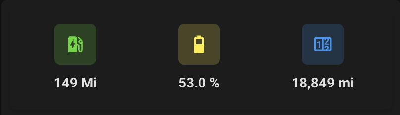
I recently set up my 1st wall panel and soon found out that using a mobile dashboard isn’t as readable on a bigger screen. I stumbled across the custom button card and seems like it is perfect for tablet dashboards.
I’ve been getting to grips with the custom button card, and it’s working like a dream. However, I’ve come unstuck on the below conversion for mobile to tablet
Can anyone point me in the right direction?
I currently have this
Which is achieved with this code
type: custom:stack-in-card
mode: vertical
keep:
  outer_padding: true
  margin: true
  box_shadow: false
  background: false
cards:
  - type: custom:stack-in-card
    mode: horizontal
    keep:
      outer_padding: true
      margin: true
      box_shadow: false
      background: false
    cards:
      - type: custom:mushroom-template-card
        primary: '{{ states(''sensor.fordpass_elveh'')}} Mi'
        secondary: ''
        icon: mdi:ev-station
        entity: sensor.fordpass_elveh
        icon_color: |-
          {% if states('sensor.fordpass_elveh')|int > 100 %}
          #48D821
          {% elif states('sensor.fordpass_elveh')|int < 60 %}
          #DF0808
          {% else %}
          #DF8708
          {% endif %}
        tap_action:
          action: more-info
        layout: vertical
      - type: custom:mushroom-template-card
        primary: '{{ states(''sensor.musty_battery_precentage'')}} %'
        secondary: ''
        icon: |-
          {% set state = states('sensor.musty_battery_precentage')|float %}
          {% if state >= 0 and state < 10 %} mdi:battery-10
          {% elif state >= 10 and state < 20 %} mdi:battery-20
          {% elif state >= 20 and state < 30 %} mdi:battery-30
          {% elif state >= 30 and state < 40 %} mdi:battery-40
          {% elif state >= 40 and state < 50 %} mdi:battery-50
          {% elif state >= 50 and state < 60 %} mdi:battery-60
          {% elif state >= 60 and state < 70 %} mdi:battery-70
          {% elif state >= 70 and state < 80 %} mdi:battery-80
          {% elif state >= 80 and state < 95 %} mdi:battery-90
          {% else %} mdi:battery
          {% endif %}
        entity: sensor.musty_battery_precentage
        icon_color: |-
          {% set state = states('sensor.musty_battery_precentage')|float %}
          {% if state >= 0 and state < 20 %} red
          {% elif state >= 20 and state < 50 %} orange
          {% elif state >= 50 and state < 80 %} yellow
          {% else %} green
          {% endif %}
        tap_action:
          action: more-info
        layout: vertical
      - type: custom:mushroom-entity-card
        entity: sensor.fordpass_odometer
        layout: vertical
        primary_info: state
        secondary_info: none
        tap_action:
          action: more-info
The custom button card I’ve achieved so far is this
with this code
type: vertical-stack
cards:
  - type: vertical-stack
    cards:
      - type: custom:button-card
        color_type: label-card
        color: rgb(150, 20, 246)
        name: Musty
  - type: horizontal-stack
    cards:
      - type: custom:button-card
        entity: sensor.fordpass_elveh
        icon: mdi:ev-station
        name: Range
        show_name: true
        show_state: true
        icon_state: true
      - type: custom:button-card
        entity: sensor.musty_battery_precentage
        icon: mdi:battery
        name: Battery
        show_name: true
        show_state: true
        icon_state: true
      - type: custom:button-card
        entity: sensor.fordpass_odometer
        icon: mdi:counter
        name: Millage
        show_name: true
        show_state: true
        icon_state: true
However, I can’t work out how to replicate the icons to change colour based on the state (well actually, I want the background to change based on the state, as button card can do that)
Where am I going wrong?
Thanks, Patrick
Ceddy
September 18, 2023, 10:16pm
816
Trying to master this code… but you need something like this as the last line of your type: custom block
state:
  - value: >150
    styles:
      custom_fields:
        icon:
          - border-color: '#77c66e'
State and value conditions is what will do your custom colour. Let me know if this works for you…
2 Likes