Fun with custom:button-card

OK. I have one other question. How can I add a second circle field directly below the original circle field without impacting the position of the icon, name, or state? I would like to add a second circle below the one shown, without affecting the position of anything on the left side of the card.

image

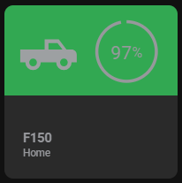
Here is my current card code. Thanks in advance for any help. I tried just making a second field called “fuel” and put it in the right column next to l, s, n and copied the circle code. But it altered the location of my name and label.

truck:
  template:
    - base
  variables:
    state_on: >
      [[[ return states["sensor.garage_fordpass_ignitionstatus"].state == 'ON' ]]]
    circle_input: >
      [[[ return states["sensor.garage_fordpass_fuel"].state ]]]
  state_display: >
    [[[
      if (entity) {
          return variables.state === 'home'
              ? variables.translate_home
              : variables.state === 'not_home'
                  ? variables.translate_not_home
                  : variables.state;
      }
      return variables.translate_unknown;
    ]]]
  tap_action:
    action: more-info
  double_tap_action:
    action: more-info
    entity: sensor.garage_fordpass_fuel
  hold_action:
    action: toggle
    entity: switch.garage_fordpass_ignition_switch
  styles:
    grid:
      - grid-template-areas: |
          "icon  circle"
          "n     n"
          "s     s"
          "l     l"
      - grid-template-columns: repeat(2, 1fr)
      - grid-template-rows: auto repeat(3, min-content)
      - gap: 1.3%
      - align-items: start
      - will-change: transform
    name:
      - justify-self: start
      - line-height: 110%
      - font-size: 15px
      - font-weight: bold
    state:
      - justify-self: start
      - line-height: 110%
      - font-size: 12px
    label:
      - justify-self: start
      - line-height: 110%
      - font-size: 12px
    card:
      - --c-color-home: none
      - --c-color-away: none
      - --c-color-zone: none
      - --c-stroke-width: none
      - --c-icon-color-on: var(--contrast1)
      - --c-icon-color-off: '#97989c'
      - --c-stroke-color-on: var(--contrast1)
      - --c-stroke-color-off: '#97989c'
      - --c-stroke-color-power-off: none
      - --c-fill-color-on: none
      - --c-fill-color-off: none
      - --c-fill-color-power-off: none
      - --c-stroke-width: 2.3
      - --c-stroke-width-dragging: 4
      - --c-font-color-on: var(--contrast1)
      - --c-font-color-off: '#97989c'
      - --c-font-color-power-off: none
      - --c-font-size: 14px
      - --c-unit-font-size: 10.5px
      - --c-font-weight: 700
      - --c-letter-spacing: -0.02rem
      - background-image: >
          [[[
            if (variables.state === 'home') {
            return `linear-gradient(to bottom, rgba(50,168,82,1) 0%, rgba(50,168,82,1) 52%, rgba(0,0,0,0) 48%)`;
            }
            if (variables.state === 'BHS') {
            return `linear-gradient(to bottom, rgba(255,191,0,1) 0%, rgba(255,191,0,1) 52%, rgba(0,0,0,0) 48%)`;
            }
            if (variables.state === 'CCAC') {
            return `linear-gradient(to bottom, rgba(255,191,0,1) 0%, rgba(255,191,0,1) 52%, rgba(0,0,0,0) 48%)`;
            }
            if (variables.state === 'Lowes') {
            return `linear-gradient(to bottom, rgba(255,191,0,1) 0%, rgba(255,191,0,1) 52%, rgba(0,0,0,0) 48%)`;
            }
            if (variables.state === 'Stantec') {
            return `linear-gradient(to bottom, rgba(255,191,0,1) 0%, rgba(255,191,0,1) 52%, rgba(0,0,0,0) 48%)`;
            }
            if (variables.state === 'Vernon') {
            return `linear-gradient(to bottom, rgba(255,191,0,1) 0%, rgba(255,191,0,1) 52%, rgba(0,0,0,0) 48%)`;
            } else {
            return `linear-gradient(to bottom, rgba(255,0,0,1) 0%, rgba(255,0,0,1) 52%, rgba(0,0,0,0) 48%)`;
            }
          ]]]
    custom_fields:
      circle:
        - display: initial
        - width: 100%
        - margin: -9% 0 0 0
        - justify-self: center
        - opacity: 1
  custom_fields:
    circle: >
      [[[
        if (variables.state_on) {
            let input = variables.circle_input,
              r = 22,
              c = r * 2 * Math.PI,
              dasharray = c,
              dashoffset = c - input / 100 * c;
          return `
            <svg viewBox="0 0 50 50">
              <circle cx="25" cy="25" r="${r}" stroke='var(--c-stroke-color-on)' stroke-dashoffset="${dashoffset}" stroke-dasharray="${dasharray}" stroke-width='var(--c-stroke-width)' fill='var(--c-fill-color-on)' style="transform: rotate(-90deg); transform-origin: 50% 50%;" />
              <text x="50%" y="54%" fill='var(--c-font-color-on)' font-size='var(--c-font-size)' text-anchor="middle" alignment-baseline="middle" dominant-baseline="middle">${variables.circle_input}<tspan font-size='var(--c-unit-font-size)'>%</tspan></text>
            </svg>
          `;
        } else {
            let input = variables.circle_input,
              r = 22,
              c = r * 2 * Math.PI,
              dasharray = c,
              dashoffset = c - input / 100 * c;
          return `
            <svg viewBox="0 0 50 50">
              <circle cx="25" cy="25" r="22" stroke='var(--c-stroke-color-off)' stroke-dashoffset="${dashoffset}" stroke-dasharray="${dasharray}" stroke-width='var(--c-stroke-width)' fill='var(--c-fill-color-off)' style="transform: rotate(-90deg); transform-origin: 50% 50%;" />
              <text x="50%" y="54%" fill='var(--c-font-color-off)' font-size='var(--c-font-size)' text-anchor="middle" alignment-baseline="middle" dominant-baseline="middle">${variables.circle_input}<tspan font-size='var(--c-unit-font-size)'>%</tspan></text>
            </svg>
          `;
        }
      ]]]

I tried to just copy the current custom field and altered the code, but I ended up with this.
image

I would really appreciate it if someone could help me with a problem that I can’t solve or understand. FYI I the noob of the noobs so…don’t laugh xD

As you can see in the image below, I have a problem with those cards when viewing them on a iPhone 11. One thing I learned is if I remove all the icons I don’t have any problem.

The code below is for the second card…

Thank you all in advance!

type: custom:button-card
name: Praia de Miramar
entity: weather.praia_de_miramar
label: |
  [[[
     const temperature = states["weather.praia_de_miramar"].attributes.temperature;
     const humidity = states["weather.praia_de_miramar"].attributes.humidity;
     return `<ha-icon icon="fas:temperature-half" style="height:15px; color: #E3DA29;"></ha-icon> ${temperature}°C <ha-icon icon="fas:droplet" style="height:15px; color: #29abe2;"></ha-icon> ${humidity}%`;
   ]]]
show_label: true
show_name: true
show_icon: true
size: 45px
color: '#f1c64d'
card_size: 10
styles:
  card:
    - padding: 7px
    - background: rgba(0, 0, 0, 0.4)
    - border: none
    - border-radius: 100px
    - width: 100%
  grid:
    - grid-template-areas: '"i n" "i l"'
    - grid-template-rows: min-content min-content
    - grid-template-columns: 0.8fr 1.5fr
    - padding-right: 12px
  label:
    - font-family: Montserrat, sans-serif
    - font-size: 1.1rem
    - line-height: 1
    - justify-self: right
    - font-weight: 1000
    - text-align: right
    - width: 100%
    - margin-left: 24px
  name:
    - align: right
    - font-size: 0.8rem
    - line-height: 1
    - font-weight: 200
    - width: 100%
    - text-align: right

EDIT: Nevermind. I was able to figure this out.

I have a custom button card that shows the number of people at home. It turns on when there is anyone at home and it reports the number of people home within the circle. As shown.
image

When everyone leaves, I have an automation that waits for an hour before adjusting the HVAC so that it is not constantly fluctuating for short trips. I have been able to show a progress bar for the countdown. On other cards though, I have been able to show a countdown for other timers by using an embedded button-card.
image

I am struggling on how to get this to happen within this card. Essentially, I want the card like it is in the first picture when someone is home. While the automation is counting down, I would like for it to be the second picture with the addition of the countdown timer. And finally when there is no one home and the countdown is complete it would be this.
image

I guess my question is how can I have the sensor count and the countdown timer overlap the same area of the card and only show up when the appropriate states are met. I have included a copy of my current code for the button.

Button card code

  - type: custom:button-card
    template:
      - base
      - icon_home2
    variables:
      timer: >
        [[[ return states["timer.leaving"].state == 'active' ]]]
      circle_input: >
        [[[ return states["sensor.people_home"].state]]]
    entity: group.humans
    name: Presence
    show_state: true
    state_display: >
      [[[
        if (entity) {
            return variables.state === 'home'
                ? variables.translate_home
                : variables.state === 'not_home'
                    ? variables.translate_not_home
                    : variables.state;
        }
        return variables.translate_unknown;
      ]]]
    tap_action:
      action: more-info
    styles:
      card:
        - --c-stroke-color-on: var(--contrast1)
        - --c-stroke-color-off: none
        - --c-fill-color-on: none
        - --c-fill-color-off: none
        - --c-stroke-width: 2.3
        - --c-stroke-width-dragging: 4
        - --c-font-color-on: var(--contrast1)
        - --c-font-color-off: none
        - --c-font-size: 14px
        - --c-font-weight: 700
        - --c-letter-spacing: -0.02rem
      custom_fields:
        circle:
          - display: initial
          - width: 88%
          - margin: -3% 2% 0 0
          - justify-self: end
          - opacity: 1
        timer:
          - display: block
          - position: absolute
          - top: >
              [[[
                return window.matchMedia('(max-width: 1200px)').matches
                    ? '82%'
                    : '89%';
              ]]]
          - left: -13%
          - width: 125%
    custom_fields:
      circle: >
        [[[
          if (variables.state_on) {
            return `
              <svg viewBox="0 0 50 50">
                <circle cx="25" cy="25" r="22" stroke='var(--c-stroke-color-on)' stroke-width='var(--c-stroke-width)' fill='var(--c-fill-color-on)' />
                <text x="50%" y="54%" fill='var(--c-font-color-on)' font-size='var(--c-font-size)' font-weight='var(--c-font-weight)' letter-spacing='var(--c-letterlspacing)' text-anchor="middle" alignment-baseline="middle" dominant-baseline="middle">${variables.circle_input}</text>
              </svg>
            `;
          } else {
            return `
              <svg viewBox="0 0 50 50">
                <circle cx="25" cy="25" r="22" stroke='var(--c-stroke-color-off)' stroke-width='var(--c-stroke-width)' fill='var(--c-fill-color-off)' />
                <text x="50%" y="54%" fill='var(--c-font-color-off)' font-size='var(--c-font-size)' font-weight='var(--c-font-weight)' letter-spacing='var(--c-letterlspacing)' text-anchor="middle" alignment-baseline="middle" dominant-baseline="middle">${variables.circle_input}</text>
              </svg>
            `;
          }
        ]]]
      timer:
        card:
          type: custom:timer-bar-card
          entity: timer.leaving
          layout: full_row
          text_width: 0px
          invert: true
          bar_foreground: >
            [[[
              return variables.timer
                  ? '#3182b7'
                  : 'none';
            ]]]
          bar_background: none
          modifications:
            - elapsed: 90%
              bar_foreground: 'rgb(255,0,0)'

Base template code.

base:
  template:
    - settings
    - extra_styles
  variables:
    state_on: >
      [[[ return ['on', 'home', 'heat_cool', 'Complete', 'Running', 'Fresh', 'Charging', 'Started'].indexOf(!entity || entity.state) !== -1; ]]]
    state_home: >
      [[[ return ['home'].indexOf(!entity || entity.state) !== -1; ]]]
    state_zone: >
      [[[ return ['BHS', 'CCAC', 'Harmony', 'Stantec', 'Vernon'].indexOf(!entity || entity.state) !== -1; ]]]
    state_away: >
      [[[ return ['not_home'].indexOf(!entity || entity.state) !== -1; ]]]
    state: >
      [[[ return !entity || entity.state; ]]]
    entity_id: >
      [[[ return !entity || entity.entity_id; ]]]
    entity_picture: >
      [[[ return !entity || entity.attributes.entity_picture; ]]]
  aspect_ratio: 1/1
  show_state: false
  show_label: false
  show_icon: false
  styles:
    grid:
      - grid-template-areas: |
          "icon   circle"
          "n      n"
          "l      l"
          "s      s"
      - grid-template-columns: repeat(2, 1fr)
      - grid-template-rows: auto repeat(3, min-content)
      - gap: 1.3%
      - align-items: start
      - will-change: transform
      - position: relative
    name:
      - justify-self: start
      - line-height: 110%
      - font-size: 15px
      - font-weight: bold
    state:
      - justify-self: start
      - line-height: 110%
      - font-size: 12px
    label:
      - justify-self: start
      - line-height: 110%
      - font-size: 12px
    card:
      - overflow: hidden
      - border-radius: 10px
      - border-width: 0px
      - -webkit-tap-highlight-color: rgba(0,0,0,0)
      - transition: none
      - --mdc-ripple-color: >
          [[[
            return variables.state_on
                ? 'var(--contrast1)'
                : '#97989c';
          ]]]
      - color: >
          [[[
            return variables.state_on
                ? 'var(--contrast1)'
                : '#97989c';
          ]]]
      - background-color: >
          [[[
            return variables.state_on
                ? 'var(--contrast20)'
                : 'rgba(115, 115, 115, 0.25)';
          ]]]

EDIT: I was able to figure it out with the use of conditional cards.

Are you asking for my help? I am not sure what you need or that I can even help.

Hey guys, can someone give me a hint why my color template won’t work?

type: custom:button-card
entity: input_button.helper_staus_wechseln_aussensteckdose
icon: |
  [[[
    if (states['input_select.shelly1pm_eingangsbereich_aussen_aussensteckdose'].state == "Dauer An")
       return 'mdi:power-on';
    if (states['input_select.shelly1pm_eingangsbereich_aussen_aussensteckdose'].state == "Aus")
       return 'mdi:power-off';
    else return 'mdi:clock'
  ]]]
name: Außensteckdose
label: |
  [[[
    return states['input_select.shelly1pm_eingangsbereich_aussen_aussensteckdose'].state ;
  ]]]
show_label: true
color: |
  [[[
    if (states['switch.shelly_eingangsbereich_aussen_aussensteckdose'].state == "on")
       return "red";
    else 
      return "lightGrey";
  ]]]
hold_action:
  action: more-info
tap_action:
  action: call-service
  service: input_select.select_next
  service_data:
    entity_id: input_select.shelly1pm_eingangsbereich_aussen_aussensteckdose
    cycle: true
styles:
  label:
    - color: gray
    - font-size: 12px
  grid:
    - grid-template-areas: '"i" "n" "s" "l"'
    - grid-template-columns: 1fr
    - grid-template-rows: 1fr min-content min-content
  img_cell:
    - align-self: center
    - text-align: center
  name:
    - justify-self: center
    - padding-left: 0px
    - font-weight: bold
    - font-size: 12px
  state:
    - justify-self: start
    - padding-left: 10px

Guys, I’m looking for a way to create a button that:

  • toggles a script to mute/unmute my mediaplayers
  • the icon should represent the state

This is what I have:

show_name: false
show_icon: true
type: custom:button-card
styles:
  card:
    - height: 60px
tap_action:
  action: toggle
entity: script.toggle_volume_mediaplayers
icon:
  - color: |
      [[[
        if (input_boolean.mediaplayersmuted == 'on') return 'red';
        else return 'white';
      ]]] 
state:
  - value: 'on'
    icon: mdi:volume-off
  - value: 'off'
    icon: mdi:volume-high

How do I get the icon to show an unmuted/muted speaker with the right primary and accent colors (used some colors for my test in the code above)?
The state changes only briefly when toggling the button.

Thanks a lot for any help!

Dear all, could someone point me to the right direction on how to give to a custom button a “particular” color if weekday is today??
I have 7 custom buttons (from monday to sunday) and wanna give orange color to the sunday button (if today is sunday).

thanks a lot

You’d need card_mod for that, something like this:

card_mod:
  style:
    .: |
      ha-card {       
        /* Set size and spacing of button */

        {% if states('sensor.example) == 'True' %}
          background: rgba(70, 130, 180, 0.5) !important;
        {% else %}
          background: rgba(199, 224, 238, 0.5) !important; 
        {% endif %}
        }

I tried to follow the example posted by OP to organize custom buttons using card templates. Initially seemed like everything is working fine.

But then I noticed that sometimes when I open dashboard with these components - they are not rendering. Refreshing the page (if in browser) or switching to another dashboard and re-opening previous dashboard “fixes” it till next time.

Then I spotted a JavaScript errors in the console:

TypeError: Cannot read properties of undefined (reading 'style')
    at button-card.js:426:18867
    at Ti._createCard (button-card.js:426:19038)
    at button-card.js:445:213
    at Array.forEach (<anonymous>)
    at Ti._buildCustomFields (button-card.js:445:30)
    at Ti._gridHtml (button-card.js:524:25)
    at Ti._buttonContent (button-card.js:506:454)
    at Ti._cardHtml (button-card.js:486:18)
    at Ti.render (button-card.js:426:19509)
    at Ti.update (button-card.js:1:14818)
Uncaught (in promise) TypeError: e.setConfig is not a function
    at Ti.render (button-card.js:426:19640)
    at Ti.update (button-card.js:1:14818)
    at Ti.performUpdate (button-card.js:1:6145)
    at Ti.scheduleUpdate (button-card.js:1:5792)
    at Ti._$Ej (button-card.js:1:5700)

Apparently, something isn’t working as expected and causing the custom button card to fail to render.
After experimenting a bit I found out that it’s only happens when child cards are added into custom:button-car container.

This doesn’t happens 100 out of 100. Sometimes, after countless refreshes, there will be no error and the card would render.

If I comment the custom_fields node in the first card (horizontal-stack) - the card renders fine (an empty container with title “Garage”) and there is no JS errors. I can refresh the page whole day and it will work. A second card in the view - a standalone custom button card renders just fine, without any errors.

Seems like custom button card used as a container expect children cards to have certain properties in JavaScript, which are not set/undefined.

Does anyone have this issue?

button_card_templates:
  standard:
    color_type: card
    size: 80%
    hold_action:
      action: more-info
    styles:
      card:
        - padding: 0.2em
        - '--mdc-ripple-color': yellow
        - '--mdc-ripple-press-opacity': 0.5
      icon:
        - opacity: 0.5
      name:
        - font-size: 0.65em
        - white-space: normal
      state:
        - font-size: 0.65em
        - white-space: normal
      label:
        - font-size: 0.4em
        - white-space: normal
  wide:
    template: standard
    styles:
      grid:
        - position: relative
        - grid-template-areas: '"i n"'
        - grid-template-columns: 1fr 1fr
        - grid-template-rows: 1fr
  container:
    color_type: label-card
    color: dimgray
    styles:
      card:
        - padding: 0
      name:
        - border-radius: 0.4em 0.4em 0 0
        - padding: 0.1em
        - width: 100%
        - font-weight: bold
      grid:
        - grid-template-areas: '"i" "n" "buttons"'
        - grid-template-columns: 1fr
        - grid-template-rows: 1fr min-content min-content
      custom_fields:
        buttons:
          - background-color: rgba(0,0,0,0.3)
          - margin: 0
          - padding: 0.3em
views:
  - title: Home
    cards:
      - type: custom:button-card
        color: '#EDE7B0'
        name: Garage Card
        # custom_fields:
        #   buttons:
        #     card:
        #       type: horizontal-stack
        #       cards:
        #         - entity: light.garage_ceiling_ligths_garage_ceiling_lights
        #           name: Ceiling Lights
        #           template: standard
        #           icon: mdi:lightbulb-fluorescent-tube
        #           type: custom:button-card
        #         - entity: switch.garage_workbench_lights_relay
        #           name: Workbench Lights
        #           template: standard
        #           icon: mdi:lightbulb-fluorescent-tube-outline
        #           type: custom:button-card
      - type: custom:button-card
        entity: light.garage_ceiling_ligths_garage_ceiling_lights

@n6ham, I haven’t seen that issue on my dashboards. I noticed you don’t have template: container on your top level card. The container template defines styles for the “buttons” custom field, but I wouldn’t think it would cause an error if you aren’t using the template. I have no idea why you are getting that error.

Right, I was messing around and removed the template.
Added it back, but still getting this problem.
It only appears when I refresh the page of the dashboard.
Switching between the dashboards somehow fixes it

Ok, I narrowed down the problem a little further. Here’s the dashboard code that works (i.e. does not throw and renders consistently with a minor glitch in icon color of the button).

Removing or commenting non-custom horizontal-stack container will break the dashboard. Moving it below the custom container will break it as well.

It feels like there’s something going on with initialization of some JS objects that only works properly when a custom container is not the first container in the dashboard.

button_card_templates:
  standard:
    color_type: card
    size: 80%
    hold_action:
      action: more-info
    styles:
      card:
        - padding: 0.2em
        - '--mdc-ripple-color': yellow
        - '--mdc-ripple-press-opacity': 0.5
      icon:
        - opacity: 0.5
      name:
        - font-size: 0.65em
        - white-space: normal
      state:
        - font-size: 0.65em
        - white-space: normal
      label:
        - font-size: 0.4em
        - white-space: normal
  wide:
    template: standard
    styles:
      grid:
        - position: relative
        - grid-template-areas: '"i n"'
        - grid-template-columns: 1fr 1fr
        - grid-template-rows: 1fr
  container:
    color_type: label-card
    styles:
      card:
        - padding: 0
      name:
        - border-radius: 0.4em 0.4em 0 0
        - padding: 0.1em
        - width: 100%
        - font-weight: bold
      grid:
        - grid-template-areas: '"i" "n" "buttons"'
        - grid-template-columns: 1fr
        - grid-template-rows: 1fr min-content min-content
      custom_fields:
        buttons:
          - margin: 0
          - padding: 0.3em
views:
  - title: Home
    cards:
      - type: horizontal-stack
        cards:
          - type: entity
            entity: sensor.cpu_temperature
      - type: custom:button-card
        color: '#EDE7B0'
        name: Garage Card
        template: container
        custom_fields:
          buttons:
            card:
              type: horizontal-stack
              cards:
                - entity: light.garage_ceiling_ligths_garage_ceiling_lights
                  name: Ceiling Lights
                  template: standard
                  icon: mdi:lightbulb-fluorescent-tube
                  type: custom:button-card
                - entity: switch.garage_workbench_lights_relay
                  name: Workbench Lights
                  template: standard
                  icon: mdi:lightbulb-fluorescent-tube-outline
                  type: custom:button-card

Hi,

while I am restructuring my Home Assistant instance, I am also getting into button_card_templates and I love the idea of the different code segments splitted in different files and folders.
However, I am not getting it to work :frowning:

I have a folder called /config/common/button-card-templates - where I have one file per template .

Within this folder I have a template file called header_chip.yaml, which contains yaml code as follows:

header_chip:
  variables:
    var_path: 'var_path'
    var_icon: 'var_icon'
    var_iconColor: 'var_iconColor'
    var_name: 'var_name'

  tap_action:
    action: navigate
    navigation_path: '[[[ return variables.var_path ]]]'
  name: '[[[ return variables.var_name ]]]'
  content_info: none
  icon: '[[[ return variables.var_icon ]]]'
  icon_color: '[[[ return variables.var_iconColor ]]]'
  use_entity_picture: false

and this template I reference in a file called living-room.yaml, which contains code follows:

title: home
button_card_templates: !include_dir_merge_named ../../common/button-card-templates/

views:
  - title: Test-Dash
    cards:
      - type: custom:mushroom-chips-card
        chips:
          - type: weather
            show_conditions: true
            show_temperature: true
            entity: weather.forecast_home

      - type: custom:mushroom-chips-card
        chips:
          - type: custom:button-card
            template: header_chip
            entity: person.nebuhome
            variables:
              var_path: '/Office'
              var_icon: 'mdi:desk'
              var_iconColor: 'var(--orange)'
              var_name: 'Test41'

While the weather shows up, the template does not show up, and I have no idea why that is.
The reference of !include_dir_merge_named works - I have tested that with another reference.

Anybody an idea, what I am doing wrong?

Thanks a lot for any help!

@svenschuldt, I haven’t used custom:mushroom-chips-card before…any chance it’s not playing nicely with custom:button-card? Try removing template: header_chip from your button card and see if it renders the button card. If it still doesn’t render something then it’s not related to your template.

1 Like

@n6ham, I think I remember seeing something in the button card documentation mentioning an issue when the button card is or is not the first card under some particular circumstance. I don’t remember anything beyond that…go take a look at the documentation for the button card. I never run into that because all my top level cards are button cards that I use as containers for other cards.

Excellent tutorial, i have used these in every area that i use custom button cards, but i have run into a logistical issue with these on my wall tablet where it cuts off the 4th button. This looks great on my desktop, but sizing constraints pose an issue. Is there a solution for this when using the home companion app?

how it looks on my desktop
2023-12-14 20_29_25-Andrew Dashboard – Home Assistant - Vivaldi

how it looks on my tablet
2023-12-14 20_29_30-Andrew Dashboard – Home Assistant - Vivaldi

@shredder_guitarist, I haven’t had that problem on any of my devices. Is your phone view zoomed? I’ve noticed that sometimes I need to pinch to zoom out the view. If that’s not it, maybe someone else has seen the issue.

Good spotted!
When I use directly a button-card with a template and take it out of the chips-card structure it works, so does it with the template. However, when I use custom:button-cardunder the mushroom-chips level with or without a template it does not work …

Now I have to see how I deal with that :wink:

I need a little help to solve this:

Annotazione 2023-12-15 113325

Why isn’t it formatted well? Where is the error?

          - type: horizontal-stack
            cards:                 
                

              - type: custom:button-card
                entity: 'sensor.zhimi_mb3_1542_pm25'
                icon: 'mdi:air-filter'
                aspect_ratio: 1/1
                tap_action:
                 action: navigate
                 navigation_path: /lovelace/airpurifier 
                name: Purifier
                styles:
                  card:
                    - height: 100px                   
#                    - background-color: '#ffffff'
                    - border-radius: 10%
                    - padding: 10%
#                    - color: black
                    - font-size: 12px
#                    - text-shadow: 0px 0px 5px black
                    - text-transform: capitalize
                  grid:
                    - grid-template-areas: '"i livello" "n n" "pm pm" "stato stato"'
                    - grid-template-columns: 1fr 1fr
                    - grid-template-rows: 1fr min-content min-content min-content min-content
                  name:
                    - font-weight: normal
                    - font-size: 12px
#                    - color: grey
                    - align-self: middle
                    - justify-self: start
                    - padding-bottom: 4px
                  img_cell:
                    - justify-content: start
                    - align-items: start
                    - margin: none
                  icon:
                    - color: >
                       [[[
                          if (entity.state <= 5) return 'blue';
                          if (entity.state >= 6 && entity.state < 15) return 'green';
                          if (entity.state >= 16 && entity.state < 35) return 'orange'; 
                          if (entity.state >= 36) return 'red';                        
                          else return 'grey';
                        ]]]
                    - width: 90%
                    - margin-top: -5%
                  custom_fields:
                    stato:
                      - align-self: start
                      - justify-self: end
                      - --text-color-sensor: '[[[ if (states["fan.zhimi_mb3_1542_air_purifier"].state == "on") return "red"; ]]]'                      
                    livello:
                      - padding-bottom: 2px
                      - align-self: middle
                      - justify-self: start
                      - --text-color-sensor: '[[[ if (states["sensor.zhimi_mb3_1542_pm25"].state > 200) return "red"; ]]]'
                    pm:
                      - align-self: middle
                      - justify-self: start
                      - --text-color-sensor: '[[[ if (states["sensor.zhimi_mb3_1542_pm25"].state < "2") return "green"; ]]]'
                custom_fields:
                  stato: >
                    [[[
                      return `<ha-icon
                        icon="mdi:card"
                        style="width: 12px; height: 12px; color: orange;">
                        </ha-icon><span>Stato <span style="color: var(--text-color-sensor);">${states['fan.zhimi_mb3_1542_air_purifier'].state}</span></span>`
                    ]]]
                  livello: >
                    [[[
                      return `<ha-icon
                        icon="mdi:toggle-switch-outline"
                        style="width: 12px; height: 12px; color: green;">
                        </ha-icon><span> <span style="color: var(--text-color-sensor);">${states['switch.zhimi_mb3_1542_switch_status'].state}</span></span>`
                    ]]]
                  pm: >
                    [[[
                      return `<ha-icon
                        icon="mdi:blur"
                        style="width: 12px; height: 12px; color: lightgreen;">
                        </ha-icon><span> <span style="color: var(--text-color-sensor);">${states['sensor.zhimi_mb3_1542_pm25'].state} PM25</span></span>`
                    ]]]                 


              - type: custom:button-card
                entity: 'sensor.tecnoware_battery_charge'
                icon: 'mdi:omega'
                aspect_ratio: 1/1
                tap_action:
                  action: navigate
                  navigation_path: /lovelace/ups
                name: UPS
                styles:
                  card:
                    - height: 100px                   
#                    - background-color: '#ffffff'
                    - border-radius: 10%
                    - padding: 10%
#                    - color: black
                    - font-size: 12px
#                    - text-shadow: 0px 0px 5px black
                    - text-transform: capitalize
                  grid:
                    - grid-template-areas: '"i batteria" "n n" "carico carico" "online online"'
                    - grid-template-columns: 1fr 1fr
                    - grid-template-rows: 1fr min-content min-content min-content min-content
                  name:
                    - font-weight: normal
                    - font-size: 12px
#                    - color: grey
                    - align-self: middle
                    - justify-self: start
                    - padding-bottom: 4px
                  img_cell:
                    - justify-content: start
                    - align-items: start
                    - margin: none
                  icon:
                    - color: >
                        [[[
                          if (entity.state >= 90) return 'blue';
                          if (entity.state >= 75 && entity.state < 90) return 'green';
                          if (entity.state >= 45 && entity.state < 75) return 'orange'; 
                          if (entity.state >= 10 && entity.state < 45) return 'red';                        
                          else return 'grey';
                        ]]]
                    - width: 90%
                    - margin-top: -5%
                  custom_fields:
                    batteria:
                      - align-self: start
                      - justify-self: end
                    carico:
                      - padding-bottom: 2px
                      - align-self: middle
                      - justify-self: start
                      - --text-color-sensor: '[[[ if (states["sensor.tecnoware_load"].state > 30) return "red"; ]]]'
                    online:
                      - align-self: middle
                      - justify-self: start
                      - --text-color-sensor: '[[[ (states["sensor.tecnoware_status_data"].state ) ; ]]]'
                custom_fields:
                  batteria: >
                    [[[
                      return `<ha-icon
                        icon="mdi:battery"
                        style="width: 15px; height: 20px; color: orange;">
                        </ha-icon><span> <span style="color: var(--text-color-sensor);">${states['sensor.tecnoware_battery_charge'].state}</span></span>`
                    ]]]
                  carico: >
                    [[[
                      return `<ha-icon
                        icon="mdi:battery-high"
                        style="width: 12px; height: 12px; color: blue;">
                        </ha-icon><span>Carico: <span style="color: var(--text-color-sensor);">${states['sensor.tecnoware_load'].state}%</span></span>`
                    ]]]
                  online: >
                    [[[
                      return `<ha-icon
                        icon="mdi:sine-wave"
                        style="width: 12px; height: 12px; color: green;">
                        </ha-icon><span>Stato: <span style="color: var(--text-color-sensor);">${states['sensor.tecnoware_status_data'].state}</span></span>`
                    ]]]    
                    
                    
              - type: custom:button-card
                entity: 'sensor.ge630gb_fuel_quantity'
                icon: 'mdi:car-side'
                aspect_ratio: 1/1
                tap_action:
                  action: navigate
                  navigation_path: /lovelace/arkana
                name: Arkana
                styles:
                  card:
                    - height: 100px                   
#                    - background-color: '#ffffff'
                    - border-radius: 10%
                    - padding: 10%
#                    - color: black
                    - font-size: 12px
#                    - text-shadow: 0px 0px 5px black
                    - text-transform: capitalize
                  grid:
                    - grid-template-areas: '"i litri" "n n" "autonomia autonomia" "km km"'
                    - grid-template-columns: 1fr 1fr
                    - grid-template-rows: 1fr min-content min-content min-content min-content
                  name:
                    - font-weight: normal
                    - font-size: 9px
#                    - color: grey
                    - align-self: middle
                    - justify-self: start
                    - padding-bottom: 4px
                  img_cell:
                    - justify-content: start
                    - align-items: start
                    - margin: none
                  icon:
                    - color: >
                        [[[
                          if (entity.state >= 50) return 'blue';
                          if (entity.state >= 35 && entity.state < 50) return 'green';
                          if (entity.state >= 20 && entity.state < 35) return 'orange'; 
                          if (entity.state >= 10 && entity.state < 20) return 'red';                        
                          else return 'grey';
                        ]]]
                    - width: 70%
                    - margin-top: -5%
                  custom_fields:
                    litri:
                      - align-self: start
                      - justify-self: end
                    autonomia:
                      - padding-bottom: 2px
                      - align-self: middle
                      - justify-self: start
                      - --text-color-sensor: '[[[ if (states["sensor.ge630gb_fuel_autonomy"].state > 75) return "red"; ]]]'
                    km:
                      - align-self: middle
                      - justify-self: start
                      - --text-color-sensor: '[[[ if (states["sensor.ge630gb_mileage"].state < 15) return "red"; ]]]'
                custom_fields:
                  litri: >
                    [[[
                      return `<ha-icon
                        icon="mdi:gas-station"
                        style="width: 15px; height: 15px; color: blue;">
                        </ha-icon><span>Lt: <span style="color: var(--text-color-sensor);">${states['sensor.ge630gb_fuel_quantity'].state}</span></span>`
                    ]]]
                  autonomia: >
                    [[[
                      return `<ha-icon
                        icon="mdi:map-marker-distance"
                        style="width: 12px; height: 12px; color: grey;">
                        </ha-icon><span>Autonomia: <span style="color: var(--text-color-sensor);">${states['sensor.ge630gb_fuel_autonomy'].state}km</span></span>`
                    ]]]
                  km: >
                    [[[
                      return `<ha-icon
                        icon="mdi:gauge-low"
                        style="width: 12px; height: 12px; color: grey;">
                        </ha-icon><span>Km: <span style="color: var(--text-color-sensor);">${states['sensor.ge630gb_mileage'].state}</span></span>`
                    ]]]        
                    
                    
              - type: custom:button-card
                entity: 'sensor.botdreame_status'
                icon: 'mdi:robot-vacuum'
                aspect_ratio: 1/1
                tap_action:
                 action: navigate
                 navigation_path: /lovelace/airpurifier 
                name: Dreame
                styles:
                  card:
                    - height: 100px                   
#                    - background-color: '#ffffff'
                    - border-radius: 10%
                    - padding: 10%
#                    - color: black
                    - font-size: 12px
#                    - text-shadow: 0px 0px 5px black
                    - text-transform: capitalize
                  grid:
                    - grid-template-areas: '"i batteria" "n n" "stato stato" "stanza stanza"'
                    - grid-template-columns: 1fr 1fr
                    - grid-template-rows: 1fr min-content min-content min-content min-content
                  name:
                    - font-weight: normal
                    - font-size: 12px
#                    - color: grey
                    - align-self: middle
                    - justify-self: start
                    - padding-bottom: 4px
                  img_cell:
                    - justify-content: start
                    - align-items: start
                    - margin: none
                  icon:
                    - color: >
                        [[[
                          if (entity.state == 'sleeping') return 'green';
                          if (entity.state == 'room_cleaning') return 'orange';
                          if (entity.state == 'return_to_charge') return 'blue';
                          if (entity.state == 'paused') return 'yellow';  
                          if (entity.state == 'returning') return 'lightblue';                          
                          else return 'red';
                        ]]]
                    - width: 90%
                    - margin-top: -5%
                  custom_fields:
                    stanza:
                      - align-self: start
                      - justify-self: end
                    batteria:
                      - padding-bottom: 2px
                      - align-self: middle
                      - justify-self: start
                      - --text-color-sensor: '[[[ if (states["sensor.botdreame_battery_level"].state < 100) return "red"; ]]]'
                    stato:
                      - align-self: middle
                      - justify-self: start
                      - --text-color-sensor: '[[[ if (states["sensor.botdreame_task_status"].state == "completed") return "green"; ]]]'
                custom_fields:
                  stanza: >
                    [[[
                      return `<ha-icon
                        icon="mdi:floor-plan"
                        style="width: 12px; height: 12px; color: orange;">
                        </ha-icon><span><span style="color: var(--text-color-sensor);">${states['sensor.botdreame_current_room'].state}</span></span>`
                    ]]]
                  batteria: >
                    [[[
                      return `<ha-icon
                        icon="mdi:battery"
                        style="width: 15px; height: 15px; color: lightblue;">
                        </ha-icon><span> <span style="color: var(--text-color-sensor);">${states['sensor.botdreame_battery_level'].state}%</span></span>`
                    ]]]
                  stato: >
                    [[[
                      return `<ha-icon
                        icon="mdi:card"
                        style="width: 12px; height: 12px; color: lightgreen;">
                        </ha-icon><span> <span style="color: var(--text-color-sensor);">${states['sensor.botdreame_status'].state}</span></span>`
                    ]]]

thank you for help